


Why Responsive Web Design Matters for Canadian Businesses
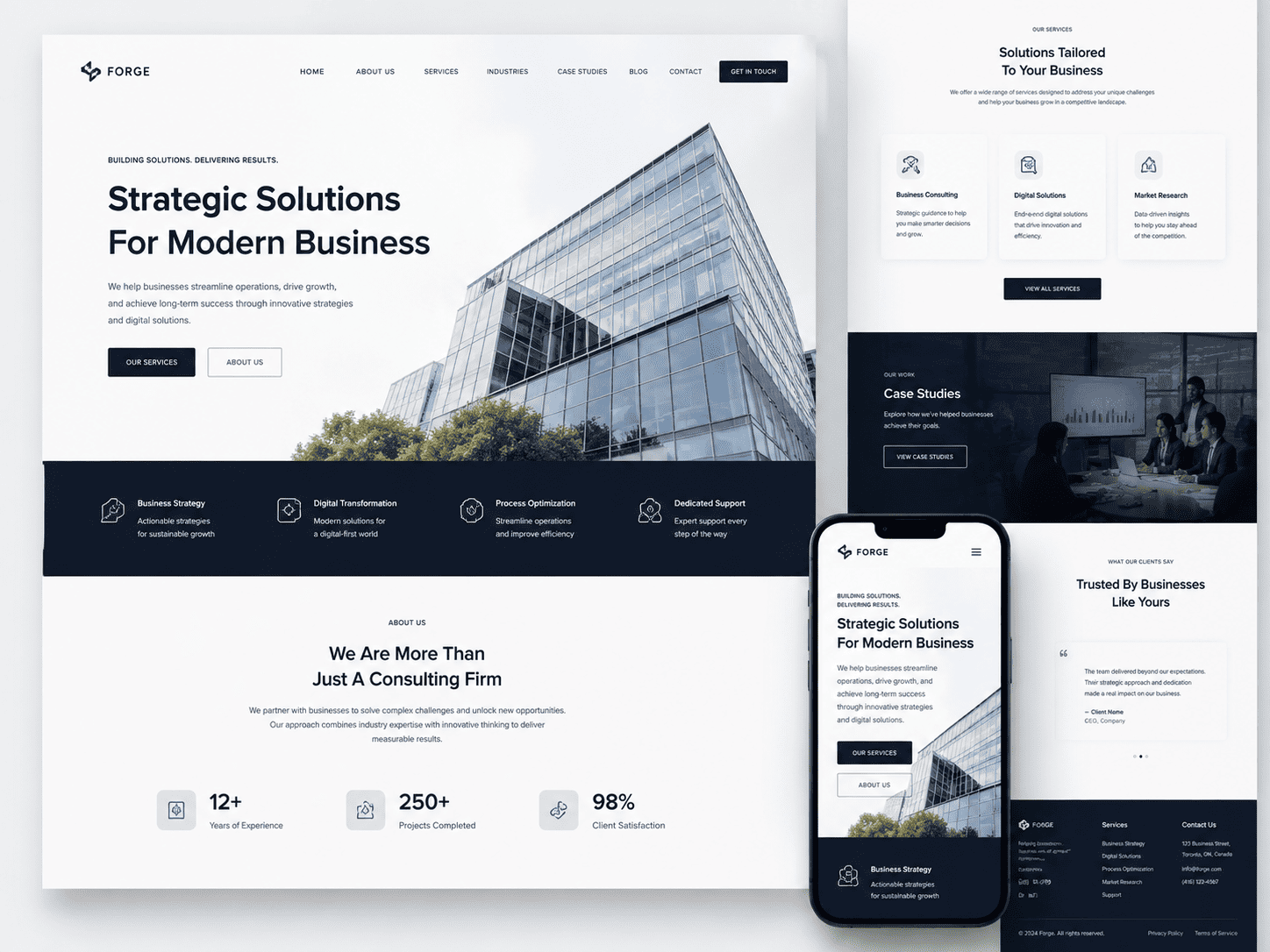
In a country as geographically vast and digitally connected as Canada, your website is often the first point of contact with a potential customer. Yet, if that website does not adapt seamlessly to the device in hand—whether it is a smartphone on a Toronto commute, a tablet on a Vancouver couch, or a desktop in a Halifax office—you risk losing that customer before the relationship begins. Responsive web design is no longer a technical nicety; it is the foundational standard for competing in the Canadian digital economy. It ensures that your content, images, and navigation reflow intelligently to provide an optimal viewing experience across every screen size, directly influencing how Canadians perceive and interact with your brand.
Mobile Usage Trends Across Canadian Provinces
Mobile internet usage in Canada has not only surpassed desktop but has done so unevenly across provinces, reflecting distinct regional behaviours. While national averages show that over 60% of web traffic now originates from smartphones, the story is more nuanced when you look closer. For instance, in Ontario and British Columbia, urban centres drive high mobile engagement during commutes and lunch breaks, with peaks in the early morning and late evening. In contrast, the Prairie provinces—Alberta, Saskatchewan, and Manitoba—see a more balanced split between mobile and desktop, often due to office-based industries and wider rural areas where desktop connections are more stable. Atlantic Canada, particularly Newfoundland and Labrador, shows a higher reliance on mobile for news and local services, especially in communities where broadband infrastructure is less robust. The key takeaway for any business is simple: a fixed-width desktop site will alienate a significant portion of your provincial audience, while a responsive site captures every user regardless of their regional device preference.
The Direct Link Between Mobile Experience and Sales
Canadian consumers are decisive, but they are also impatient. A slow-loading, unresponsive mobile page is a direct conversion killer. Consider these critical statistics that shape purchasing behaviour:
- Abandonment rates: Over half of Canadian mobile users will leave a page that takes longer than three seconds to load, and they rarely return.
- Cart abandonment: On e-commerce sites, a non-responsive checkout process is the leading cause of cart abandonment, with 70% of users citing difficulty in entering payment details or viewing product images on a small screen.
- Local search intent: Nearly 80% of mobile searches for local businesses in Canada result in a purchase within 24 hours, but only if the landing page is instantly usable.
When your site is responsive, you eliminate the pinch-and-zoom frustration, the horizontal scrolling, and the hidden call-to-action buttons. This frictionless path from discovery to purchase directly correlates with higher conversion rates. A responsive design also consolidates your analytics, allowing you to track the full customer journey from first click on a phone to final purchase on a laptop, giving you a clearer picture of what drives revenue.
How Responsive Design Builds Trust with Canadian Consumers
Trust is the currency of Canadian commerce, and your website’s usability is a direct reflection of your credibility. A site that appears broken or difficult to navigate on a mobile device signals negligence and a lack of investment in the customer experience. Conversely, a responsive site that loads crisply and functions intuitively on any device communicates professionalism and reliability. This is particularly vital for small and medium-sized enterprises competing against larger national chains. When a user’s experience is seamless—from reading your about page on a phone to submitting a contact form on a tablet—they perceive your business as modern, attentive, and worthy of their loyalty. Responsive design also ensures that your content is always readable without annoying text-size adjustments, which is a practical courtesy that Canadian consumers, known for valuing politeness and straightforwardness, will notice and reward with repeat visits and positive word-of-mouth referrals.
Understanding Responsive Web Design: Core Principles
Responsive web design (RWD) is an approach to <a href=”https://niagaraforge.ca/service/web-development/”>web development that ensures a single website adapts its layout, content, and functionality to fit any screen size—from a 4-inch smartphone to a 30-inch desktop monitor. Instead of creating separate versions of a site for different devices, RWD uses a unified codebase that responds dynamically to the user’s viewport. For Canadian businesses, this is particularly critical given the diverse range of devices used across provinces, from urban centres like Toronto to remote communities where mobile data may be slower. The core technical pillars of RWD are threefold: fluid grids, flexible media, and CSS media queries. Together, they eliminate the need for pinch-zooming, horizontal scrolling, or frustratingly tiny text, delivering a seamless experience that improves engagement and conversion rates.
To understand RWD fully, it is essential to distinguish it from older or alternative approaches. Adaptive design, for example, uses fixed layouts that snap to predefined screen widths (e.g., 320px, 768px, 1024px) and often requires server-side or client-side detection to serve different CSS. Separate mobile sites, such as m.example.com, are entirely distinct builds with their own URLs and maintenance overhead. In contrast, RWD is fluid and continuous: it uses one HTML source, and CSS rules adjust the layout proportionally at any point in between. This makes RWD more future-proof, as it naturally handles new device sizes (foldables, tablets with unusual aspect ratios) without additional coding.
Fluid Grids vs. Fixed Layouts: A Technical Overview
A fixed layout uses pixel-based widths—for instance, a container set to 960px. This works well on a desktop but breaks on a 375px-wide phone, forcing horizontal scroll. A fluid grid, however, uses relative units like percentages or fr (fractional) units in CSS Grid. Instead of declaring width: 960px, you might set width: 100% and then divide columns proportionally: column-left: 60%; column-right: 40%. The grid then shrinks or expands with the viewport, maintaining the same visual hierarchy. For example, a three-column layout for a legal firm in Vancouver might become a single column on a mobile device, but without any breakpoint, the fluid grid would simply compress the columns to the point of illegibility. Therefore, fluid grids are the foundation, but they work best when paired with breakpoints that adjust the grid’s structure at specific thresholds.
Using CSS Media Queries for Breakpoint Targeting
Media queries are conditional CSS rules that apply styles only when certain conditions are met—most commonly, the width of the viewport. They act as the “intelligence” of RWD, enabling you to rearrange content. A typical breakpoint might be set at 768px (tablet portrait) or 1024px (landscape). Here is a practical example for a Canadian e-commerce site that wants to hide a sidebar on small screens:
/* Default: fluid layout for mobile-first approach */
.main-content { width: 100%; }
.sidebar { display: none; }

/* At 768px and above, show a two-column layout */
@media (min-width: 768px) {
  .main-content { width: 70%; float: left; }
  .sidebar { display: block; width: 28%; float: right; }
}
Notice the mobile-first strategy: base styles apply to all devices, then media queries add enhancements for larger screens. Breakpoints should not be chosen arbitrarily based on popular devices; they should be driven by your content—where the layout starts to look cramped or stretched. For bilingual Canadian sites (English/French), text length varies significantly, so you may need additional breakpoints to handle longer French phrases without overflow.
Flexible Images and Media for Seamless Scaling
Images, videos, and embedded maps are common culprits for breaking responsive layouts. A fixed-width image (e.g., <img width="800">) will overflow its container on a small screen. The solution is to make all media fluid using a simple CSS rule:
img, video, iframe {
  max-width: 100%;
  height: auto;
}
Setting max-width: 100% ensures the media never exceeds its parent container’s width, while height: auto maintains the aspect ratio. For background images, use background-size: cover or contain depending on whether you need to crop or fit the entire image. A more advanced technique is using the <picture> element or the srcset attribute to serve different file resolutions based on device pixel ratio (e.g., serving a 2x image for Retina displays). For Canadian businesses with large product catalogs, this prevents wasted bandwidth on mobile data plans, which is a key user experience factor. By ensuring every image scales fluidly, you avoid the common pitfall of distorted visuals or broken layouts, keeping your site professional and accessible.
The Canadian Digital Landscape: User Behavior and Expectations
For Canadian businesses, responsive web design is not merely a technical convenience—it is a direct response to how the nation actually browses. Canadians engage with digital content across a fragmented ecosystem of devices, networks, and languages. A website that fails to adapt to this reality risks alienating a significant portion of its audience. Understanding the nuances of Canadian user behavior—from coast to coast, city to countryside, and between linguistic communities—is the first step toward building a truly effective online presence.
Device Preferences by Age Group and Region
While smartphones dominate overall traffic in Canada, usage patterns split sharply along generational and geographic lines. Younger Canadians (ages 18–34) are overwhelmingly mobile-first, often using their phone as their primary or only computing device. In contrast, Canadians over 55 still show a strong preference for desktops and laptops, particularly for tasks like online banking, lengthy research, or professional work. Regionally, urban centres like Toronto and Vancouver see higher mobile usage during commute hours, while rural and northern communities rely more heavily on desktops due to less reliable mobile networks at home.
| User Segment | Primary Device | Typical Context |
|---|---|---|
| Adults 18–34 (urban) | Smartphone (often only device) | Social media, shopping, quick lookups on the go |
| Adults 35–54 (suburban/rural) | Laptop or tablet | Work, detailed product research, video streaming |
| Adults 55+ (all regions) | Desktop computer | Banking, email, reading long-form news or government pages |
This divergence means a responsive site cannot simply shrink a desktop layout. It must prioritize thumb-friendly navigation for younger mobile users while preserving dense, readable layouts and hover-based menus for older desktop users. Ignoring either group costs conversions.
Internet Speed and Connectivity in Urban vs. Rural Canada
Canada’s vast geography creates a stark digital divide. Urban centres enjoy some of the fastest fibre and 5G connections globally, with median download speeds often exceeding 100 Mbps. However, rural and remote communities—including many Indigenous territories and northern towns—frequently rely on slower DSL, satellite, or spotty LTE. In these areas, median speeds can fall below 10 Mbps, and data caps are common. For responsive design, this means more than flexible images. It demands performance budgets that work on constrained connections:
- Progressive enhancement: Core content and navigation must load without waiting for heavy JavaScript or web fonts.
- Adaptive image delivery: Serve compressed, low-resolution versions to rural users unless they explicitly choose higher quality.
- Offline resilience: Simple caching strategies allow repeat visits to work even with intermittent connectivity.
- Reduced motion and animation: These features consume bandwidth and CPU, disproportionately slowing devices in low-connectivity areas.
A responsive site that performs beautifully on a Toronto fibre connection but crawls on a Saskatchewan satellite link is not truly responsive—it is merely flexible.
Localization and Bilingual Considerations for Responsive Sites
Canada is officially bilingual, and this legal reality shapes user expectations. A responsive design must accommodate not only text translation but also layout shifts between English and French. French text is typically 20–30% longer than its English equivalent, which can break one-line buttons, push images out of alignment, or create awkward white space on mobile screens. Effective localization goes beyond translation:
- Layout flexibility: Use fluid grids that allow longer French words to wrap naturally without overflowing containers.
- Regional content: Address provincial differences—for example, Quebec’s distinct consumer protection laws or local payment methods like Interac in both languages.
- Direction and formatting: While both languages use left-to-right text, date formats (DD/MM/YYYY in French, YYYY-MM-DD in English) and numbers (decimal comma in French) must adjust responsively.
- Navigation clarity: Ensure language switcher is always visible on mobile, not hidden behind a hamburger menu, as bilingual users frequently toggle between versions.
When these elements are handled correctly, a responsive site feels native to both a francophone in Montreal and an anglophone in Vancouver. When they are ignored, users perceive the site as foreign and untrustworthy. Responsive design in Canada, therefore, is as much about cultural and linguistic adaptation as it is about screen size—and businesses that master this balance gain a decisive competitive edge.
SEO Benefits of Responsive Web Design for Canadian Companies
For Canadian businesses, the path to higher search visibility runs directly through mobile usability. With Google’s persistent shift toward mobile-first evaluation, a responsive website is no longer a convenience—it is a foundational requirement. Responsive design consolidates your technical SEO efforts into a single, adaptable framework, which directly addresses how Google crawls, indexes, and ranks content for Canadian audiences searching from coast to coast.
Mobile-First Indexing and Its Impact on Canadian Rankings
Google has used mobile-first indexing as its primary method for crawling and ranking all new websites since July 2019, and it now applies to the vast majority of pages. This means Googlebot predominantly uses the mobile version of your page to determine rankings, content relevance, and structured data signals. For a Canadian company—whether serving Toronto, Vancouver, or rural Alberta—this has a clear implication: if your desktop site is rich with content but your mobile version is stripped down, you are effectively hiding your best assets from the search engine.
Responsive design solves this by serving the same HTML and CSS to all devices, with layout adjustments via media queries. Googlebot does not need to render a separate mobile user agent to see your full content. This parity ensures that every text block, image alt attribute, and internal link on your desktop page is equally accessible on a smartphone. Consequently, Canadian businesses avoid the common ranking penalty of “mobile content gaps,” where key product descriptions or location-specific service pages fail to appear in mobile crawls. This is especially critical for local search queries like “plumber in Calgary” or “legal services in Ottawa,” where Google prioritizes fast, complete mobile experiences.
Consolidating Link Equity with a Single Responsive URL
Before responsive design became the standard, many Canadian companies operated separate mobile subdomains (e.g., m.example.ca) or dynamic serving URLs. This approach fragments your link profile. A blog post about Canadian tax regulations might earn backlinks pointing to the desktop URL, while social shares or directory listings link to the mobile subdomain. Over time, this dilutes the authority passed to any single page, weakening your ability to rank for competitive national keywords.
With a single responsive URL—such as https://www.example.ca/services—all external signals converge on one address. Every backlink, internal anchor, and social share contributes to the same page’s equity. For a Canadian business targeting both provincial and national markets, this consolidation is a practical advantage. You avoid the need for complex 301 redirects between mobile and desktop versions, which can leak crawl budget and slow down link discovery. Moreover, a unified URL simplifies reporting in Google Search Console, giving you a clear, unambiguous view of which pages earn impressions and clicks from Canadian searchers.
Reducing Bounce Rates to Strengthen SEO Signals
Bounce rate is not a direct ranking factor, but it acts as a powerful proxy for user experience, which Google does measure through engagement metrics. When a Canadian user taps a search result and lands on a page that is slow to load, requires horizontal scrolling, or has unclickable text, they typically leave within seconds. High bounce rates, especially on mobile, signal to Google that your page fails to satisfy the query intent. Over time, this can suppress your rankings for high-value commercial keywords.
Responsive design directly mitigates this problem. Consider these practical improvements:
- Faster load times: A single responsive site avoids redirects to separate mobile domains, reducing server response time by an average of 1–2 seconds on 3G and 4G connections common in Canadian rural areas.
- Readable content without zoom: Fluid grids and flexible images ensure text is legible at any viewport width, keeping users engaged with your service descriptions or pricing tables.
- Simplified navigation: Touch-friendly menus and appropriately sized tap targets reduce accidental clicks, which are a primary cause of immediate exits on mobile.
For example, a responsive CSS rule to ensure proper tap target sizing is:
a, button {
  min-height: 48px;
  min-width: 48px;
  display: inline-flex;
  align-items: center;
  justify-content: center;
}
This small adjustment prevents users from mis-tapping a “Contact Us” link and bouncing away in frustration. When Canadian users stay longer, scroll deeper, and interact with your conversion elements, Google interprets these positive behavioral signals as proof of relevance. Consequently, your responsive pages earn stronger positions in Canadian search results, driving sustained organic traffic and qualified leads.
User Experience (UX) and Accessibility: Key Considerations for Canada
For Canadian businesses, responsive web design is not merely about resizing screens; it is about creating an inclusive, frictionless experience that respects the country’s linguistic duality and diverse user base. A truly effective mobile experience in Canada must prioritize clarity, speed, and compliance. When users switch between a phone, tablet, or desktop, the interface should feel native to each device, not like a scaled-down afterthought. This is especially critical given that a significant portion of Canadian web traffic comes from mobile devices, often on slower rural connections. Therefore, UX decisions must be deliberate, focusing on reducing cognitive load and physical effort for every user, regardless of ability.
Designing for Thumb-Friendly Navigation and Touch Targets
Canadian users often browse on the go—commuting on public transit, waiting in coffee shops, or navigating between meetings. This context demands a layout that accommodates the natural arc of a thumb on a smartphone. Avoid placing primary navigation links or call-to-action buttons in the top corners, which are difficult to reach without a stretch. Instead, position key actions within the bottom third of the screen. Touch targets should be a minimum of 44 by 44 CSS pixels, as recommended by Apple’s Human Interface Guidelines, to prevent mis-taps.
Consider these practical rules for mobile menus and interactive elements:
- Sticky bottom navigation: For primary actions like “Call Now” or “Get Directions,” use a persistent bottom bar that does not interfere with content reading.
- Generous spacing: Ensure at least 8 pixels of space between tappable elements to reduce accidental activation, especially for users with larger hands or motor impairments.
- Icon plus label: Never rely on icons alone for navigation. Pair each icon with a short text label, as Canadian users may be unfamiliar with ambiguous symbols.
- Hamburger menu caution: While common, the hamburger menu hides critical links. For Canadian sites, consider a visible “Menu” button or a bottom tab bar for the five most important pages (e.g., Home, Services, Contact).
Testing on real devices, not just browser emulators, is essential to validate that the thumb reach feels natural across different screen widths, from a small iPhone SE to a large Android phablet.
Meeting AODA and WCAG Guidelines on All Devices
Canada has a distinct legal landscape for digital accessibility. The Accessibility for Ontarians with Disabilities Act (AODA) mandates that public and private organizations in Ontario meet WCAG 2.0 Level AA standards. However, for businesses operating nationally, it is best practice to aim for WCAG 2.1 AA, which addresses mobile accessibility more thoroughly. This is not just a legal checkbox; it is a user experience imperative. A responsive site must maintain accessibility features across every breakpoint. For example, text that becomes too small on a phone violates contrast and readability guidelines.
Key compliance considerations for responsive layouts include:
- Contrast ratios: Ensure a 4.5:1 contrast ratio for normal text and 3:1 for large text, even when background colors shift on smaller screens.
- Reordering of content: When a layout collapses from three columns to one, the logical tab order must remain intact. Screen readers should navigate from header to main content to footer, not jump randomly.
- Tap target size for WCAG 2.1: WCAG Success Criterion 2.5.8 (Target Size Minimum) requires targets to be at least 24 by 24 CSS pixels, but 44 pixels is safer for user comfort.
- No horizontal scrolling: Content must fit vertically without requiring side swiping, which is disorienting for users with low vision or cognitive disabilities.
- Pause, stop, hide: Any auto-playing carousel or video (common on Canadian retail sites) must have controls to pause or stop, and must not be the only way to access key information.
Regular automated audits paired with manual keyboard-only testing on a mobile device are necessary to catch issues that arise from dynamic resizing.
Optimizing Forms and Checkout for Canadian Mobile Users
Forms are often the final barrier between a Canadian visitor and a conversion. On a mobile device, long, multi-column forms are a major source of abandonment. For a responsive design, forms must be rebuilt for a single-column flow, with input fields that automatically invoke the correct mobile keyboard (numeric for postal codes, email for email addresses). This is particularly relevant for Canadian-specific data like postal codes (e.g., K1A 0B1) and province selection, which should be a simple dropdown or a list of large, tappable options rather than a free-text field.
To optimize the checkout or lead generation experience for Canadian users:
- Autofill and autocomplete: Implement browser autofill for name, address, and payment fields. Canada Post’s address validation API can be integrated to suggest addresses, reducing typos and delivery errors.
- Split fields logically: Separate the postal code from the street address. Do not force a single “City, Province” field; instead, use two distinct dropdowns or a smart text input with autocomplete.
- Error messaging: Show inline validation errors immediately, in plain language, and do not clear the entire form on a single mistake. For French-Canadian users, ensure error messages are translated and placed near the relevant field.
- Progress indicators: For multi-step checkouts, show a clear, numbered progress bar (e.g., “1. Cart, 2. Shipping, 3. Payment”) that is visible and tappable on mobile.
- Payment options: Include popular Canadian payment methods such as Interac Online or Visa Debit, and clearly display trust badges (e.g., “SSL Secured”) near the payment button.
- Call-to-action button size: The final “Submit Order” or “Send Message” button must be full-width and at least 48 pixels tall, with no other links nearby that could be tapped accidentally.
By simplifying the input process and respecting the user’s context, you reduce friction and build trust with Canadian customers who expect efficiency and reliability from your digital presence.
Performance Optimization for Responsive Websites in Canada
In Canada’s vast geographic landscape, from dense urban cores to remote rural communities, internet connectivity varies dramatically. A responsive website that fails to load quickly on a slower 3G or congested LTE connection will frustrate users and drive them to competitors. Performance optimization is not a technical luxury—it is a business necessity. By prioritizing speed, you directly improve user satisfaction, conversion rates, and search engine rankings, particularly on mobile devices where most Canadian users now browse.
Core Web Vitals and Their Role in User Satisfaction
Core Web Vitals are Google’s standardized metrics for measuring real-world user experience. Three key signals matter most:
- Largest Contentful Paint (LCP): Measures loading performance. Aim for under 2.5 seconds. This reflects how quickly the main content becomes visible.
- Interaction to Next Paint (INP): Assesses responsiveness to user input. A target under 200 milliseconds ensures taps and clicks feel instant.
- Cumulative Layout Shift (CLS): Quantifies visual stability. Keep a score below 0.1 to prevent unexpected page jumps that cause mis-taps and frustration.
For Canadian audiences, these metrics are especially critical during peak usage hours when networks throttle speeds. A slow LCP on a mobile device in rural Saskatchewan will lead to high bounce rates. To monitor and improve these, use tools like Google PageSpeed Insights or Lighthouse. A practical server-side improvement is to prioritize critical CSS and defer non-essential JavaScript. For example, you can use the loading="lazy" attribute on below-the-fold images, but ensure your hero image uses fetchpriority="high" to accelerate LCP.
Image Compression and Next-Gen Formats for Faster Loads
Images account for the largest portion of a webpage’s weight. Unoptimized photos can easily exceed 2 MB, crippling load times on slower connections. Compress all images without sacrificing visual quality. Use modern formats like WebP or AVIF, which offer 25–50% smaller file sizes than traditional JPEG or PNG. Most Canadian content management systems and web hosts support these formats natively. For example, a simple server rewrite can serve WebP when supported:
<picture>
  <source srcset="hero.avif" type="image/avif">
  <source srcset="hero.webp" type="image/webp">
  <img src="hero.jpg" alt="Canadian business storefront" width="1200" height="800" loading="eager" fetchpriority="high">
</picture>
Additionally, implement responsive image attributes like srcset and sizes to serve scaled versions based on viewport width. A smartphone in Vancouver should not download a 2000-pixel-wide image meant for a desktop in Toronto. Combine this with lossless compression tools like imagemin or online services to automate the process during deployment.
Caching and Content Delivery Networks (CDNs) for Canadian Reach
Caching reduces server load and speeds up repeat visits. Set browser caching headers so static assets like CSS, JavaScript, and images are stored locally after the first load. For a typical WordPress or custom site, add this to your .htaccess or server config:
<IfModule mod_expires.c>
  ExpiresActive On
  ExpiresByType image/webp "access plus 1 month"
  ExpiresByType text/css "access plus 1 week"
  ExpiresByType application/javascript "access plus 1 week"
</IfModule>
More importantly, deploy a Content Delivery Network (CDN) with edge nodes located in Canada. A CDN stores cached copies of your site across multiple servers. When a user in Halifax requests your site, the CDN serves data from the nearest node—perhaps in Montreal or Toronto—rather than a distant origin server in California or Europe. This dramatically reduces latency, particularly for users in northern territories or remote areas where direct routing is inefficient. Leading CDNs like Cloudflare, Akamai, and Amazon CloudFront have robust Canadian presence. Beyond speed, a CDN also offers DDoS protection and handles traffic spikes during seasonal promotions, which is essential for Canadian e-commerce businesses operating across multiple time zones.
Finally, always test your site’s performance using tools that simulate slower connections, such as Chrome DevTools’ network throttling. Optimize for the lowest common denominator—a user on a 3G connection in rural Alberta—and you will deliver a flawless experience for everyone else on faster networks.
E-Commerce and Responsive Design: Driving Online Sales in Canada
For Canadian businesses, a responsive e-commerce site is no longer an optional enhancement—it is the primary driver of revenue. When a store adapts seamlessly to any screen size, it removes friction between the moment a customer lands on a page and the moment they complete a purchase. In a market where shoppers frequently switch between a desktop at work, a tablet on the couch, and a phone in line at a café, the ability to maintain a consistent, fast, and intuitive experience across all devices directly correlates with your bottom line. A non-responsive site does not just frustrate users; it actively pushes them toward competitors who have invested in fluid grids and flexible images.
Mobile Shopping Habits and Conversion Rates in Canada
Canadian consumers have firmly embraced mobile commerce, but their behaviour reveals distinct patterns that businesses must understand. Unlike impulse-driven markets, Canadian mobile shoppers often conduct extensive research on their phones before purchasing—comparing prices, reading reviews, and checking shipping timelines. This means your responsive design must prioritize load speed and readability for informational browsing, not just transactional clicks. Conversion rates on mobile in Canada tend to lag slightly behind desktop for high-ticket items, yet they excel for repeat purchases, groceries, and everyday essentials. To bridge this gap, consider the following mobile-specific optimizations:
- Thumb-friendly navigation: Ensure menu buttons and add-to-cart icons are at least 48 pixels tall and placed within easy reach.
- Accelerated mobile pages (AMP): Use lightweight code for product listings to reduce bounce rates on slower 4G and 5G connections.
- Guest checkout: Many Canadian shoppers abandon carts when forced to create an account; offer a guest option prominently on small screens.
- Local pickup filters: Allow users to filter inventory by nearby stores, a feature that significantly boosts in-store and online conversion synergy.
Integrating Canadian Payment Gateways into Responsive Checkouts
One of the most critical elements of a responsive checkout is the payment experience. Canadian consumers have specific expectations that differ from U.S. or European users. While credit cards remain dominant, Interac Online and Interac e-Transfer are widely trusted for domestic transactions, and many shoppers expect to see these options alongside Visa and Mastercard. A responsive checkout must not only display these gateways clearly but also handle their unique verification steps—such as redirects to bank portals—without breaking the layout or losing the user’s cart data. Key integration considerations include:
- Seamless redirects: Ensure that when a user is sent to their bank for Interac verification, the return URL preserves their session and automatically re-syncs the cart on any device.
- Touch-friendly form fields: Credit card expiry dates and CVV inputs should use numeric keyboards and large, clear fields to minimize typos.
- Apple Pay and Google Pay: These digital wallets are increasingly popular in Canada; integrate them as one-tap options that bypass manual data entry entirely.
- Bilingual error messages: Display payment errors in both English and French to reduce confusion and support completion rates in Quebec and other francophone regions.
Streamlining Product Pages for Small Screens
Product pages are where responsive design faces its toughest test. On a desktop, you can show multiple images, detailed descriptions, and customer reviews simultaneously; on a smartphone, this information must be sequenced logically to prevent overwhelming the user. The goal is to reduce cognitive load while preserving the persuasive elements that drive a sale. To achieve this, focus on a mobile-first hierarchy that presents the most critical information first. A practical structure for a responsive product page might include:
| Mobile Priority | Element | Why It Matters |
|---|---|---|
| 1 | High-resolution hero image with swipeable gallery | Visual confirmation is the first trust signal. |
| 2 | Price, availability, and shipping estimate | Answers the two most common questions instantly. |
| 3 | Sticky “Add to Cart” button | Keeps the purchase action always visible without scrolling. |
| 4 | Collapsible description and specs | Allows deep dives only when the user chooses. |
| 5 | Review carousel with star ratings | Social proof appears after core details, not before. |
Additionally, avoid using hover-based menus or zoom-dependent text on product pages. Instead, implement expandable accordions for size guides and return policies. Ensure that every image uses responsive srcset attributes so that a 6-inch screen does not download a 2MB desktop file, which would slow down the page and harm conversion. By treating the product page as a sequential story—image, price, action, details, proof—you align the user’s natural decision-making process with your site’s architecture, ultimately reducing cart abandonment and increasing the likelihood of a completed sale.
Responsive Design and Content Strategy for Canadian Audiences
In Canada, a responsive website is not merely a technical feature—it is the foundation of an effective content strategy. With over 80% of Canadians accessing the internet via mobile devices, content must be designed to perform across a spectrum of screen sizes, from compact smartphones to expansive desktop monitors. However, true responsiveness extends beyond fluid grids and flexible images; it requires a deliberate approach to how text, visuals, and multimedia are presented and prioritized. For businesses serving Canadian audiences, this means balancing universal usability with distinct local and linguistic considerations. A well-executed responsive content strategy ensures that a user in rural Newfoundland on a 4G connection receives the same clarity, brand integrity, and relevance as a user in downtown Toronto on fibre optic.
Typography and Readability Across Breakpoints
Typography is the backbone of content legibility, and it must be treated as a fluid component, not a fixed asset. On smaller screens, font sizes should scale proportionally, but readability demands more than simple enlargement. Line length, for instance, should not exceed 45–75 characters per line on any device to prevent eye strain; this often requires adjusting padding and margins at each breakpoint. For Canadian businesses, this also means supporting both official languages without layout rupture. French text, on average, is 15–20% longer than its English equivalent, so a heading that fits elegantly on a 320px viewport in English may wrap awkwardly in French. To mitigate this, consider the following:
- Use relative units (e.g.,
remorem) for font sizes, allowing the browser to adapt dynamically. - Test line-height at 1.5 or higher for body text on mobile, as dense paragraphs become unreadable without adequate vertical spacing.
- Implement fluid type scales that increase by at least 2px between major breakpoints (e.g., 360px, 768px, 1024px).
- Avoid hyphenation for French text on narrow screens; instead, allow natural word wrapping to preserve readability.
Additionally, interactive elements like buttons and links must meet a minimum touch target of 44×44 pixels, which is particularly critical for thumb-based navigation on phones. Font weights should be tested for anti-aliasing differences across browsers, as thin weights (300 or less) often fade on low-resolution mobile screens.
Optimizing Images and Videos for Mobile Data Usage
Canadian mobile users face significant data caps and variable network speeds, especially in rural and northern regions. A responsive content strategy must therefore treat media as a cost to the user, not just a visual enhancement. Large, uncompressed images can consume megabytes of data, leading to slow load times and frustrated visitors. The solution is layered optimization that adapts both file size and resolution to the device context. For example, a hero image on a desktop might be 2400px wide, but the same image should be served as a 600px-wide, compressed WebP file on a smartphone. Similarly, video content requires careful handling; autoplaying videos with sound are a common annoyance and a data drain. Instead, offer poster images with explicit play buttons, and use adaptive bitrate streaming to adjust video quality based on the user’s connection.
| Media Type | Desktop Strategy | Mobile Strategy (≤768px) |
|---|---|---|
| Images (JPG/PNG) | Serve 1920px wide, 80% compression, lazy-load below the fold. | Serve 640px wide, 50% compression, use WebP format where supported. |
| Video (MP4) | Stream at 1080p with user-initiated playback. | Stream at 480p or 720p, disable autoplay, show thumbnail with play icon. |
| Background Graphics | Use CSS gradients or SVG patterns instead of raster files. | Eliminate background images entirely or replace with solid colors. |
| Infographics | Display as a single high-resolution image. | Split into multiple stacked, zoomable sections or an accessible HTML table. |
Beyond file formats, use the srcset attribute with width descriptors to let the browser choose the optimal image. Always include loading="lazy" for off-screen media, and consider using Content Delivery Networks (CDNs) with Canadian edge nodes to reduce latency for users in remote provinces.
Creating Localized Content for English and French Markets
Canada’s bilingual reality requires more than translation; it demands localization that respects cultural context and regional nuance. A responsive layout must accommodate both languages gracefully, but the content itself must be crafted for distinct audiences. For instance, English content for a national audience may use Canadian spelling (e.g., “colour,” “centre”), while French content should follow Quebec’s standard French, not European French, for terms like “courriel” (email) or “fin de semaine” (weekend). Localization also affects content length, as discussed, but it extends to imagery and tone. A photo of a maple leaf may resonate nationally, but a French-language page for a Quebec audience might better use local landmarks or seasonal references. To implement this effectively:
- Use a language toggle that preserves the user’s scroll position and filters, rather than resetting to the homepage.
- Ensure that date formats (e.g., “2025-02-14” for French, “February 14, 2025” for English) and currency symbols ($ vs. $ CA) are dynamically rendered based on locale.
- Develop separate content hierarchies for each market; do not assume the same call-to-action performs equally in Vancouver and Montreal.
- Test all breakpoints with both languages side-by-side, as French text may force vertical expansion of cards or navigation menus.
For media, localize alt text and video captions in both languages, which also improves accessibility for hearing-impaired users. A practical approach is to use a headless CMS that stores content as structured language variants, allowing the responsive front-end to pull the correct string lengths without breaking the grid. By treating language as a design constraint, not an afterthought, Canadian businesses can ensure that every visitor—regardless of device, location, or language—receives a cohesive, respectful, and high-performing experience.
Choosing the Right Approach: Responsive vs. Other Mobile Solutions
For Canadian businesses, the decision between responsive design and alternatives like adaptive design, dynamic serving, or a separate mobile site is not merely technical—it directly affects user experience, SEO performance, and operational costs. Each method solves the mobile problem differently, and the best choice depends on your content complexity, target audience, and long-term maintenance capacity. Below is a practical comparison to help you navigate this landscape.
Responsive vs. Adaptive: Which Fits Your Business Goals?
Responsive design uses fluid grids, flexible images, and CSS media queries to create one layout that adapts seamlessly to any screen size. It is the most common approach because it serves the same HTML to all devices, which simplifies SEO and analytics. For most Canadian SMBs—from a Toronto restaurant to a Vancouver law firm—responsive design aligns with goals like local search visibility and consistent branding.
Adaptive design, in contrast, uses predefined breakpoints to load different layouts for specific screen widths (e.g., mobile, tablet, desktop). It offers more precise control over what users see on each device, which can be useful for complex interfaces like e‑commerce checkout flows or interactive dashboards. However, adaptive requires you to maintain multiple layout templates, and it can lead to inconsistencies in content delivery if not carefully managed.
- Choose responsive if you have content-heavy pages, want lower maintenance, or need to future-proof against new device sizes.
- Choose adaptive if you have a small number of well-defined user journeys and need pixel-perfect control over each device type.
For a typical Canadian business with a blog, service pages, and a contact form, responsive design is usually the safer investment. It also aligns with Google’s mobile-first indexing, which prioritizes sites that deliver the same content to all users.
Dynamic Serving and Separate Mobile Sites: When Are They Justified?
Dynamic serving uses the same URL but sends different HTML and CSS based on the user’s device (detected via the User-Agent header). A separate mobile site, such as m.example.ca, is a distinct site with its own URL structure. Both approaches are heavier to manage than responsive or adaptive, but they have niche use cases.
Dynamic serving is justified when you need to drastically reduce mobile payloads—for example, if your desktop page has heavy interactive maps or large data tables that are irrelevant on a phone. However, it introduces risks: misconfigured Vary headers can cause SEO duplication, and real-time device detection can fail on older browsers or privacy tools that block User-Agent strings.
A separate mobile site is rarely recommended today, but it may be justified for very large enterprises with distinct mobile audiences, such as a national retailer offering a stripped-down m‑commerce experience. The main drawback is the cost of maintaining two codebases, plus the need for rel=canonical and rel=alternate tags to avoid duplicate content penalties.
| Approach | Best For | Key Risk |
|---|---|---|
| Dynamic serving | Heavy media sites needing optimized mobile versions | SEO errors from improper caching headers |
| Separate mobile site | Large enterprises with legacy systems | Double maintenance and content drift |
For most Canadian SMBs, these approaches are overkill. They add complexity without proportional benefits, especially when responsive design can handle 95% of use cases.
Maintenance and Cost Implications for Canadian SMBs
Cost is a deciding factor for small and medium businesses, especially with the Canadian dollar’s purchasing power and the need to budget for bilingual content (English and French). Responsive design has the lowest total cost of ownership: you maintain one codebase, one content management system, and one set of templates. Updates to a product description or a service page happen once, and they propagate to all devices.
Adaptive design increases costs because you must test and update each layout separately. Dynamic serving adds server-side complexity, which often requires developer time for configuration and debugging. A separate mobile site roughly doubles your hosting, design, and content management expenses—and you must also handle cross-linking and redirects.
In practical terms, consider a simple code example for a responsive image that avoids unnecessary downloads:
<img src="hero-desktop.jpg"
     srcset="hero-mobile.jpg 480w, hero-tablet.jpg 768w, hero-desktop.jpg 1200w"
     sizes="(max-width: 600px) 100vw, (max-width: 900px) 80vw, 60vw"
     alt="Canadian business storefront">
This single tag ensures the browser picks the right image size, reducing data usage for mobile users—a critical factor in rural areas with slower LTE. Ultimately, for Canadian SMBs, responsive design offers the best balance of performance, SEO, and budget. It keeps your team focused on content and customer experience, not on juggling multiple platforms.
Implementing Responsive Web Design: A Step-by-Step Guide
Moving from theory to a fully functional responsive website requires a disciplined, phased approach. Rushing into code without a clear roadmap often leads to fragmented layouts, performance issues, and a poor user experience—especially problematic in Canada’s diverse digital landscape, where users span multiple time zones, device types, and connection speeds. The following step-by-step process will help your team execute a responsive build with confidence, minimizing costly revisions and ensuring every visitor receives a seamless experience.
Planning Your Responsive Strategy: Goals and Audience Research
Before any pixel is placed, define what your responsive site must achieve. Start by auditing your current analytics to identify which devices, browsers, and screen sizes your Canadian audience actually uses. For example, a local service business in Toronto may see heavy mobile traffic from iOS devices, while a B2B firm targeting Vancouver tech companies might encounter a balanced split of desktop and tablet users. Conduct user interviews or surveys to understand context: are visitors on a 4G connection in a rural area, or on high-speed fibre in a downtown core? These insights directly inform breakpoint choices and performance budgets.
Create a concise project brief that includes:
- Primary conversion goals (e.g., phone calls, form fills, online purchases).
- Key user tasks for each segment (e.g., finding store hours, comparing product specs).
- Performance targets (e.g., load under 3 seconds on mid-range mobile devices).
- Content hierarchy that reflects user priorities, not internal politics.
Finally, map out your breakpoints based on real traffic data, not arbitrary device names. Common ranges—such as 320px, 480px, 768px, and 1024px—serve as starting points, but your analytics will tell you where users actually drop off or struggle.
Designing Mobile-First: Wireframes and Prototyping
Adopt a mobile-first methodology: design the smallest screen first, then progressively enhance for larger viewports. This forces you to prioritize content and interactions that matter most, eliminating non-essential clutter. Begin with low-fidelity wireframes for key templates—home, product listing, article page, and checkout. Sketch these at a 360px width to validate the core user flow. Use a tool like Figma, Sketch, or Adobe XD to create clickable prototypes that demonstrate touch targets (at least 44×44 pixels), thumb-friendly navigation, and stacked content order.
During prototyping, test your assumptions internally. Ask: Does the primary call-to-action appear without scrolling? Can a user complete a purchase with one hand? For larger screens, define how components reflow—for instance, a single-column product description might split into two columns beside a sticky gallery at 768px, then expand to a three-column related-products grid at 1200px. Document these rules in a shared design system to prevent developers from making arbitrary layout decisions.
Testing on Real Devices and Tools for Canadian Developers
Emulator tools are useful for quick checks, but they cannot replicate the nuances of real hardware—battery drain, ambient lighting, or touch latency. Build a device lab that includes a mix of older and newer phones (e.g., iPhone SE, Samsung Galaxy A-series) and tablets with varying screen densities. If you lack physical inventory, use cloud-based testing platforms like BrowserStack or Sauce Labs that offer remote access to hundreds of real devices. For Canadian-specific concerns, test on slower network throttling profiles (e.g., 3G or 4G at 1.5 Mbps) to simulate rural connectivity issues.
Automate where possible. Use Lighthouse from Chrome DevTools to audit performance, accessibility, and best practices in a continuous integration pipeline. Pair this with a visual regression tool like Percy to catch unintended layout shifts across breakpoints. For on-device debugging, enable remote inspection via Safari’s Web Inspector or Chrome’s remote debugging over USB. Always test critical user journeys—not just the homepage—including forms with address autofill, maps, and multilingual content if your site serves both English and French markets.
Finally, create a pre-launch checklist that includes a cross-browser matrix (Safari, Chrome, Firefox, Edge), a review of horizontal scrolling issues, and a verification that all images use responsive srcset attributes. By embedding testing into every sprint rather than treating it as a final gate, you will catch problems early and deliver a responsive site that feels effortless on every screen.
Frequently Asked Questions
What is responsive web design and why is it important for Canadian businesses?
Responsive web design is an approach where a website adapts its layout and content to fit any screen size, from smartphones to desktop monitors. For Canadian businesses, it’s crucial because a large portion of web traffic comes from mobile devices, and a positive mobile experience directly impacts user engagement, conversions, and search rankings. Google also prioritizes mobile-friendly sites in search results, making it essential for local visibility and competitiveness.
How does responsive design affect SEO in Canada?
Responsive design is Google’s recommended mobile configuration and helps consolidate your SEO efforts into a single URL. This simplifies link building, avoids duplicate content issues, and allows Googlebot to crawl your site more efficiently. In Canada, where local search is vital, a responsive site can improve your rankings for mobile searches like ‘near me’ queries, leading to more qualified traffic and potential customers.
What are the key elements of a responsive website for Canadian audiences?
Key elements include a fluid grid that resizes content proportionally, flexible images and media that adjust without breaking layout, and CSS media queries to apply different styles based on device characteristics. Additionally, consider Canadian-specific factors like bilingual content (English/French), fast loading times on various networks, and accessible design to meet standards (AODA). Prioritize touch-friendly navigation and readable text without zooming.
How does responsive design impact user experience (UX) and conversion rates?
A responsive website provides a consistent and optimized experience across all devices, which reduces user frustration and bounce rates. When visitors can easily navigate, read, and interact on their preferred device, they are more likely to trust your brand and complete desired actions, such as making a purchase or filling out a contact form. This seamless experience leads to higher conversion rates and improved customer satisfaction.
What is the difference between responsive and adaptive design?
Responsive design uses fluid grids and flexible layouts that respond continuously to any screen size. Adaptive design uses predefined layouts for specific screen sizes and detects the device to serve the most appropriate layout. While both aim to be mobile-friendly, responsive design is more future-proof and easier to maintain because it doesn’t require designing for every possible device. Most modern web design projects favor responsive approaches.
How can Canadian businesses ensure their responsive site is accessible?
To ensure accessibility, follow the Web Content Accessibility Guidelines (WCAG) 2.1 AA, which are referenced in Canadian accessibility laws like the AODA. Use semantic HTML, provide text alternatives for images, ensure sufficient color contrast, and make sure all interactive elements are keyboard accessible. Responsive design should also consider touch targets and resizable text to accommodate users with visual or motor impairments.
What are common mistakes to avoid when implementing responsive design?
Common mistakes include ignoring the viewport meta tag, using fixed-width elements, hiding content on mobile, and not optimizing images for different resolutions. Additionally, failing to test on real devices, overlooking page speed, and not prioritizing touch interactions can harm the mobile experience. Avoid these pitfalls by embracing fluidity, testing thoroughly, and focusing on performance and usability.
How often should a Canadian business update its responsive website?
Website technology and user expectations evolve rapidly. It’s recommended to review your website annually at minimum, but more frequent updates may be needed if you add new content, features, or services. Also, monitor analytics for changes in device usage and user behavior. Regular updates ensure your site remains compatible with new browsers, devices, and accessibility standards, keeping your competitive edge in the Canadian market.
Sources and further reading
- Responsive Web Design – What It Is And How To Use It
- Responsive Web Design – Wikipedia
- Responsive Web Design – W3C
- Web Content Accessibility Guidelines (WCAG) 2.1
- Accessibility for Ontarians with Disabilities Act (AODA)
- Canadian Internet Use Survey (Statistics Canada)
- The Impact of Mobile-Friendliness on Google Search (Google Research)
- Mobile Page Speed – Think with Google
- The State of Mobile Web in Canada (Think with Google)
- Mobile Web Best Practices (W3C)
Need help with this topic?
Send us your details and we will contact you.