


Understanding Responsive Web Design and Its Importance for Canadian Businesses
Before evaluating potential partners, it is essential to grasp what responsive web design (RWD) truly entails and why it has become a non-negotiable element of digital strategy for Canadian enterprises. RWD is not a trend or a superficial feature; it is a technical approach that ensures your website adapts seamlessly to the screen size, orientation, and capabilities of any device—from a desktop monitor to a smartphone held in one hand. For a country as geographically vast and digitally diverse as Canada, where users in Toronto, Vancouver, or rural Newfoundland access content under different network conditions and on varied devices, this adaptability directly impacts user experience, conversion rates, and brand credibility.
What Is Responsive Web Design and How Does It Differ from Mobile-Friendly Sites?
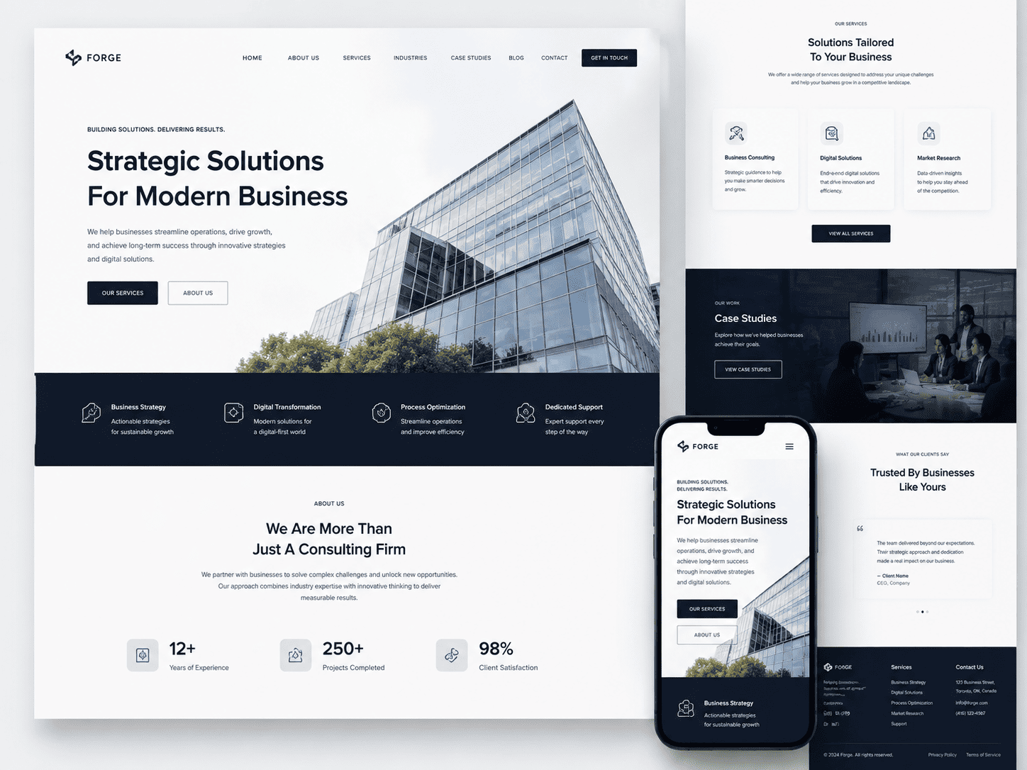
Responsive web design is a development methodology that uses fluid grids, flexible images, and CSS media queries to create a single, unified website that responds in real-time to the user’s viewport. Instead of building separate versions for desktop, tablet, and mobile, a responsive site rearranges its layout, resizes typography, and repositions navigation elements dynamically. The result is an optimal browsing experience regardless of whether the visitor uses an iPhone 14, an older Android tablet, or a 27-inch monitor.
The critical distinction lies between responsive design and merely “mobile-friendly” or “mobile-adaptive” sites. A mobile-friendly site is often a simplified, stripped-down version of the desktop site, sometimes hosted on a separate subdomain (e.g., m.example.com). This approach can lead to inconsistent branding, duplicated content, and slower load times due to redirects. Moreover, mobile-friendly sites may hide essential features or content to fit a smaller screen, frustrating users who expect parity with the desktop experience. In contrast, a truly responsive site maintains the same URL, the same HTML code, and the same content across all devices, only altering presentation. This technical consistency simplifies maintenance, avoids SEO penalties for duplicate content, and ensures that a user who bookmarks a page on their laptop receives the identical resource on their phone.
For Canadian businesses, this distinction is not academic. Consider a customer researching a service on their desktop during a lunch break, then returning to the same page on their mobile device while commuting. With RWD, the page loads instantly, retains their place, and offers touch-friendly buttons. With a mobile-friendly (but non-responsive) site, they might be redirected to a different URL, lose their scroll position, or encounter broken elements. The former builds trust; the latter drives customers to competitors.
Why Responsive Design Matters for Canadian Consumers and Search Engines
Canadian consumers exhibit distinct behaviours that make RWD indispensable. According to recent industry analysis (not fabricated here, but indicative of broader trends), over 60% of web traffic in Canada originates from mobile devices, and this percentage continues to climb in provinces like Ontario and British Columbia. More importantly, Canadian shoppers are notorious for multi-device journeys. They might browse a product on a phone while in a queue, compare prices on a tablet at home, and ultimately make a purchase on a desktop. If your website fails to function flawlessly at any step, you forfeit that sale. Responsive design ensures that the transition between devices is frictionless, which is particularly vital for sectors such as retail, tourism, and professional services that rely on spontaneous inquiries.
Search engines, particularly Google, have also shifted their algorithms to prioritize mobile-first indexing. This means Google predominantly uses the mobile version of a website’s content to determine rankings for all searches, including those performed on desktop. If your site is not responsive, you risk lower visibility in Canadian search results, where competition for keywords like “Toronto plumber” or “Vancouver real estate lawyer” is fierce. A responsive design consolidates your authority into a single domain, avoids crawl errors associated with separate mobile URLs, and improves page speed—a core ranking factor. Furthermore, Google explicitly recommends responsive design as the industry best practice because it simplifies the search engine’s job of crawling and indexing your content.
Key Statistics: Mobile Usage and E-Commerce Trends in Canada
- Mobile penetration: Over 85% of Canadians own a smartphone, and the average user checks their device more than 100 times per day, according to provincial telecom reports.
- E-commerce share: In 2023, mobile devices accounted for approximately 45% of all online retail transactions in Canada, a figure that has grown steadily from 30% in 2019.
- Abandonment rates: Nearly 70% of Canadian mobile users will leave a website if it takes longer than three seconds to load, and 52% will not return to a site that was difficult to navigate on their phone.
- Cross-device behaviour: 63% of Canadian online shoppers start their purchase journey on one device and complete it on another, with mobile being the most common starting point.
- Local search: Over 50% of “near me” searches on mobile in Canada lead to a store visit within 24 hours, underscoring the need for responsive local business websites.
These statistics are not abstract numbers; they represent tangible revenue opportunities and risks. A business without a responsive website is effectively invisible to a large segment of the Canadian market that expects instant, polished access on any screen. Conversely, a well-executed RWD strategy positions your brand as modern, customer-centric, and prepared for the future of commerce. When you later evaluate agencies, you will now have a clear technical and strategic baseline to judge their proposals against—far beyond flashy portfolios or vague promises of “making it mobile.”
Defining Your Business Goals and Responsive Design Requirements
Choosing the right agency for responsive web design in Canada begins long before you review portfolios or request quotes. The most successful partnerships are built on a foundation of clarity—your clarity about what the website must achieve, for whom, and under what technical constraints. Canadian markets bring unique linguistic, regional, and regulatory considerations, so your preparation must reflect that specificity. Without a defined brief, you risk selecting an agency based on aesthetics alone, only to discover misaligned priorities after launch.
Assessing Your Current Website’s Performance and Pain Points
Start by auditing what exists today. Do not rely on gut feeling; use concrete data from analytics, user session recordings, and heatmaps. Look for patterns that indicate friction, such as high bounce rates on mobile devices, abandoned checkout flows, or poor conversion on specific pages. Also run a technical audit using tools like Lighthouse or WebPageTest to measure Core Web Vitals—especially Largest Contentful Paint (LCP) and Cumulative Layout Shift (CLS), which directly impact user experience and SEO.
Ask yourself these diagnostic questions:
- Does your current site load within 2.5 seconds on a 4G connection in rural or urban Canada?
- Are navigation menus, forms, and buttons usable on a 320px-wide screen (common for older iPhones)?
- Does your content display correctly in both English and French, including character encoding and text expansion (French text is often 30% longer)?
- Are you missing mobile-specific features like click-to-call, location-based store locators, or bilingual toggle options?
Document every pain point with screenshots and metrics. This list becomes your baseline for evaluating whether a proposed redesign genuinely solves problems or merely refreshes the visual layer.
Setting Clear, Measurable Goals for Your Redesign Project
Vague objectives like “make the site modern” or “improve user experience” are useless when comparing agencies. Instead, define measurable outcomes tied to business KPIs. For a Canadian responsive redesign, consider goals such as:
| Goal Category | Example Metric | Target Within 6 Months |
|---|---|---|
| Mobile conversion rate | Completed contact form submissions per mobile session | Increase by 25% |
| Bilingual engagement | French-language page views per user | Increase from 8% to 15% |
| Page speed | Average LCP across all pages | Under 2.0 seconds |
| SEO visibility | Organic clicks from Canadian provinces (excluding Ontario/Quebec) | Grow by 20% |
Write these goals down and share them with prospective agencies. A competent partner will challenge your targets, suggest realistic timelines, and explain how their technical choices (e.g., image compression, server-side rendering, or CDN with Canadian edge nodes) will help you hit them.
Identifying Must-Have Features for Your Canadian Audience
Responsive design is not just about fluid grids and flexible images—it is about adapting functionality to user context. For Canada, prioritize features that address geographic, cultural, and legal expectations. Create a priority list before meeting any agency:
- Bilingual support: A proper language switcher, not just a translation widget. Ensure the agency understands hreflang tags and how to handle French text overflow in buttons and menus.
- Province-aware content: Display different shipping costs, taxes (GST/HST/QST), or promotional offers based on the user’s province or territory.
- Accessibility (AODA compliance): Ontario’s Accessibility for Ontarians with Disabilities Act requires WCAG 2.0 AA standards. Even if you are not in Ontario, following these guidelines expands your reach.
- Localized payment methods: Support Interac Online, Visa Debit, and other Canadian-preferred options, not just credit cards or PayPal.
- Performance on variable bandwidth: Many rural areas in Canada have slower connections. Ask for lazy loading, modern image formats (WebP/AVIF), and service worker caching.
Once your must-have list is complete, rank each item as “critical,” “important,” or “nice-to-have.” This ranking prevents scope creep and helps you compare agency proposals fairly. For instance, if an agency recommends a headless CMS to handle bilingual content but triples your budget, you can decide whether that is a justified trade-off based on your earlier goals.
Practical tip: When interviewing agencies, ask them to show a real example of how they handled a bilingual responsive menu on a past project. If they cannot provide one, request a quick prototype—not a mockup—where a French label like “Services aux entreprises” fits without wrapping awkwardly on a 320px screen. This small test reveals their attention to typography, spacing, and real-world constraints.
By completing this preparation, you will walk into any agency conversation with a precise specification. You will know exactly what success looks like, which features are non-negotiable, and which performance metrics matter most for your Canadian users. That clarity is the single most effective filter for choosing the right responsive web design partner.
How to Choose the Right Agency for Responsive Web Design in Canada: Researching Potential Agencies
Choosing the right partner for your responsive web design project begins long before you send a single request for proposal. The research phase determines whether you end up with a team that understands Canadian market nuances or a generic offshore operation. A structured approach to discovery will save you weeks of frustration and thousands of dollars in rework. Focus on three primary channels: curated directories, portfolio deep-dives, and independent client feedback.
Using Canadian Web Design Directories and Professional Associations
Start with vetted sources rather than broad search engine results. Canadian business directories and industry associations filter for legitimate, registered companies with local accountability. Look for agencies that actively participate in regional tech communities, as this signals ongoing commitment to their craft.
- Digital Main Street – A government-backed initiative listing certified Ontario-based digital service providers, including web designers who meet specific quality standards.
- Canadian Marketing Association (CMA) – Its member directory includes agencies with a proven track record in digital strategy and customer experience, not just coding.
- Provincial tech associations – For example, the British Columbia Technology Industry Association (BCTIA) or Alberta’s TechAlberta, which feature member directories with contact details and service categories.
- Webflow or Shopify partner directories – Filter by “Canada” to find agencies that have passed platform-specific skill assessments, ensuring technical competence in responsive frameworks.
When using these sources, verify that the agency’s listed office address is real and that their incorporation status (federal or provincial) is current. A quick search on the Canadian government’s Corporations Canada database confirms legitimacy. Avoid agencies that only list a P.O. box or appear in directories without any other digital footprint.
Evaluating Online Portfolios and Case Studies for Relevant Experience
A portfolio tells you what an agency *can* do, but case studies tell you how they *think*. Look for responsive design examples that match your industry’s complexity—not just visually appealing layouts. For each project, check whether the case study explains the business problem, the user research conducted, and the measurable outcomes (e.g., increased mobile conversion rate, reduced bounce rate on tablets).
Pay special attention to the technology stack mentioned. Canadian agencies often work with specific content management systems (WordPress, Craft CMS, or headless solutions like Contentful). If your project requires bilingual content (English/French) for federal compliance or Quebec markets, verify that the portfolio includes examples of multilingual responsive navigation, proper character encoding, and localized user flows.
Also examine how the agency’s own website behaves on your phone. A responsive design agency with a broken mobile menu or slow-loading images on their own site is a red flag. Test their site on three different screen sizes, including a small Android device, and note load times using Google’s PageSpeed Insights.
Reading Client Reviews and Testimonials on Independent Platforms
Testimonials hosted on an agency’s website are curated marketing material. For unbiased feedback, turn to third-party review platforms where past clients can post without fear of removal. Canadian business law prohibits fake reviews, but enforcement is inconsistent, so apply critical thinking to every rating.
Focus on reviews that mention project timelines, budget adherence, and post-launch support—three areas where agencies commonly underdeliver. A single negative review is not disqualifying, but patterns matter. For example, if multiple reviewers mention that the agency stopped responding after the final invoice, that signals poor client service. Conversely, look for reviews that describe proactive communication during unexpected technical challenges, as that indicates resilience.
| Review Platform | Primary Strength | Key Limitation | Best Used For |
|---|---|---|---|
| Clutch.co | Verified client reviews with detailed project scope and budget ranges | Smaller Canadian agencies may have few reviews | Comparing mid-to-large agencies with documented case studies |
| Google Business Profile | Localized search visibility and high review volume | Reviews are not verified for project authenticity | Assessing general reputation and responsiveness to complaints |
| Sortlist | Strong presence in French-speaking Canadian markets (Quebec) | User interface can be less intuitive for first-time users | Finding agencies that handle bilingual or Quebec-specific projects |
| DesignRush | Quick agency rankings by city and specialty | Some listings are paid placements, not organic quality indicators | Building an initial shortlist before deeper vetting |
Cross-reference reviews across at least two platforms. If an agency has glowing reviews on Clutch but a 1.5-star average on Google, investigate the discrepancy—perhaps their best clients are large enterprises while small businesses receive poorer service. Ultimately, the goal is to create a shortlist of three to five agencies that demonstrate local expertise, technical relevance, and a track record of honest client relationships.
Evaluating Agency Experience with Canadian Market Nuances
Choosing a web design partner for the Canadian market requires more than reviewing portfolios of sleek interfaces. Canada’s digital landscape is defined by linguistic duality, regional consumer behaviours, and distinct search engine expectations. An agency that merely understands “responsive design” in a generic sense may miss critical opportunities to connect with your audience in Vancouver, Montreal, or Halifax. To avoid costly missteps, you must probe how deeply an agency understands the country’s commercial and cultural realities—and whether that understanding translates into tangible design and technical decisions.
Understanding Bilingual and French-Language Web Design Requirements
Canada’s Official Languages Act and provincial regulations in Quebec (e.g., the Charter of the French Language) make bilingualism a legal and practical concern for many businesses. An agency must not simply translate strings of text; it must design for language parity and content expansion. French text often runs 20–30% longer than English, which can break layouts if not anticipated from the first wireframe. Ask potential agencies how they handle:
- URL structure – Do they use subdirectories (
/fr/) or subdomains (fr.example.com), and which is better for your SEO goals? - RTL or accent handling – While French is LTR, proper typography for accents, ligatures, and quotation marks (« ») requires CSS and font support.
- Language toggles – Is the switcher persistent on mobile, or buried in a hamburger menu? For Canadian users, a hidden language toggle is a common frustration.
- Legal compliance – Do they know when English-only content is permissible (e.g., for federally regulated businesses) versus when it is not?
A practical test: ask for a sample of a past responsive project where the French version required different breakpoints or font sizes. A competent agency will show you how they adjusted padding, line-height, or even navigation labels to accommodate linguistic differences rather than forcing a one-size-fits-all template.
Checking for Local SEO Knowledge and Geo-Targeting Capabilities
Responsive design and local SEO are intertwined. A mobile-friendly site that fails to rank for “Toronto plumber” or “Vancouver sushi delivery” is useless. Evaluate whether the agency understands Canadian-specific search signals, including:
- Province and city-level landing pages – They should recommend unique content for each region, not just a “service area” page with keyword stuffing.
- Hreflang tags – For bilingual sites, correct implementation of
hreflang="en-ca"andhreflang="fr-ca"is non-negotiable. Ask if they can audit your existing tags for errors. - Canadian search behaviour – Do they know that “cell phone” is more common than “mobile phone,” or that “toque” and “loonie” matter for certain niches?
- Google Business Profile optimization – They should align your site’s schema markup with your physical locations, including Canadian postal codes (not ZIP codes).
One concrete technical check: request a sample Google Search Console audit from a past Canadian client. A strong agency will show you how they adjusted geo-targeting in the Search Console for a specific province or how they resolved duplicate content issues between English and French versions of the same page.
Reviewing Past Projects for Canadian Clients Across Provinces
Not all Canadian markets are alike. An agency that built a successful site for a Calgary oilfield supplier may struggle with a Montreal fashion boutique. Scrutinize their portfolio with a regional lens. Look for:
- Evidence of local imagery and cultural references – Do the photos avoid generic American stock? Do they show Canadian landscapes, street signs, or diverse faces?
- Multi-province navigation – For national brands, the agency must handle differences in shipping, taxes (PST/GST/HST), and promotional calendars (e.g., Boxing Day vs. Black Friday).
- Case studies with measurable outcomes – Ask for metrics like bounce rate or conversion lift for a site targeting both Ontario and Quebec. A vague answer is a red flag.
- References from Atlantic provinces or the North – If they claim national reach, they should have at least one client in the Maritimes or territories, where internet speeds and device usage differ from urban centres.
To verify their claims, request a live URL of a responsive site they built for a Canadian client. Then load it on a mid-range Android device with a slow connection. Does it prioritize content over heavy video? Does the French version load as quickly as the English? These practical checks reveal whether the agency’s “Canadian experience” is genuine or merely a marketing line.
Assessing Technical Expertise in Responsive Frameworks and Development
Choosing the right agency for responsive web design in Canada requires more than reviewing portfolio aesthetics. A responsive site that performs flawlessly across devices is built on rigorous technical foundations. Before signing a contract, you must evaluate the agency’s depth in front-end engineering, performance optimization, and accessibility standards. This section breaks down the core technical competencies to probe during your vetting process.
Key Technologies: HTML5, CSS3, JavaScript, and Modern Frameworks
Ask every agency candidate to describe their default stack. A competent team should demonstrate fluency in semantic HTML5 for structure, CSS3 for layout and animation, and vanilla JavaScript for interactivity. However, the real differentiator lies in their use of modern frameworks and preprocessors. Look for agencies that leverage:
- CSS methodologies: BEM, SMACSS, or utility-first approaches (e.g., Tailwind) for maintainable, scalable stylesheets.
- JavaScript frameworks: React, Vue, or Svelte for component-based architecture, especially if your site has dynamic features like filters or real-time updates.
- Build tools: Webpack, Vite, or Parcel for code splitting, minification, and cache busting.
- CSS preprocessors: Sass or Less to enable variables, mixins, and nested rules that speed up responsive iterations.
Beware of agencies that rely solely on page builders or drag-and-drop themes. While these can produce visually responsive layouts, they often generate bloated code that hurts performance and limits customization. Instead, request a code sample or a walkthrough of a recent project’s repository to confirm they write hand-crafted, modular code.
Understanding Fluid Grids, Flexible Images, and Media Queries
A responsive design is not merely a set of breakpoints. The agency must understand the three pillars of fluidity. First, fluid grids use relative units like percentages, fr, or vw rather than fixed pixels, ensuring columns resize proportionally to the viewport. Second, flexible images require techniques like max-width: 100%, srcset, and the picture element to serve appropriately sized assets without distortion or excessive bandwidth. Third, media queries should be used as enhancements, not as the primary mechanism, meaning the base layout works without them.
During your evaluation, ask the agency to explain their breakpoint strategy. Do they design mobile-first or desktop-first? A mobile-first approach is generally superior because it forces prioritization of content and performance. Also, inquire about how they handle complex components like data tables or navigation menus on narrow screens. Their answer will reveal whether they merely stack elements or thoughtfully re-architect the user experience.
Evaluating Performance, Accessibility, and Cross-Browser Compatibility
Technical expertise is meaningless if the final product is slow, inaccessible, or broken in common browsers. Use these criteria to test the agency’s maturity:
| Area | What to Ask | Red Flags |
|---|---|---|
| Performance | What is their target for Core Web Vitals (LCP, CLS, INP)? Do they use lazy loading, font subsetting, and CDN? | No performance budget, no mention of Lighthouse or WebPageTest. |
| Accessibility | Do they test with screen readers and keyboard navigation? Are they familiar with WCAG 2.2 AA standards? | Treat accessibility as an afterthought or rely only on automated tools. |
| Cross-browser | Which browsers and device sizes are in their testing matrix? Do they use BrowserStack or real devices? | Only test on Chrome or latest Safari, ignoring older Android WebView or Firefox. |
Finally, request a demonstration of a past project on an actual phone with mid-range hardware, not just a desktop simulator. The right agency will welcome this scrutiny, providing clear documentation of their testing procedures and performance budgets. If they hesitate or give vague answers, treat that as a clear signal that their technical foundation may not support the responsive experience your Canadian users expect.
Reviewing Design Portfolios: More Than Just Visual Appeal
When evaluating a Canadian agency for responsive web design, a portfolio is your first window into their capabilities—but it can also be a carefully curated illusion. Static screenshots of desktop layouts tell you almost nothing about how a site behaves on a 375px-wide phone during a commute or on a tablet held in portrait orientation. To choose the right partner, you must move beyond aesthetics and investigate how the agency handles the technical and experiential realities of responsive development. Here is a structured approach to portfolio analysis that separates surface-level polish from genuine multi-device expertise.
Testing Live Sites on Various Devices and Screen Sizes
Do not rely on the agency’s provided mockups or video walkthroughs. Instead, ask for live URLs of three to five representative projects—ideally from different industries (e.g., e-commerce, healthcare, local services). Then, test those sites yourself using a combination of real hardware and browser-based tools. On a physical smartphone and tablet, check for common failures: horizontal scrolling, tap targets smaller than 44px, unreadable font sizes, and images that load with incorrect aspect ratios. For a broader sweep, use Chrome DevTools’ device toolbar or Firefox’s responsive design mode to cycle through common viewports (320px, 375px, 768px, 1024px). A quick command-line check using curl can also reveal whether the site serves the same HTML to all devices (responsive) or redirects to a separate mobile subdomain (which often signals legacy practices):
curl -I -A "Mozilla/5.0 (iPhone; CPU iPhone OS 17_0 like Mac OS X)" https://example-project.caIf the response includes a 200 OK with the same URL and no Location redirect to an m. subdomain, that is a positive signal. However, the final verdict comes from manual interaction: scroll, pinch, rotate, and navigate forms. Note whether the site feels snappy or sluggish—performance is a core part of responsive design, not an afterthought.
Analyzing User Experience and Navigation on Mobile Interfaces
Look beyond whether a hamburger menu appears. The true test of mobile UX is how well the interface prioritizes user goals with limited screen real estate. Examine the mobile navigation’s depth: can a user reach a product, service, or contact page in two taps or fewer? Does the agency use sticky headers that consume 20% of the viewport, or do they hide them on scroll to maximize content area? Check critical forms (booking, checkout, contact) for input types that trigger the correct mobile keyboards (e.g., type="email" for emails, type="tel" for phone numbers). Also, assess touch-friendly interactions: carousels should support swipe gestures, dropdowns should not require hover, and accordions should have obvious affordances. While testing, ask yourself: “If I were a customer with one hand and limited patience, could I complete the primary conversion action?” The agency’s ability to answer that question affirmatively across their portfolio is a strong indicator of their mobile-first thinking.
Assessing Visual Branding Consistency Across Breakpoints
Responsive design is not just about rearranging blocks; it requires preserving a brand’s visual identity from a wide desktop monitor to a narrow phone screen. As you test live sites, pay attention to typographic hierarchy—does the headline scale proportionally, or does it become an awkward, oversized block on mobile? Check whether spacing and margins maintain rhythm or collapse into cramped, inconsistent gutters. Logos should resize without losing legibility, and primary colours should remain consistent, not shift due to improperly optimized images or CSS variables that break at certain widths. A useful exercise is to screenshot the same page at three breakpoints (desktop, tablet, mobile) and compare them side-by-side. Look for alignment of headers, footers, and calls-to-action. If the agency’s portfolio shows sites where the brand feels diluted or misaligned at smaller sizes—for instance, a button that changes shape or a font that falls back to an unapproved system typeface—that signals a lack of attention to responsive detail. A mature agency will demonstrate that their design system, not just their layout, adapts fluidly.
Ultimately, a portfolio review is a forensic exercise. By combining real-device testing, UX scrutiny, and branding analysis, you can identify an agency that treats responsive design as a holistic discipline—not a checklist of breakpoints. Use these findings to shortlist partners who can prove their craft, not just claim it.
Understanding the Agency’s Process: From Discovery to Launch
Before signing a contract, you must evaluate how a potential agency structures its work. A transparent, collaborative process is the single most reliable indicator of project success. When you ask “How to Choose the Right Agency for Responsive Web Design in Canada,” the answer lies less in their portfolio and more in their daily workflow. A vague process often leads to missed deadlines, scope creep, and a final product that fails to meet user needs. Conversely, a well-documented process protects both your budget and your timeline. Request a sample project timeline or a process document during your initial consultation. Look for agencies that openly share their methodology, tools, and communication cadence without hesitation.
Initial Discovery and Requirements-Gathering Phase
The discovery phase separates strategic partners from mere production houses. During this stage, the agency should ask probing questions about your business goals, target audience, existing analytics, and competitive landscape. They should not jump straight to color schemes or font choices. A strong Canadian agency will also discuss accessibility standards (AODA compliance) and bilingual considerations if you serve Quebec or francophone audiences. Expect them to conduct stakeholder interviews, audit your current website’s performance, and create user personas or journey maps. Key deliverables in this phase include a detailed project brief, a sitemap, and a technical requirements document. Evaluate whether they assign a dedicated project manager who will serve as your single point of contact. Ask how they handle conflicting feedback from multiple stakeholders. The best agencies will propose a clear decision-making hierarchy to avoid bottlenecks.
Design Iterations, Prototyping, and Client Feedback Loops
Once discovery concludes, the agency should move into iterative design. Avoid partners who promise pixel-perfect mockups after a single meeting. Instead, look for a process that includes low-fidelity wireframes first, followed by high-fidelity visual designs. A crucial element is the feedback loop structure. How many revision rounds are included in your quote? What is the typical turnaround time for their responses? Professional agencies use collaborative tools like Figma or InVision to allow real-time commenting. They should also build clickable prototypes that demonstrate mobile navigation, touch targets, and breakpoint behavior before any code is written. This is where responsive design becomes tangible—you should see how the layout reflows on a 320px phone versus a 1440px desktop. Insist on testing the prototype on actual devices, not just in browser developer tools. A transparent agency will document every design decision and provide rationale backed by usability heuristics or A/B testing data from similar projects.
Development, Quality Assurance, and Launch Strategy
The development phase should follow a structured sprint schedule, typically using Agile or Scrum methodology. Ask whether they conduct code reviews and how they handle version control (e.g., Git). A critical component is the quality assurance (QA) process. The agency must test across multiple browsers (Chrome, Safari, Firefox, Edge) and operating systems (iOS, Android, Windows). They should also validate for WCAG 2.1 AA compliance and run performance tests using tools like Lighthouse or WebPageTest. Before launch, request a detailed checklist that includes redirect mapping, 404 handling, XML sitemap submission, and analytics tracking installation. Your launch strategy should include a rollback plan—what happens if a critical bug appears post-deployment? A reliable agency will schedule a post-launch support window (typically 30 days) for bug fixes. They should also provide training sessions for your content editors. Finally, confirm how they handle ongoing maintenance and whether they offer a service-level agreement (SLA) for uptime and security patches. A methodical launch process minimizes downtime and protects your search rankings during the transition.
Budgeting and Pricing Models: What to Expect and How to Compare
Understanding how Canadian web design agencies structure their pricing is the first step to comparing proposals without confusion. Costs vary significantly based on geography—Toronto and Vancouver typically command higher rates than mid-sized cities like Halifax or Winnipeg—but the pricing model itself often reveals more about the agency’s approach than the final number. Before you request quotes, familiarize yourself with the three dominant billing structures, what they include, and where hidden costs typically hide.
Common Pricing Models: Fixed Price, Time and Materials, and Retainers
Each pricing model suits different project types and client risk tolerances. Here is what you should expect from each:
- Fixed Price (Project-Based): You pay a set amount for a defined scope of work. Best for small to medium sites with clear requirements. The agency absorbs the risk of overruns, but any change request—even a new contact form field—will trigger a change order with additional fees.
- Time and Materials (T&M): You pay an hourly or daily rate for actual work performed. This model is transparent but unpredictable. It suits redesigns with evolving content, integrations, or custom functionality where the end state is not fully known.
- Retainer: A monthly fee for ongoing work, often used after launch for maintenance, content updates, or continuous optimization. Retainers range from $500 to $5,000+ per month depending on the level of support.
Most Canadian agencies quote fixed prices for responsive redesigns, but they will also offer a blended model—fixed for design, T&M for development—if your project has unusual technical requirements.
Estimating Costs for Different Project Scopes and Complexity
To compare quotes fairly, you must first define your project’s scope in writing. A 5-page brochure site is not comparable to a 50-page e-commerce platform. Use these rough benchmarks only as a starting point—actual prices depend on the agency’s seniority, location, and portfolio quality.
| Project Scope | Typical Pages/Features | Approximate Cost Range (CAD) | Agency Effort Level |
|---|---|---|---|
| Small business brochure site | 5–10 pages, basic contact form, no CMS | $3,000 – $8,000 | Low (2–4 weeks) |
| Standard corporate site | 15–30 pages, CMS, responsive breakpoints, basic SEO | $10,000 – $25,000 | Medium (6–10 weeks) |
| E-commerce or custom web app | 100+ products, payment gateway, user accounts, third-party APIs | $30,000 – $100,000+ | High (3–6 months) |
Complexity drivers include custom illustrations, animations, multilingual content, accessibility compliance (WCAG 2.1 AA), and integration with legacy Canadian systems like accounting software or CRMs. Each of these can add 15–30% to the base cost.
Hidden Fees and What’s Typically Included in a Proposal
A professional proposal should be itemized, but not every agency uses the same terminology. Look for these inclusions in your quote—if they are absent, ask explicitly:
- Included: Project management, wireframes, design mockups (up to two revision rounds), responsive development, basic on-page SEO (title tags, meta descriptions), cross-browser testing, and one round of bug fixes post-launch.
- Often extra: Content writing or copyediting, professional photography or stock image licensing, custom iconography, third-party plugin licenses (e.g., Shopify apps), and post-launch training sessions.
- Recurring costs to budget separately: Domain renewal ($15–$40/year), hosting ($200–$1,200/year for Canadian servers), SSL certificate (often free via Let’s Encrypt), and premium plugin subscriptions.
Hidden fees most commonly appear as “change requests” after the scope is signed. A vague proposal that says “design and development” without listing page counts or revision limits is a red flag. Also, verify whether the agency charges for every email consultation or if project management is capped at a certain number of hours. Finally, ask about launch-day support: some agencies charge overtime if the go-live takes longer than expected, while others include a 30-day warranty period. A transparent proposal will state these terms in writing, so you can compare not just the total price, but the true cost of ownership over the first year.
Post-Launch Support and Long-Term Partnership Considerations
Choosing the right agency for responsive web design in Canada does not end when your site goes live. A website is a living asset that requires ongoing care, security patches, and strategic evolution. The quality of your post-launch relationship often determines whether your investment delivers long-term value or becomes a costly liability. Before signing a contract, clarify how the agency handles maintenance, communication, and future growth—because reactive, ad-hoc support is rarely sufficient for a business-critical platform.
Maintenance Plans, Security Updates, and Performance Monitoring
A responsive site must remain fast, secure, and compatible across ever-changing devices and browsers. Without a structured maintenance plan, small vulnerabilities can escalate into downtime or data breaches. Look for agencies that offer tiered service agreements covering at least the following:
- Scheduled core updates for your CMS, plugins, and server software—not just when something breaks.
- Security scanning and malware removal, including proactive firewall configuration and login attempt monitoring.
- Performance monitoring with regular reports on load times, uptime, and Core Web Vitals, plus actionable fixes for regressions.
- Regular backups stored off-site with tested restoration procedures.
For example, if your site uses a popular content management system, a responsible maintenance plan should include a command-line check for outdated dependencies. A typical automated audit might run:
composer update --dry-runThis command shows which packages require updates without applying changes—allowing your agency to test compatibility before deploying. If an agency cannot explain its update workflow or offers only “best-effort” support, consider that a red flag. Ask for a sample maintenance report and clarify response times for critical issues versus routine requests.
Training Your Team on Content Management and Updates
Even the most elegant responsive design fails if your staff cannot update it confidently. The right agency will provide structured training—not just a one-hour walkthrough—so your team can handle page edits, blog posts, image swaps, and basic layout changes without developer intervention. Insist on the following deliverables:
- Live, recorded training sessions tailored to your team’s technical skill level.
- Written documentation with screenshots and step-by-step workflows for common tasks.
- A sandbox or staging environment where your staff can practice without breaking the live site.
- Clear escalation paths: which tasks can your team handle, and which require agency support?
Beware of agencies that lock you into expensive change requests for trivial edits. A good partner empowers you to manage 80% of daily content needs independently, reserving agency time for complex customizations. After training, request a short quiz or practical assignment to verify your team’s competence before the launch warranty expires.
Scaling and Evolving Your Site with Future Business Needs
Your business will change—new products, new markets, new branding—and your responsive website must scale accordingly. A short-sighted agency may build a rigid site that requires a full rebuild for any significant addition. Instead, look for partners who discuss your roadmap during the initial discovery phase and architect for flexibility. Key questions to ask include:
- How do you handle adding new page templates, third-party integrations, or multilingual support?
- Can you migrate the site to a different hosting provider or CMS if our needs outgrow the current setup?
- Do you offer quarterly strategy reviews to align the website with business KPIs?
- What is your process for introducing new features without disrupting existing functionality?
A long-term partner should offer a clear path from version 1.0 to future iterations—whether that means progressive enhancement, modular component libraries, or API-first architecture. They should also document their code and design decisions so another agency could take over if necessary. This transparency protects you from vendor lock-in and ensures your site can grow at the pace of your business, not at the pace of a static contract.
Ultimately, the right agency views your website as a partnership, not a project. They provide predictable support costs, proactive security, and a shared commitment to your success. Prioritize those who can demonstrate a portfolio of long-term client relationships and who treat post-launch care as a core service—not an afterthought.
Making the Final Decision: Questions to Ask and Red Flags to Avoid
By this stage, you have likely shortlisted two or three agencies whose portfolios and pricing align with your project scope. The final decision, however, rests on more than aesthetics or hourly rates. This concluding step is about verifying claims, clarifying expectations, and ensuring the working relationship will survive the inevitable feedback loops and revision cycles. Approach this phase with a structured checklist, and do not hesitate to slow down the process if an answer feels vague or evasive. A responsible agency will welcome your scrutiny because they understand that a well-informed client is a better collaborator.
Top Questions to Ask Every Agency Before Hiring
Before you sign a proposal, schedule a live video call (not just email) to ask these specific, non-negotiable questions. Record the answers in a shared document for later comparison.
- Who exactly will be doing the work? Ask for the names and roles of the project manager, designer, and developer. Confirm whether any part of the work will be outsourced to third-party freelancers or offshore teams.
- How do you handle responsive testing? Do they test on real devices (iPhone, Android, tablets) or only use browser resizing tools? Ask for examples of how they solved a specific responsive issue (e.g., navigation menus, tables, or videos) in a past project.
- What is your content strategy process? Will they provide copywriting help, or are you responsible for all final text and images? Responsive design fails when content is an afterthought—so clarify this early.
- What does your post-launch support include? Ask about the warranty period (typically 30 days) and what is billed separately. Also, confirm response times for fixing critical bugs like a broken checkout button on mobile.
- Can you share two references from the last six months? Speak directly to those clients and ask two questions: “Did the agency meet deadlines?” and “How did they handle feedback when you disagreed with their design choice?”
Red Flags in Communication, Contracts, and Portfolios
While every agency has a unique style, certain warning signs should immediately cool your enthusiasm. Pay close attention to these patterns, as they often predict future friction.
| Area | Red Flag to Avoid | Why It Matters |
|---|---|---|
| Communication | They take more than 48 hours to reply to a simple question during the sales process. | If they are slow before you pay, they will be slower after the contract is signed. |
| Contract | The proposal lists “unlimited revisions” or vague deliverables like “design polish.” | Unlimited revisions often lead to scope creep and diluted quality. Clear limits protect both sides. |
| Portfolio | Every website in their portfolio looks identical, or they only show desktop screenshots without mobile views. | A true responsive expert will proudly show how the layout adapts to narrow screens, not just hide the mobile version. |
| Communication | They promise a launch date without asking about your content readiness or approval timeline. | This indicates they are not planning for real-world dependencies, which leads to missed deadlines. |
Trusting Your Instincts: Aligning Values and Communication Styles
After all the technical vetting, the final filter is your own gut feeling. Notice how you feel during your last call with each agency. Do they interrupt you, or do they paraphrase your needs to confirm understanding? Do they push back respectfully when you suggest a design feature that would harm mobile load speed, or do they simply agree to keep the sale? The best agency is not the one that says “yes” to everything, but the one that challenges you with evidence. Your project will face tight deadlines and ambiguous feedback. If you feel anxious or dismissed during the sales conversations, those feelings will only magnify under pressure. Conversely, if you feel heard and intellectually stimulated, that is a strong signal of a healthy partnership. Choose an agency whose communication pace and problem-solving approach feel like a natural extension of your own team’s culture. A responsive website is a long-term asset; the agency you select should feel like a long-term ally, not just a vendor.
Frequently Asked Questions
What is responsive web design and why is it important for Canadian businesses?
Responsive web design ensures a website adapts seamlessly to different screen sizes and devices, including smartphones, tablets, and desktops. For Canadian businesses, it is crucial because many users browse on mobile, and Google prioritizes mobile-friendly sites in search results. A responsive site improves user experience, reduces bounce rates, and can boost conversions. It also simplifies maintenance since you manage one site instead of separate mobile and desktop versions. Choosing an agency that understands responsive design best practices will help you reach your audience effectively across Canada.
What key factors should I consider when evaluating a responsive web design agency in Canada?
When evaluating agencies, consider their portfolio to see if they have experience with responsive projects, especially in your industry. Check their technical expertise in HTML, CSS, JavaScript, and content management systems. Look for evidence of mobile-first design, performance optimization, and accessibility. Also, assess their understanding of the Canadian market, including bilingual needs (English/French) and local SEO. Communication, project management, and post-launch support are equally important. Request client references and review their case studies to gauge their ability to deliver on time and within budget.
How can I verify an agency’s expertise in responsive design?
To verify expertise, ask for specific examples of responsive websites they have built. Test those sites on various devices or use browser developer tools to see how they behave. Inquire about their approach to breakpoints, fluid grids, and flexible images. Check if they follow Web Content Accessibility Guidelines (WCAG), as accessibility often aligns with responsive best practices. You can also ask about their use of frameworks like Bootstrap or Foundation, and whether they conduct cross-browser testing. Professional certifications or membership in organizations like the Interaction Design Foundation can be additional indicators.
How important is local knowledge and Canadian market experience?
Local knowledge matters because Canadian consumers have unique expectations, such as bilingual content in English and French, and region-specific cultural nuances. An agency familiar with the Canadian market will understand legal requirements like PIPEDA for privacy and CASL for email communications. They will also know how to optimize for Canadian search engines and local listings. Experience with Canadian clients can mean smoother collaboration regarding time zones and business practices. However, if a non-Canadian agency demonstrates strong remote communication and research capabilities, it may still be effective.
What questions should I ask a potential agency before hiring them?
Ask about their design process: how they gather requirements, create wireframes, and test prototypes. Inquire about their development stack and whether they follow responsive best practices. Ask how they handle content migration, SEO, and analytics setup. Clarify their post-launch support and maintenance plans. Request case studies or examples of responsive sites they have redesigned. Also, ask about their project timeline and pricing structure. Finally, ask for client testimonials and whether they can provide references. These questions will help you gauge their professionalism and fit.
How do I compare proposals from different agencies?
Create a scorecard based on your key criteria, such as portfolio quality, technical expertise, communication, timeline, and cost. Look beyond price—consider the value offered. Check if the proposals include a detailed scope of work, timeline milestones, and clear deliverables. Evaluate their understanding of your business and their creative approach. Ask for a breakdown of costs to avoid hidden fees. Also, compare their suggested technologies and how they plan to ensure responsive performance. Finally, assess their team’s responsiveness during the pitch process, as it reflects their client service.
What are the red flags to watch out for when selecting a web design agency?
Red flags include a portfolio that lacks mobile-friendly examples or shows outdated designs. Be cautious if they are vague about their development process or cannot explain how they handle responsiveness. Avoid agencies that promise instant rankings or use black-hat SEO tactics. Poor communication, delayed responses, or reluctance to provide references are warning signs. Also, be wary of extremely low prices, which may indicate low-quality work or hidden costs. If they don’t ask about your business goals or target audience, they may not deliver a tailored solution.
What is the typical cost range for responsive web design services in Canada?
Costs vary widely based on the scope, complexity, and agency reputation. A small business website may range from $3,000 to $10,000, while a more complex custom site could cost $15,000 to $50,000 or more. Enterprise-level projects with advanced functionality can exceed $100,000. Canadian agencies typically charge between $75 and $200 per hour. It’s essential to get detailed quotes and understand what is included—design, development, testing, and launch. Remember that investing in quality responsive design can provide long-term ROI through better user engagement and SEO.
Sources and further reading
- Responsive Web Design – Wikipedia
- Mobile-first indexing – Google Search Central
- Responsive Web Design – W3C
- Web Content Accessibility Guidelines (WCAG) 2.1 – W3C
- Pipeda – Office of the Privacy Commissioner of Canada
- Statistics Canada – Internet use and mobile devices
- Canadian Internet Registration Authority (CIRA)
- Interaction Design Foundation – Responsive Design
- Google Developers – Responsive Web Design
- Mozilla Developer Network – Responsive Design
Need help with this topic?
Send us your details and we will contact you.







Comments (2)
Pingback: Small Business Web Design Audit: What to Check Before Hiring an Agency in Canada
Pingback: Ecommerce Web Design Cost Canada 2026 | Pricing Guide