
Conversion Optimization
176 Minute
How Ecommerce Web Design Supports Search Visibility and Conversions in Canada


Introduction: The Role of Web Design in Canadian Ecommerce Success
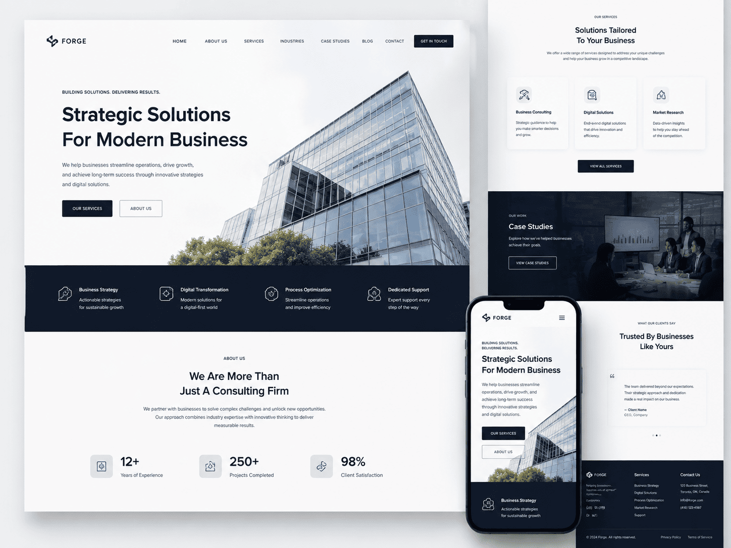
In the Canadian <a href=”https://niagaraforge.ca/service/web-design/ecommerce/”>ecommerce landscape, web design is far more than a digital storefront’s visual polish. It functions as the structural backbone that determines whether a business is discoverable on search engines like Google and whether visitors convert into paying customers. With a market that spans vast geographic distances, two official languages, and highly discerning consumers who expect seamless experiences across devices, Canadian ecommerce businesses face unique pressures. A website that loads slowly, obscures product information, or fails to support local payment preferences will bleed traffic to competitors regardless of how compelling the merchandise might be. This article unpacks the dual role of web design: it must satisfy search engine algorithms through technical rigor while simultaneously guiding human users toward checkout with intuitive clarity.
The Canadian digital economy rewards businesses that treat design as a strategic investment rather than an afterthought. Search visibility in Canada is fiercely contested, with international giants and domestic retailers vying for the same query space. Meanwhile, conversion rates hinge on trust signals, navigation efficiency, and page speed—all elements that fall squarely within web design’s domain. When these two objectives align, the result is a compounding effect: higher rankings bring more qualified traffic, and a frictionless experience turns that traffic into revenue. Conversely, neglecting either side creates a leaky funnel. A beautiful site with poor technical SEO remains invisible; a technically sound site with cluttered layouts repels buyers.
This guide is structured to provide Canadian merchants with a practical roadmap. It begins by examining why a strategic design approach is non-negotiable in this market, then traces the direct causal links between design choices, search engine rankings, and sales outcomes. Following that, the content moves through technical SEO foundations, conversion-centered user experience principles, and the specific Canadian localization factors that influence both visibility and purchasing behavior. Each section offers actionable takeaways, from optimizing for mobile-first indexing to structuring product pages for local intent. By the end, you will understand how every design decision—from font size to URL structure—contributes to a unified goal: dominating Canadian search results while delivering a shopping experience that converts.
Why Canadian Ecommerce Businesses Need a Strategic Web Design Approach
A strategic approach to web design in Canada is not optional—it is a survival mechanism. The Canadian ecommerce market is characterized by high consumer expectations, shaped by exposure to US giants like Amazon and Shopify-powered brands. Shoppers across provinces demand fast loading times, clear product imagery, and straightforward checkout processes. At the same time, search engines increasingly prioritize user experience signals, such as Core Web Vitals and mobile responsiveness, as ranking factors. A haphazard design that ignores these signals will struggle to rank for high-intent keywords like “buy winter boots online Toronto” or “Canadian-made skincare free shipping.”
Strategic design also accounts for regional diversity. English and French Canadian users require equally polished experiences; a site that only functions well in English misses a substantial Quebec market. Additionally, cross-border competition means Canadian businesses must differentiate on trust—clear return policies, visible contact information, and secure payment badges are design elements that build confidence. Without a deliberate plan that maps design choices to business goals, ecommerce owners waste budget on aesthetics that neither attract search engines nor persuade shoppers. Instead, every layout decision should answer two questions: “Does this help a user find what they need?” and “Does this help Google understand what this page is about?”
Strategic web design also future-proofs a business. Canadian search trends shift with seasons, economic conditions, and platform algorithm updates. A flexible design system allows for rapid A/B testing of product page layouts, promotional banners, and navigation structures without a full redesign. This agility is crucial in a market where consumer behavior can pivot quickly, such as the surge in local online grocery shopping during extreme weather events. Ultimately, a strategic approach treats web design as a living asset that evolves with search engine requirements and shopper preferences, not a static brochure.
The Direct Connection Between Design, Search Rankings, and Sales
The relationship between web design, search rankings, and sales is causal and measurable. Search engines crawl and index a site based on its structural clarity: clean HTML, logical heading hierarchy, descriptive URLs, and fast server response times. Design choices like image compression, lazy loading, and minimal render-blocking JavaScript directly impact page speed scores, which are confirmed ranking signals. For Canadian ecommerce, where mobile traffic often exceeds desktop, a responsive design that adapts to smaller screens is non-negotiable. Google’s mobile-first indexing means the mobile version of your site is the primary version evaluated for rankings. A design that hides content behind click-to-expand menus or uses tiny touch targets will rank poorly and frustrate users simultaneously.
Sales conversion follows a parallel path. Design governs the user’s journey from product discovery to checkout. Clear category navigation, prominent search bars, and filterable product listings reduce cognitive load, helping users find items quickly. Product pages that feature high-resolution images, zoomable thumbnails, and concise descriptions address purchase hesitations. Trust elements—shipping cost calculators, customer review snippets, and SSL security indicators—are design components that increase add-to-cart rates. When a page loads in under two seconds, displays a clear “Add to Cart” button above the fold, and offers a guest checkout option, conversion rates rise by measurable margins. Conversely, a design that forces users to hunt for a checkout link or displays cluttered pop-ups will see abandoned carts.
The synthesis of these two forces creates a virtuous cycle. Higher search rankings drive more organic traffic, which provides behavioral data that informs design improvements. For example, if analytics show high bounce rates on category pages, a designer might add richer product thumbnails or breadcrumb navigation. These improvements reduce bounce rates, which signals relevance to search engines, further boosting rankings. Canadian businesses that track this loop—using tools like Google Search Console for query performance and heatmaps for user behavior—can make incremental design changes that yield compounding gains in both visibility and revenue. In this sense, design is not a one-time project but an ongoing optimization engine.
What This Guide Covers: From Technical SEO to Conversion Optimization
This guide is organized into four core pillars, each addressing a distinct aspect of ecommerce design’s impact on Canadian search and sales. The first pillar, technical SEO foundations, covers site architecture, URL best practices, schema markup for products, and server performance—all elements that determine whether search engines can efficiently crawl and rank your pages. The second pillar, conversion-centered user experience, delves into navigation design, mobile optimization, checkout flow simplification, and the use of persuasive visual cues like progress indicators and trust badges. The third pillar focuses on Canadian-specific localization, including bilingual content strategies, HST/GST display considerations, and shipping options that appeal to shoppers in remote regions versus urban centers.
Each section includes practical checklists and examples tailored to Canadian businesses. For instance, the technical SEO portion will explain how to structure a breadcrumb trail that helps Google understand product hierarchies while also aiding user orientation. The UX section will demonstrate how to design a product filter for “Canadian Tire” or “Lululemon” style audiences that expect robust filtering by size, color, and price. The localization section will address the importance of using Canadian spelling (e.g., “colour” vs. “color”) and incorporating French language URLs for Quebec-based queries. Tables will be used to compare design element priorities across desktop, tablet, and mobile devices, as well as to outline the typical conversion rate impact of key design changes based on industry best practices.
By the conclusion, you will have a comprehensive framework for auditing your existing ecommerce site and implementing design upgrades that serve dual purposes: improving search engine visibility and increasing conversion rates. The guide avoids generic advice, instead offering specific, actionable recommendations grounded in the realities of the Canadian market. Whether you are launching a new store or refining an established one, the principles herein will help you build a digital storefront that not only attracts Canadian shoppers but also persuades them to complete their purchases with confidence.
Understanding the Canadian Ecommerce Landscape: User Expectations and Market Nuances
To succeed online in Canada, ecommerce web design must move beyond generic templates and address the country’s distinct digital behaviours. Canadian shoppers are not a monolithic group; their expectations are shaped by language laws, regional logistics, and a cautious approach to online trust. A website that ignores these nuances will struggle to rank for local search queries and will see higher cart abandonment rates, regardless of product quality.
Bilingual and Multicultural Design: Catering to English and French Audiences
The most immediate design constraint is linguistic duality. Under the Official Languages Act and Quebec’s Charter of the French Language, any business targeting Canadian consumers—especially those in Quebec—must provide a full French experience, not just a translated homepage. This is not merely a legal checkbox; it is a search visibility factor. Google Canada uses hreflang annotations and localized content to serve the correct language version. A poorly executed translation or a missing French URL structure signals low quality, hurting rankings for keywords like “chaussures de course” or “livraison gratuite”.
Effective bilingual design requires:
- Language toggle placement: Position a clear EN/FR switcher in the header, persistent across all pages, and never rely on automatic browser detection alone.
- Separate URL structures: Use
/fr/subdirectories or.ca/fr/paths, with unique metadata and content—not machine-translated text. - Cultural adaptation: French Canadian shoppers expect local idioms, metric measurements, and Canadian spelling (e.g., “colour” vs. “color”), while English Canadians respond to a more neutral, inclusive tone.
Multicultural design also extends to pricing display and payment options. For example, showing prices in CAD with GST/HST clearly indicated before checkout reduces friction. Additionally, supporting payment methods popular in Canada, such as Interac Online or Visa Debit, signals local competence to both users and search engines.
Mobile Usage and Cross-Border Shopping Trends in Canada
Canada has one of the highest smartphone penetration rates globally, and mobile commerce accounts for over half of all online retail traffic. However, Canadian mobile users behave differently than their US counterparts. They are more likely to compare prices across multiple tabs, pause a purchase to check shipping costs, and abandon a site if the mobile layout requires excessive zooming or horizontal scrolling. A responsive design is non-negotiable, but true mobile optimization for Canada means prioritizing speed on slower rural connections and simplifying forms for thumb-based entry.
Cross-border shopping also shapes expectations. Many Canadians routinely buy from US retailers, which means they are accustomed to fast, free shipping thresholds and easy returns. When they visit a Canadian ecommerce site, they expect:
| Feature | Canadian User Expectation |
|---|---|
| Shipping calculator | Visible on product page, not just at checkout |
| Duty and tax estimate | Shown upfront for out-of-province or cross-border orders |
| Delivery timeframes | Clear distinction between urban and remote areas (e.g., Northern Canada) |
Designing for these trends means embedding sticky “free shipping over $X” progress bars, using geolocation to pre-select the province for tax calculations, and ensuring that product images are compressed for fast loading on 4G networks. Search engines reward this with better Core Web Vitals scores, which directly influence rankings.
Trust Signals That Matter to Canadian Consumers (e.g., Secure Checkout, Clear Policies)
Canadian shoppers are notoriously risk-averse online. High-profile data breaches and aggressive spam laws (CASL) have made them wary of sharing personal information. Trust is not a single badge; it is a system of visible cues woven throughout the design. The checkout page must display SSL certification prominently, but more importantly, it should never ask for unnecessary data. A minimalist checkout with only required fields—name, address, email, payment—performs better than one that requests a phone number or birthdate.
Clear, accessible policies are equally critical. A Canadian user will look for three specific documents before purchasing:
- Return policy: Must state the 15-day or 30-day window, who pays for return shipping, and whether restocking fees apply.
- Privacy policy: Must explain how data is used and stored, referencing compliance with PIPEDA (Personal Information Protection and Electronic Documents Act).
- Shipping policy: Must list all provinces and territories, including delivery estimates for Yukon, Northwest Territories, and Nunavut, which often lack express options.
These pages should be linked in the footer and near the “Add to Cart” button, not buried in fine print. Visual trust signals—such as a padlock icon, “Verified by Visa” logos, or bilingual customer service phone numbers—reinforce legitimacy. For search visibility, this translates into lower bounce rates and longer dwell time, as users who feel secure are more likely to explore multiple pages and complete a purchase, sending positive engagement signals to search engines.
Core Web Vitals and Technical SEO: The Foundation of Search Visibility
In Canada’s competitive ecommerce landscape, Google’s Core Web Vitals (CWV) serve as both a ranking signal and a direct proxy for user satisfaction. These metrics—Largest Contentful Paint (LCP), First Input Delay (FID), and Cumulative Layout Shift (CLS)—measure loading performance, interactivity, and visual stability. For Canadian retailers, a slow or unstable site not only loses search placement but also drives customers toward faster US-based competitors. Technical SEO begins with design choices: image compression, server response times, and layout constraints must be addressed at the wireframe stage, not retrofitted after launch. A site that loads within 2.5 seconds on a 4G connection in Toronto will outperform a heavier competitor in both Google’s index and conversion rate, as every 100ms of delay reduces session length and basket value.
Optimizing Page Speed for Canadian Users: Hosting, Images, and Caching
Canadian ecommerce sites face unique geographic challenges. Data travelling from a server in Vancouver to a shopper in Halifax crosses thousands of kilometres, adding latency that impacts LCP. The first actionable step is to select a hosting provider with data centres in Canada, ideally in both Ontario and British Columbia, to reduce round-trip times. Pair this with a Content Delivery Network (CDN) that has points of presence in major Canadian cities—Toronto, Montreal, Calgary, and Vancouver—to serve static assets from the nearest edge node.
Image optimization is the highest-impact design lever. Use next-generation formats like WebP or AVIF, which provide 25–35% smaller file sizes than JPEG or PNG without visible quality loss. Implement lazy loading for below-the-fold product images, but ensure the hero image and above-fold content load eagerly. For caching, set long expiry headers (at least 30 days) for static resources and use server-side caching for product category pages that change infrequently. Consider the following comparison when choosing a delivery strategy:
| Delivery Method | Typical LCP (Toronto User) | Key Design Action |
|---|---|---|
| Single server in Montreal, no CDN | 3.8–4.5 seconds | Compress images and enable gzip |
| Canadian CDN with 5+ edge nodes | 2.0–2.8 seconds | Serve WebP and cache static assets |
| Multi-region hosting (ON + BC) plus CDN | 1.5–2.2 seconds | Implement preconnect to CDN origin |
Mobile-First Design: Ensuring Seamless Experience Across Devices
Over 60% of Canadian ecommerce traffic originates from smartphones, and Google indexes mobile versions of sites first. A mobile-first design means your layout, typography, and touch targets are conceived for small screens, then scaled up for desktop. Avoid separate mobile domains (e.g., m.example.com) as they fragment crawl budgets and slow rendering. Instead, use responsive design with fluid grids and flexible images. Key practices include: ensuring tap targets are at least 48×48 pixels, using a single-column checkout flow to reduce accidental clicks, and hiding non-essential elements (like large promotional banners) on mobile to cut CLS. Test on real devices across carriers—Rogers, Bell, Telus—because network throttling in rural areas differs from urban fibre connections.
Measuring and Improving Core Web Vitals with Real User Monitoring
Lab testing with Lighthouse provides a baseline, but real user monitoring (RUM) captures actual CWV from Canadian shoppers’ browsers. Tools like Google’s Search Console (CrUX report) and third-party RUM platforms (e.g., Cloudflare Web Analytics) show field data segmented by region and device. If LCP is above 2.5 seconds for users in the Prairies, investigate server location or preload key images. For FID (soon to be replaced by Interaction to Next Paint), minimize JavaScript execution by deferring non-critical scripts like chat widgets. To improve CLS, reserve space for images and ads using explicit width and height attributes, and avoid inserting dynamic elements (e.g., cookie banners) above the fold after load. Set a monthly review cadence: track the 75th percentile of each metric, and use the “diagnose, fix, verify” loop—each change must be validated against field data before rolling out site-wide.
Site Architecture and Navigation: Guiding Both Users and Search Engines
For Canadian ecommerce businesses, site architecture is the blueprint that determines whether search engines can efficiently discover your products and whether shoppers can find them without frustration. A logical, flat structure—where any page is reachable within three clicks from the homepage—creates a win-win scenario. Search engine crawlers follow internal links to index new products quickly, while users navigate intuitively, reducing bounce rates and increasing the likelihood of conversion. In a market spanning vast geography and diverse shopping behaviours, from Toronto’s fast-paced urban centres to rural Atlantic Canada, clarity in structure is non-negotiable.
Designing a Crawlable and Scalable URL Structure for Ecommerce
Your URL hierarchy should mirror your physical store layout: broad departments first, then subcategories, then individual products. A flat, descriptive URL structure not only aids crawlers but also gives Canadian shoppers confidence in what they are about to click. Avoid deep nesting like /shop/mens/outerwear/jackets/leather/urban-bomber; instead, keep it shallow and keyword-rich.
- Use lowercase, hyphen-separated words:
/ca/en/outdoor-gear/camping-tentsis clearer than/Category1/Product123?ref=xyz. - Incorporate locale signals: For Canadian sites, include
/ca/or province-specific paths when targeting regional markets (e.g.,/ca/on/torontoonly if truly necessary). Otherwise, rely on hreflang tags for bilingual needs. - Plan for scalability: As your catalogue grows, a predictable pattern like
/category/subcategory/productallows you to add new items without restructuring existing URLs, preserving link equity.
One practical tip: use canonical tags to consolidate duplicate product variants (e.g., colour or size) into a single indexed URL, preventing crawl waste on thin-content pages.
Using Breadcrumbs and Internal Linking to Boost Authority and UX
Breadcrumbs are a dual-purpose navigation aid: they show users their current position within the site hierarchy, and they provide search engines with clear contextual signals about page relationships. For Canadian ecommerce, where bilingual shoppers may switch between English and French, breadcrumbs should dynamically reflect the active language—e.g., “Accueil > Vêtements > Vestes” instead of a static English path.
Internal linking goes beyond menus. Strategically link from product pages to related items, from category pages to buying guides, and from blog content to best-selling products. Each link passes authority and guides crawlers toward high-priority pages. Aim for a hub-and-spoke model: your homepage and major categories are hubs, while product pages are spokes that link back to their parent categories. Avoid orphan pages—every product should have at least one internal link from a category or related product.
Creating Intuitive Category Pages That Match Search Intent
Category pages are often the true entry point for Canadian shoppers—they search broadly (“winter boots Canada”) before narrowing down. Design these pages to satisfy intent by combining clear headings, filterable attributes, and descriptive copy that addresses regional needs, such as “rated for -30°C” for Prairie winters or “waterproof for Vancouver rain.”
Organize product cards with consistent metadata: name, price in CAD, provincial availability if applicable, and delivery timelines. For search engines, include a unique meta description and title tag per category, avoiding auto-generated generic text. Use faceted navigation carefully—each filter combination should either be noindexed or produce a unique, useful URL. Otherwise, you risk creating hundreds of thin pages that dilute crawl budget.
Finally, test your structure with real users. A quick card-sorting exercise or heatmap analysis can reveal whether your category names match how Canadians actually speak about products. For example, using “Toques” instead of “Beanies” in English and “Tuques” in French demonstrates local relevance, improving both user trust and search visibility for regional queries.
On-Page SEO Elements: Designing for Keywords and Content Visibility
In the Canadian ecommerce landscape, where competition spans from local artisanal shops to cross-border retail giants, on-page SEO is not an afterthought—it is a design discipline. The visual layout of a product page or category page directly influences how search engines interpret relevance and how users perceive value. When design and keyword strategy align, every pixel works toward both crawling efficiency and conversion momentum. Below are the core areas where layout decisions and SEO requirements intersect.
Strategically Placing Target Keywords in Headings, Body, and Metadata
Keyword placement must follow the natural reading path of your Canadian audience, which typically scans left-to-right and top-to-bottom in an F-pattern. Your primary keyword—for example, “How Ecommerce Web Design Supports Search Visibility and Conversions in Canada”—should appear in the H1 (if present on the page), the first 100 words of visible body copy, and the meta title and description. However, design dictates prominence:
- H1 and H2 hierarchy: Use one H1 per page, followed by descriptive H2s and H3s that contain secondary keywords (e.g., “Canadian Ecommerce UX Best Practices”). This creates a clear semantic outline that search engines use to establish topical authority.
- Metadata as design microcopy: Title tags (60 characters) and meta descriptions (155 characters) should be treated as part of the interface. Write them with a Canadian tone—clear, polite, and specific—while including location modifiers like “Canada” or “Toronto” if relevant.
- Body text above the fold: Place a keyword-rich introductory paragraph within the first 200×600 pixel viewport area. Avoid hiding keywords inside accordions or tabs, as reduced crawl priority can diminish visibility.
For multilingual Canadian pages (English and French), replicate this structure in each language, ensuring hreflang tags are properly implemented within the head metadata. Design should not force text into cramped spaces that truncate long-tail phrases; instead, allocate generous line-height and white space to keep keyword-dense sentences readable.
Designing Product Pages That Highlight Keywords and Benefits
Product pages are where search visibility converts into revenue. A well-designed product page balances keyword-rich text with scannable benefit statements. Avoid walls of text; instead, use a two-column layout: left for product imagery, right for title, price, and a short keyword-optimized description. Below the fold, integrate a structured “Features” list with bullet points that naturally incorporate synonyms and long-tail variations (e.g., “winter-rated parka for Canadian climates” rather than just “parka”).
Key design considerations for product pages:
- Keyword in the product title: Place the primary keyword at the beginning of the title tag and H1, but keep the visible product name human-readable. For example, “Men’s Insulated Snow Boots – Waterproof | Canadian Made” works better than keyword stuffing.
- Benefit-driven subheadings: Use H3 subheadings like “Why These Boots Perform in Canadian Winters” to signal relevance and answer user intent.
- Schema markup integration: Design microdata (e.g., Product, Offer, AggregateRating) into the backend, but ensure the visual output does not hide critical review snippets. Star ratings and price visibility near the top improve click-through rates from search results.
- Internal linking as visual navigation: Include related-product carousels or “You May Also Like” sections with anchor text that includes keywords—this distributes link equity and keeps users engaged.
For category pages, use faceted navigation that generates clean, keyword-rich URLs (e.g., /winter-boots/mens-waterproof) while avoiding duplicate content from filter parameters. Design the filter bar to collapse under a clear “Refine” button, preventing search engines from indexing hundreds of near-identical variations.
Image and Video Optimization: Using Alt Text and Rich Media for SEO
Visual content is the backbone of ecommerce, but without proper optimization, images and videos become dead weight for search visibility. Alt text is not just an accessibility requirement—it is a keyword placement opportunity that search engines read when they cannot parse the image itself. Every product image should have descriptive alt text that includes the target keyword naturally, such as “Red waterproof rain jacket with hood for Vancouver weather.” Avoid keyword stuffing in alt text; instead, describe the image accurately while incorporating one primary and one secondary keyword.
Rich media also supports conversions when designed with SEO in mind:
- Lazy loading with fallback: Implement lazy loading for images to improve page speed, but ensure the
srcattribute contains a real image, not a placeholder, so search engine crawlers can access the file. - Video transcripts and captions: For product videos or how-to guides, provide a text transcript below the video player. This makes video content crawlable and adds a keyword-rich paragraph to the page.
- File naming conventions: Rename image files from “IMG_2048.jpg” to “canadian-moose-socks-front-view.jpg” before uploading—this reinforces topical relevance in image search.
- Responsive images with
srcset: Use responsive design to serve appropriately sized images for mobile users in Canada, where over 60% of traffic is on smartphones. This reduces bounce rates and improves Core Web Vitals, which are ranking factors.
When designing rich media sections, maintain a consistent visual hierarchy: place the primary product image with optimized alt text first, followed by lifestyle images and a video thumbnail with descriptive filename. Each media element should have a related caption that includes a keyword variation, as captions are indexed and often appear in rich snippets. By treating every image and video as a small piece of on-page content, you create a multimodal experience that satisfies both search engine crawlers and Canadian shoppers seeking detailed product information. The result is a page that ranks higher for “How Ecommerce Web Design Supports Search Visibility and Conversions in Canada” while guiding users toward a purchase with clarity and trust.
User Experience (UX) and Conversion Rate Optimization (CRO): Design That Sells
In the competitive Canadian ecommerce landscape, a visually appealing storefront is not enough. Your website’s design must actively guide visitors toward a purchase by removing friction and building trust at every interaction. User experience (UX) and conversion rate optimization (CRO) work hand-in-hand: UX ensures the journey feels intuitive, while CRO systematically turns that ease into measurable sales. Every design choice—from button colour to checkout field count—either accelerates or stalls your revenue. For Canadian retailers, this means tailoring the experience to local expectations, including payment preferences, bilingual cues, and shipping realities, all while keeping the path to purchase unmistakably clear.
Effective Call-to-Action Placement and Visual Hierarchy
Your calls-to-action (CTAs) are the digital handshake that closes a sale. If they are buried, ambiguous, or competing with too many distractions, Canadian shoppers will bounce to a competitor. Visual hierarchy ensures the eye lands where you want it—first on the product, then on the “Add to Cart” button, and finally on “Checkout.”
- Above the fold: Place a primary CTA (e.g., “Shop Now” or “Buy It Today”) within the first screen view on mobile and desktop. Do not force scrolling to find the next step.
- Contrast and size: Use a high-contrast colour (e.g., deep red or forest green) that stands out from your brand palette but remains accessible. The button should be large enough to tap easily on a 320px-wide phone screen.
- Repetition with purpose: Repeat the CTA after product descriptions, in sticky headers, and at the bottom of long landing pages. Each repetition must feel contextual, not nagging.
- One primary action per view: Avoid linking “Learn More,” “Read Reviews,” and “Add to Cart” with equal visual weight. Instead, use secondary text links or ghost buttons for non-essential actions.
For example, a product page that shows the price, a large “Add to Cart” button, and a smaller “Check Size Guide” link beneath it creates a clear priority. The user’s eye moves from product image to price to action without hesitation.
Streamlining Checkout: Reducing Steps and Offering Canadian Payment Methods
Checkout abandonment in Canada often stems from lengthy forms and payment confusion. A streamlined checkout reduces cognitive load and respects the user’s time. Aim for a single-page checkout or a maximum of three steps: contact/shipping, payment, and review. Remove mandatory account creation—offer a guest checkout option with a subtle “Create account after purchase” prompt.
Canadian shoppers expect specific payment methods. Beyond standard credit cards, integrate:
| Payment Method | Why It Matters for Canadian Users |
|---|---|
| Interac Debit (Online) | Direct bank transfer, no credit card needed; highly trusted for domestic purchases. |
| Visa/Mastercard Debit | Common for users without credit cards; must show clear logos. |
| Apple Pay / Google Pay | Fast mobile checkout using biometrics; reduces typing errors. |
| PayPal | Adds buyer protection layer; familiar to cross-border shoppers. |
Also display shipping costs and estimated delivery dates early, ideally on the cart page, because unexpected fees at the final step are a leading abandonment trigger. If you offer free shipping over a threshold (e.g., $75), show a progress bar that encourages adding one more item.
Using Trust Badges, Reviews, and Clear Return Policies to Build Confidence
Canadian consumers are cautious with online purchases, particularly with smaller or newer brands. Trust elements are not decorative—they are conversion levers. Place a secure checkout badge (e.g., SSL padlock, “Verified by Visa”) directly beside the payment button. However, avoid cluttering the header with too many badges; instead, feature them at the point of decision.
- Product reviews: Show star ratings near the price and full reviews in a tab below the product image. Include a filter for “Recent” and “Verified Purchase” to increase authenticity. For French-speaking regions, offer reviews in both English and French.
- Return policy clarity: State your return window (e.g., “30-day hassle-free returns”) on the product page and again at checkout. A simple, generous policy reduces perceived risk.
- Local trust cues: Mention “Ships from Toronto” or “Canadian customer support” if true. Display Canadian flags or bilingual toggles to signal local presence.
For a practical example, consider a checkout button that reads “Secure Checkout with Interac.” Below it, add a thin line: “Free returns within 30 days. No questions asked.” This single area combines payment security, convenience, and policy transparency—three pillars that directly address Canadian buyer hesitation. When these elements are visible without requiring a click, you lower anxiety and increase the likelihood of completing the purchase. The result is not just a one-time sale but a repeat customer who trusts your design to deliver on its promises.
Mobile and Responsive Design: Capturing Canada’s On-the-Go Shoppers
Canadian consumers are increasingly turning to their smartphones for product research, price comparisons, and purchases—often while commuting, waiting in line, or relaxing at home. This shift means that an ecommerce website’s mobile experience is no longer a secondary consideration but a primary driver of both search visibility and conversion rates. A responsive design that fluidly adapts to different screen sizes is the foundation, but true success requires a deeper commitment to mobile-first principles, from how Google indexes your site to how easily a thumb can tap a “Buy” button.
Prioritizing Mobile-First Indexing for Better Search Rankings
Google predominantly uses the mobile version of a website for indexing and ranking. This means that if your desktop site is sleek but your mobile site is slow, cluttered, or missing key content, your rankings will suffer across all devices. For Canadian ecommerce businesses, this is particularly critical given the high mobile penetration rate in urban centres like Toronto, Vancouver, and Montreal. To align with mobile-first indexing, you must ensure that:
- Your mobile site contains the same high-quality, relevant content as your desktop version, including product descriptions, reviews, and FAQs.
- Structured data (schema markup) is present on both versions, with identical URLs and meta tags where possible.
- Images and videos are optimized for mobile delivery without losing descriptive alt text or file names.
- Internal links and navigation menus are fully crawlable on mobile, avoiding hidden content that requires JavaScript to render.
By treating mobile as the primary experience, you signal to search engines that your site is reliable and user-focused, which can lead to improved organic visibility for high-intent queries like “buy winter boots online Canada” or “same-day delivery electronics Toronto.”
Designing for Touch: Large Tap Targets and Easy Navigation
Mobile users interact with screens using fingers, not precise mouse cursors. This fundamental difference demands a design that prioritizes touch ergonomics. The most common mobile conversion killer is a button that is too small or too close to another element, leading to accidental taps and frustrating misclicks. To create a frictionless shopping experience, adhere to these touch-friendly principles:
- Minimum tap target size: Ensure buttons and links are at least 44×44 pixels. This is especially important for “Add to Cart,” “Checkout,” and size selector options.
- Adequate spacing: Provide at least 8 pixels of space between interactive elements to prevent accidental taps.
- Thumb-zone optimization: Place primary actions like “Add to Cart” within the lower half of the screen, where thumbs naturally rest. Secondary actions like “Save for Later” should be in less accessible areas.
- Sticky, minimal headers: Use a persistent but slim header with a search icon and cart icon, avoiding large menus that consume valuable screen real estate.
- Simplified forms: Use large input fields, drop-down selectors for province and size, and enable autofill for credit card and shipping addresses.
When navigation is intuitive and buttons are easy to hit, users feel in control. This reduces bounce rates and increases the likelihood of completing a purchase, which in turn sends positive engagement signals to search engines.
Mobile Page Speed Optimization and Accelerated Mobile Pages (AMP)
Speed is a ranking factor and a conversion catalyst. In Canada, where high-speed internet is common but users still expect near-instantaneous loading, every additional second of load time can result in significant cart abandonment. A slow mobile site not only frustrates shoppers but also signals poor quality to Google. To optimize mobile page speed, focus on the following technical elements:
| Optimization Area | Actionable Tactic | Expected Benefit |
|---|---|---|
| Image Compression | Use modern formats like WebP, implement lazy loading, and serve correctly sized images based on device viewport. | Reduces page weight by 30-50%, leading to faster rendering. |
| Code Minification | Remove unnecessary characters from HTML, CSS, and JavaScript files. Combine multiple stylesheets into one. | Decreases server response time and parsing effort. |
| Server Response Time | Use a Canadian content delivery network (CDN) with edge servers in Vancouver, Toronto, and Montreal to cache content closer to users. | Lower latency for geographically distributed shoppers. |
| Accelerated Mobile Pages (AMP) | Implement AMP for key landing pages like product categories and blog posts. AMP uses a stripped-down version of HTML and a pre-rendered cache. | Near-instant load times (under 1 second) and better visibility in carousels on mobile search results. |
While AMP is not a universal requirement for all ecommerce pages—particularly for complex product pages with dynamic content—it can be highly effective for informational content that supports shopping decisions, such as buying guides and size charts. By combining rigorous speed optimization with AMP where appropriate, you create a seamless, rapid experience that keeps Canadian shoppers engaged from first tap to final checkout. This technical excellence directly supports both higher search rankings and improved conversion rates, proving that mobile design is not just about aesthetics but about strategic business performance.
Content and Visuals: Engaging Users and Enhancing SEO
In Canadian ecommerce, where distances are vast and competition is fierce, content and visuals do more than decorate a page—they are functional tools for search visibility and conversion. High-quality, original material signals relevance to search engines while giving shoppers reasons to stay, explore, and trust your brand. When users linger on product pages, dwell time rises and bounce rates drop—two behavioural signals that correlate with stronger rankings. Moreover, genuinely useful content and striking visuals earn organic backlinks from blogs, forums, and industry publications, amplifying your domain authority without paid outreach. The challenge lies in integrating these elements seamlessly into product and category pages without overwhelming the core shopping purpose.
Creating Compelling Product Descriptions That Rank and Persuade
Product descriptions must serve two masters: search engines and human buyers. For SEO, each description should naturally incorporate the focus keyword and relevant long-tail variations, including Canadian-specific terms like “free shipping across Ontario” or “duty-free pricing for Canadian customers.” For persuasion, descriptions should answer the shopper’s unspoken questions: What problem does this solve? How is it different from competitors? What materials or specifications matter?
- Structure for scannability: Use short paragraphs, bullet points for key features, and a clear “Why you’ll love it” section to break up text blocks.
- Incorporate sensory and benefit-driven language: Instead of “waterproof jacket,” write “seam-sealed waterproof shell keeps you dry through Vancouver rain showers.”
- Add unique value: Mention Canadian climate suitability, local certifications (e.g., CSA-approved), or shipping logistics to differentiate from generic global copy.
Avoid duplicating manufacturer descriptions—search engines penalize thin or copied content, and Canadian shoppers quickly lose trust when they see the same text across multiple retailers. Instead, write 150–300 words per product, weaving in keywords naturally without stuffing.
Using High-Resolution, Optimized Images to Drive Engagement
Images are the first thing a shopper notices, but they also affect page speed and SEO. High-resolution visuals that load slowly frustrate users and increase bounce rates, while properly optimized images improve Core Web Vitals—a confirmed ranking factor. For Canadian ecommerce, where mobile shopping is prevalent, image compression and responsive sizing are non-negotiable.
| Image Attribute | SEO & Conversion Impact | Recommended Practice |
|---|---|---|
| File format | WebP reduces file size by 25–35% compared to JPEG, speeding up load times. | Use WebP for product photos, with PNG fallbacks for transparent images. |
| Alt text | Describes the image to search engines and screen readers; improves image search rankings. | Write descriptive, keyword-rich alt text (e.g., “red maple-leaf wool toque with fleece lining”). |
| File name | Reinforces relevance for image search and URL readability. | Rename files like “canadian-made-wool-toque-front-view.jpg” instead of “IMG_2049.jpg.” |
| Dimensions | Properly scaled images prevent layout shift, improving user experience and SEO. | Set explicit width/height attributes; use srcset for different viewport sizes. |
Beyond technical optimization, use multiple angles, zoom functionality, and lifestyle shots that show products in real Canadian settings—a parka on a snowy Ottawa street, a kayak on a BC lake. This contextual imagery increases time-on-site as shoppers examine details and imagine usage.
Incorporating Video and Interactive Elements to Boost Time-on-Site
Video is the most powerful engagement tool for ecommerce. Product demos, installation guides, and behind-the-scenes footage keep visitors on your page 1.5 to 2 times longer than static content alone. For Canadian retailers, consider seasonal videos—unboxing a winter boot line or testing a camping stove in light rain—that resonate with local conditions. Interactive elements like 360-degree product viewers, size calculators, or “build your own” configurators also encourage active participation, increasing dwell time and reducing bounce rates. These features generate backlinks because they are genuinely useful: a sizing guide for Canadian hockey equipment or a colour-matching tool for paint products becomes a reference resource that others link to.
To integrate these elements without hurting load speed, lazy-load videos (only play when scrolled into view), host long-form content on a CDN, and keep interactive tools lightweight. Place a short video above the fold on category pages for hero products, but reserve full interactive modules for product detail pages where shoppers are closer to purchase. Track user interactions via heatmaps to see which visuals keep people engaged longest, then refine—this continuous improvement loop directly supports both search visibility and conversion rates.
Local SEO and Canadian-Specific Search Features
For Canadian ecommerce businesses with physical storefronts or those targeting specific provinces and territories, web design is not merely an aesthetic layer—it is a structural signal that search engines interpret to determine geographic relevance. A well-architected site tells Google and Bing exactly where you operate, what regions you serve, and how you handle the uniquely Canadian complexities of cross-border commerce. When your design schema, URL structure, and on-page content align around location, you earn visibility in local pack results, map-based searches, and province-filtered queries—all of which carry higher purchase intent than generic national searches.
Implementing Local Business Schema for Rich Results in Canada
Structured data using schema.org vocabulary is the backbone of local search visibility. For Canadian merchants, this means embedding LocalBusiness or Store markup on your contact and location pages, but with Canadian-specific fields that many U.S.-focused tutorials omit. Your schema should include:
- address with
addressRegionset to the two-letter province code (e.g., “ON” for Ontario, “BC” for British Columbia) andaddressCountryset to “CA”. - geo coordinates for each physical location, enabling map pin accuracy.
- openingHoursSpecification that respects provincial holiday closures—do not assume a national standard.
- areaServed using
AdministrativeAreawith province names, which helps for businesses that ship nationwide but only service certain regions in-store. - priceRange in CAD, and currenciesAccepted set to “CAD” to avoid mixed signals.
Here is a practical snippet for a Toronto-based store with regional shipping:
<script type="application/ld+json">
{
  "@context": "https://schema.org",
  "@type": "Store",
  "name": "Maple & Main Goods",
  "address": {
    "@type": "PostalAddress",
    "streetAddress": "482 Queen St W",
    "addressLocality": "Toronto",
    "addressRegion": "ON",
    "postalCode": "M5V 2A9",
    "addressCountry": "CA"
  },
  "areaServed": [
    {"@type": "AdministrativeArea", "name": "Ontario"},
    {"@type": "AdministrativeArea", "name": "Quebec"}
  ],
  "currenciesAccepted": "CAD",
  "priceRange": "$$"
}
</script>
Place this markup on a dedicated contact page or location page—not sitewide—and validate it using Google’s Rich Results Test. A common Canadian mistake is using US-style addressRegion values like “ON” without the country code, which confuses crawlers when you also ship to US border states. Be explicit: addressCountry: "CA" is non-negotiable.
Designing Location-Specific Landing Pages (Provinces and Cities)
Rather than a single generic “Shipping to Canada” page, design discrete landing pages for provinces or major cities where you have inventory, local pickup, or high demand. Each page must offer unique value—not just swapping a city name in a template. For example, a page targeting Vancouver should reference local delivery windows, the Carbon Tax surcharge on applicable goods, or pickup points near SkyTrain stations. This design approach supports search in two ways: it matches long-tail queries like “buy camping gear shipped to Alberta” and it builds internal links that distribute authority across your domain.
When structuring these pages, follow a clear hierarchy:
| Page Element | Canadian-Specific Content | SEO Benefit |
|---|---|---|
| H1 heading | “Free Shipping to Calgary Over $75” | Matches provincial city + shipping intent |
| Body copy | Mention local warehouse or fulfillment partner | Supports proximity signals for local pack |
| FAQ section | “Do you charge PST in Saskatchewan?” | Targets voice search and featured snippets |
Avoid thin content. Each province page should include at least 300 words of original text covering local delivery estimates, applicable taxes, and regional return policies. Use your URL structure to reinforce location—for example, /shipping/british-columbia rather than query parameters. This creates crawlable, shareable URLs that users and search engines both parse easily.
Showcasing Canadian Shipping, Taxes, and Duties in the User Interface
Search visibility does not end at the click—it extends to whether the user converts. In Canada, the biggest conversion killers are unexpected costs at checkout. Your web design must surface shipping, taxes, and duties early and clearly, which also reduces bounce rates that indirectly harm rankings. Implement a persistent shipping estimator on product pages and a province selector in the header that remembers the user’s location via cookies or geolocation.
Key design patterns include:
- Pre-checkout tax display: Show estimated GST/HST/PST before the cart page, not just at final payment. For Quebec, indicate QST is included; for Alberta, show only GST.
- Duty-free messaging: If you ship from within Canada, explicitly state “No additional duties—shipped from Canadian warehouse.” This differentiates you from US-based dropshippers and earns trust.
- Provincial shipping tables: Instead of a single “Canada” flat rate, display a collapsible table or dropdown listing estimated delivery times for each province, from Yukon to Newfoundland.
- Bilingual cues: For sites targeting Quebec, even a simple “Livraison gratuite au Québec” badge can improve engagement and dwell time, a positive search signal.
When these elements are built into the interface—not buried in a FAQ—they reduce cart abandonment. Abandonment rates affect repeat visits and direct traffic, which search engines interpret as poor user experience. By making Canadian shipping logic a first-class citizen of your design, you align technical SEO with conversion optimization, creating a loop where visibility drives traffic that converts, and that traffic signals relevance back to the algorithm.
Measuring Success: Analytics and Continuous Design Improvement
In the competitive Canadian ecommerce landscape, web design is never a “set and forget” asset. To understand how your design choices directly influence search visibility and conversions, you must adopt a rigorous, data-driven approach. Analytics reveal not just what users do, but why they do it, allowing you to refine your design iteratively. This continuous loop of measurement, testing, and adjustment ensures your store remains aligned with both search engine requirements and shopper expectations, securing a durable competitive edge across provinces from Ontario to British Columbia.
Setting Up Ecommerce Analytics: Key Metrics to Track (Traffic, Bounce, Conversion)
Before making any design changes, establish a baseline using a robust analytics stack—typically Google Analytics 4 (GA4) integrated with Google Search Console and your ecommerce platform’s native reporting. Focus on a core set of metrics that bridge design performance and business outcomes:
- Organic Traffic by Landing Page: Monitor sessions from Canadian search queries. A drop in traffic to a specific product category page often signals a design issue like slow load times or poor mobile rendering.
- Bounce Rate and Exit Rate: A high bounce rate (above 60% for ecommerce) on key pages indicates a mismatch between user intent and your design’s clarity. Exit rate on checkout or cart pages points to friction points.
- Conversion Rate (CVR): Track macro-conversions (purchases) and micro-conversions (add-to-cart, newsletter signups). Segment CVR by device—mobile vs. desktop—because Canadian mobile shoppers may abandon a desktop-optimized layout that is not fully responsive.
- Average Order Value (AOV) and Revenue per Session: These reveal whether your design encourages upselling and trust, not just clicks.
- Search Console Impressions and CTR: A low click-through rate from search results, despite high impressions, often points to weak title tags or meta descriptions—design elements that live in the search engine results page (SERP).
Create a weekly dashboard that plots these metrics against design changes, so you can spot correlations quickly.
Conducting A/B Tests on Design Elements for Continuous CRO
A/B testing (or split testing) is the gold standard for validating design hypotheses. Rather than guessing whether a larger “Add to Cart” button or a different product image layout will boost conversions, test one variable at a time against a control version. For Canadian ecommerce, prioritize these high-impact elements:
- Product Page Layout: Test the position of trust badges (e.g., “Free Shipping over $75 CAD”) versus customer reviews above the fold.
- Checkout Flow: Experiment with a one-page checkout versus a multi-step process. Also test whether showing shipping costs early reduces cart abandonment.
- Search Bar and Filters: Test prominent search placement and faceted navigation on category pages—crucial for users who know exactly what they want.
- Call-to-Action (CTA) Copy and Color: For example, test “Buy Now” versus “Add to Bag” and observe which drives more clicks without increasing returns.
Run each test for at least two weeks or until you reach statistical significance (typically 95% confidence) to account for weekly shopping cycles in Canada. Use tools like Google Optimize (if still available) or VWO, and always segment results by traffic source—organic visitors may behave differently from paid social traffic.
Using Heatmaps and User Session Recordings to Identify Design Friction
While A/B tests tell you what works, heatmaps and session recordings explain the “why” behind user behavior. These qualitative tools uncover friction points that quantitative metrics miss. Implement them via services like Hotjar or Microsoft Clarity on your key templates:
| Tool Type | What It Reveals | Design Action Example |
|---|---|---|
| Scroll Heatmaps | How far users scroll on product and category pages; where they stop. | If 80% of users never reach the bottom of a product description, move key info (shipping, returns) higher. |
| Click Maps | Which elements users click that are not links (dead clicks) or which images they assume are clickable. | If users click on a product thumbnail expecting a zoom, ensure the lightbox feature is obvious and functional. |
| Session Recordings | Real-time user navigation paths, hesitations, and rage clicks (rapid repeated clicks). | If recordings show users struggling to find the province selector for shipping quotes, redesign the form field with an autocomplete dropdown. |
| Form Analytics | Which fields in checkout or signup cause abandonment or long pauses. | Remove unnecessary fields like “Company” if not required, or auto-format phone numbers for Canadian area codes. |
Review recordings weekly, focusing on mobile sessions from urban centers like Toronto and Vancouver, where user expectations for speed and simplicity are highest. Combine heatmap insights with your A/B test results—for instance, if a heatmap shows users ignoring a promotional banner, test removing it entirely to reduce visual clutter.
Finally, establish a monthly iteration cycle: analyze analytics, generate hypotheses, run A/B tests, validate with heatmaps, and deploy winning designs. By institutionalizing this process, you ensure your ecommerce design not only supports search visibility through clean, crawlable layouts but also continuously converts Canadian shoppers into loyal customers.
Frequently Asked Questions
How does ecommerce web design affect SEO in Canada?
Ecommerce web design directly impacts SEO through site architecture, page speed, mobile responsiveness, and structured data. Search engines reward sites that are easy to crawl and provide a good user experience. In Canada, fast-loading, mobile-friendly designs with clear navigation help search engines index products effectively and improve rankings for geo-targeted queries like ‘buy online Canada’.
What are the key design elements for conversions in Canadian ecommerce?
Key conversion-focused design elements include intuitive navigation, prominent calls-to-action, trust signals such as Canadian payment options and secure checkout, clear product images, and simplified forms. Also, offering bilingual (English/French) support and displaying shipping costs in CAD can significantly reduce friction and increase checkout completion rates.
Why is mobile-first design critical for Canadian ecommerce?
The majority of Canadian online shoppers browse on mobile devices. Google uses mobile-first indexing, so a mobile-friendly design is essential for SEO. For conversions, a responsive design that offers a seamless shopping experience on any screen size reduces bounce rates and encourages purchases, especially during peak shopping hours when consumers use smartphones.
How can Canadian ecommerce sites optimize for local search?
To optimize for local search, Canadian ecommerce sites should include location-specific keywords, create content relevant to Canadian regions, and ensure their business address appears consistently in local directories. Also, using schema markup for local business and optimizing for ‘near me’ searches can help attract local shoppers looking for nearby products or pickup options.
What role does page speed play in Canadian ecommerce SEO and conversions?
Page speed is a ranking factor for Google, and it heavily influences user experience. In Canada, where internet speeds vary, a slow-loading store can increase bounce rates and reduce conversions. Optimizing images, using content delivery networks (CDNs) with Canadian servers, and minimizing scripts ensure faster load times, improving both SEO and customer satisfaction.
How should Canadian ecommerce sites handle bilingual content?
For Canadian ecommerce, offering bilingual content (English and French) can expand your reach and build trust. Implement hreflang tags to indicate language and regional targeting. Ensure that navigation, product descriptions, and checkout are fully translated. This not only improves user experience for French-speaking Canadians but also signals relevance to search engines for French-language queries.
What are effective trust signals for Canadian online shoppers?
Effective trust signals for Canadian shoppers include clear return policies, visible customer reviews, SSL certificates, payment icons for major Canadian credit cards and Interac, and contact information. Displaying physical addresses and business registration numbers can also enhance credibility. Trust signals reduce shopping anxiety and increase conversion rates.
How can site structure improve both SEO and user experience?
A logical site structure with clear categories and subcategories helps users find products quickly and allows search engines to crawl and index pages efficiently. Use descriptive URLs, breadcrumb navigation, and internal linking to distribute authority. In Canada, structuring your site to include both English and French versions can also improve user experience and SEO.
Sources and further reading
- Google Search Central: Core Web Vitals
- Google Search Central: Page Experience
- Google Search Central: Structured Data for Ecommerce
- Statistics Canada: E-commerce Online Shopping
- Office of the Privacy Commissioner of Canada – PIPEDA
- Canadian Digital Service (CDS) – Design Standards
- Web Content Accessibility Guidelines (WCAG) 2.1
- Google Search Central: Hreflang for Language and Regional URLs
- Baymard Institute: Checkout Usability
- Think with Google – Mobile Shopping Insights
Need help with this topic?
Send us your details and we will contact you.