


Understanding Responsive Web Design and Its Importance in Canada
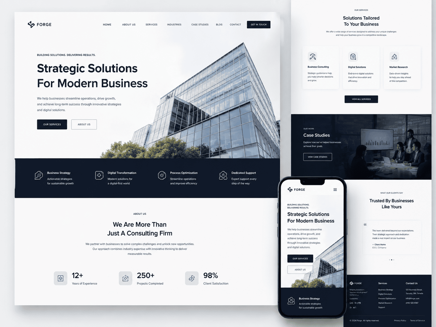
Before you begin evaluating potential partners, it is essential to understand exactly what responsive <a href=”https://niagaraforge.ca/service/web-design/”>web design (RWD) entails and why it is non-negotiable for Canadian businesses. RWD is not merely a trend; it is the foundational standard for building websites that function seamlessly across the vast array of devices your customers use daily. When you search for guidance on <a href=”https://niagaraforge.ca/blog/how-to-choose-the-right-agency-for-responsive-web-design-in-canada/”>How to Choose the Right Agency for Responsive Web Design in Canada, the first step is always to assess the agency’s technical mastery of this discipline. A truly responsive site adapts its layout, content, and functionality to the screen size and orientation of the device, eliminating the need for separate mobile sites or unwieldy pinch-and-zoom interactions. This technical foundation directly influences user satisfaction, conversion rates, and your visibility in search engines.
Defining Responsive Web Design: Fluid Grids, Flexible Images, and Media Queries
At its core, responsive web design rests on three interconnected technical pillars. A competent agency should be able to articulate these clearly and demonstrate their application in past projects.
- Fluid Grids: Instead of designing with fixed pixel widths, the layout uses relative units like percentages. This allows columns and sections to resize proportionally to the viewport, ensuring that a three-column desktop layout gracefully collapses into a single, readable column on a smartphone.
- Flexible Images: Images and media assets are coded with
max-width: 100%so they scale within their containing elements. This prevents overflow, broken layouts, and excessive data usage on slower mobile connections common in rural or remote Canadian regions. - Media Queries: These CSS rules act as conditional filters. They apply specific styling based on device characteristics, such as width, height, resolution, and orientation. A media query can shift navigation menus, enlarge touch targets, or adjust font sizes for optimal legibility on a 320px-wide phone versus a 27-inch monitor.
A reputable Canadian agency will not treat these as optional extras. Instead, they will build a design system where these three elements work in concert, tested across real devices and browsers. If an agency proposes a separate mobile domain (e.g., m.yoursite.ca) or an adaptive layout with fixed breakpoints only for a few popular phones, consider that a red flag. True fluidity requires a more sophisticated, content-first approach.
Why Canadian Businesses Need a Mobile-First Approach in a Multi-Screen Era
Canadian internet usage patterns are distinct. From the busy streets of Toronto and Vancouver to the sprawling communities of the Prairies and Atlantic Canada, your audience is constantly switching between smartphones, tablets, laptops, and desktop workstations. Statistics consistently show that over half of all web traffic in Canada originates from mobile devices. However, the reality is more nuanced: many users start a task on their phone during a commute and finish it on a laptop at home. A mobile-first approach forces your agency to prioritize content hierarchy, speed, and thumb-friendly navigation from the outset.
Consider the bilingual nature of the Canadian market. A responsive site must handle longer text strings in French without breaking the layout. For instance, a French button label like “S’abonner à notre infolettre” is significantly longer than its English equivalent. A fluid grid and thoughtfully applied media queries ensure that language switching does not lead to clipped text, overlapping elements, or horizontal scrolling. An agency experienced with Canadian clients will proactively plan for these linguistic and typographic variations, not treat them as an afterthought.
The Impact of RWD on Local SEO and Google’s Mobile-First Indexing
Your choice of agency directly impacts your search performance. Since Google transitioned to mobile-first indexing, Google predominantly uses the mobile version of a website’s content for indexing and ranking. If your site is not fully responsive, you risk losing rankings to competitors who deliver a superior mobile experience. This is especially critical for local searches—the “near me” queries that drive foot traffic to Canadian brick-and-mortar businesses.
Here is a concise breakdown of how RWD supports your SEO goals:
| SEO Factor | How RWD Helps | Consequence of Ignoring RWD |
|---|---|---|
| Single URL Structure | One URL for all devices, consolidating link equity and simplifying crawling. | Duplicate content issues across separate mobile and desktop URLs. |
| Page Speed | Efficient code and flexible images reduce load times on 4G and 5G networks. | High bounce rates and lower Core Web Vitals scores. |
| User Engagement | Consistent, readable content without zooming leads to longer dwell time. | Frustration, rapid exits, and lower conversion potential. |
| Local Search Visibility | Properly structured mobile content helps Google associate your site with location-based intent. | Reduced appearance in local map packs and organic results. |
When interviewing agencies, ask for specific examples of how they have optimized responsive sites for Core Web Vitals, particularly CLS (Cumulative Layout Shift) and LCP (Largest Contentful Paint). An agency that understands the interplay between fluid grids and performance metrics will be better equipped to protect your digital presence in Canada’s competitive landscape.
Defining Your Project Goals and Requirements Before You Search
Entering an agency search without a clear blueprint is like asking a contractor to build a house while you’re still deciding whether you need a kitchen. Canadian businesses often waste weeks interviewing firms that are fundamentally mismatched because they haven’t translated their business needs into technical and creative specifications. Before you send a single request for proposal, invest two to three days in internal alignment. This upfront work will not only narrow your agency shortlist but also make your conversations with potential partners far more productive—agencies respond better to clients who know what they don’t know.
Identifying Your Website’s Primary Goals: Lead Generation, E-Commerce, or Brand Awareness
Your website cannot be everything to everyone, and responsive design does not change that reality. Begin by writing a single sentence that completes this thought: “This website exists to ______.” Then, rank the following three objectives from most to least important:
- Lead generation: You want form submissions, quote requests, or phone calls. This requires prominent calls-to-action, trust signals (certifications, case studies), and minimal navigation distractions.
- E-commerce: You need product discovery, secure checkout, and inventory integration. Mobile cart abandonment rates are high, so your agency must demonstrate experience with streamlined payment flows on small screens.
- Brand awareness: You prioritize storytelling, visual impact, and content engagement. Here, scrolling behavior and media-heavy layouts matter more than conversion funnels.
Be ruthless. If your sales team relies on inbound leads, but your marketing director wants a cinematic homepage, you must resolve that conflict now. A responsive agency cannot optimize for both simultaneously without a clear hierarchy. Document your primary goal in one sentence, and use it as a filter when reviewing agency portfolios—if their past work doesn’t align with that goal, move on.
Mapping User Journeys and Content Requirements for a Responsive Site
Responsive design is not about shrinking a desktop layout; it is about reordering content for context. Before you meet agencies, map three critical user journeys on paper. For each journey, answer these questions:
- What device is the user likely holding? (Mobile-first research shows 60% of Canadian traffic comes from phones for many sectors, but verify your own analytics.)
- What is the single action they must complete? (Call, buy, download, or read.)
- What content blocks are essential, and what can be hidden behind a “view more” toggle?
Create a simple content inventory table for your current site:
| Page Type | Primary Content | Mobile Priority (High/Medium/Low) | Interactive Elements Needed |
|---|---|---|---|
| Homepage | Value proposition, recent work | High | Image slider (touch swipe) |
| Service page | Detailed descriptions, pricing tables | Medium | Accordion FAQ |
| Contact | Form, map, phone number | High | Click-to-call button |
This exercise reveals whether you need a custom content management system, a third-party booking widget, or a simple brochure site. When you brief agencies, you can then say, “On mobile, our service page must show the pricing table before the FAQ,” rather than vaguely asking for a “good mobile experience.”
Establishing a Realistic Budget and Timeline for Your Web Design Project
Canadian web design costs vary dramatically by province and agency tier. A small business in Halifax might pay $8,000 for a responsive site, while a Toronto enterprise firm charges $50,000 or more for the same scope. To avoid sticker shock, calculate your budget using this rule of thumb:
- Minimum viable budget: $5,000–$10,000 for a template-based responsive build with limited custom features.
- Mid-range: $15,000–$30,000 for a custom design with a content management system and basic integrations (e.g., CRM or email marketing).
- Premium: $40,000+ for full custom development, user testing, and ongoing performance optimization.
For timeline, be honest about your launch deadline. A typical responsive redesign takes 8–14 weeks from kickoff to launch. If you need it faster, expect to pay a rush premium or reduce scope. Write down your absolute “no later than” date, and subtract two weeks for quality assurance and stakeholder approvals. Then, when you ask an agency for a proposal, include that internal buffer date. Agencies will respect your clarity, and you will avoid the common failure of choosing a vendor solely because they promise an unrealistic two-week turnaround.
Researching Potential Web Design Agencies in Canada
Finding the right partner for your responsive web design project requires a structured approach that goes beyond a simple Google search. Canadian businesses benefit from a diverse market of agencies, from boutique studios in Toronto to specialized firms in Vancouver, Montreal, and Calgary. Your research phase should balance local expertise with proven technical capability, all while filtering for agencies that genuinely understand responsive design principles—not just those that claim to.
Using Canadian Web Directories and Industry Associations to Build a Shortlist
Start by leveraging curated sources that vet agencies for quality. National and provincial industry associations maintain member directories that often include portfolio links and service specialties. These are more reliable than generic business listings because members typically adhere to professional standards.
- Digital Marketing Agencies of Canada (DMAC) – A national association with a searchable member directory focusing on digital services, including web design.
- Provincial tech associations – Examples include the BC Tech Association, Alberta’s Technology Association, or the Ontario Digital Media Association; these often list vetted design firms in their regions.
- Professional networks like the Interaction Design Association (IxDA) – Local chapters in major Canadian cities often have job boards and member directories.
- Clutch or Sortlist Canada filters – While global, these platforms allow you to filter by Canadian city, budget range, and verified client reviews.
When building your shortlist, note the agency’s physical location. A Toronto agency may understand Ontario’s market nuances, while a Vancouver firm might have stronger ties to Pacific Rim industries. This regional awareness can influence content strategy, but it should not trump technical expertise in responsive frameworks like CSS Grid or mobile-first architecture.
Evaluating Online Reviews, Case Studies, and Client Testimonials
Once you have 5–8 candidates, move to deep evaluation. Reviews on platforms like Google Business Profile or Trustpilot offer raw sentiment, but they lack technical depth. Instead, prioritize case studies that show responsive design outcomes—not just pretty screenshots. Look for evidence of:
- Breakpoint testing across multiple device widths (e.g., 320px, 768px, 1024px, 1440px)
- Performance metrics such as page speed improvements after redesign
- Accessibility compliance (WCAG 2.1 AA) as part of their responsive approach
- Post-launch analytics showing reduced mobile bounce rates or increased conversions
Client testimonials are useful but must be weighted carefully. A single glowing quote from a small business owner is less persuasive than a detailed video interview with a marketing director who explains how the agency solved a specific mobile usability problem. Cross-reference any testimonial with the client’s actual website to verify the claims are current—a case study from 2021 may not reflect modern responsive standards.
Seeking Referrals from Your Business Network and Canadian Industry Peers
Referrals remain the most reliable source for agency selection, particularly in Canada’s tight-knit business communities. Reach out to peers in your industry who have recently redesigned their websites. Ask specific questions about the agency’s process, not just the final product. For example, inquire about how they handled responsive testing on real devices versus emulators, or how they communicated technical trade-offs during the project.
Professional networking groups like local chambers of commerce, industry-specific associations (e.g., Canadian Marketing Association), or even LinkedIn groups focused on Canadian e-commerce can yield candid recommendations. When you receive a referral, ask for a direct contact person at the agency—not just the sales rep—so you can discuss project management styles. Also, consider regional nuances: an agency in Quebec may need to offer bilingual responsive content management systems, while a firm in the Prairies might have deeper experience with agricultural or energy sector-specific mobile user needs.
| Research Source | Primary Strength | Key Limitation | Best Used For |
|---|---|---|---|
| Industry association directories (e.g., DMAC) | Vetted members, professional standards | May not list newer boutique firms | Initial shortlisting of established agencies |
| Review platforms (Clutch, Google) | Volume of feedback, project scope details | Potential for unverified or incentivized reviews | Comparing multiple agencies on service quality |
| Case studies on agency websites | Technical depth, visual proof of work | Self-selected successes only | Assessing responsive design expertise |
| Peer referrals from Canadian networks | Contextual insights, honest process feedback | Limited pool of contacts | Validating shortlisted candidates |
Combine these four sources systematically. Build your shortlist from directories, filter by reviews and case studies, then validate with peer referrals. This layered research approach ensures you are not relying on a single, potentially biased source. Document your findings in a spreadsheet that tracks each agency’s location, relevant portfolio examples, responsive testing methodology, and client feedback themes. This organized profile will make your final decision—choosing the right agency for responsive web design in Canada—far more manageable when you move to direct outreach and proposal comparisons.
Evaluating Agency Portfolios and Proven Responsive Design Experience
When you narrow down Canadian web design agencies, the portfolio is your primary evidence of capability. A polished website or a compelling pitch deck means little if the agency cannot demonstrate responsive design that works flawlessly in real-world conditions. Your evaluation should go beyond surface-level screenshots. You need to inspect how their past projects behave, feel, and perform across the fragmented landscape of devices, browsers, and network speeds that Canadian users rely on daily.
Checking for Mobile Responsiveness Across Different Devices and Browsers
Do not trust the static images in a portfolio. Instead, open the live websites on your own hardware. Test them on a recent iPhone, an older Android phone, a tablet, and a laptop with a narrow browser window. Pay attention to how the layout reflows, whether text remains legible without zooming, and if interactive elements like menus or forms are easy to tap with a thumb. Also, check the same pages in Chrome, Safari, and Firefox—both on mobile and desktop. A truly responsive site should not break or shift awkwardly in any of these environments.
For a quick technical check, use your browser’s developer tools to simulate different viewport widths. Look at the CSS breakpoints the agency used. A competent team will have defined breakpoints that align with common device sizes, not just three or four arbitrary widths. If you spot horizontal scrolling, overlapping text, or images that stretch out of proportion, that is a red flag. For example, you can run a simple command in your browser console to check the viewport width:
// In Chrome DevTools, enter this in the console to see current viewport width
console.log(`Current viewport: ${window.innerWidth}px`);
Resize the window and watch how the layout responds. If elements jump or disappear without a clear pattern, the agency likely relies on fragile hacks rather than solid responsive architecture.
Analyzing Design Aesthetics and User Experience in Sample Work
Responsive design is not just about technical resizing; it is about preserving the intended user experience at every screen size. When reviewing sample work, ask yourself whether the visual hierarchy holds up on a small screen. Does the most important content—like a call-to-action button or a product image—appear first without excessive scrolling? Are navigation menus simplified logically, or do they become cluttered dropdowns? Evaluate the typography: font sizes should scale proportionally, and line lengths should remain readable on wide desktop monitors without becoming excessively long.
Also, consider the loading performance on mobile. A portfolio site that looks beautiful but takes ten seconds to load on a 4G connection is a poor example of user-centered design. Use Google’s PageSpeed Insights or a similar tool on the agency’s own portfolio pieces to see their performance scores. Look for evidence of lazy loading for images, compressed media files, and minimal use of heavy JavaScript libraries. The best portfolios will not just showcase design; they will demonstrate that the agency prioritizes speed and accessibility—two factors that directly affect Canadian users in regions with variable internet coverage.
Looking for Industry-Specific or Canadian Market Experience in Their Portfolio
An agency that understands the Canadian market can save you from costly mistakes. Review their portfolio for projects that target Canadian audiences, especially if they operate in your industry—whether that is e-commerce, healthcare, professional services, or tourism. Look for signs of localized thinking: bilingual content handling (French and English), integration with Canadian payment gateways like Interac or Stripe with CAD support, and compliance with provincial regulations such as PIPEDA for privacy. A portfolio that only shows generic global designs may struggle with these nuances.
Additionally, examine whether their past work addresses Canadian-specific user behaviors. For example, do their e-commerce sites account for higher shipping costs and longer delivery times that are common in Canada? Do their service-based sites include clear contact methods for different time zones, from Newfoundland to British Columbia? If the agency has worked with Canadian clients, they should be able to explain how they adapted their designs for regional needs. If they lack direct Canadian experience, ask pointed questions about how they would research and accommodate your target audience. A strong agency will show curiosity and a clear process, even if their portfolio is not exclusively Canadian.
Finally, create a shortlist of three to five agencies based on this portfolio analysis. Contact them and ask for references from clients whose projects were similar in scope and market focus. The portfolio is your first filter; the reference conversation will reveal whether their responsive design practice is truly reliable under pressure.
Assessing Technical Expertise and the Range of Services Offered
Choosing the right agency for responsive web design in Canada goes far beyond reviewing a portfolio of pretty screenshots. The technical backbone of your website determines its performance, security, scalability, and ability to adapt to future devices and user behaviors. A truly professional agency will demonstrate deep proficiency in core web technologies, a commitment to inclusive design, and a clear strategy for keeping your site healthy long after launch. To make an informed decision, you must evaluate three critical dimensions: front-end development skills, compliance with Canadian accessibility regulations, and the availability of post-launch support.
Reviewing Technical Skills: Front-End Development, Frameworks, and Testing
Responsive design is not simply about making a layout shrink on mobile. It requires a rigorous understanding of how HTML, CSS, and JavaScript interact across viewports, input methods, and network conditions. When interviewing potential agencies, ask for specific examples of how they handle fluid grids, flexible images, and breakpoints. Probe their experience with CSS preprocessors (Sass or LESS), modern layout techniques like Flexbox and Grid, and performance optimization methods such as lazy loading or code splitting.
Beyond the basics, the agency should be fluent in contemporary JavaScript frameworks or libraries—React, Vue, or Angular—especially if your site requires dynamic components, interactive forms, or real-time data. However, be wary of agencies that default to a heavy framework for a simple marketing site; this can slow load times and complicate maintenance. A balanced approach is preferable.
Equally important is their testing process. Ask about their device lab, browser testing matrix, and use of automated tools for cross-browser and cross-device validation. A responsible agency will test not only on the latest iPhone and Chrome but also on older Android devices, Safari, Edge, and assistive technologies. Request a clear breakdown of their quality assurance workflow. Below is a list of key technical questions to ask before signing a contract:
- How do you handle responsive images and art direction for different screen densities?
- Which version of HTML and CSS do you standardize on, and why?
- Can you demonstrate a project where you refactored legacy code for better responsiveness?
- What performance budgets do you set for initial load time and page weight?
- Do you conduct real-device testing, or only rely on emulators?
- How do you ensure that server-side rendering or static generation works for mobile users?
Ensuring the Agency Supports Canadian Accessibility Standards (AODA/WCAG)
In Canada, accessibility is not optional. The Accessibility for Ontarians with Disabilities Act (AODA) mandates that public and private organizations with 50 or more employees meet Web Content Accessibility Guidelines (WCAG) 2.0 Level AA. Other provinces, such as Manitoba and Nova Scotia, have similar legislation or are moving toward it. Your agency must not only know these rules but also integrate them into the design and development process from the first wireframe.
Ask whether they conduct automated accessibility audits (e.g., axe or Lighthouse) and, more importantly, manual testing with screen readers like JAWS, NVDA, or VoiceOver. Automated tools catch only about 30% of issues; human testing is essential for keyboard navigation, focus order, and color contrast. The agency should also be able to explain how they handle responsive accessibility—for example, ensuring that mobile menus are fully operable via keyboard, that touch targets meet minimum sizes, and that orientation changes do not cause loss of content.
Request a copy of their accessibility checklist and ask for a sample accessibility report from a recent project. A credible agency will happily provide one. They should also be willing to sign a contract clause that guarantees WCAG 2.1 AA compliance for the final deliverable. If they hesitate or suggest that accessibility is an optional “add-on,” consider that a red flag. Building an inaccessible site not only excludes users but also exposes your organization to legal risk and reputational damage.
Confirming Availability of Post-Launch Support, Maintenance, and Digital Marketing Services
A responsive website is never truly finished. Browsers update, devices evolve, and your content will change. Therefore, you need an agency that offers clear, ongoing support rather than disappearing after launch. Ask about their maintenance plans: Do they provide regular security patches, plugin updates, and core software upgrades? How quickly do they respond to critical issues such as a broken mobile menu or a server outage? A standard service level agreement (SLA) should include response times measured in hours, not days, for urgent problems.
Beyond technical upkeep, consider whether the agency offers complementary services that affect responsive performance and reach. Search engine optimization (SEO) is closely tied to responsive design—Google uses mobile-first indexing, so your site’s mobile usability directly impacts rankings. Does the agency include technical SEO audits, structured data implementation, and Core Web Vitals optimization as part of their package? Similarly, digital marketing services such as content strategy, conversion rate optimization, and analytics setup can help you measure how well your responsive site performs across devices.
The table below outlines typical service tiers you might encounter and what to look for in each:
| Service Area | Essential Inclusions | Value-Added Extras |
|---|---|---|
| Maintenance | Monthly backups, security updates, uptime monitoring | Performance regression testing, content updates, browser compatibility patches |
| SEO | Mobile-first indexing compliance, meta tags, sitemap | Schema markup, local SEO, page speed optimization, regular rank tracking |
| Digital Marketing | Google Analytics setup, basic conversion tracking | A/B testing for mobile layouts, email campaign integration, PPC landing page design |
| Accessibility | Initial audit and remediation to WCAG AA | Quarterly re-testing, user testing with disabled communities, ongoing compliance monitoring |
Ultimately, the right agency treats your responsive website as a living product, not a static deliverable. They will proactively suggest improvements, monitor user behavior on different devices, and keep your site aligned with both Canadian legal standards and evolving web technologies. By thoroughly assessing their technical skills, accessibility practices, and post-launch services, you can select a partner who will protect your investment and deliver a seamless experience for every visitor, regardless of how they connect.
Understanding the Agency’s Design Process and Communication Style
Selecting a responsive web design agency in Canada without first examining its internal workflow is like hiring a contractor who refuses to show you the blueprint. The process—not just the portfolio—determines whether your project stays on budget, meets deadlines, and aligns with your business goals. A transparent agency treats the design journey as a structured partnership, not a black box. Below, we break down the three pillars of a healthy workflow and how to evaluate them before signing a contract.
The Discovery Phase: How Agencies Gather Requirements and Conduct Research
A credible agency begins not with mockups, but with questions. During discovery, expect them to conduct stakeholder interviews, analyze your analytics (e.g., Google Search Console, Hotjar recordings), audit competitor sites, and review your content inventory. They should produce a documented requirements matrix that maps every user persona to specific page types (e.g., product pages, blog, contact forms).
Red flags include an agency that skips research and jumps straight to “design concepts” or asks for a fixed quote before understanding your content management system (CMS) limitations. Conversely, a strong discovery phase results in a concise brief containing:
- Primary conversion goals (e.g., quote requests, newsletter signups)
- Technical constraints (e.g., legacy CRM integration, multilingual needs)
- User journey maps for mobile, tablet, and desktop breakpoints
- A timeline with clear milestones for your approval
To gauge their rigor, ask during the initial call: “What three questions will you ask my customer support team, and why?” A thoughtful answer indicates they plan to dig beyond surface-level aesthetics.
Wireframing, Prototyping, and the Value of Iterative Feedback
After discovery, the agency should move from low-fidelity wireframes (simple grey boxes) to clickable prototypes before any visual design. This sequence saves costly rework. A transparent process includes:
- Wireframe review: You approve page structure and hierarchy—not colors or fonts—at this stage.
- Interactive prototype: Built in tools like Figma or Axure, this lets you click through mobile navigation, test form validation, and experience touch gestures.
- Iterative feedback loops: A good agency offers 2–3 structured revision rounds, each with a written changelog explaining what was modified and why.
Beware of agencies that deliver a single “final” design after one presentation. Instead, look for those that schedule 30-minute syncs after each milestone. A practical test: ask how they handle conflicting feedback between your marketing and IT teams. The best answer involves a decision matrix that prioritizes user testing data over internal opinion. For example, they might say: “We’ll run a five-user usability test on the prototype and use session recordings to settle the debate.”
Project Management Tools and Communication Channels for Timely Updates
Responsive web design involves parallel tracks: front-end development, QA on real devices, and content migration. Without disciplined project management, tasks slip. A transparent agency uses a shared tool (e.g., Asana, Jira, or Basecamp) where you can see task dependencies, blockers, and upcoming deadlines. They should also define a communication cadence in writing—typically:
- Weekly status email: A bullet-point summary of completed tasks, upcoming milestones, and risks.
- Bi-weekly video call: Live screen-share walkthrough of the latest staging build.
- Slack or Teams channel: For urgent questions (with a 4-hour response promise during business hours).
To test responsiveness before hiring, send a follow-up question after your first meeting and measure their reply time. A reliable agency answers within one business day. Additionally, request a sample of their “change request” procedure. For instance, they should explain how a mid-project scope change (e.g., adding a new page template) affects cost and timeline. If they cannot provide a clear version-control process, consider that a warning. A practical example of their transparency might be sharing a snippet of their QA checklist:
# Responsive QA Checklist (Sample)
- [ ] Test at 320px, 375px, 768px, 1024px, 1440px
- [ ] Verify touch target size ≥ 44px on mobile
- [ ] Check horizontal scroll on all breakpoints
- [ ] Confirm font loading with `font-display: swap`
Ultimately, the right agency treats communication as a two-way street—they listen as much as they report. By evaluating their discovery depth, iterative prototyping, and project management tools, you can separate process-driven partners from mere vendors. Ask for their process documentation upfront; if they hesitate, that hesitation itself is your answer.
Considering Bilingual and Localized Design Needs for the Canadian Market
When selecting a responsive web design partner in Canada, overlooking bilingual and regional requirements is a costly mistake. A website that works visually in English but fails in French—or ignores provincial legal nuances—will alienate a significant portion of your audience. The right agency must treat localization as a core design function, not a post-launch translation add-on. Here is what to evaluate before signing a contract.
Why Bilingual (English/French) Design and Content Matter for Canadian Websites
Canada’s Official Languages Act and Quebec’s Charter of the French Language (Bill 101) make French content a legal necessity for many businesses. But beyond compliance, bilingual design signals respect and builds trust. English and French are not interchangeable translations; they carry distinct idioms, tone, and formality levels. For example, Canadian French uses “courriel” for email, while European French uses “e-mail.” A generic translation agency will miss these subtleties, making your brand feel foreign.
Moreover, user experience (UX) in both languages must be equal. If your English site loads faster, has richer imagery, or offers more intuitive navigation than the French version, you are actively discouraging Francophone engagement. The agency must demonstrate a workflow that includes:
- Native French-speaking copywriters and UX writers, not just translators.
- Parallel content strategy, where both languages are developed simultaneously rather than translated after the fact.
- Quality assurance testing by bilingual testers who check for broken strings, truncated text, and cultural missteps.
Adapting Layouts and UX for Different Language Lengths and Cultural Preferences
French text is typically 20–30% longer than English. A headline like “Fast Shipping” (“Livraison rapide”) expands, but longer phrases can break your grid. A responsive agency must plan for this from the wireframe stage. Key adaptations include:
- Flexible text containers: Buttons, menus, and cards should allow for horizontal expansion without overlapping or clipping.
- Dynamic spacing: Margins and padding must adjust automatically when switching locales, not just on mobile but on all breakpoints.
- Direction of navigation: While both languages read left-to-right, French users often prefer more descriptive labels (e.g., “Ajouter au panier” vs. “Add to cart”), which requires wider menu items or alternative iconography.
Cultural preferences also affect visual hierarchy. In Quebec, direct marketing language is common, but imagery tends to be more community-oriented and less individualistic than in English Canada. For instance, a testimonial section may perform better with photos of groups or families rather than solo portraits. The agency should ask about your target region—Toronto vs. Montreal vs. rural Quebec—and adjust color schemes, calls-to-action, and even font choices (e.g., sans-serif fonts like Roboto are preferred for French legibility on screens).
Checking Agency Experience with Canadian Provinces and Regional Regulations
Not all Canadian provinces have the same digital rules. Quebec mandates French as the primary language for commercial websites, including interactive features like chatbots and forms. Certain industries—such as financial services, healthcare, and e-commerce—must also comply with provincial privacy laws (e.g., Quebec’s Law 25) that affect cookie banners, data consent forms, and accessibility standards. A responsive agency with true Canadian expertise will:
| Province/Region | Key Regulatory Consideration | Design Impact |
|---|---|---|
| Quebec | French-first content, Law 25 privacy | Bilingual toggle prominent; consent pop-ups in French by default |
| Ontario | AODA accessibility compliance | Keyboard navigation, screen-reader labels, contrast ratios |
| British Columbia | PIPEDA privacy (federal) | Clear cookie disclosures, location-based redirects |
Ask the agency for case studies from your specific province. Have they built responsive sites for Quebec-based clients with French-first architecture? Do they understand that a “bilingual” site in Ottawa might require both languages on the same page, while in Montreal you may need separate subdomains (e.g., votresite.ca/fr)? Verifying their familiarity with regional nuances prevents costly redesigns and legal penalties. Ultimately, the best agency will treat your Canadian audience as diverse, not uniform—and prove it through their portfolio, team composition, and testing process.
Budgeting and Comparing Proposals from Canadian Agencies
Budgeting for responsive web design in Canada involves more than picking the lowest number. A thoughtful budget accounts for the agency’s expertise, the complexity of your site, and the long-term value of a mobile-first experience. Before you request proposals, define your functional requirements—ecommerce, content management, multilingual support—and your timeline. This clarity prevents scope creep and helps you compare apples to apples. When proposals arrive, resist the urge to focus solely on the bottom line. Instead, evaluate how each agency structures its pricing, what deliverables are explicitly stated, and whether the proposed process aligns with your business goals. A slightly higher upfront cost often translates to fewer revisions, better performance, and a site that converts visitors into customers.
Understanding Typical Pricing Models: Fixed Price, Time & Materials, or Value-Based
Canadian agencies commonly use three pricing structures, each with distinct trade-offs. Fixed-price contracts offer predictable costs but require a well-defined scope; changes mid-project can trigger change orders. Time and materials billing provides flexibility for evolving requirements but demands trust in the agency’s efficiency and regular budget tracking. Value-based pricing ties fees to projected business outcomes, such as increased conversions or reduced maintenance time—this is rarer and works best when you have clear performance metrics. For most small to mid-sized Canadian businesses, a fixed-price model with a detailed scope is the safest starting point. However, if your project involves ongoing discovery or iterative design, time and materials with a capped budget may be more realistic. Ask each agency which model they recommend and why, then verify that their suggested model aligns with your risk tolerance.
What a Comprehensive Proposal Should Include: Scope, Deliverables, and Milestones
A professional proposal is your blueprint for accountability. At minimum, it must clearly state the scope of work—which pages, features, and integrations are included—and just as importantly, what is excluded. Deliverables should be named concretely, such as “wireframes for 10 templates,” “a style guide,” or “QA testing on iOS and Android.” Milestones break the project into phases with dates and payment triggers, allowing you to track progress without micromanaging. Look for specifics on content migration, training, and post-launch support; vague phrases like “ongoing maintenance” are red flags. The proposal should also indicate who owns the final code and design assets, and what happens if either party terminates the agreement. If a proposal lacks these elements, ask for a revised version before signing—never assume missing details will be handled later.
| Proposal Element | What to Look For | Why It Matters |
|---|---|---|
| Scope | Explicit list of pages, features, and integrations | Prevents scope creep and unexpected charges |
| Deliverables | Named outputs (wireframes, prototypes, final files) | Ensures you receive usable assets, not just “a website” |
| Milestones | Dated phases with payment schedules | Allows progress checks and cash-flow planning |
| Exclusions | Listed items not covered (e.g., copywriting, photography) | Reveals hidden costs before you commit |
| Post-Launch Support | Duration and cost of bug fixes or updates | Clarifies ongoing responsibilities |
Balancing Cost with Quality: Red Flags Like Extremely Low Bids or Hidden Fees
In Canada’s competitive web design market, an extremely low bid—say, under $5,000 for a full custom build—should trigger caution, not celebration. Such bids often rely on template-based work, offshore subcontractors, or minimal testing, which can fail on mobile responsiveness and accessibility standards. Similarly, watch for hidden fees buried in the fine print: charges for content entry, plugin licenses, SSL certificates, or basic revisions beyond one round. A reputable agency will itemize these costs upfront. Quality indicators include a portfolio with real Canadian clients, case studies that mention performance metrics, and transparent communication during the sales process. Ask for references and check whether the agency follows Web Content Accessibility Guidelines (WCAG), which is legally relevant for many Canadian public-sector organizations. Ultimately, the right choice is not the cheapest or the priciest—it is the agency that demonstrates a clear process, honest pricing, and a genuine interest in your project’s success. Take time to compare proposals side by side, using a scoring matrix that weights scope clarity, technical fit, and communication responsiveness equally with cost.
How to Choose the Right Agency for Responsive Web Design in Canada
Once you have shortlisted a few Canadian web design agencies, the next step is to verify their claims. A polished portfolio can hide project management issues, missed deadlines, or poor post-launch communication. The only way to uncover these realities is to check references and ask pointed questions—both to past clients and directly to the agency itself. Below is a structured approach to get the information you need before signing a contract.
Questions to Ask Past Clients: Timeliness, Budget Adherence, and Results
When an agency provides references, treat them as your primary source of truth. Speak directly with the project owner or marketing lead—not just a technical contact. Ask questions that force specificity rather than general praise.
- Timeliness: “What was the original launch date versus the actual launch date, and what caused any delay?”
- Budget adherence: “Did the final invoice match the initial quote within 5%? If not, what line items changed and why?”
- Results: “What specific metrics improved after launch (e.g., mobile conversion rate, bounce rate, pages per session)? Can you share a screenshot of your analytics before and after?”
- Communication: “How often did you receive progress updates, and was the agency proactive in flagging risks?”
- Post-launch support: “If a critical bug appeared on a weekend, how long did it take to get a fix?”
Listen for vague answers like “it went fine” versus concrete examples. A strong reference will describe a specific challenge (e.g., integrating a legacy inventory system) and how the agency solved it.
Direct Questions for the Agency: Their Responsive Design Approach and Metrics
When you interview the agency itself, your goal is to understand their process, not just their portfolio. Ask questions that reveal whether they treat responsive design as a checkbox or as a core strategy.
- Breakpoint strategy: “Which breakpoints do you design for, and how do you test on actual devices versus browser resizing?”
- Performance budgets: “What is your maximum page weight or load time target for mobile, and how do you enforce it during development?”
- Content prioritization: “How do you decide which content is hidden, collapsed, or rearranged on smaller screens?”
- Accessibility: “Does your responsive testing include keyboard navigation and screen reader compatibility at all breakpoints?”
- Post-launch measurement: “What metrics do you track in the first 30 days to verify responsive success, and who reports them to us?”
Ask for a concrete example of a technical constraint they solved. For instance, a competent agency should be able to explain how they handle responsive images. A practical check: request a code snippet from a recent project that uses the srcset attribute for art-directed images. A proper implementation looks like this:
<img src="hero-mobile.jpg"
     srcset="hero-small.jpg 480w,
             hero-medium.jpg 800w,
             hero-large.jpg 1200w"
     sizes="(max-width: 600px) 100vw, (max-width: 1200px) 80vw, 50vw"
     alt="Primary product showcase">
If they cannot explain why sizes matters for bandwidth, that signals a shallow understanding of responsive performance.
Evaluating Red Flags in Responses and What They Reveal About the Agency
The way an agency answers questions is as informative as the content of their answers. Watch for these warning signs and interpret what they mean.
| Red flag response | What it reveals |
|---|---|
| “We use a standard template for all responsive sites.” | They may not customise for your user journey or content hierarchy. |
| “We don’t share client analytics for confidentiality reasons.” | They likely lack measurable results or do not track post-launch performance. |
| “Our project manager will handle that after the contract is signed.” | They are avoiding accountability for specific processes like testing or QA. |
| “All changes after launch are billable, even bug fixes.” | They may not stand behind their work or have a clear warranty policy. |
| “We don’t need to test on real devices; we use an emulator.” | They will likely miss device-specific issues like touch targets or viewport quirks. |
A reference who hesitates when asked about budget overruns often signals that the agency underbids and then adds scope creep. Similarly, if the agency deflects questions about mobile performance metrics, they may not have a rigorous QA process. Trust your instincts: if responses feel rehearsed or evasive, that is a reliable indicator of how they will handle post-launch support. The right agency will welcome scrutiny because they have nothing to hide.
Making the Final Decision and Starting Your Project Successfully
After weeks of reviewing portfolios, conducting interviews, and comparing proposals, you likely face a shortlist of two or three strong agencies. The final decision should not hinge on a single factor, such as the lowest quote or the flashiest design. Instead, synthesize your findings by revisiting your original project goals and the specific feedback each agency provided during discussions. A structured scoring method helps remove emotional bias and clarifies which partner genuinely aligns with your business needs.
Scoring Your Top Candidates: Weighing Experience, Cost, and Cultural Fit
Create a simple weighted scorecard to evaluate each agency objectively. Assign percentage weights based on your priorities—for example, 40% experience, 30% cultural fit, 20% cost, and 10% technical capabilities. Under each category, rate the agency on a scale of 1 to 5, then multiply by the weight to get a total score.
- Experience: Look beyond years in business. Ask for case studies in your industry, examples of mobile-first designs, and measurable outcomes like conversion rate improvements or reduced bounce rates.
- Cost: Compare line items, not just totals. A higher quote may include rigorous QA, post-launch support, or accessibility compliance that a cheaper bid omits.
- Cultural fit: Consider communication style, responsiveness during the sales process, and willingness to challenge your assumptions. A partner who asks probing questions often delivers better results than one who simply agrees.
After scoring, schedule one final call with the top candidate to discuss any lingering doubts. Trust your instinct about rapport—you will work with this team for months, and friction during onboarding often predicts friction during delivery.
Contract Essentials: Legal Terms, Intellectual Property, and Service Level Agreements
Before signing, verify that the contract explicitly covers three non-negotiable areas. First, intellectual property: the agreement must state that you own all source code, design files, and content upon final payment. Second, service level agreements (SLAs): define response times for critical bugs (e.g., 4 business hours) versus minor issues (e.g., 2 business days), plus penalties for missed milestones. Third, legal terms: clarify liability limits, indemnification for third-party assets (like stock photos or fonts), and the process for terminating the contract if the work stalls.
Also confirm the scope of post-launch support. Ask whether the quoted price includes a 30-day warranty for bug fixes, and what hourly rates apply after that period. Avoid vague phrases like “best efforts” in timelines; instead, demand specific dates for design review, content integration, and final deployment.
Onboarding and Kickoff: Establishing Roles, Timelines, and Success Metrics
A successful kickoff meeting sets the tone for the entire project. During this session, you must agree on a single point of contact from each side, a communication cadence (weekly video calls or daily Slack updates), and a shared repository for files and feedback. Define your internal approval process—who signs off on design mockups and content drafts—so the agency never waits on an unclear bottleneck.
Establish a detailed timeline with buffer days for unexpected revisions. Break the project into phases: discovery, wireframes, visual design, development, testing, and launch. For each phase, specify the deliverable and the acceptance criteria. Finally, agree on success metrics before a single pixel is designed. These might include mobile page load time under 3 seconds, a 20% increase in mobile conversions, or a 15% reduction in drop-off on the checkout form. Write these metrics into the contract or a separate project charter so both teams hold the same definition of “done.”
With a signed contract, a clear scorecard, and a detailed kickoff agenda, you transform a promising proposal into a manageable, accountable partnership—ready to deliver a responsive site that performs for your Canadian audience.
Frequently Asked Questions
What should I look for in a responsive web design agency’s portfolio?
Review portfolios for diversity in industries, mobile responsiveness, visual design quality, and user experience. Check if their past projects are accessible and load quickly on mobile devices. Look for case studies that explain their process and measurable outcomes, such as increased traffic or conversions. Also, verify that the designs are current, not outdated, and that the agency has experience with projects similar in scope to yours.
How important is technical expertise in responsive web design?
Technical expertise is crucial. Ensure the agency uses modern HTML5, CSS3, and JavaScript, and understands responsive frameworks like Bootstrap or Foundation. They should be proficient in optimizing images and code for fast load times. Ask about their approach to cross-browser testing and mobile performance. A technically skilled agency will ensure your site works flawlessly across all devices and screen sizes.
What are typical costs for responsive web design services in Canada?
Costs vary widely based on project complexity, agency reputation, and location. Small business websites may range from $3,000 to $10,000, while larger custom builds can exceed $50,000. Hourly rates in Canada typically range from $75 to $200. Always request detailed quotes and compare them against the value offered. Be wary of extremely low prices, as they may compromise quality or include hidden costs.
How long does a typical responsive web design project take?
Most projects take between 6 to 16 weeks from discovery to launch. The timeline depends on the scope, number of pages, custom features, and how quickly you provide content and feedback. A simple brochure site may take 4-6 weeks, while an e-commerce site with complex functionality can take several months. Ensure the agency provides a realistic timeline and communicates progress throughout.
Why is mobile-first design important for responsive websites?
Mobile-first design ensures the site is optimized for smaller screens, which is essential since over half of global web traffic comes from mobile devices. It forces prioritization of content and functionality, leading to faster load times and better user experience. Google uses mobile-first indexing, so a mobile-friendly site is critical for SEO. A good agency will design with mobile users as the primary audience.
How can I evaluate an agency’s SEO capabilities?
Ask about their experience with technical SEO, including site speed optimization, structured data, and URL structure. They should follow best practices for meta tags and header tags. Request examples of how their designs have improved clients’ search rankings. A responsive design alone doesn’t guarantee SEO success, but it’s a foundation. Also, ask if they provide ongoing SEO services or work with your SEO team.
Should I choose a local agency or can I work with one from another province?
Working with a local agency can offer advantages like in-person meetings and knowledge of local market trends. However, many Canadian agencies work remotely with clients across the country. The key is to ensure they understand your target audience and time zone. You can also consider agencies in major hubs like Toronto, Vancouver, or Montreal, but don’t overlook smaller cities that may offer competitive rates and quality.
What questions should I ask before signing a contract?
Ask about their process, project timeline, cost breakdown, and what happens if you’re not satisfied. Clarify who owns the design and code, how they handle revisions, and what ongoing support is included. Also, ask about their experience with content management systems, training, and post-launch maintenance. Ensure the contract includes clear deliverables and milestones to protect both parties.
Sources and further reading
- Responsive Web Design – Wikipedia
- Mobile-first Indexing – Google Search Central
- Web Content Accessibility Guidelines (WCAG) 2.1 – W3C
- W3C Recommendation: CSS Flexible Box Layout
- W3C Recommendation: CSS Grid Layout
- Industry Canada – Government of Canada
- Canadian Digital Service (CDS)
- Responsive Web Design – Smashing Magazine
- The Importance of Website Speed – Google Web Fundamentals
- Core Web Vitals – Google Developers
Need help with this topic?
Send us your details and we will contact you.