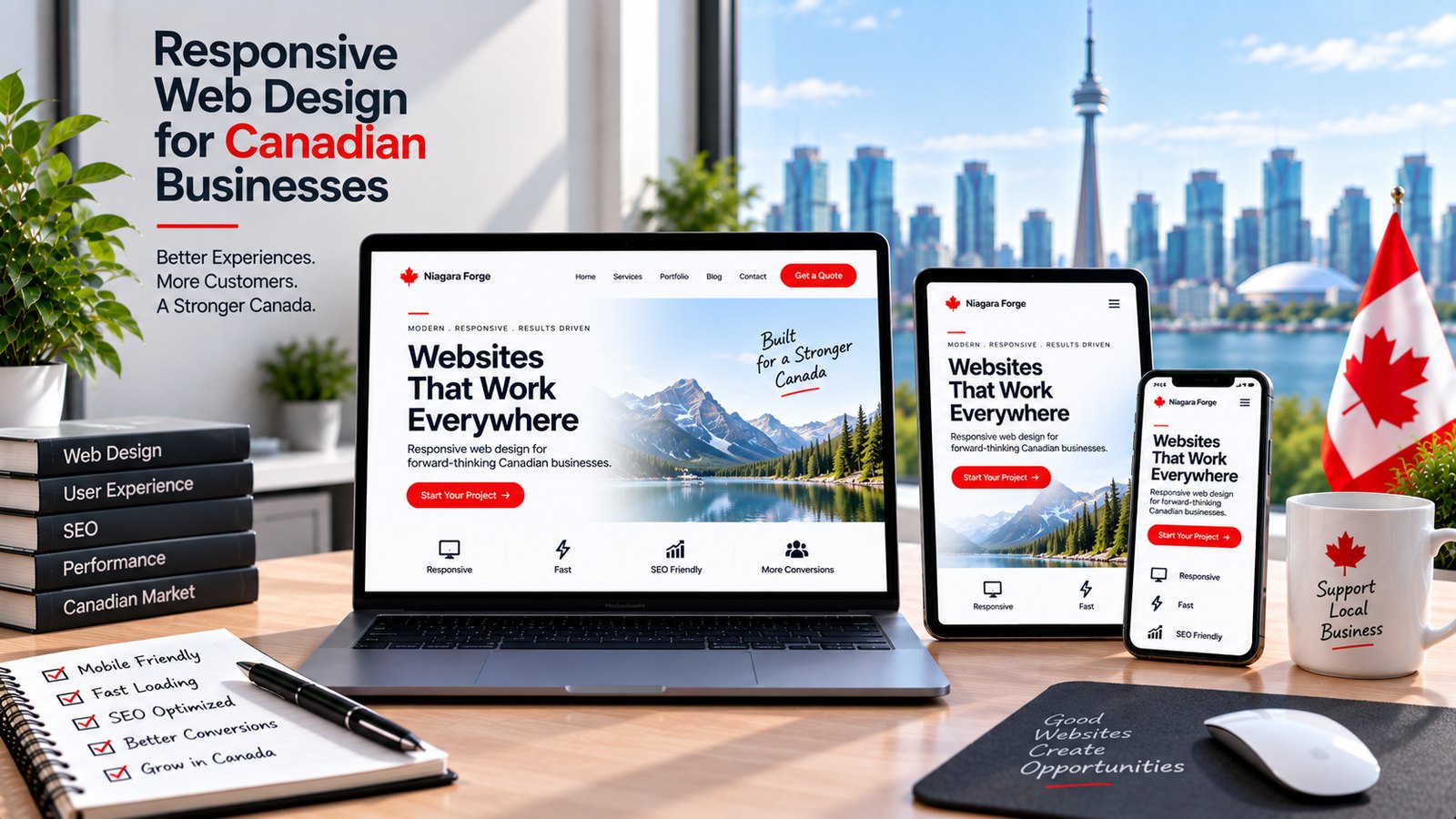
Why Canadian Businesses Need a Dedicated Responsive Design Checklist
For Canadian businesses, a generic web design checklist is insufficient. The country’s unique digital ecosystem—shaped by official bilingualism, vast geography, and distinct regional shopping habits—demands a tailored approach. A dedicated responsive web design checklist for Canadian businesses ensures your site performs equally well on a smartphone in downtown Toronto, a tablet in rural Quebec, or a laptop in Vancouver. Without this focus, you risk alienating a significant portion of your audience and losing ground to competitors who understand these local nuances.
Understanding the Canadian Digital Landscape
Canada is not a single market. It is a mosaic of provinces, languages, and consumer behaviours. Your checklist must account for:
- Dual-language requirements: English and French content must display correctly without layout breaks, especially for longer French text strings in navigation menus and buttons. Text truncation or overlapping elements are common failures when a responsive design is not tested for both languages.
- Regional e-commerce expectations: Shipping costs, GST/HST calculations, and return policies vary by province. A responsive checkout must accommodate these differences without forcing users to zoom or scroll horizontally.
- Device fragmentation: Canadians use a mix of iOS and Android devices, with varying screen sizes. Your checklist should include testing on older models, not just the latest flagship phones, because rural and remote areas often have slower adoption rates.
- Connectivity variability: From high-speed fibre in cities to limited LTE in northern regions, your responsive design must prioritize performance. Heavy images or unoptimized scripts that load slowly on 3G connections will frustrate users and increase bounce rates.
How Responsive Design Impacts Local SEO and Conversions
Google uses mobile-first indexing, meaning the search engine primarily uses your site’s mobile version for ranking and indexing. For Canadian businesses targeting local customers, this has direct consequences. A responsive design that fails on mobile will hurt your visibility in searches like “plumber near me” or “best coffee shop in Calgary.” The checklist must include:
- Tap-target sizing: Buttons and links should be at least 44×44 pixels to accommodate thumbs, reducing accidental clicks and increasing conversion rates.
- Local schema markup: Ensure your business address, phone number, and service area are visible and correctly formatted on mobile, as this data feeds into local pack results.
- Page speed optimization: Compress images and use lazy loading to keep load times under three seconds, which is critical for both SEO and user patience.
- Click-to-call functionality: For service-based businesses, a prominently placed phone number that initiates a call on mobile is a conversion driver. Test that this feature works across all browsers and devices.
Consequences of Ignoring Mobile-First User Behaviour in Canada
Canadian internet users are mobile-heavy. According to recent usage patterns, over 70% of web traffic in Canada comes from mobile devices, and the trend is rising. Ignoring this behaviour leads to tangible losses:
- High bounce rates: If a user lands on a page that requires pinch-zooming or horizontal scrolling, they will leave within seconds. Each abandoned visit is a lost opportunity for a sale, quote, or inquiry.
- Damaged brand trust: A broken mobile experience signals negligence. Canadian consumers, known for loyalty to local brands, will quickly switch to a competitor with a smooth interface.
- Poor accessibility compliance: Canadian businesses are increasingly held to accessibility standards (AODA in Ontario, for example). A non-responsive site often fails basic accessibility checks, exposing you to legal risk and public criticism.
- Lost bilingual audience: If your French pages render poorly on mobile, Francophone users will perceive your business as uninterested in serving them. This is a reputational cost that is difficult to reverse.
A dedicated responsive web design checklist for Canadian businesses is not a luxury—it is a strategic requirement. By addressing language, regional logistics, and mobile-first behaviour, you build a site that earns trust, ranks well, and converts visitors into loyal customers across all ten provinces.
Core Technical Foundations for Responsive Performance
For Canadian businesses, a responsive website is not a luxury—it is a prerequisite for reaching customers from downtown Toronto to rural Yukon. The technical foundation determines whether your site loads in under three seconds on a fibre connection or crawls on a 3G signal over a satellite link. Skipping these fundamentals leads to high bounce rates, lost conversions, and poor search rankings. Below are the non-negotiable elements every developer and business owner must verify.
Setting the Correct Viewport and Meta Tags
The viewport meta tag controls how your page renders on different screen widths. Without it, mobile browsers default to a desktop-width layout and zoom out, making text illegible and navigation frustrating. Place this tag in the <head> of every page:
<meta name="viewport" content="width=device-width, initial-scale=1.0">Beyond the viewport, confirm these meta tags are present and correctly formatted:
- Charset:
<meta charset="UTF-8">– ensures proper display of French accents and punctuation for Quebec audiences. - Title and Description: Unique per page, under 60 and 160 characters respectively, to avoid truncation in search results.
- Open Graph and Twitter Cards: Essential for social sharing of product pages or blog posts, especially when customers share via mobile apps.
- Canonical URL: Prevents duplicate content issues when your site is accessed via
www, non-www, or tracking parameters.
Test your viewport by using Chrome DevTools’ device toolbar or a real device. Do not rely on emulators alone—physical hardware reveals subtle rendering differences.
Implementing Fluid Grids and Breakpoint Strategy
A fluid grid uses relative units like percentages or fr (fractional units in CSS Grid) instead of fixed pixel widths. This ensures columns stretch and shrink with the viewport. For example, a three-column layout on desktop should collapse to a single column on a 320px-wide phone without horizontal scrolling.
Breakpoints are the specific viewport widths where your layout changes. Common choices include 480px, 768px, and 1024px, but do not chase device names—base them on your content. A better approach is to start with a mobile layout and use min-width media queries to progressively enhance for larger screens:
/* Base: single column for small screens */
.container { display: grid; grid-template-columns: 1fr; gap: 1rem; }

/* Tablet and up */
@media (min-width: 768px) {
  .container { grid-template-columns: 1fr 1fr; }
}

/* Desktop and up */
@media (min-width: 1024px) {
  .container { grid-template-columns: 1fr 1fr 1fr; }
}
Keep your breakpoint list short—two or three is usually enough. Overcomplicating with ten breakpoints increases maintenance and testing time. Also verify that interactive elements like buttons and form fields have a minimum touch target of 44×44 pixels, per accessibility guidelines, regardless of breakpoint.
Optimizing Images and Media for Variable Bandwidth
Images account for the largest share of page weight on most websites. A typical product photo of 2MB will destroy load times for a user on a rural DSL connection. Use the srcset attribute to serve different resolutions based on viewport, and pair it with the sizes attribute for precise control:
<img src="hero-small.jpg"
     srcset="hero-small.jpg 480w,
             hero-medium.jpg 768w,
             hero-large.jpg 1200w"
     sizes="(max-width: 600px) 100vw,
            (max-width: 1024px) 50vw,
            33vw"
     alt="Canadian landscape">
For bandwidth variability, adopt these practices:
| Media Type | Recommended Action | Why It Matters |
|---|---|---|
| JPEG/PNG | Compress to under 200KB per image; use WebP or AVIF where supported. | Reduces initial payload without visible quality loss. |
| Video | Provide multiple file sizes via <source>; use preload="none" for non-critical clips. |
Prevents auto-downloading large files on slow connections. |
| Icons and logos | Inline SVG instead of font icons or PNG. | Scalable, tiny file size, and no extra HTTP requests. |
| Background images | Use CSS media queries to load small images on mobile, larger on desktop. | Avoids fetching a 2000px image for a phone screen. |
Finally, set a performance budget. For example, target under 1MB total page weight on first load, or under 2.5 seconds on a simulated 3G connection. Use tools like Lighthouse or WebPageTest to measure—do not guess. If your business serves remote regions, test from a throttled connection profile regularly, not just on your office Wi-Fi. Every kilobyte saved improves the experience for a customer in a rural community.
Navigation and Usability for Canadian Audiences
For Canadian businesses, responsive design is not merely about shrinking a desktop layout. It is about adapting navigation and usability to the distinct realities of a vast, bilingual, and regionally diverse market. A user in downtown Toronto on a 5G connection has different immediate needs than a user in rural Newfoundland on a slower network. Your navigation must prioritize clarity, reduce friction, and respect the user’s context—whether they are looking for a store in Vancouver, a service area in the Prairies, or French-language support in Quebec. Below are the core usability components to audit.
Designing Mobile-First Menus and Hamburger Alternatives
The classic hamburger icon (three stacked lines) is familiar, but it hides critical navigation behind a tap and often reduces discoverability. For Canadian audiences, consider a bottom tab bar for primary actions (Home, Shop, Contact, Menu) on mobile. This places key choices within thumb reach—a proven pattern for e-commerce and service-based local businesses.
When a full menu is necessary, use a persistent “sticky” header with a visible “Menu” label rather than an icon alone. For multi-region businesses, do not bury province-specific information inside a generic menu. Instead, provide a visible “Location” or “Store Finder” link in the header. If you operate in Quebec, ensure the menu labels are available in French and that the language toggle is prominent, not relegated to a footer.
Alternatives to test:
- Scroll-triggered menus: Show a condensed navigation bar only when scrolling up, saving screen space.
- List-style index: For content-heavy sites (e.g., legal or financial services), use a single-column, expandable list with clear section headers instead of a hidden overlay.
- Search-first navigation: Place a search bar directly in the header for sites with many SKUs or service pages.
Placing High-Value CTAs Above the Fold
On a mobile screen, “above the fold” means the first 500–600 pixels. Do not waste this space on a large hero image or a generic welcome message. Your primary call-to-action (CTA) must answer the most common Canadian user intent: booking a service, calling your store, or finding a location.
For a local business (e.g., a plumber in Calgary), the CTA “Call Now” with a click-to-call link is critical. For an e-commerce retailer shipping nationwide, “Shop by Province” or “Free Shipping Over $75” works better. Place the CTA as a button, not a text link, with high contrast against the background. Avoid carousels or rotating banners that delay the CTA’s visibility.
Consider the following comparison for CTA placement:
| Business Type | Primary Mobile CTA (Above Fold) | Secondary CTA (Below Fold) |
|---|---|---|
| Local restaurant (Vancouver) | “Order Pickup” or “Reserve” | “View Menu” or “Hours” |
| Home services (Ontario-wide) | “Call for a Quote” | “See Service Areas” |
| E-commerce (Nationwide shipping) | “Shop Best Sellers” | “Track Order” |
The table demonstrates that the primary CTA should trigger immediate action, while secondary CTAs support exploration. Never place a newsletter signup or social media link above the fold for a transactional site.
Streamlining Forms for Quick Conversions on Small Screens
Canadian users abandon forms that require excessive typing, especially on mobile. The national average for form completion drops sharply with each additional field. Audit every form—contact, quote request, or checkout—and remove non-essential fields. For multi-province businesses, do not ask for “Province” as a free-text field; use a dropdown with the 10 provinces and 3 territories pre-sorted alphabetically.
Critical streamlining tactics:
- Use auto-detection for postal codes: Implement a field that accepts both “A1A 1A1” and “a1a1a1” formats without error, as Canadians often omit spaces.
- Enable phone number validation with country code: Default to +1, but allow editing for users near borders.
- Offer “Call Me Back” as an alternative: A simple name and phone field converts better than a full contact form for service businesses.
- Minimize required fields to three: Name, email, and message. For quote requests, add a single “Service Needed” dropdown.
Test your forms on a 320px-wide screen (e.g., iPhone SE). If a field label wraps awkwardly or the submit button is not visible without scrolling, your conversion rate will suffer. Finally, ensure error messages appear inline, in both English and French where applicable, and never trigger a full page reload that loses user input.
Bilingual and Cultural Considerations in Layout
For Canadian businesses, a responsive website must do more than resize gracefully. It must accommodate two official languages and a diverse cultural landscape. When a layout is designed primarily for English, switching to French can cause text to expand by up to 30%—or shrink unexpectedly—leading to clipped headings, overlapping buttons, or excessive white space. A truly responsive design treats language as a structural variable, not an afterthought. Below are the core considerations to keep your bilingual experience polished on every screen size.
Managing Text Length Variations Between English and French
French commonly uses longer words and phrases than English (e.g., “Submit” becomes “Soumettre” but “Contact us” becomes “Communiquez avec nous”). To prevent layout breakage, adopt these strategies:
- Set flexible containers: Avoid fixed-width buttons or cards. Use
min-widthwithmax-widthin CSS, and let padding absorb expansion. - Use CSS
hyphens: autofor long words in body text, but disable it for headings where readability matters more. - Design for the longer language first. Prototype in French to see the worst-case expansion, then verify English fits comfortably.
- Allow vertical growth: Never set a fixed height on text blocks, navigation bars, or call-to-action banners.
- Test at 320px width (small phones) and 768px (tablets) with both languages active to catch overflow early.
A practical CSS example for a language-aware button:
.btn {
  display: inline-block;
  padding: 0.75rem 1.5rem;
  white-space: normal; /* allows wrapping */
  overflow-wrap: break-word;
  max-width: 100%;
  box-sizing: border-box;
}
Implementing a Seamless Language Switcher
A language toggle should be instantly discoverable and never cause a jarring reload that resets the user’s scroll position or form inputs. Key requirements:
- Place the switcher in the header (top right on desktop) and in a persistent footer link on mobile—not hidden inside a hamburger menu.
- Use clear labels: “Français” and “English” (not just flags, which can be ambiguous for regions like Quebec or Acadian communities).
- Preserve the current page context: When toggling, redirect to the translated equivalent URL (e.g.,
/fr/produitsvs/en/products), not the homepage. - Maintain state: If a user has selected a language preference, store it in a cookie or
localStorageand apply it on subsequent visits. - Test the toggle on all breakpoints: Ensure the button remains tappable (minimum 44x44px touch target) and doesn’t overlap the logo.
For a single-page app, you can dynamically swap text via a simple JavaScript object, but for standard sites, use server-side redirects to avoid flash-of-untranslated-content. Always ensure the lang attribute updates to lang="fr" or lang="en" on the <html> element after switching—this is critical for screen readers and browser translation tools.
Using Culturally Relevant Visuals That Scale Across Devices
Imagery must resonate with Canadian audiences—from coast to coast, including urban and rural settings—without creating layout distortion. Follow these guidelines:
- Choose responsive images with
srcsetandsizes: This lets the browser download the correct resolution for the device, preventing blurry or oversized files. - Use
object-fit: coverfor hero images and thumbnails so cropping is consistent regardless of aspect ratio, but avoid cropping faces or key cultural symbols. - Select visuals that are neutral or regionally inclusive: Avoid imagery that assumes one climate (e.g., palm trees for BC) or one cultural practice (e.g., only poutine or maple leaves). Instead, show diverse people in everyday Canadian settings—winter sports, urban transit, agricultural landscapes—that scale well from a phone to a desktop.
- Provide text alternatives in both languages for icons and infographics: If an image contains English text, it must be replaced or localized for French—do not rely on overlays that may overflow on small screens.
- Test on high-density (Retina) and low-density screens: A culturally relevant photo that looks crisp on a desktop may pixelate on a budget Android; use vector SVGs for logos and simple icons.
Finally, remember that readability trumps decoration. A bilingual layout that forces users to zoom, scroll horizontally, or lose sight of a call-to-action will harm conversion rates. Run regular device tests with both languages active, and always ask: does the experience feel native in French and English? If yes, your responsive design is truly Canadian-ready.
E-Commerce and Checkout Responsiveness
For Canadian online retailers, a mobile-responsive storefront is not merely a convenience—it is the primary point of sale. Over half of all web traffic in Canada now originates from smartphones, and cart abandonment rates spike sharply when the checkout experience feels cramped or confusing. The following checklist focuses on the three most fragile areas of mobile e-commerce: product imagery, payment flow, and location-based data entry. Each element must be tested on a real device, not just a browser simulator, to ensure thumb-friendly navigation and minimal cognitive load.
Optimizing Product Images and Zoom for Touchscreens
Desktop users expect hover-to-zoom; mobile users expect pinch-to-zoom or tap-to-inspect. A common failure point is forcing shoppers to open a separate image viewer, which breaks their browsing rhythm. On a responsive product page, ensure that:
- Images are served in responsive
srcsetformats with appropriate compression (WebP or AVIF) to avoid slow load times on 4G or 5G connections. - The zoom gesture is native—use the browser’s built-in pinch zoom rather than a JavaScript overlay that may lag or trap the user.
- A dedicated “tap to enlarge” button is placed within 48px of the main image, with no overlapping text or buttons.
- Product thumbnails are horizontally swipeable, with a visible progress indicator (dots or a scroll bar) to signal more options.
- For high-margin items like furniture or electronics, include a 360-degree view that rotates via touch drag, but always fall back to a static high-resolution image if the interactive feature fails.
Test on both iOS Safari and Android Chrome, as touch event handling differs. Also, ensure that alt text is descriptive for screen readers, since many Canadian shoppers use assistive technology on mobile.
Simplifying Cart and Checkout with Mobile Payment Options
Canadian consumers have distinct payment preferences. While credit cards (Visa, Mastercard) dominate, Interac Online and Visa Debit are widely used for bank-linked transactions. A responsive checkout must reduce typing friction by integrating digital wallets and pre-fill tools. Prioritize the following:
| Payment Method | Mobile Integration Requirement |
|---|---|
| Apple Pay / Google Pay | One-tap purchase button on the cart summary and at the final step. Do not require a separate account creation. |
| Interac Online | Redirect to the bank’s mobile page, but ensure the return URL works without losing cart contents. |
| PayPal | Offer as a secondary option, with a “Pay with PayPal” button that does not force a full page reload. |
| Credit card | Auto-format card number, expiry, and CVV fields. Use a numeric keypad on input focus. |
Additionally, keep the cart summary sticky (but collapsible) at the bottom of the screen so users see the total without scrolling. Never hide shipping costs until the last step—this is the top reason for abandonment among Canadian shoppers. Provide a “guest checkout” link that is larger than the “create account” button, and allow users to save their email for a receipt without forcing a password.
Handling Provincial Taxes and Shipping Fields Responsively
Canada’s tax structure is not uniform: GST applies nationally, but PST or QST varies by province (e.g., Ontario’s HST, Quebec’s QST, Alberta’s no PST). A responsive form must automatically calculate taxes based on the shipping address, not a default province. This requires careful field design:
- Use a single “Province” dropdown that is pre-sorted alphabetically, with the most populous provinces (ON, QC, BC, AB) pinned to the top for faster selection.
- Shipping cost should recalculate instantly when the province changes, without requiring a page refresh. Use AJAX to update the order total in the sticky summary.
- For postal codes, enforce the Canadian format (e.g., K1A 0B1) with an automatic space insertion after the third character. Show a validation error immediately if the format is invalid, but allow a “ship to different address” toggle.
- Split the address into two lines: “Address” and “Apt/Suite/Unit” (optional). Keep the “City” field next to the province, not above it, to reduce vertical scrolling.
Finally, test with a Quebec address (which requires QST) and a Nunavut address (which has no PST but high shipping rates). Ensure that the tax breakdown is visible line-by-line—not lumped into a single “Total” field—so users trust the calculation. If you offer free shipping over a threshold, display a progress bar (e.g., “You’re $12 away from free shipping”) that updates as items are added or removed from the cart. This small touch reduces friction and increases average order value on mobile, where attention spans are shortest.
Content Readability and Accessibility Standards
For Canadian businesses, a responsive website must do more than resize gracefully on mobile devices. It must also ensure that every visitor—regardless of vision, motor ability, or cognitive processing—can read and navigate your content without friction. This dual focus on readability and accessibility is not merely a best practice; it is increasingly aligned with provincial accessibility legislation, such as the Accessibility for Ontarians with Disabilities Act (AODA) and the forthcoming Accessible Canada Act regulations. By prioritizing legible typography, adequate touch targets, and robust semantic markup, you reduce bounce rates, improve SEO signals, and protect your brand from legal risk. Below is a practical breakdown of the core standards to implement in your next design iteration.
Choosing Legible Font Sizes and Line Spacing
Text that is too small or cramped forces users to pinch-zoom, which breaks the fluidity of a responsive layout. For body copy, a minimum font size of 16 pixels (or 1rem) is the baseline for desktop, but on smaller screens consider 17–18 pixels to compensate for higher pixel density and increased viewing distance. Headings should scale hierarchically—use a fluid type scale (e.g., clamp(1.5rem, 4vw, 2.5rem) for H2s) so that titles never overflow their container.
Line spacing is equally critical. Set line-height to at least 1.5 for paragraphs and 1.3 for headings. This prevents text from overlapping when users increase browser zoom to 200%, a common assistive technique. Additionally, avoid justified text alignment, as it creates irregular gaps that hinder dyslexic readers. Left-aligned text with a ragged right edge is safer.
- Use relative units (rem, em, %) instead of fixed pixels for all font sizes.
- Test your site at 200% zoom to ensure no horizontal scrolling occurs.
- Keep paragraph width between 45–75 characters per line for comfortable scanning.
- Reserve decorative fonts for logos only; use system fonts or widely supported web fonts for body content.
Ensuring Touch Targets Meet Minimum Size Recommendations
On mobile and tablet devices, a finger is not as precise as a mouse cursor. If your buttons, links, or form fields are too small, users with tremors or low dexterity will accidentally tap the wrong element. The Web Content Accessibility Guidelines (WCAG) 2.2 suggest a minimum touch target of 24 by 24 CSS pixels, but for practical usability, aim for 44 by 44 pixels as recommended by Apple and Google. This includes interactive elements like checkboxes, accordion headers, and pagination arrows.
Spacing matters just as much as size. Even if a target is 44px wide, adding an 8px margin or padding between adjacent targets prevents mis-taps. For inline text links, ensure that the clickable area extends beyond the text itself—for example, by adding padding to the anchor tag. Avoid using only an icon without a text label, as icons alone are harder to hit and understand.
| Element Type | Minimum Target Size | Recommended Spacing |
|---|---|---|
| Primary buttons (e.g., “Add to Cart”) | 44px × 44px | 8px from adjacent buttons |
| Navigation menu links | 44px height | 16px vertical gap |
| Form checkboxes / radio buttons | 24px × 24px (visual), 44px hit area | 10px from label text |
| Close (X) icons | 44px × 44px | 12px from screen edge |
Implementing ARIA Labels and Keyboard Navigation
Many Canadian users rely on screen readers or keyboard-only navigation due to visual impairments or motor conditions. To support them, your responsive design must expose the same logical structure to assistive technologies as it does visually. Start by using native HTML elements—<button>, <a>, <input>—because they inherit keyboard behavior for free. When you must use non-semantic elements (e.g., a <div> styled as a dropdown), add role="button" and tabindex="0" to make them focusable.
ARIA (Accessible Rich Internet Applications) labels fill gaps where visible text is insufficient. For example, an icon-only search button needs an accessible name:
<button aria-label="Search the entire site">
  <svg>...</svg>
</button>
Keyboard navigation must follow a logical tab order that mirrors the visual layout. On mobile, where the DOM order often differs from the rendered order due to CSS grid or flexbox, verify that the tabindex sequence moves left-to-right and top-to-bottom. Implement visible focus indicators (e.g., a 2px outline with a contrasting color) that are not removed on :focus. Also, ensure that all interactive elements are reachable without a mouse, and that modal dialogs trap focus within them until closed. Finally, test with the Tab key alone—if you get stuck or skip content, your structure needs correction.
Testing Across Devices, Browsers, and Network Speeds
For Canadian businesses, a responsive website is not a one-time build—it is an ongoing commitment to user experience across a vast and varied landscape. From high-speed fibre in downtown Toronto to satellite or LTE connections in rural Yukon, your customers access your site under wildly different conditions. A robust testing protocol ensures your design holds up everywhere, preventing lost sales and frustrated visitors. The goal is to catch layout breaks, slow load times, and unresponsive elements before they cost you credibility.
Building a Device and Browser Testing Matrix
Start by creating a structured matrix that reflects your actual audience, not just the most popular devices globally. Canada’s browser and device mix has unique characteristics, including a significant share of Safari on iOS and Chrome on both Android and desktop. Your matrix should list every combination you will test, prioritized by your analytics data.
- Mobile phones: Include at least one recent iPhone (e.g., iPhone 15) and one mid-range Android (e.g., Pixel 7 or Samsung Galaxy A54) to cover both premium and budget rendering engines.
- Tablets: Test on an iPad (both portrait and landscape) and a common Android tablet like the Samsung Tab series. Ignore smaller tablets if your analytics show negligible traffic.
- Desktop and laptop screens: Cover a standard 1366×768 laptop, a 1920×1080 monitor, and a large 2560×1440 display to check for stretched layouts.
- Key browsers: Prioritize Chrome, Safari, and Firefox. Include Edge for Windows-based corporate users. Test both the latest two major versions of each.
- Operating systems: Verify against current iOS, Android, Windows, and macOS versions. Older OS versions often have different default font rendering and viewport handling.
Document each test case in a simple spreadsheet. For every page template (homepage, product page, checkout), record pass/fail status, screenshots of any issues, and the exact device and browser version used. This matrix becomes your regression baseline for future updates.
Using Responsive Design Checkers vs. Real-Device Testing
Responsive design checkers—browser developer tools and online emulators—are excellent for quick, iterative checks during development. They allow you to resize viewports instantly and inspect CSS breakpoints without leaving your desk. However, they are simulations. They cannot accurately replicate the physical characteristics of a real device, such as touch target precision, screen glare, or the way a browser handles hardware acceleration.
Real-device testing remains the gold standard for final validation. Here is how to balance the two:
| Method | Best For | Limitations |
|---|---|---|
| Emulators and checkers | Rapid layout checks, testing many viewport widths in minutes | No true rendering of touch gestures, camera, or native fonts |
| Physical devices | Final sign-off on critical user flows (e.g., checkout, forms) | Costly to maintain a large library, time-consuming to test manually |
| Cloud device farms | Accessing a wide range of devices without buying them | Requires subscription fees; network conditions are often simulated |
Adopt a hybrid approach: use emulators for every code change, but keep a physical “critical device” set (one phone, one tablet, one laptop) for weekly sanity checks. For comprehensive coverage before a major launch, consider a cloud service that provides real devices hosted remotely.
Simulating Low-Bandwidth and High-Latency Scenarios
Canadian internet speeds vary dramatically. A site that loads in one second on fibre may take eight seconds on a rural LTE connection, causing visitors to abandon it. You must test under constrained conditions, not just on your fast office network.
Use your browser’s developer tools to throttle network speed. Chrome’s DevTools, for example, offers presets like “Slow 3G” and “Fast 3G.” But these presets do not reflect real Canadian latency patterns. Instead, set custom profiles:
- Urban fibre: 100 Mbps download, 10 Mbps upload, 10 ms latency.
- Urban cable: 30 Mbps download, 5 Mbps upload, 25 ms latency.
- Rural LTE: 5 Mbps download, 1 Mbps upload, 80 ms latency.
- Remote satellite: 15 Mbps download, 3 Mbps upload, 600 ms latency (high packet loss).
While testing under these profiles, focus on three aspects: first contentful paint (when text appears), time to interactive (when buttons respond), and cumulative layout shift (elements jumping while images load). For low-bandwidth, check that your images use responsive srcset attributes so smaller screens download smaller files. For high latency, verify that critical CSS and JavaScript are minified and that third-party scripts (analytics, chat widgets) do not block rendering. Finally, test the entire checkout flow under the rural LTE profile—this is where Canadian businesses often lose customers due to impatient waiting on slow connections.
Performance Metrics and Core Web Vitals
For Canadian businesses, a responsive website is only as effective as its speed and stability on the devices your customers actually use. Google’s Core Web Vitals—Largest Contentful Paint (LCP), First Input Delay (FID), and Cumulative Layout Shift (CLS)—are not abstract scores. They directly measure user frustration: slow hero images, unresponsive buttons, and content that jumps mid-scroll. In a Canadian context, where users may be on 4G LTE in rural areas or congested urban Wi-Fi, these metrics become the difference between a completed sale and a closed tab. Importantly, responsive design influences these metrics structurally. A mobile-first layout that defers off-screen images, for example, improves LCP. A CSS grid that reserves space for dynamic elements prevents CLS. The checklist below focuses on measuring and optimizing these signals with Canadian hosting realities in mind.
Monitoring LCP, CLS, and INP on Mobile
Note: While First Input Delay (FID) is being replaced by Interaction to Next Paint (INP) in 2024, monitoring both is prudent for legacy data. You cannot improve what you do not measure. Use Google Search Console’s “Core Web Vitals” report, filtered by mobile, to see field data from real Canadian users. For lab testing, use PageSpeed Insights with a mobile emulation profile that mimics mid-tier Android hardware—a common device class in Canada. Focus on these thresholds:
- LCP: Target under 2.5 seconds. For Canadian businesses, the largest element is often a hero image or a product photo. Check if your server response time (TTFB) is slow due to distance from a data center in Toronto or Vancouver if your host is US-based.
- CLS: Keep below 0.1. On mobile, the most frequent cause is inserting ads or banners above the fold without reserved space. Audit your CSS for
font-display: swapand explicit width/height attributes on all images. - INP: Aim for under 200 milliseconds. This measures responsiveness to taps. Long JavaScript tasks on the main thread—common with heavy tracking scripts—will inflate INP. Test with a throttled CPU in Chrome DevTools.
For a practical workflow, set up a monthly automated Lighthouse CI run against your staging site, but always cross-reference with real-user monitoring (RUM) data from a tool like Cloudflare Web Analytics or a simple custom event in Google Analytics 4.
Leveraging Canadian CDNs and Edge Caching
Your hosting location matters, but a Content Delivery Network (CDN) with Canadian Points of Presence (PoPs) is non-negotiable. A CDN serves cached static assets—CSS, JavaScript, images—from a server geographically close to the user. For a user in Halifax, a CDN edge node in Montreal or Toronto will dramatically reduce network latency compared to a request traveling to a central US server. When selecting a CDN, verify their Canadian PoP coverage. Not all CDNs are equal; some only have one or two edge locations in Canada. Key configurations include:
- Edge caching for HTML: While many CDNs cache images and CSS by default, ensure your HTML pages are cached at the edge for anonymous users. This reduces TTFB, directly improving LCP.
- Cache-control headers: Set
Cache-Control: s-maxage=86400for static assets and usestale-while-revalidateto serve old content instantly while fetching fresh data. - Canadian-specific routing: Use a CDN that supports GeoDNS or Anycast routing to ensure a user in Vancouver does not get routed to a US West server if a Canadian PoP is available.
Avoid the temptation to cache personalized content (e.g., cart counts) at the edge. Instead, use an API request that loads after the initial LCP element.
Reducing JavaScript and CSS Payloads for Faster Loads
Heavy JavaScript is the primary enemy of both LCP and INP on mobile. A responsive theme often loads desktop-specific scripts that are unnecessary on a smaller viewport. For Canadian businesses, this is critical when users have limited data plans or older phones. Start with a payload audit. Use Chrome DevTools’ Coverage tab to find unused CSS and JS. Then, implement these strategies:
- Code-splitting: Use dynamic imports so that below-the-fold components (e.g., a product carousel) load only when scrolled into view.
- Critical CSS: Inline the CSS required for the above-the-fold content. Load the rest asynchronously with
media="print"trick orrel="preload". - Remove jQuery dependencies: If your site uses jQuery only for simple DOM manipulation, replace it with vanilla JavaScript. This can reduce payloads by 30-80 KB.
- Optimize font loading: Use
font-display: optionalfor local fonts or self-hosted subsets. Avoid loading multiple weights.
Finally, minify all CSS and JS in your build process. Gzip or Brotli compression on your Canadian server is expected, but ensure your CDN also applies Brotli for supported browsers.
| Metric | Good Threshold | Primary Responsive Fix | Canadian-Specific Action |
|---|---|---|---|
| LCP | < 2.5s | Preload hero image; lazy-load below-fold media | Use CDN with PoP in Toronto or Montreal |
| CLS | < 0.1 | Reserve space for ads/images; set aspect-ratio CSS | Test on 3G/4G throttling (Bell/Rogers networks) |
| INP/FID | < 200ms | Defer non-critical JS; break long tasks | Audit third-party scripts (e.g., Shopify apps) for regional latency |
After implementing these changes, re-measure on a real device over a Canadian cellular network, not just office Wi-Fi. Your responsive design is not complete until it passes these thresholds for the user in Yellowknife or St. John’s.
SEO and Local Search Integration for Multi-Region Sites
For Canadian businesses operating across provinces or serving both anglophone and francophone markets, responsive design is the structural foundation of local SEO—but it is only the beginning. A mobile-friendly site ensures Google can crawl and render your pages efficiently, yet without deliberate geo-targeting and structured data, your business risks appearing irrelevant in local results. The following practices bridge responsive UX with search visibility across Canada’s diverse regions.
Using Hreflang Tags for English and French Pages
Canada’s bilingual reality demands clear signals to search engines about language and regional targeting. Hreflang tags tell Google which version of a page to serve to users based on their language and location—critical when you maintain parallel English and French URLs. Without these tags, you may face duplicate content issues or serve the wrong language to a Quebec-based mobile user.
Implement hreflang in the “ of each page or in your XML sitemap. For a Canadian business with separate URLs for English (en) and French (fr), the code looks like this:
<link rel="alternate" hreflang="en-CA" href="https://www.example.ca/services" />
<link rel="alternate" hreflang="fr-CA" href="https://www.example.ca/fr/services" />
<link rel="alternate" hreflang="x-default" href="https://www.example.ca/services" />
Use `en-CA` and `fr-CA`—not generic `en` or `fr`—to signal Canadian variants. Also add a self-referencing hreflang tag on each page. A common pitfall is forgetting to link back to the alternate version from both pages; always include reciprocal tags.
Embedding Local Business Schema for Mobile Results
Structured data markup (schema.org) helps search engines display rich results—such as star ratings, hours, and click-to-call buttons—directly on mobile SERPs. For Canadian businesses, LocalBusiness schema with geo-coordinates is especially potent because it enables Google to match your listing to nearby queries even when the user omits your brand name.
On your responsive pages, embed JSON-LD in the “ or body. A minimal example for a Toronto-based business:
<script type="application/ld+json">
{
  "@context": "https://schema.org",
  "@type": "LocalBusiness",
  "name": "Maple Leaf Plumbing",
  "address": {
    "@type": "PostalAddress",
    "streetAddress": "123 King St W",
    "addressLocality": "Toronto",
    "addressRegion": "ON",
    "postalCode": "M5V 1K1",
    "addressCountry": "CA"
  },
  "geo": {
    "@type": "GeoCoordinates",
    "latitude": 43.6445,
    "longitude": -79.3836
  },
  "telephone": "+1-416-555-0199",
  "openingHours": "Mo-Fr 08:00-18:00",
  "priceRange": "$$"
}
</script>
Validate your markup with Google’s Rich Results Test. Avoid using multiple schema types (e.g., both `LocalBusiness` and `Organization`) on the same page—this confuses crawlers. Instead, use `@type` as a single parent class and add properties like `areaServed` for province-wide service.
Aligning Content with Province-Specific Search Intent
Responsive design ensures your content displays well, but the words themselves must reflect local nuances. Canadian search behaviour varies by province—a query like “plumber emergency” in Alberta may imply oilfield-related work, while in Nova Scotia it might relate to coastal home repairs. Your mobile pages should mirror these distinctions.
- Use province-named headings and body copy: Write “serving British Columbia’s Lower Mainland” instead of “serving Western Canada.”
- Include regional testimonials or case studies: A quote from a client in Saskatoon builds trust and reinforces local relevance.
- Adjust for seasonal and regulatory differences: For example, mention “winter tire installation” in Ontario pages but “frost-proof outdoor faucets” in Manitoba content.
- Leverage local units of measurement: Use kilometres, Celsius, and litres—not miles or Fahrenheit—to align with Canadian expectations.
To operationalize this, create a content matrix per province. For each service page, list the top three local search terms, related schema properties (e.g., `areaServed` with province codes), and a unique paragraph addressing regional pain points. This ensures your responsive pages don’t just resize—they resonate with the searcher’s immediate context, improving click-through rates and dwell time, both of which feed back into local rankings.
Launch Checklist and Ongoing Maintenance
Crossing the finish line with a responsive website is not a one-time event. For Canadian businesses, where users switch between mobile, tablet, and desktop throughout the day, a launch is merely the start of a continuous cycle of refinement. A disciplined pre-launch review followed by a structured post-launch monitoring plan ensures your investment remains resilient against shifting user expectations, browser updates, and new device form factors. Below is a practical framework to guide you from final testing to long-term stewardship.
Pre-Launch QA Checklist for Responsive Elements
Before you flip the switch, verify that every layout adapts gracefully, not just on popular simulators but on real hardware. Use a combination of browser developer tools and physical devices to catch inconsistencies. Work through this checklist systematically:
- Breakpoint behavior: Confirm that text does not overflow, images scale without distortion, and sidebars stack correctly at 320px, 375px, 768px, and 1024px widths.
- Touch targets: Ensure buttons and links are at least 44×44 pixels, with adequate spacing to prevent accidental taps—especially for e-commerce checkout flows.
- Form fields: Test that input types (email, tel, postal code) trigger the correct mobile keyboard. Also, verify autofill and validation messages are readable without zooming.
- Navigation: Check that hamburger menus, filters, and accordions open and close smoothly, and that the active state is visible in both portrait and landscape orientations.
- Media and performance: Confirm lazy-loaded images render correctly, videos do not block the first paint, and that no horizontal scrolling occurs on any viewport.
- Cross-browser consistency: Test on the latest versions of Safari (iOS), Chrome, Firefox, and Edge, including older versions still used by Canadian public sector clients.
If your site uses geolocation for store locators or delivery options, test that permission prompts appear correctly on mobile and do not break the layout when dismissed. Also, verify that all third-party scripts (chat widgets, analytics) do not shift page content after load.
Setting Up Analytics to Track Mobile Conversions
Default analytics often hide the full picture. To understand how Canadian users convert, configure goals and segments that isolate device type, screen size, and connection speed. Start by defining your key actions—such as phone calls, form submissions, or online purchases—then create custom events for each. For example, a click-to-call button should send an event with the label “tap-to-call” to distinguish it from desktop clicks.
Next, enable enhanced e-commerce if you sell products, and set up viewport-based segments: “Small mobile (under 375px),” “Large mobile (376px–767px),” “Tablet (768px–1023px),” and “Desktop (1024px+).” This granularity reveals whether your mobile users abandon at the shipping step or struggle with the payment form. Also, track page load time by device category using the Site Speed report, as slower 3G connections in rural areas may need leaner assets. Finally, create a custom dashboard that shows mobile conversion rate, bounce rate, and average session duration side by side—review it weekly for the first month after launch.
Scheduling Quarterly Responsive Design Audits
Responsive design degrades silently. New browser versions, OS updates, and even seasonal content changes can introduce layout shifts. A quarterly audit keeps your site aligned with Canadian user behavior. Set a recurring calendar reminder for the first week of each fiscal quarter, and follow this audit flow:
- Device inventory review: Check your analytics to see the top 10 devices used by Canadians. If a new phone model (e.g., a foldable or a larger iPhone) appears, test your site on it.
- Manual visual sweep: Use a responsive viewer tool to capture screenshots at key breakpoints. Look for overlapping text, cropped images, or sticky elements that cover content.
- Performance re-test: Run a Lighthouse test for mobile. If your Largest Contentful Paint exceeds 2.5 seconds, investigate new scripts or oversized hero images.
- Accessibility spot-check: Use a keyboard to tab through the mobile menu and forms. Ensure focus indicators are visible and that touch gestures have non-touch alternatives.
- Feedback review: Read recent customer service tickets and app store comments—if users mention “the site is broken on my phone,” replicate their device and resolve the issue.
Document findings in a shared log, and prioritize fixes based on impact. Schedule a small buffer of development time each quarter to address these issues before they compound into lost conversions. By treating maintenance as a routine, your responsive site will remain a dependable asset for every Canadian visitor.
Frequently Asked Questions
Why is responsive web design important for Canadian businesses?
Responsive web design ensures your website adapts to any device, providing an optimal viewing experience. In Canada, over 70% of web traffic comes from mobile devices, and Google uses mobile-first indexing, meaning the mobile version of your site is the primary basis for ranking. A responsive site improves user experience, reduces bounce rates, and boosts SEO, helping you reach more customers across the country.
What are the key elements of a responsive web design checklist?
Key elements include flexible grid layouts, fluid images, CSS media queries, mobile-first approach, touch-friendly navigation, readable font sizes, optimized page speed, and cross-device testing. Additionally, ensure forms are easy to fill on mobile, buttons are large enough to tap, and content is prioritized for smaller screens. These elements work together to create a seamless experience for all users.
How does responsive design affect SEO in Canada?
Responsive design directly impacts SEO because Google uses mobile-first indexing. A single responsive site consolidates your SEO signals, avoiding duplicate content issues from separate mobile sites. It also improves user experience metrics like dwell time and bounce rate, which are indirect ranking factors. For Canadian businesses, this means better visibility in local searches and higher chances of appearing in Google’s local pack.
What are common mistakes in responsive web design?
Common mistakes include hiding content on mobile, using fixed-width elements, ignoring touch targets, and failing to compress images. Also, not testing on real devices or neglecting to consider different screen orientations can lead to poor UX. Another mistake is using intrusive pop-ups that frustrate mobile users. Avoiding these errors ensures your responsive design truly serves your audience.
How can Canadian businesses test their website’s responsiveness?
You can use Google’s Mobile-Friendly Test, which checks if your pages are mobile-friendly and highlights issues. Also, use Chrome DevTools to simulate various devices, and tools like BrowserStack or Responsinator for cross-device testing. Additionally, analyze your Google Search Console data for mobile usability reports. Regularly testing ensures your site remains responsive as new devices emerge.
What is the role of page speed in responsive design?
Page speed is critical in responsive design because mobile users expect fast loading times. Google’s Page Experience signals include speed as a ranking factor. Techniques like image compression, lazy loading, and minimizing JavaScript can help. A fast responsive site reduces bounce rates and improves user satisfaction, which is especially important for Canadian businesses competing in a growing online market.
Does responsive design impact accessibility?
Yes, responsive design and accessibility go hand in hand. A responsive site should maintain proper contrast, resizable text, and keyboard navigation. It should also ensure that touch targets are large enough for users with motor impairments. Following WCAG guidelines while designing responsively ensures that all users, including those with disabilities, can access your content, which is both ethical and legally beneficial in Canada.
Should Canadian businesses use a separate mobile site instead of responsive design?
No, responsive design is generally recommended over separate mobile sites. It is more cost-effective, easier to maintain, and avoids SEO issues like duplicate content. Responsive design also provides a consistent experience across devices. While separate sites may allow for tailored content, they require more resources and can confuse users. Google also recommends responsive design as the best practice.
Sources and further reading
- Google Search Central: Mobile-First Indexing
- W3C: Mobile Web Best Practices
- MDN Web Docs: Responsive Design
- Statistics Canada: Internet and Digital Technology Use
- Web Content Accessibility Guidelines (WCAG) 2.1
- Google: PageSpeed Insights
- Google: Mobile-Friendly Test
- Think with Google: Mobile Marketing Insights
- Smashing Magazine: Responsive Web Design Guidelines
- A List Apart: Responsive Web Design
Need help with this topic?
Send us your details and we will contact you.