

Why Custom Web Design Matters for Canadian Businesses
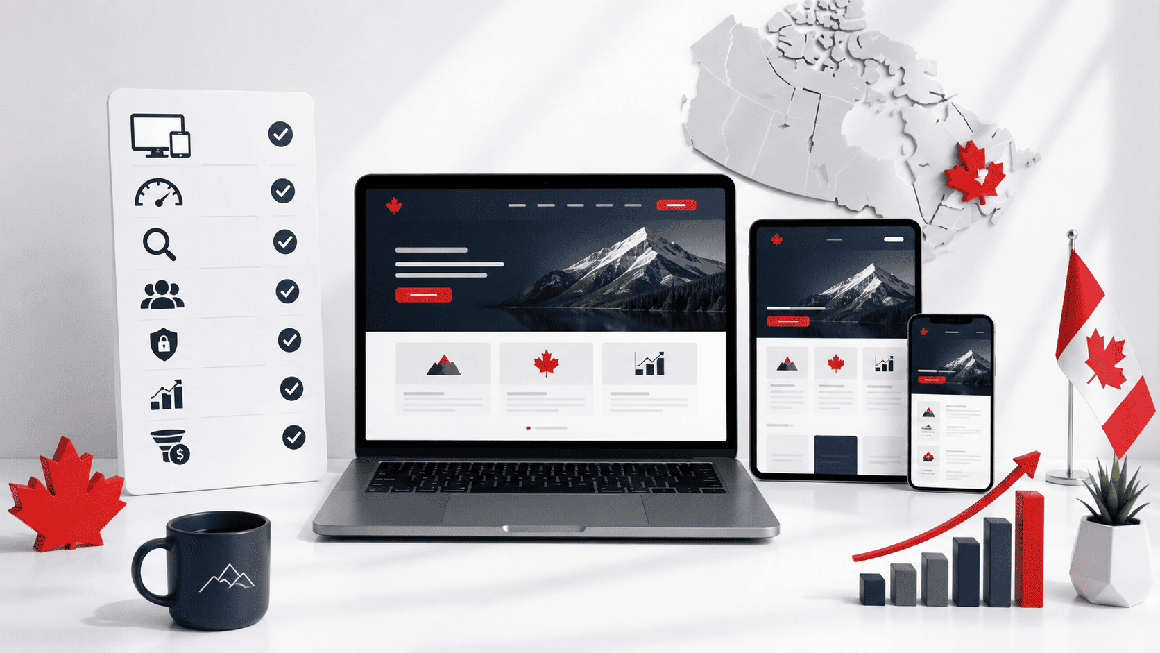
For Canadian businesses competing in a crowded digital landscape, the choice between a pre-built template and a custom-designed website is far more than an aesthetic decision. It is a strategic investment that directly impacts brand perception, customer acquisition, and long-term operational efficiency. While templates offer a quick and inexpensive starting point, they come with significant hidden costs—most notably, a lack of differentiation and the inability to adapt as your business evolves. Custom web design, by contrast, is built around your specific goals, your audience’s expectations, and the unique realities of the Canadian market. This approach ensures that your website does not merely exist but actively works to convert visitors into loyal customers, while also establishing a foundation for scalable growth.
The Limitations of Template-Based Websites
Template-based websites are engineered for mass appeal, not for individual business success. They are designed to be generic enough to serve a wide range of industries, which means they inevitably compromise on the very elements that make a brand memorable. For a Canadian business, these limitations manifest in several concrete ways:
- Lack of Brand Differentiation: Thousands of businesses may use the same template you select. This creates a “sameness” that erodes trust and makes it difficult for customers to recall your brand. When a visitor lands on your site, they should immediately understand what makes you different—not wonder if they have seen your layout before on a competitor’s page.
- Inflexible Layout and Functionality: Templates are built within a rigid framework. If your business model requires a unique booking system, a specialized product configurator, or a bilingual content structure (critical for English/French markets), you will likely hit a wall. Workarounds often involve clunky plugins or custom code that can break with updates, leading to downtime and a poor user experience.
- Performance Bloat: Many templates include a wide array of features and design elements that you do not need. This excess code slows page load times, which is a critical factor for both user experience and search engine rankings. Canadian consumers expect fast, responsive sites; a sluggish template can cost you conversions before a visitor even reads your content.
- Poor Accessibility and SEO Structure: Templates are rarely built with accessibility standards (like WCAG) or advanced SEO best practices in mind. This means you may struggle to reach all users, including those with disabilities, and you may find it difficult to rank for competitive keywords in your region. Custom development ensures that semantic HTML, proper heading hierarchy, and schema markup are implemented from the ground up.
Ultimately, a template is a compromise. You are fitting your business into a pre-existing mould, which often results in a website that feels impersonal and fails to communicate the quality of your products or services. For a Canadian business trying to build credibility in a market that values authenticity and reliability, this is a significant disadvantage.
How Custom Design Supports Long-Term Growth
Custom web design is not just about the initial launch; it is about creating a digital asset that grows with your business. Unlike a template, which may become outdated or unsupported, a custom-built site is a long-term investment in your operational agility. Here is how custom design supports sustainable growth:
| Growth Challenge | Template Limitation | Custom Solution |
|---|---|---|
| Adding new product lines or services | Requires forcing new content into existing page structures, often leading to awkward layouts. | Developers build scalable content models and modular components that allow for seamless expansion without redesign. |
| Expanding into new provinces or regions | Limited ability to create localized landing pages or manage multi-regional content efficiently. | Custom architecture supports geo-targeting, localized messaging, and integration with Canadian payment and shipping providers (e.g., Interac, Canada Post). |
| Integrating advanced marketing tools | Plugin conflicts and performance issues when adding complex CRM, email automation, or analytics tools. | Clean, custom code enables seamless API integrations and ensures that all marketing tools work in harmony. |
| Improving conversion rates over time | Making significant design or UX changes requires rebuilding sections within the template’s constraints. | Your team can iterate quickly, running A/B tests and refining user flows based on data, without being limited by a rigid theme. |
Furthermore, custom design allows you to prioritize performance from the start. Every image, script, and animation is chosen for a reason, resulting in faster load times and a smoother user journey. As your traffic grows, your site can handle increased demand without crashing or slowing down. This technical robustness is essential for seasonal peaks, such as Black Friday or the holiday shopping season, when Canadian consumers are actively comparing options online.
Another critical growth advantage is ownership. With a custom site, you own the code and the design outright. You are not locked into a proprietary platform or dependent on a template developer’s update schedule. This freedom means you can change developers, add new features, or pivot your digital strategy without losing your brand’s digital foundation. For a business planning for the next five to ten years, this level of control is invaluable.
Aligning Design with Canadian Consumer Trust
Canadian consumers have distinct expectations when they interact with a website. They are generally more privacy-conscious, value transparency, and expect a high standard of usability. Custom web design allows you to align your digital presence with these values, directly fostering trust and loyalty. Here are the key areas where custom design makes a measurable difference:
- Bilingual and Inclusive Content: Canada’s official languages are English and French. A custom site can be built with a robust bilingual framework, ensuring that both versions are equally functional and polished. This is not just about translation; it is about cultural nuance. A custom design allows you to structure content so that a French-speaking user in Quebec or New Brunswick has an experience that feels native, not like an afterthought.
- Clear Privacy and Security Signals: With PIPEDA (Personal Information Protection and Electronic Documents Act) as the governing law, Canadian consumers are aware of their data rights. Custom design lets you integrate clear cookie consent mechanisms, straightforward privacy policies, and secure checkout processes directly into the user experience. You can visually communicate your commitment to data protection, which is a powerful trust signal.
- Transparent Pricing and Contact Information: Canadian shoppers often research extensively before making a purchase. They expect to see clear pricing, shipping costs (including duties and taxes), and accessible customer service contact information. Custom design allows you to present this information prominently and logically, reducing friction and the anxiety of hidden costs. A template may force you to bury this information in a footer or behind multiple clicks.
- Mobile-First, Yet Accessible: While mobile usage is dominant, Canadian users also access websites from desktops and tablets. A custom design ensures a truly responsive experience across all devices, with touch targets that are appropriately sized and text that is legible without zooming. Moreover, custom development can prioritize WCAG 2.1 AA compliance, making your site usable for people with visual, auditory, or cognitive impairments. This inclusivity not only expands your audience but also demonstrates a commitment to social responsibility, which resonates with Canadian values.
- Localized Imagery and Messaging: Generic stock photos of American landscapes or non-Canadian settings can feel disconnected. Custom design gives you the freedom to use imagery that reflects Canada’s diverse regions, seasons, and communities. Whether you are showcasing a Vancouver skyline, a Prairie farm, or a Maritime fishing village, local relevance builds an immediate emotional connection with your audience.
Trust is not built on a single element; it is the cumulative effect of a website that feels reliable, secure, and respectful of the user’s time and data. Custom web design empowers you to control every touchpoint of that experience. From the moment a visitor lands on your homepage to the final checkout confirmation, you can ensure that your messaging, visual cues, and functional interactions all reinforce the credibility of your Canadian business. In a market where consumers have countless options, that level of intentional design is not a luxury—it is a competitive necessity.
Understanding Your Canadian Audience: Cultural and Regional Nuances
For Canadian businesses, a website is not a one-size-fits-all digital storefront. The country’s vast geography, dual official languages, and rich multicultural fabric mean that a design that resonates in Vancouver may fall flat in Montreal or Moncton. Custom web design best practices for Canadian businesses begin not with colour palettes or typography, but with a deep, empathetic understanding of the people who will visit your site. When you tailor your design to reflect regional identities, linguistic realities, and cultural expectations, you build trust, reduce friction, and create a user experience that feels genuinely local—even when your business operates nationally. This section explores how to navigate these nuances effectively, turning potential cultural missteps into competitive advantages.
Bilingual Considerations (English and French)
Canada’s Official Languages Act makes English and French equal in status within federal institutions, but for businesses, bilingualism is more than a legal obligation—it is a sign of respect and a practical driver of engagement. A custom web design that ignores French-speaking users in Quebec, New Brunswick, or parts of Ontario risks alienating a significant portion of the market. However, true bilingual design is not merely translating strings of text. It requires a structural approach that accounts for language expansion, cultural tone, and navigation logic.
First, consider text expansion. French text is typically 20% to 30% longer than its English equivalent. A button that reads “Get Started” in English becomes “Commencer” (shorter), but a phrase like “Learn More About Our Services” expands to “En savoir plus sur nos services.” Your layout must use flexible grids, not fixed-width columns, so that buttons, headers, and navigation menus do not break when switching languages. Avoid embedding text inside images; instead, use CSS and web fonts that support accented characters (é, è, à, ç) without rendering issues.
Second, decide on your language-switching mechanism. Best practice is a prominent, persistent toggle in the header—usually labelled “FR” or “EN”—that preserves the user’s current page context. Do not force users to return to the homepage to change languages. Use the lang attribute in your HTML to signal language changes to screen readers and search engines:
<html lang="fr">
<head>
  <meta charset="UTF-8">
  <title>Nos Services | Entreprise Exemple</title>
</head>
<body>
  <nav>
    <a href="/en/services" lang="en">English</a> |
    <span lang="fr">Français (actuel)</span>
  </nav>
</body>
</html>
Third, avoid literal translation. Canadian French differs from European French in vocabulary, idioms, and formality. For example, “courriel” is preferred over “email,” and “stationnement” over “parking.” Hire native Canadian French copywriters, not machine translation tools, to ensure your tone feels authentic. Also, be mindful of gender-neutral language, which is increasingly expected in Canadian French public-facing content. Finally, do not assume that bilingualism means 50/50 presentation. Some businesses may lead with French in Quebec, while others serve a predominantly English-speaking audience with French as a secondary option. Your design should allow for asymmetric weighting based on your target regions.
Regional Preferences and Localization
Canada’s regions are not monolithic. The Maritimes, Quebec, Ontario, the Prairies, British Columbia, and the North each have distinct economic drivers, cultural touchpoints, and even visual aesthetics. Custom web design best practices for Canadian businesses require you to localize beyond language—considering imagery, colour symbolism, and even seasonal references.
For instance, a home renovation company targeting Toronto might feature modern condominium interiors, while the same company serving Saskatchewan should showcase prairie-style bungalows and wide, open landscapes. Imagery matters: using a photo of downtown Vancouver’s skyline on a page aimed at St. John’s, Newfoundland, signals carelessness. Instead, create region-specific landing pages or at least swap hero images based on the user’s detected location (via IP geolocation) or a manual province selector.
Localization also extends to practical elements:
- Units of measurement: Use metric (metres, kilograms) consistently, but be aware that some construction or DIY audiences may expect imperial in casual contexts. Provide both where relevant.
- Currency and pricing: Show prices in Canadian dollars (CAD) with appropriate formatting (e.g., $1,250.00). Avoid assuming GST/HST rates are uniform; display pre-tax prices and note that taxes vary by province.
- Dates and addresses: Use YYYY-MM-DD or DD/MM/YYYY formats, and include province abbreviations (ON, QC, BC) in postal addresses. Never use US state abbreviations.
- Holidays and seasons: Acknowledge provincial holidays (e.g., Family Day in most provinces, St. Jean-Baptiste in Quebec, Civic Holiday in Ontario). Do not run a generic “President’s Day” sale—that is a US-centric misstep.
Consider a table to clarify regional differences that affect design decisions:
| Region | Design Consideration | Example |
|---|---|---|
| Quebec | Strong French-first identity; visual humour and bold colours are common. | Use a playful, vibrant palette for a Quebec-based food delivery service. |
| Prairies (AB, SK, MB) | Practical, straightforward aesthetics; emphasis on community and agriculture. | Showcase real farm imagery and clean, sans-serif typography for an equipment dealer. |
| Atlantic Canada | Coastal, maritime themes; slower, more personal tone. | Incorporate ocean blues and warm, human-centred copy for a tourism site. |
| British Columbia | West-coast modernism; sustainability and outdoor lifestyle focus. | Use natural greens, earthy neutrals, and ample whitespace for a wellness brand. |
Finally, remember that localization is not static. A user in Yellowknife may have different internet speeds than one in downtown Toronto. Optimize images with responsive breakpoints, and consider offering a “lite” version of your site for low-bandwidth areas. This level of attention signals that you understand the lived realities of Canadians from coast to coast.
Inclusive Design for a Multicultural Market
Canada is one of the most ethnically diverse countries in the world, with over 20% of the population born outside its borders. In cities like Toronto, Vancouver, and Montreal, more than 40% of residents are visible minorities. Custom web design best practices for Canadian businesses must therefore prioritize inclusive design—not as an afterthought, but as a core principle that shapes imagery, language, and accessibility.
Start with visual representation. Avoid stock photos that depict only one demographic or that stereotype roles. Instead, use authentic imagery that reflects the actual diversity of your customer base: multi-generational families, people of various skin tones, religious attire (e.g., hijabs, turbans), and diverse abilities. Ensure that your photo library includes people with disabilities in professional and everyday settings, not just in “inspirational” contexts. A website that mirrors the reality of Canadian streets builds instant relatability.
Inclusive design also means considering cultural norms around interaction. For example, some cultures prefer indirect communication and may respond better to softer calls-to-action (“We invite you to learn more”) versus aggressive, imperative phrasing (“Buy now!”). Similarly, be mindful of colour connotations: white is associated with purity in some cultures but mourning in others; red may signify luck in Chinese-Canadian communities but danger in Western contexts. Do not over-index on these associations, but avoid obviously offensive combinations.
Accessibility is a non-negotiable pillar of inclusivity. The Accessibility for Ontarians with Disabilities Act (AODA) and similar provincial legislation set standards that go beyond basic WCAG compliance. Your design should:
- Provide sufficient colour contrast (at least 4.5:1 for normal text).
- Support keyboard navigation for all interactive elements.
- Include alt text for images that conveys meaning, not just description.
- Offer transcripts for video and audio content.
- Use semantic HTML (header, nav, main, footer) to help screen readers.
Beyond legal compliance, consider cognitive inclusivity. Write in plain language—avoid jargon, acronyms, and complex sentence structures. For a multicultural audience where many users may be second-language speakers of English or French, clarity is kindness. Use icons alongside text labels for navigation, but ensure the icons are universally understood (e.g., a magnifying glass for search, a house for home). Test your design with users from diverse linguistic backgrounds to uncover subtle misunderstandings.
Finally, do not forget multicultural events and calendars. While Christmas and Canada Day are widely celebrated, your audience may also observe Diwali, Lunar New Year, Eid, or Vaisakhi. A custom design that occasionally acknowledges these occasions—through a banner, a blog post, or a seasonal promotion—demonstrates cultural fluency. However, avoid performative gestures; ensure that any such acknowledgement is genuine and linked to actual offerings, not just a decorative graphic.
In summary, understanding your Canadian audience is not a single task but an ongoing commitment. By weaving bilingual functionality, regional localization, and inclusive design into your custom web development process, you create a digital space that feels like home to a remarkably diverse population. That feeling of being understood is the ultimate driver of loyalty, conversion, and long-term success in the Canadian market.
Custom Web Design Best Practices for Canadian Businesses: Mobile-First and Responsive Design as a Non-Negotiable
For Canadian businesses, the path to customer engagement runs directly through the smartphone. The days of designing a desktop website and then shrinking it to fit smaller screens are over. Today, a mobile-first approach is not merely a technical preference; it is a fundamental business requirement. When a potential customer in Vancouver, Toronto, or Halifax searches for your product or service, their first interaction is likely on a device that fits in their palm. If that experience is clunky, slow, or difficult to navigate, they will move to a competitor without hesitation. This section outlines why mobile-first design is non-negotiable for Canadian businesses and provides a practical framework for implementing it effectively.
Mobile Usage Statistics in Canada
The data from Canadian digital behavior makes a compelling case. Canada consistently ranks among the top countries for smartphone penetration and daily mobile internet usage. Recent reports from the Canadian Radio-television and Telecommunications Commission (CRTC) and independent analytics firms indicate that over 85% of Canadians aged 15 and older own a smartphone. More critically, mobile devices account for a significant majority of all web traffic in the country—often exceeding 60% of total page views, with some sectors like retail and food service seeing figures closer to 70-75%.
This is not just about browsing. Canadians use their phones to complete complex transactions, compare prices, read reviews, and make final purchasing decisions. The “mobile-only” user is a growing demographic, particularly among younger Canadians (ages 18-34), many of whom rarely use a desktop computer for personal tasks. Furthermore, mobile usage spikes during commutes, lunch breaks, and evening hours, meaning your website must perform flawlessly at all times of day. Ignoring these statistics means ignoring the primary channel through which your customers find and evaluate your business. A desktop-only mindset will alienate the majority of your potential audience and severely limit your reach across Canada’s competitive digital landscape.
Key Principles of Mobile-First Design
Adopting a mobile-first philosophy changes how you approach the entire design process. Instead of starting with a wide canvas and adding content, you begin with the smallest screen and the most constrained environment. This forces prioritization and clarity. The following principles are central to this approach:
- Content Hierarchy and Prioritization: On a mobile screen, space is precious. You cannot display everything at once. Mobile-first design forces you to ask: “What is the single most important action or piece of information for the user?” For a Canadian restaurant, that might be the “Reserve a Table” or “View Menu” button. For a professional service firm, it might be a clear phone number or a “Get a Quote” form. Everything else becomes secondary and is placed deeper in the navigation or below the fold. Start with the core message and value proposition, then layer in supporting details.
- Thumb-Friendly Navigation and Touch Targets: Users hold their phones in one hand, navigating primarily with their thumb. Design interactive elements—buttons, links, form fields—to be at least 44×44 pixels in size, which is the minimum recommended by Apple and widely accepted in UX research. Place primary actions within the lower third of the screen, where the thumb naturally rests. Avoid hover-dependent interactions, which do not exist on touchscreens. Instead, use clear, visible tap states and provide immediate visual feedback when a button is pressed.
- Performance and Speed Optimization: Mobile users are often on cellular networks, which can be slower and less stable than wired connections. A mobile-first design prioritizes performance. This means compressing images (using modern formats like WebP), minifying CSS and JavaScript, leveraging browser caching, and minimizing the number of HTTP requests. Google’s Core Web Vitals—specifically Largest Contentful Paint (LCP), First Input Delay (FID), and Cumulative Layout Shift (CLS)—are critical metrics. Aim for an LCP of under 2.5 seconds. A fast-loading site not only improves user experience but also directly impacts your search engine ranking on Google.
- Simplified Forms and Input: Filling out a form on a phone is tedious. Every field you add is a potential point of friction. Mobile-first design streamlines forms to only ask for essential information. Use appropriate input types (e.g.,
type="tel"for phone numbers,type="email"for email addresses) to trigger the correct keyboard on a mobile device. Implement features like autocomplete and large, clearly labeled fields to reduce errors and speed up completion. Consider breaking long forms into smaller, multi-step segments to make the process less daunting. - Readable Typography and Spacing: Small text is a common mobile usability killer. Set your base font size to at least 16 pixels to prevent iOS and Android from auto-zooming. Maintain a comfortable line height (1.5x the font size is a good rule) and ensure sufficient spacing between text blocks and interactive elements. Do not rely on side-by-side columns for text; use a single column layout that allows for easy vertical scrolling. Ensure that text resizes gracefully across different screen widths without breaking the layout.
Testing Across Devices and Screen Sizes
Even the most carefully designed mobile-first layout can fail if it is not rigorously tested. The Canadian market is diverse, with users accessing the web on a wide array of devices—from older Android handsets to the latest iPhones, plus tablets and foldable phones. You cannot assume that your design will look and function perfectly everywhere. A comprehensive testing strategy is essential to catch layout bugs, performance issues, and usability problems before they affect your customers.
Testing should occur at multiple stages of development and continue after launch. Start with responsive design testing tools available in browser developer consoles (e.g., Google Chrome’s DevTools). These allow you to simulate various screen widths and test your breakpoints. However, these simulations are not a substitute for real-device testing. Physical devices reveal issues with touch responsiveness, screen glare, actual rendering speeds, and the behavior of specific browsers (like Safari on iOS versus Chrome on Android).
Consider the following comparison of testing approaches to build a robust quality assurance process:
| Testing Method | Primary Use | Key Advantages | Limitations |
|---|---|---|---|
| Browser Developer Tools (Responsive Mode) | Quickly checking layout at various standard viewport widths (e.g., 360px, 768px, 1024px). | Fast, free, no additional hardware needed. Useful for catching major CSS breakpoint failures. | Does not accurately simulate real device performance, touch interactions, or browser-specific rendering quirks. |
| Cloud-Based Device Emulators (e.g., BrowserStack, Sauce Labs) | Testing on a wide range of virtual devices and OS/browser combinations without owning physical hardware. | Access to hundreds of device profiles; allows for automated screenshot comparisons and cross-browser testing. Scalable for teams. | Requires a subscription. Emulation is still an approximation; may not catch subtle hardware or OS-specific issues (e.g., battery drain, thermal throttling). |
| Physical Device Testing (In-House Device Lab) | Validating real-world performance, touch targets, and usability on actual smartphones and tablets. | Most accurate representation of user experience. Allows you to test network conditions (3G, 4G, 5G), screen brightness, and physical handling. | High upfront cost and maintenance. Limited coverage of the vast number of devices available in the market. |
| Real User Monitoring (RUM) Tools (e.g., Google Analytics, New Relic) | Tracking actual performance and user behavior on your live site, post-launch. | Provides data on real-world load times, device types, and user interactions across Canada. Identifies issues you may have missed. | Requires implementation and ongoing analysis. Only shows data from users who have already visited; does not help during initial development. |
A practical testing workflow combines all four methods. Use developer tools for early-stage checks, cloud emulators for broad compatibility sweeps, a small set of physical devices (at minimum, one low-end Android and one recent iPhone) for final validation, and RUM tools to monitor ongoing performance. Pay special attention to how your site behaves on slower 3G or 4G connections, which are common in rural parts of Canada. Also, test with popular accessibility tools like screen readers to ensure your mobile site is usable by all Canadians, including those with disabilities.
Ultimately, mobile-first design is a continuous commitment, not a one-time project. As new devices and browser versions are released, your testing must evolve. By prioritizing content, optimizing for touch and speed, and validating your work across the real-world ecosystem of devices used by Canadians, you build a web experience that is not just responsive, but genuinely responsive to the needs of your customers. This investment directly translates into higher engagement, lower bounce rates, and increased conversions, solidifying your competitive edge in the Canadian digital marketplace.
Accessibility and Inclusive Design (AODA Compliance)
For Canadian businesses, web accessibility is not merely a legal obligation—it is a strategic advantage. The Accessibility for Ontarians with Disabilities Act (AODA) and the broader Accessible Canada Act (ACA) set clear expectations for digital content, and failing to meet these standards can result in fines, legal challenges, and reputational damage. However, the deeper value lies in reaching the over 6 million Canadians living with a disability, many of whom face barriers daily when navigating poorly designed websites. Custom web design best practices for Canadian businesses must therefore treat accessibility as a foundational principle, not an afterthought. By embedding inclusive design from the first wireframe, you create a site that works for everyone—including those using assistive technologies, older users with declining vision, and people on mobile devices in bright sunlight. This section outlines the core requirements, practical implementation strategies, and common pitfalls to avoid when building an accessible, AODA-compliant website.
Overview of AODA and WCAG Requirements
The AODA, enacted in 2005, mandates that all public and private organizations in Ontario with 50 or more employees must comply with the Web Content Accessibility Guidelines (WCAG) 2.0 at Level AA. As of January 1, 2021, all websites and web content published after January 1, 2012 must meet these standards. The Accessible Canada Act, which came into force in 2019, extends similar expectations to federally regulated entities, reinforcing the need for a national approach to digital inclusion. While WCAG 2.1 and 2.2 have since updated the guidelines, AODA currently references WCAG 2.0, but forward-thinking businesses should aim for the latest version to future-proof their sites.
WCAG is organized around four principles: Perceivable, Operable, Understandable, and Robust (POUR). Under each principle lie specific success criteria, with Level A being the minimum and Level AA being the target for most organizations. Key Level AA requirements include:
- Text alternatives for all non-text content (e.g., images, charts, icons).
- Captions and audio descriptions for multimedia.
- Contrast ratio of at least 4.5:1 for normal text and 3:1 for large text.
- Keyboard-accessible navigation with no keyboard traps.
- Consistent navigation and predictable page functionality.
- Error identification and suggestions for form input.
To integrate these requirements from the start, begin by conducting an accessibility audit of your existing site or creating a detailed checklist for new builds. Use automated tools like WAVE or axe to catch obvious issues, but remember that automated testing only identifies about 30–40% of problems. Manual testing with real users, including those who rely on screen readers, is essential. When writing custom code, follow semantic HTML5—use <header>, <nav>, <main>, and <footer> to structure your page, and ensure every interactive element has a programmatic label. This provides a solid foundation that reduces remediation costs later.
Designing for Screen Readers and Keyboard Navigation
Screen readers convert on-screen text into synthesized speech or Braille, and they depend on a logical document structure to convey meaning. A common mistake is using <div> elements with click handlers instead of native buttons or links. Screen reader users navigate by headings, landmarks, and links, so if your design relies on visual cues alone, it becomes unusable. Start by defining a clear heading hierarchy (one <h1> per page, followed by <h2> and <h3> subheadings) that mirrors your content outline. Never skip levels for visual styling—use CSS to adjust size instead.
Keyboard navigation is equally critical. Many users with motor impairments cannot use a mouse, so every action—clicking, scrolling, expanding menus, closing modals—must be operable via the Tab, Enter, Space, and Escape keys. Ensure the tab order follows the visual order of the page, and add a visible focus indicator (e.g., a 2px outline) that appears when an element receives focus. Avoid using tabindex="-1" on interactive elements unless you are managing focus programmatically for a modal or a complex widget. One practical example for custom JavaScript is to trap focus within a modal dialog:
// Trap focus inside modal for keyboard users
function trapFocus(modal) {
  const focusable = modal.querySelectorAll('a[href], button:not([disabled]), input:not([disabled]), select, textarea, [tabindex]:not([tabindex="-1"])');
  const first = focusable[0];
  const last = focusable[focusable.length - 1];
  modal.addEventListener('keydown', (e) => {
    if (e.key === 'Tab') {
      if (e.shiftKey && document.activeElement === first) {
        e.preventDefault();
        last.focus();
      } else if (!e.shiftKey && document.activeElement === last) {
        e.preventDefault();
        first.focus();
      }
    }
    if (e.key === 'Escape') {
      closeModal();
    }
  });
}
Also, provide skip navigation links at the top of the page so keyboard users can jump directly to main content without tabbing through every menu item. When building custom navigation, use ARIA roles sparingly—only when native HTML elements cannot express the behavior. For example, a hamburger menu should use a <button> with aria-expanded="true" or "false" to indicate state, and the menu itself should be a navigation region with a descriptive label. Test with real screen readers like NVDA (Windows) or VoiceOver (macOS) to ensure announcements make sense in context.
Creating Accessible Forms and Color Contrast
Forms are among the most common points of failure for accessibility. Users with visual impairments, cognitive disabilities, or motor challenges often struggle with forms that lack clear labels, instructions, and error recovery. For every input, select, and textarea, provide a visible <label> element associated via the for attribute. Placeholder text alone is insufficient—it disappears when typing and often has low contrast. Group related fields with <fieldset> and <legend>, especially for radio buttons and checkboxes, so screen readers announce the group context. For error messages, use aria-describedby to link the input to a descriptive error text, and set aria-invalid="true" on the field. Avoid color-only indicators (e.g., red borders); add an icon or text message like “Please enter a valid email address.”
Color contrast is a visual accessibility requirement with measurable standards. WCAG 2.0 Level AA mandates a contrast ratio of at least 4.5:1 for body text and 3:1 for large text (18pt or 14pt bold) and UI components. Many custom designs fail here because they use light gray text on white backgrounds or subtle hover states. Use a contrast checker like WebAIM’s Contrast Checker during the design phase, not after development. For example, a common palette of #767676 (gray) on #FFFFFF (white) yields a ratio of 4.54:1—just passing for normal text, but risky for smaller fonts. For interactive elements like buttons, ensure the border or background contrasts with adjacent colors, and do not rely solely on color to convey state (e.g., a red asterisk for required fields). Also consider users with color blindness: avoid red/green combinations for status indicators; instead, pair colors with text or icons.
To integrate these practices from the start, create a design token system that includes contrast-safe color pairs. For example, define primary text as #1A1A1A, secondary as #4D4D4D, and accent colors that pass 3:1 against white. When you prototype, test with a grayscale filter to see if information is lost. Finally, remember that accessibility is not a one-time fix—schedule regular audits and involve users with disabilities in usability testing. By following these custom web design best practices for Canadian businesses, you not only comply with AODA but also build a more inclusive, user-friendly site that expands your audience and strengthens your brand reputation.
Performance Optimization for Canadian Users
For Canadian businesses, a beautifully designed website is only as effective as its performance. Users from St. John’s to Vancouver Island expect pages to load almost instantly, and any delay directly impacts engagement, conversion rates, and search rankings. However, optimizing for Canadian users is not a one-size-fits-all task. The country’s vast geography, coupled with varying internet infrastructure—from high-speed fibre in downtown Toronto to satellite or slower DSL in rural and northern communities—demands a deliberate, performance-first approach. By adhering to custom web design best practices for Canadian businesses, you ensure that every visitor, regardless of their location, receives a fast, reliable, and frustration-free experience. This section outlines the critical performance levers you must pull, focusing on measurable benchmarks, asset optimization, and strategic content delivery.
Core Web Vitals and Page Speed Benchmarks
Google’s Core Web Vitals are the industry-standard metrics for user experience, and they are non-negotiable for any serious Canadian website. These metrics measure real-world loading speed, visual stability, and interactivity. For Canadian businesses, targeting these benchmarks is essential because they directly correlate with both user satisfaction and organic search visibility. You should track and optimize for the following three primary signals:
- Largest Contentful Paint (LCP): Measures loading performance. This should occur within 2.5 seconds of the page starting to load. For Canadian users on slower connections, this means prioritizing the hero image, headline, or key product visual above all else.
- Interaction to Next Paint (INP): Measures responsiveness. Your page should have an INP of 200 milliseconds or less. This ensures that when a user clicks a button or taps a menu, the browser responds immediately, which is critical for e-commerce interactions on mobile devices.
- Cumulative Layout Shift (CLS): Measures visual stability. Keep your CLS score below 0.1. Unexpected shifts in page elements (like images loading late or fonts swapping) are a primary cause of misclicks and user frustration, especially on content-heavy news or retail sites.
Beyond these core metrics, you should also monitor Time to First Byte (TTFB), which should ideally be under 800ms. A high TTFB indicates your server or hosting configuration is slow to respond, often due to poor routing or inadequate server resources. For a Canadian business, a practical benchmark is to test your site from multiple locations—using tools that simulate connections in Halifax, Toronto, Calgary, and Whitehorse. If your site loads in under 3 seconds in all these regions, you are meeting baseline expectations. If it takes longer than 4 seconds in any region, you are likely losing a significant portion of that regional audience to competitors.
Optimizing Images, Scripts, and Hosting
Heavy assets are the most common bottleneck for website speed. For Canadian businesses, which often rely on high-quality photography to showcase products, services, or local expertise, image optimization is a critical first step. You must move beyond simply saving a JPEG. The following practices are essential for a high-performance build:
- Use Next-Gen Formats: Convert all images to WebP or AVIF formats. These provide superior compression and quality compared to older JPEG and PNG formats, often reducing file size by 30–50% without a visible loss in fidelity.
- Implement Responsive Images: Use the
srcsetattribute in your HTML to serve different image sizes based on the user’s viewport. A mobile user on a 3G connection in rural Saskatchewan should not download the same 5000px-wide image intended for a desktop monitor. Provide multiple breakpoints (e.g., 480w, 768w, 1200w) and let the browser choose the most appropriate file. - Lazy Load Below-the-Fold Content: Do not load images, iframes, or video embeds that are not visible in the initial viewport. Use native
loading="lazy"attributes so that resources are fetched only when the user scrolls near them. This dramatically reduces initial page weight and speeds up LCP.
Scripts are another major source of slowdown. Third-party scripts for analytics, chat widgets, and advertising tags are often heavy and execute on the main thread, blocking page rendering. A best practice is to load these scripts asynchronously or defer them until after the critical content has rendered. Audit every script on your site. If a script is not essential for the initial user experience, delay it. For example, a live chat widget can load 5 seconds after page load, while a custom font can be loaded with font-display: swap to prevent invisible text.
Hosting is the foundation of performance. For a Canadian audience, your hosting provider and server location matter immensely. If your server is located in the United States or Europe, every request from a Canadian user must travel across international borders, increasing latency. Choose a hosting provider with data centers in Canada—specifically in regions like Toronto, Montreal, or Vancouver. This reduces physical distance and TTFB. Additionally, consider using a managed hosting solution that offers built-in caching (like Varnish or Redis), HTTP/2 or HTTP/3 support, and solid-state drives (SSDs) for faster database queries. If you are on a shared server, upgrading to a Virtual Private Server (VPS) or dedicated server can provide the dedicated resources necessary for consistent performance under traffic spikes.
Leveraging CDNs for Nationwide Reach
Even with a server in Toronto, a user in Victoria, British Columbia, will experience higher latency than a user in Ottawa. This is where a Content Delivery Network (CDN) becomes indispensable. A CDN is a network of geographically distributed servers that cache your static assets (images, CSS, JavaScript, fonts) and serve them to users from the nearest edge location. For a Canadian business, a CDN is not a luxury; it is a necessity for delivering a consistent experience across the country’s 4,800-kilometer span.
When choosing a CDN, prioritize providers with robust points of presence (PoPs) within Canada. Major providers like Cloudflare, Amazon CloudFront, and Fastly have multiple Canadian edge locations in cities such as Toronto, Montreal, Vancouver, and Calgary. When a user in Halifax requests your website, the CDN serves the cached files from a server in Montreal, rather than routing the request all the way to your origin server in Vancouver. This reduces network round-trip time by hundreds of milliseconds, significantly improving LCP and reducing overall page load time.
To get the most out of a CDN, follow these implementation best practices:
- Cache Static Assets Aggressively: Set long cache-control headers (e.g., one year) for images, CSS, and JavaScript files that have versioned filenames (e.g.,
style.v2.css). This ensures repeat visitors receive files instantly from the edge without contacting your origin server. - Purge Cache on Deployment: When you update your website’s design or content, ensure you have a process to invalidate or purge the CDN cache. Otherwise, users may see stale content for hours.
- Use a CDN for Dynamic Content (with caution): While CDNs are traditionally for static files, modern CDNs can also cache API responses and HTML pages. For dynamic content like a shopping cart, use CDN features like Edge Side Includes (ESI) or server-side caching to deliver a personalized experience while still benefiting from edge delivery.
- Implement HTTP/3 and TLS 1.3: Ensure your CDN is configured to support the latest protocols. HTTP/3 uses QUIC, which reduces connection establishment time, particularly beneficial for users on high-latency mobile networks in remote areas.
Finally, monitor your CDN’s performance regularly. Use Real User Monitoring (RUM) to see actual load times for users in different Canadian provinces. If you notice that users in the Yukon or Newfoundland are still experiencing slow loads, your CDN may need additional configuration, or you may need to adjust your origin server’s response times. By combining a strategically located origin server with a robust CDN, you create a resilient infrastructure that treats every Canadian user equally, regardless of their postal code. This technical diligence is a core component of custom web design best practices for Canadian businesses, ensuring your investment in design translates into real-world results for every visitor.
SEO-Driven Design: Building a Foundation for Visibility
For Canadian businesses, a visually stunning website is only half the battle. The other half is ensuring that your target audience can actually find it. Custom web design offers a unique advantage over generic templates: the ability to build your site from the ground up with search engine optimization (SEO) as a core architectural principle, not an afterthought. When your design and SEO strategies are aligned from the first wireframe, you create a digital asset that not only converts visitors but also earns their trust through higher search rankings. This section explores the critical, behind-the-scenes design decisions that determine whether your Canadian business will be discovered by customers in Vancouver, Toronto, or Halifax.
Semantic HTML and Structured Data
Search engine crawlers are not human readers. They rely on the structural clues embedded in your website’s code to understand what your content means. Semantic HTML5 is the practice of using specific, descriptive tags that convey the role of each element on the page. For example, using <header>, <nav>, <main>, <article>, <aside>, and <footer> instead of generic <div> elements tells the crawler exactly which part of the page is the navigation, which is the primary content, and which is supplementary. This clarity improves the likelihood that your content will be correctly indexed and featured in rich results.
Beyond semantic tags, structured data (often implemented via JSON-LD or Microdata) is a powerful tool for Canadian businesses. This code creates a data layer that explicitly annotates your content for search engines. For a local business, this can include your physical address, phone number, business hours, and service area. For an e-commerce site, it can include product pricing, availability, and reviews. The result is enhanced search results with star ratings, product prices, and business information directly visible to users, which dramatically increases click-through rates.
Consider this practical example of a JSON-LD snippet for a Canadian law firm in Calgary:
<script type="application/ld+json">
{
  "@context": "https://schema.org",
  "@type": "LegalService",
  "name": "Maple Leaf Legal",
  "address": {
    "@type": "PostalAddress",
    "streetAddress": "123 8th Ave SW",
    "addressLocality": "Calgary",
    "addressRegion": "AB",
    "postalCode": "T2P 1G4",
    "addressCountry": "CA"
  },
  "telephone": "+1-403-555-0123",
  "openingHours": "Mo-Fr 09:00-17:00",
  "priceRange": "$$"
}
</script>
This code, placed in the <head> of your page, helps Google understand that your business is a legal service provider in Calgary with specific hours. It enables the search engine to display a knowledge panel or rich snippet, making your listing stand out from competitors who lack this markup.
Designing for User Intent and Keyword Relevance
Modern SEO is no longer about stuffing keywords into paragraphs. It is about understanding the intent behind a user’s search query and then designing your content and layout to satisfy that intent. For Canadian businesses, this means considering the unique search behaviors of Canadian users, such as using Canadian spelling (colour, centre) or searching for region-specific terms (e.g., “mortgage broker in Mississauga” vs. “real estate agent in Vancouver”).
Your custom design should map each page to a specific cluster of keywords and a clear user goal. For instance, a service page targeting “emergency plumbing Toronto” should have a prominently placed phone number, a clear call-to-action button, and content that directly addresses urgent repair needs. Conversely, a blog post targeting “how to prevent frozen pipes in Ontario” should focus on educational content with step-by-step instructions, not a sales pitch. The design must visually reflect this intent:
- Informational intent: Use clean typography, generous white space, and logical content hierarchy with descriptive subheadings (H2, H3) to guide the reader.
- Commercial intent: Include comparison tables, customer testimonials, and trust badges near the top of the page.
- Transactional intent: Streamline the checkout or contact form, minimize distractions, and use high-contrast buttons for the primary action.
Keywords should be woven naturally into your headings, subheadings, and body text, but the design must ensure that the most important keywords are visually prominent. For example, if your focus keyword is “custom web design best practices for Canadian businesses,” then that phrase (or a close variant) should appear in your H1 or first paragraph, and the overall page structure should break down that topic into digestible sub-topics, each with its own H2 and H3. This not only helps search engines understand the page’s focus but also improves readability for your human visitors.
URL Structure and Internal Linking Best Practices
The URL of your page is a simple but critical SEO element. In a custom design, you have full control over how your URLs are generated. Best practices dictate that URLs should be short, descriptive, and contain your focus keyword when relevant. For a Canadian business, this means avoiding generic strings of numbers or parameters. Instead of yourdomain.com/page?id=4582, you should use yourdomain.com/custom-web-design-canada. This provides a clear signal to both users and search engines about the page’s content.
Additionally, a well-structured URL hierarchy helps search engines understand the relationship between pages. For example:
| URL Structure | SEO Benefit |
|---|---|
/services/ |
Top-level category, clear for crawlers. |
/services/web-design/ |
Sub-category, shows hierarchy. |
/services/web-design/toronto/ |
Localized page, targets specific Canadian region. |
Internal linking is the connective tissue of your website. By strategically linking from one page to another using descriptive anchor text, you distribute “link equity” (ranking power) throughout your site and help users navigate. For a Canadian business with multiple service locations, internal links are essential. A blog post about “BC business tax changes” should link to your “Bookkeeping Services in Vancouver” page using the anchor text “Vancouver bookkeeping services.” This tells search engines that the linked page is authoritative for that specific keyword and location.
When designing your site, plan an internal linking strategy that prioritizes your most important pages (the ones you want to rank for your primary keywords). Use a clear navigation menu, breadcrumb trails, and contextual links within your content. Avoid “orphan pages” (pages with no internal links pointing to them), as they are less likely to be discovered and indexed. By combining a clean URL structure with a thoughtful internal linking system, you create a web of content that is easy for both users and search engines to crawl, ultimately strengthening your Canadian business’s online presence.
Security and Data Privacy in Web Design
For Canadian businesses, a website is often the first point of trust between a brand and its customers. However, that trust is fragile. In an era of high-profile data breaches and increasing regulatory scrutiny, security and data privacy are not optional add-ons—they are foundational elements of custom web design. A well-designed website must balance aesthetics, functionality, and robust protection for user data. This requires a proactive approach that goes beyond installing a basic plugin. It means embedding privacy and security into the very architecture of your site, from the server configuration to the user interface. This section explores the critical best practices Canadian businesses must adopt, focusing on legal compliance, technical safeguards, and user-centric privacy design.
Understanding PIPEDA and Personal Data Handling
The Personal Information Protection and Electronic Documents Act (PIPEDA) is the federal privacy law governing how private-sector organizations collect, use, and disclose personal information in the course of commercial activity. While provincial laws like Quebec’s Law 25 (formerly Bill 64) and Alberta’s PIPA may apply, PIPEDA remains the benchmark for most Canadian businesses. Understanding its core principles is the first step in designing a compliant website.
PIPEDA is built on ten fair information principles, but for web design, four are particularly critical:
- Accountability: Your organization is responsible for personal information under its control. This means designating a privacy officer and ensuring your website’s backend tracks data access and handling.
- Consent: You must obtain meaningful consent for the collection, use, and disclosure of personal data. This is not a blanket agreement. It requires clear, understandable language at the point of collection—not buried in a 50-page legal document.
- Limiting Collection: Only collect what is necessary for the identified purpose. If you don’t need a customer’s birthdate to process an order, do not ask for it. Every form field should be justified.
- Safeguards: You must protect personal information with security safeguards appropriate to the sensitivity of the data. This includes physical, organizational, and technological measures.
In practical web design terms, this means your data handling strategy must be mapped out before a single line of code is written. Consider the following table to align design decisions with PIPEDA requirements:
| Design Element | PIPEDA Principle Applied | Implementation Example |
|---|---|---|
| Contact forms | Limiting Collection & Consent | Only ask for name, email, and message. Include a checkbox for consent to receive follow-up communications, pre-unchecked. |
| Analytics tools | Accountability & Safeguards | Anonymize IP addresses. Configure data retention periods (e.g., 26 months in GA4). Document data flows. |
| E-commerce checkout | Consent & Safeguards | Clearly state why a phone number is requested. Use tokenization for payment data, never storing full credit card numbers. |
| User accounts | Access & Accuracy | Provide a self-service dashboard where users can view, edit, or delete their profile information. This fulfills access rights. |
Your web design must also facilitate data subject requests. A hidden “privacy@yourdomain.ca” address is insufficient. A best practice is to include a clear “Privacy Request” form in the footer, allowing users to request data export or deletion. This proactive design not only ensures compliance but also builds consumer confidence.
Implementing SSL, Secure Forms, and Regular Updates
Technical safeguards are the backbone of a secure website. These are non-negotiable elements that protect data in transit and at rest. A custom design must incorporate these from the ground up, rather than relying on afterthought patches.
SSL/TLS Certificates (HTTPS): Every page of your website must run on HTTPS, not just the checkout page. This encrypts the connection between the user’s browser and your server, preventing eavesdropping and data tampering. For Canadian businesses, an Extended Validation (EV) or Organization Validated (OV) certificate may be overkill for a brochure site, but a standard Domain Validated (DV) certificate is mandatory. Ensure your SSL certificate is configured to force HTTPS on all URLs, including internal links and redirects. A common design flaw is having a secure checkout page but insecure product pages that expose session cookies.
Secure Form Design: Forms are the primary vector for data collection and also a prime target for attackers. Best practices include:
- CSRF Protection: Use anti-CSRF tokens in all form submissions to prevent cross-site request forgery.
- Input Validation: Validate all data on the server side, not just the client side. Never trust user input. Sanitize fields to prevent SQL injection and XSS (cross-site scripting) attacks.
- CAPTCHA or Honeypots: Implement a honeypot field (a hidden input that bots fill out) or a modern CAPTCHA (like Turnstile or reCAPTCHA v3) to block automated spam without harming user experience.
- Autocomplete Attributes: Use
autocomplete="off"for sensitive fields like CVV numbers andautocomplete="current-password"for password fields to prevent browser-based autofill vulnerabilities.
Regular Updates and Maintenance: A custom website is not a “set and forget” project. The underlying CMS, plugins, server software, and custom code require continuous updates. Outdated software is the most common entry point for hackers. Your design process must include a maintenance plan. This includes:
- Automated backups: Daily off-site backups with a tested restoration process.
- Security patches: Apply critical patches within 48 hours of release.
- Dependency monitoring: Use tools to scan for known vulnerabilities in third-party libraries used in your custom code.
- Web Application Firewall (WAF): A cloud-based WAF (e.g., Cloudflare) adds a filtering layer between your site and malicious traffic.
Regular security audits should be scheduled quarterly. A simple checklist for your developer includes checking file permissions, disabling directory listing, and reviewing server logs for suspicious activity. The cost of neglect is far higher than the cost of maintenance.
Building Privacy-First User Experiences
Privacy is not just a legal requirement; it is a user experience (UX) differentiator. Canadian consumers are increasingly aware of how their data is used. A privacy-first design anticipates user concerns and makes privacy controls intuitive. This approach reduces friction and builds loyalty.
Transparent Cookie and Tracking Consent: The days of “We use cookies to improve your experience” with a single “Accept” button are over. Under PIPEDA (and Quebec’s Law 25), you need granular consent. This means your cookie banner must offer clear choices: “Accept All,” “Reject Non-Essential,” and a “Manage Preferences” option. The design should be non-persuasive—no dark patterns like a green “Accept” button and a grey, barely visible “Reject” link. Place the banner in a consistent location (e.g., bottom-left) and ensure it does not block content on mobile.
Privacy by Default: Design your site with the most privacy-friendly settings as the default. For example, if you have a blog commenting system, do not automatically subscribe users to a newsletter. If you use analytics, do not track users across your site until they have opted in for non-essential cookies. This “privacy by default” approach aligns with the Office of the Privacy Commissioner of Canada’s guidance.
Clear and Accessible Privacy Policies: Your privacy policy should be written in plain language, not legalese. Structure it with headings and a table of contents. Link to it from every page footer, but also link to it contextually—for example, next to a form’s “Submit” button. A best practice is to provide a two-layer notice: a short “at a glance” summary at the top of the policy and a full detailed version below.
User Control Dashboards: For logged-in users, provide a dedicated “Privacy Settings” page where they can:
- View what data you have collected.
- Download their data in a portable format (e.g., JSON or CSV).
- Delete their account and associated data.
- Opt out of specific data uses (e.g., marketing emails or behavioral profiling).
This dashboard should be no more than two clicks from the main menu. Testing this flow with real users during the design phase is critical. If a user cannot find the delete button, they will not trust your brand.
Finally, consider the principle of data minimization in your UX copy. If a field is optional, mark it clearly. If you request a phone number, explain why (“For delivery updates only”). This microcopy reduces anxiety and increases form completion rates. A privacy-first design is not about hiding data practices; it is about surfacing them at the moment of user decision. This transparency is the ultimate best practice for any Canadian business seeking long-term digital success.
Integrating E-Commerce Features for Canadian Shoppers
Canadian e-commerce presents a distinct set of expectations that differ from those of U.S. or European audiences. A custom web design that treats Canadian shoppers as an afterthought—merely adding a province dropdown to a U.S.-centric checkout—will inevitably suffer from higher cart abandonment and lower trust. To succeed, your design must account for Canada’s bilingual realities, its unique payment infrastructure, and the logistical complexities of shipping across the world’s second-largest country by landmass. Below, we break down the essential design considerations, from payment gateways to checkout flow optimization, so that your custom build feels native to the Canadian market.
Payment Gateways and Currency Display
Canada is not a single-payment-method market. While credit cards dominate, the country has a uniquely high adoption of Interac, a debit-based network that is deeply woven into daily commerce. A custom e-commerce design should not assume that a U.S.-style “card only” checkout will suffice. Instead, integrate payment gateways that support Interac Online (for bank-based payments) and Visa Debit, in addition to standard credit cards. Furthermore, consider that many Canadians use Apple Pay and Google Pay at higher rates than their southern neighbors, particularly on mobile devices. Your design should surface these options early in the checkout process, not bury them behind a “more payment methods” accordion.
Currency display is equally critical. The Canadian dollar (CAD) is not interchangeable with USD in the minds of shoppers. Display prices in CAD by default, but also provide a clear, toggleable currency switcher for international visitors. However, do not rely on live exchange rates that fluctuate mid-session. Instead, use a fixed conversion rate that is updated daily, and clearly state the rate used at the time of checkout. A common design mistake is to show a USD price to a Canadian IP address, forcing the shopper to perform mental math. This friction alone can reduce conversion by 10-15% according to usability studies from Baymard Institute. In your custom design, ensure the currency symbol (e.g., C$ or CAD) is always visible, and avoid using the generic “$” without a qualifier, as this creates ambiguity near the U.S. border.
For a practical comparison, consider the following table that outlines common payment gateways and their suitability for Canadian e-commerce:
| Payment Gateway | Canadian-Specific Features | Best Use Case |
|---|---|---|
| Stripe | Supports Interac, Visa Debit, and all major credit cards; automatic CAD settlement; built-in tax calculation via Stripe Tax. | Small to mid-sized stores needing a flexible, developer-friendly API. |
| PayPal | Widely trusted in Canada; offers “Pay with Interac” for eligible accounts; but currency conversion fees can be higher. | Stores targeting older demographics or those wanting a familiar, low-friction express checkout. |
| Moneris | Canadian-owned processor; native support for Interac and all major Canadian banks; robust fraud tools tailored to Canadian card data. | Larger enterprises or businesses with high transaction volumes requiring dedicated support. |
| Shopify Payments | Seamless integration with Shopify’s ecosystem; supports all Canadian payment methods; automatic tax filing for GST/HST in most provinces. | Businesses already using Shopify as their CMS; not ideal for fully custom builds outside that platform. |
Shipping Calculations and Tax Handling
Shipping in Canada is a logistical puzzle that directly impacts your conversion rate. Unlike the contiguous U.S., Canada’s population is spread across vast distances, with major urban centers (Toronto, Vancouver, Montreal) separated by thousands of kilometers. A flat-rate shipping fee that works for a Toronto customer will be either unprofitable or unfairly expensive for a customer in Whitehorse. Your custom design must integrate a real-time shipping calculator that pulls rates from carriers like Canada Post, Purolator, or UPS. However, simply showing a rate at checkout is not enough. The design should provide a shipping estimate on the product page or cart page, before the customer commits to entering their full address. A common pattern is to include a “Calculate Shipping” field that asks for a postal code only. This reduces friction because the postal code is a short input, and the customer receives immediate feedback.
Tax handling is where many custom builds fail. Canada has a hybrid system: the federal Goods and Services Tax (GST) at 5%, plus Provincial Sales Tax (PST) or Harmonized Sales Tax (HST) that varies by province. For example, Ontario charges 13% HST, while Alberta charges only 5% GST with no PST. British Columbia charges 5% GST plus 7% PST. Your design must not use a single “tax rate” field. Instead, you need a rules engine that calculates tax based on the shipping destination’s province and territory. Furthermore, for digital goods, the tax rules differ: some provinces require GST/HST on digital products, while others do not. A custom solution should be able to handle both physical and digital product tax classes within the same checkout. Consider also that Quebec requires the collection of QST (Quebec Sales Tax) at 9.975%, which is separate from GST. If your business has nexus in Quebec, you must register and collect QST. The design should display tax as a line item, not bundled into the product price, to maintain transparency and avoid customer disputes.
To implement this effectively, your backend should use a postal-code-to-tax lookup table that is updated whenever provincial rates change (which happens occasionally). The frontend should show a summary like “Subtotal: C$100.00, Shipping: C$15.00, GST (5%): C$5.75, PST (7%): C$8.05, Total: C$128.80.” A poorly designed site that only shows “Taxes calculated at checkout” will cause anxiety. Canadian shoppers are accustomed to seeing exact tax amounts before entering payment information, so design your checkout to always display a full cost breakdown on the same screen as the shipping method selection.
Designing Checkout Flows that Reduce Cart Abandonment
Cart abandonment rates in Canada hover around 70-80%, consistent with global averages, but the causes are often specific to the Canadian experience. The most common culprits are unexpected shipping costs, forced account creation, and a lack of preferred payment methods. A custom design can address each of these through deliberate flow architecture. First, implement a guest checkout as the default option. Do not force account creation until after the purchase is complete, and even then, make it a simple checkbox. Canadian privacy-conscious shoppers are particularly wary of mandatory accounts, given the country’s strict Personal Information Protection and Electronic Documents Act (PIPEDA) regulations. Your design should include a clear privacy notice near any email capture field, stating that you will not share their data.
Second, reduce the number of form fields to the absolute minimum. In a custom build, you have control over every input. For shipping addresses, use a single-line address field with an autocomplete API that recognizes Canadian postal codes in the format “A1A 1A1” (with a space). Do not use a U.S. ZIP code mask. Also, consider that many Canadians live in rural areas without street numbers; your address validation should allow for “RR 1” (Rural Route) or “General Delivery” as valid entries. Third, design the checkout as a single-page flow or a two-step flow (contact + shipping, then payment). Avoid the multi-page wizard that requires five separate clicks to complete a purchase. Each additional page increases abandonment by roughly 10%.
Another key element is the progress indicator. Show a clean, visual step bar (e.g., “Cart → Information → Shipping → Payment”) but keep it as a single scrollable page with anchor links. This gives the shopper a sense of control without forcing page reloads. For mobile users, which account for over 50% of Canadian e-commerce traffic, ensure that the checkout is fully responsive with large touch targets and thumb-friendly spacing. Also, integrate a trust badge that specifically mentions Canadian data protection (e.g., “Your information is protected under PIPEDA”) near the payment button. This subtle reassurance reduces friction for cautious buyers.
Finally, consider offering a “Ship to nearest Canada Post outlet” option for customers who are not home during delivery. This is a uniquely Canadian convenience that reduces failed delivery attempts and subsequent support tickets. The design should include a map picker or a postal-code-based search for nearby outlets. By addressing these Canadian-specific pain points—tax complexity, shipping distance, and privacy concerns—your custom checkout flow will not only reduce abandonment but also build long-term loyalty among Canadian shoppers who feel understood and respected.
Content Strategy and Visual Storytelling for Engagement
For Canadian businesses, custom web design is not merely about aesthetics—it is a strategic tool for shaping how content is perceived, consumed, and remembered. A generic template often forces your narrative into a pre-existing mold, whereas custom design allows you to build the digital environment around your story. This alignment between form and function becomes especially critical when your audience spans a vast, multicultural country with distinct regional sensibilities. Effective content strategy and visual storytelling go beyond simply filling pages with text and images; they create a cohesive, emotional journey that mirrors the values, landscapes, and communities your business serves. When executed well, custom design transforms passive visitors into engaged participants, fostering trust and loyalty that generic layouts cannot achieve.
Structuring Content for Readability and Engagement
The foundation of any compelling story is its structure. On the web, structure determines whether your audience stays to read or clicks away within seconds. Custom design gives you the freedom to organize content according to your narrative logic, rather than being constrained by rigid template blocks. However, this freedom demands discipline. A well-structured page guides the reader’s eye naturally, using visual hierarchy to prioritize key messages without overwhelming them.
Start by breaking your content into scannable, digestible units. Long paragraphs are the enemy of online engagement. Instead, use short paragraphs of two to three sentences, complemented by meaningful subheadings that act as signposts. For Canadian audiences, clarity and directness are appreciated—avoid jargon and overly complex sentence structures. Your custom design should support this by offering generous whitespace, comfortable line heights, and a readable font size (at least 16px).
Consider the following practical structure for a typical service or product page:
- The Hook: A concise, benefit-driven opening statement that answers “Why should I care?” within the first 5 seconds.
- The Problem: A relatable scenario that acknowledges your customer’s pain points, using language that reflects their regional context (e.g., “harsh prairie winters” or “coastal humidity”).
- The Solution: A clear, step-by-step explanation of your offering, broken into bullet points or numbered steps for easy scanning.
- The Proof: Testimonials, case studies, or data presented in visually distinct blocks, not buried in prose.
- The Call to Action: A single, unambiguous next step, repeated at logical intervals but never cluttering the narrative.
Tables can also be effective for comparing features or pricing, especially for B2B audiences. For example, a comparison table that contrasts your service tiers with clear, plain-language descriptions often outperforms lengthy paragraphs. However, ensure that any table is responsive—on mobile, consider converting it to stacked cards or accordions to maintain readability.
Finally, remember that structure extends beyond the page level. Your entire website should have a logical flow, with internal links that guide users from introductory content to deeper, more detailed resources. Custom design allows you to create custom navigation menus that reflect your business’s unique taxonomy, rather than forcing everything into “Products,” “Services,” and “About Us.” For instance, a Canadian outdoor gear retailer might organize by region (“West Coast,” “Rockies,” “Maritimes”) to create an immediate sense of relevance.
Visual Branding and Imagery that Reflect Canadian Identity
Visuals are the fastest way to communicate your brand’s personality and values. For Canadian businesses, this means moving beyond clichéd stock photos of Mounties or maple leaves and instead crafting a visual identity that feels authentic to your specific audience. Custom design enables you to curate or commission imagery that reflects the diverse realities of Canada—urban density, rural expanses, bilingual signage, and the changing seasons that shape daily life.
Start with a color palette that resonates with your brand story. While red and white are nationally iconic, they are not appropriate for every business. A tech startup in Toronto might choose cool blues and greys to convey innovation, while a Vancouver-based wellness brand could opt for earthy greens and ocean-inspired teals. The key is consistency: every image, button, and icon should adhere to a defined palette that reinforces your identity.
Imagery should be purposeful and local. Instead of generic “happy team” photos, use real photographs of your staff, your storefront, or your community events. Canadians value authenticity and are quick to spot stock imagery that feels disconnected. If you operate in multiple provinces, consider using region-specific imagery that rotates based on the user’s location or preferences. For example, a national food delivery service might show poutine to a Montreal visitor and butter tarts to someone in the Ottawa area.
Typography also plays a role in visual branding. A custom font pairing that includes a distinctive display typeface for headings and a highly legible body font can set you apart. For bilingual content, ensure that your chosen fonts support both English and French characters, including accented letters like é, à, and ç. This attention to detail signals respect for Canada’s official languages and builds trust with francophone audiences.
Do not overlook the power of negative space. A cluttered design dilutes your message. Custom design allows you to use white space strategically, drawing attention to a single powerful image or a short, impactful statement. For instance, a homegrown coffee roaster might feature a full-width photograph of a Vancouver Island farm, with a single line of text: “Grown here. Roasted here.” This minimalist approach often has more emotional impact than a page filled with product shots and promotional banners.
Using Video and Interactive Elements Effectively
Video and interactive elements are the most engaging forms of content, but they must be used with intention. A poorly optimized video or a gimmicky interactive feature can harm your site’s performance and frustrate users. Custom design gives you the control to integrate these elements seamlessly, ensuring they enhance rather than distract from your story.
For video, prioritize short, high-quality clips that serve a clear purpose. A 30-second brand story about your company’s origins in a small Quebec town can be far more effective than a ten-minute corporate presentation. Use custom-designed video players that match your site’s aesthetic, and always include captions—not only for accessibility but because many users browse on mute, especially on mobile. Host videos on your own server or a reliable CDN to avoid third-party branding and loading delays.
Interactive elements should invite participation without demanding too much effort. Consider these examples:
- Interactive maps: Show your service areas across Canada, allowing users to click on a province or city to see localized offers or testimonials.
- Quizzes or calculators: A “Find Your Perfect Canadian Adventure” quiz for a tourism site, or a shipping cost calculator for an e-commerce business, provides immediate value and personalization.
- Animated infographics: Break down complex data, such as the growth of your industry across the country, using scroll-triggered animations that reveal information step by step.
- Before/after sliders: Ideal for renovation, landscaping, or beauty businesses, letting users drag a slider to see transformations.
When implementing interactive elements, ensure they are fully functional on all devices. A hover-only effect on desktop must have a tap equivalent on mobile. Also, consider performance: heavy JavaScript animations can slow down page load times, which is detrimental to both user experience and search engine rankings. Use lazy loading for videos and defer non-critical scripts.
For a practical example, if you are building a custom interactive map for a Canadian business, you might use a simple library like Leaflet.js. A basic implementation would look like this:
<div id="map" style="height: 400px;"></div>
<script>
  var map = L.map('map').setView([56.1304, -106.3468], 4);
  L.tileLayer('https://{s}.tile.openstreetmap.org/{z}/{x}/{y}.png', {
    attribution: '© OpenStreetMap contributors'
  }).addTo(map);
  L.marker([45.5017, -73.5673]).addTo(map)
    .bindPopup('Montreal HQ');
  L.marker([49.2827, -123.1207]).addTo(map)
    .bindPopup('Vancouver Office');
</script>
This lightweight approach gives you full control over styling and behavior, allowing you to match the map to your brand’s color scheme and interaction patterns. The key is to always ask: does this element help tell the story, or is it just decoration? If it does not serve the narrative or provide utility, remove it.
Ultimately, the most effective custom web design for Canadian businesses is one that treats content and visuals as a unified system. By structuring content for readability, using imagery that reflects the nation’s true diversity, and deploying video and interactive elements with restraint, you create a digital experience that feels both personal and professional. This approach not only engages your audience but also builds the long-term trust that is essential for success in the Canadian market.
Working with a Custom Web Design Agency in Canada
Choosing the right partner for your website is one of the most consequential decisions a Canadian business can make. A custom web design is not a template with a new logo; it is a strategic asset built around your unique market position, your customers’ behaviours, and your operational goals. The agency you select will shape your digital presence for years, so the selection and collaboration process deserves deliberate attention. This section outlines how to vet potential partners, understand realistic budgets and timelines, and establish a workflow that leads to a successful launch and long-term satisfaction.
Questions to Ask Before Hiring a Design Agency
Before you review portfolios or request proposals, you need a clear internal brief. Know your primary conversion goals, your target audience segments, and the specific problems your current website fails to solve. With that foundation, you can interview agencies with confidence. The following questions are designed to reveal not just capability, but also compatibility with your business context.
- What is your experience with Canadian businesses in my industry or region? Ask for case studies that show an understanding of Canadian consumer expectations, bilingual considerations (if relevant), and compliance with Canadian privacy laws like PIPEDA. An agency that has navigated provincial regulations, such as Quebec’s language requirements or Ontario’s accessibility standards (AODA), will save you from costly revisions.
- Who will actually do the work? Many agencies sell with senior talent but delegate to junior staff. Request the names and roles of the project manager, designer, and developer assigned to your account. Ask to speak directly with the lead designer and developer, not just the sales representative.
- How do you handle content strategy and copywriting? Custom design is only as effective as the content it presents. Determine whether the agency provides copywriting, SEO research, and content architecture, or if you are expected to supply all text. A mismatch here often causes delays.
- What is your process for user testing and accessibility? Ask how they test with real users, especially those using assistive technologies. A robust agency will have a documented checklist for WCAG 2.1 AA compliance and will test on Canadian mobile networks and devices, not just desktop in a studio.
- Do you offer post-launch support and training? Your team will need to update content, add products, or adjust design elements. Clarify what training is included, how support tickets are prioritized, and whether there are ongoing maintenance retainers available.
- Can you provide references from clients who launched at least six months ago? Speak to those references about post-launch issues, responsiveness, and whether the agency followed through on promises made during the sales process.
Understanding Costs and Timelines
Custom web design in Canada does not have a fixed price, but you can build a realistic budget by understanding what drives costs. The most significant factors are the number of unique page templates, the complexity of custom functionality (e.g., e-commerce, booking systems, member portals), and the depth of your content preparation. A small business brochure site with five pages and a contact form will cost considerably less than a bilingual e-commerce platform with 50 product categories and integration with an ERP system.
As a general planning guide, consider the following ranges for a professional Canadian agency. These are estimates, not quotes, and they assume a mid-level agency with a dedicated project manager.
| Project Scope | Typical Cost Range (CAD) | Typical Timeline |
|---|---|---|
| Small business site (5–10 pages, no e-commerce) | $8,000 – $20,000 | 6–10 weeks |
| Mid-size corporate site (10–25 pages, CMS, basic integrations) | $20,000 – $50,000 | 10–16 weeks |
| E-commerce or complex custom application (25+ pages, custom features) | $50,000 – $150,000+ | 16–24+ weeks |
Timelines are equally variable. A realistic custom project includes discovery, wireframing, visual design, development, content integration, and a testing phase. Rush jobs are possible, but they often compromise quality and user testing. Be wary of any agency that promises a full custom build in under four weeks. The timeline also depends heavily on your own responsiveness. If you take two weeks to approve each design round, the project will extend proportionally. Most agencies work in weekly sprints with clear milestones, and you should expect a detailed schedule before signing a contract.
Budget transparency is critical. Ask for a line-item breakdown that separates design, development, project management, and third-party costs (such as premium plugins, stock photography, or licensing fees). Avoid agencies that give a single lump sum with no breakdown, as this often leads to surprise “out of scope” charges later. Also, confirm whether the quoted price includes ongoing hosting, SSL certificates, and software updates for a period after launch.
Collaborative Processes for Successful Delivery
Once you have selected an agency, your role shifts from evaluator to collaborator. The most successful custom web design projects are those where the client and agency operate as a single team, not as vendor and customer. This requires a structured process that both sides respect. A typical collaborative workflow includes the following phases, and your participation is essential at each step.
Discovery and Strategy: This initial phase lasts one to two weeks. The agency will conduct stakeholder interviews, review your analytics, and audit competitor websites. You should provide access to your marketing data, customer feedback, and any existing brand guidelines. The deliverable is a discovery document that outlines user personas, sitemap, and functional requirements. Review this document carefully and push back on assumptions that do not match your real-world business operations.
Design and Iteration: The agency will present wireframes first, then high-fidelity mockups. You should approve wireframes before visual design begins. During visual design, provide feedback in writing, consolidated from all internal stakeholders. Avoid having multiple team members send conflicting comments directly to the designer. Instead, designate a single point of contact from your side. Schedule two to three rounds of revision per design phase, and stick to those limits to keep the project on track.
Development and Content Integration: While developers build the site, you should be producing final content: text, images, videos, and product descriptions. A common bottleneck is content delivery. Start writing your content in week one, not week six. The agency should provide content templates and word counts for each page. If you lack internal resources, budget for the agency’s copywriting services. During development, request a staging site where you can preview progress. Test every form, button, and link as they are built, and log issues in a shared tracker.
Testing and Launch: Before the public launch, conduct a formal user acceptance test (UAT). Use a checklist that covers desktop, tablet, and mobile browsers, as well as different operating systems. Test page load speeds, form submissions, and payment gateways. Also, test accessibility using a screen reader. The agency should provide a bug-fix period, typically one to two weeks, where all reported issues are resolved at no extra cost. After launch, schedule a debrief session to review lessons learned and set a maintenance plan.
Effective collaboration also means managing expectations on both sides. Be clear about your decision-making hierarchy, and ensure that the agency has a single point of contact for approvals. Conversely, hold the agency accountable to the project plan, but allow for reasonable flexibility when unexpected technical challenges arise. A partnership built on trust, clear communication, and documented processes will deliver a custom website that performs for your Canadian audience and serves your business for years to come.
Frequently Asked Questions
Why is bilingual design important for Canadian businesses?
Canada has two official languages—English and French—and offering a seamless bilingual experience is key to reaching a broader audience. A bilingual website respects the linguistic diversity of customers, especially in regions like Quebec and New Brunswick. Best practices include clear language toggles, proper hreflang tags for search engines, and ensuring that content is not just translated but localized for cultural nuances. This improves user trust, engagement, and can boost your SEO in both English and French searches, helping your business stand out in the Canadian market.
What are key accessibility requirements for Canadian websites?
Accessibility is legally and ethically important in Canada. The Accessible Canada Act (ACA) aims to make Canada barrier-free by 2040, and provincial laws like the Accessibility for Ontarians with Disabilities Act (AODA) set specific standards. Key requirements include WCAG 2.1 AA compliance: sufficient color contrast, keyboard navigation, alt text for images, captions for videos, and clear heading structure. Designing with accessibility in mind not only avoids legal risks but also improves user experience for all visitors, including those with visual, motor, or cognitive impairments, expanding your potential customer base.
How does local SEO affect custom web design in Canada?
Local SEO helps Canadian businesses attract nearby customers. Custom web design can support local SEO by including location-specific elements like embedded maps, local testimonials, and regionally relevant content. Use schema markup for local business, claim your Google Business Profile, and ensure your name, address, and phone (NAP) are consistent across the site. Also, include localized keywords (e.g., ‘Toronto custom web design’) in your headings and meta descriptions. A well-structured site with fast loading times and mobile responsiveness further boosts local search rankings, making it easier for Canadians to find you.
What is the ideal page speed for a Canadian business website?
Page speed is critical for user experience and SEO. Ideally, your website should load in under 2-3 seconds on both desktop and mobile. Studies show that even a 1-second delay can reduce conversions by up to 7%. For Canadian businesses, especially those serving remote areas with slower internet, optimizing images, leveraging browser caching, and using a content delivery network (CDN) with Canadian servers can significantly improve load times. Google’s Core Web Vitals are also a ranking factor, so aim for good LCP, CLS, and INP scores. Faster sites lead to higher engagement and better search rankings.
How can I make my custom website mobile-friendly for Canadian users?
Mobile-friendliness is non-negotiable, as over half of Canadian web traffic comes from mobile devices. Start with a mobile-first design approach, ensuring your layout adapts seamlessly to smaller screens. Use responsive design techniques, test on various devices (iOS and Android), and prioritize touch-friendly navigation (buttons at least 44×44 pixels). Optimize images and fonts to reduce load times on cellular networks. Also, consider mobile-specific features like click-to-call buttons and location maps. Google uses mobile-first indexing, so a mobile-friendly site is essential for SEO and user satisfaction.
What are the benefits of custom web design over templates?
Custom web design offers tailored solutions that reflect your unique brand and business goals. Unlike templates, which limit functionality and often include unnecessary code, custom designs can be optimized for performance, security, and SEO. They allow for a unique user experience that differentiates you from competitors, and can be scaled as your business grows. Custom sites also integrate better with your existing systems (CRM, inventory, etc.) and ensure compliance with Canadian regulations like PIPEDA for privacy. While the initial cost is higher, the long-term ROI from improved conversions and brand trust is often worth it.
How does web design influence trust for Canadian consumers?
Trust is crucial for online conversions. Canadian consumers are cautious and value transparency. A professional web design that includes clear contact information, a physical address, and visible trust signals like SSL certificates, privacy policies, and customer reviews builds credibility. Consistency in branding, easy navigation, and professional imagery also contribute to a trustworthy impression. Additionally, complying with Canadian privacy laws (PIPEDA) by having a clear cookie policy and data protection measures reassures users. A well-designed, secure website signals that your business is legitimate and reliable, encouraging visitors to become customers.
What are the best practices for bilingual SEO in Canada?
Bilingual SEO involves optimizing your website for both English and French searches. Use hreflang tags to tell search engines which language version to serve to users. Ensure each language version has unique, high-quality content—not just direct translations—that targets local keywords. Conduct keyword research in both languages, considering regional differences (e.g., French in Quebec vs. France). Structure your URLs logically (e.g., /fr/ or /en/). Also, build local backlinks from Canadian sources. A proper bilingual SEO strategy helps you rank in both language searches, maximizing your reach across Canada.
Sources and further reading
- Official Languages Act – Government of Canada
- Accessible Canada Act (ACA) – Government of Canada
- WCAG 2.1 – W3C
- PIPEDA – Office of the Privacy Commissioner of Canada
- Google Search Central – Mobile-First Indexing
- Google PageSpeed Insights
- Statistics Canada – Internet Use by Canadians
- Web Content Accessibility Guidelines (WCAG) Overview – W3C
- Mozilla – HTTP Strict Transport Security (HSTS)
- Google Developers – Core Web Vitals
Need help with this topic?
Send us your details and we will contact you.







Comments (3)
Pingback: Custom Web Design for B2B Companies in Canada
Pingback: Responsive Web Design Cost Canada (2025 Pricing Guide)
Pingback: WordPress Web Design Pricing in Canada: 2025 Budget Guide