
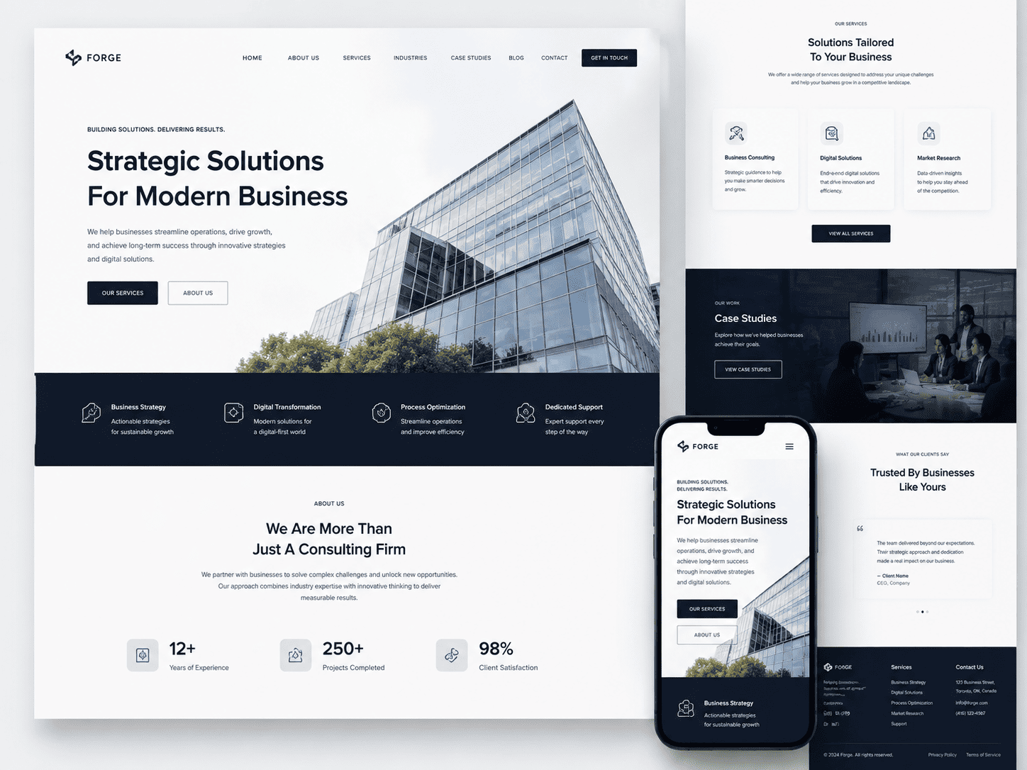
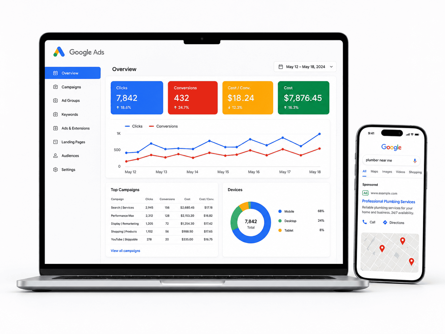


Introduction: Why Custom Web Design in Canada Demands a Localized Approach
Custom <a href=”https://niagaraforge.ca/service/web-design/”>web design is often hailed as the gold standard for businesses seeking a unique digital presence. Unlike template-based solutions, a custom build offers complete control over layout, functionality, and user experience. However, for Canadian businesses, the decision to invest in custom design carries a layer of complexity that goes far beyond aesthetics. Canada is not a monolithic market; it is a bilingual, multicultural, and geographically vast country with distinct regional expectations. A custom website that ignores these nuances is not merely a missed opportunity—it is an active liability that can erode credibility, suppress conversions, and undermine local search visibility.
This introduction establishes why a localized approach is non-negotiable for Canadian custom web design. We will examine the unique composition of the Canadian digital audience, clarify what separates a true custom build from a modified template, and quantify the real-world consequences of design failures. By understanding these foundational elements, you can avoid the most common and costly mistakes that plague Canadian businesses online.
The Canadian Digital Landscape: English, French, and Multicultural Audiences
Canada’s digital landscape is defined by its linguistic duality and cultural diversity. The Official Languages Act guarantees English and French equal status in federal institutions, but this requirement extends into the private sector as a matter of practical business necessity. Over 22% of Canadians report French as their mother tongue, with the vast majority concentrated in Quebec. However, the French-speaking market is not homogeneous—it includes Quebecois French, which differs significantly from European French in vocabulary, tone, and digital conventions. A custom website that merely translates English content into formal French without adapting idioms, navigation labels, or call-to-action phrasing will feel foreign and untrustworthy to Quebec users.
Beyond the two official languages, Canada is home to a rapidly growing multicultural population. According to recent census data, over 200 ethnic origins are represented, with visible minorities comprising nearly 27% of the population. Major urban centers like Toronto, Vancouver, and Montreal are global hubs where consumers speak Mandarin, Punjabi, Tagalog, Arabic, and dozens of other languages. Custom web design must account for this diversity, not only in content translation but in visual representation, cultural references, and even color psychology. For instance, the color white symbolizes purity in many Western cultures but is associated with mourning in parts of East Asia. A Canadian custom site that uses imagery or color schemes without cultural awareness risks alienating significant audience segments.
Regional expectations also shape user behavior. A consumer in Atlantic Canada may prioritize trust and community connection, while a user in Alberta might respond better to direct, action-oriented messaging. Search behavior varies as well: a user in British Columbia searching for “hiking gear” expects results tailored to coastal rainforests, whereas a user in the Prairies needs equipment suited to open plains. Custom web design that treats all Canadians as one uniform audience fails to capture the regional nuances that drive engagement and conversion. The most effective Canadian custom sites use geolocation, regional content blocks, and adaptive imagery to speak directly to each visitor’s context.
How Custom Design Differs from Template-Based Sites
Understanding the distinction between custom web design and template-based sites is critical for avoiding false expectations. A template site—such as those built on WordPress themes, Wix, or Squarespace—provides pre-designed layouts with limited customization options. You can change colors, fonts, and images, but the underlying structure, navigation patterns, and user flows remain fixed. Templates are affordable and fast to deploy, but they impose constraints that often conflict with Canadian market requirements. For example, a template may not support proper French typography rules, such as the non-breaking space before colons and semicolons, or it may lack built-in support for hreflang tags that signal language versions to search engines.
Custom web design, by contrast, starts from a blank slate. Every element—from the information architecture to the checkout flow—is built specifically for your business and audience. This flexibility allows for true bilingual integration, where language switching is not just a translated page but a fully adapted experience with distinct navigation, currency formatting (CAD), and local measurement units. Custom design also enables advanced features like dynamic content personalization based on province, automated inventory display for regional warehouses, and compliance with provincial privacy regulations such as Quebec’s Law 25.
However, custom design is not inherently superior in every case. The mistake many Canadian businesses make is choosing custom design without a clear strategy, ending up with a costly, over-engineered site that lacks the simplicity of a well-chosen template. The key difference lies in intentionality. A template forces you to adapt your business to its constraints; a custom site allows you to design for your specific Canadian audience. But this power comes with responsibility. Custom design demands rigorous user research, wireframing, and usability testing—steps that are often skipped under tight deadlines. When those steps are skipped, the custom site becomes a worse version of a template: expensive, slow, and confusing.
Another critical distinction is ongoing maintenance. Templates receive automatic updates and security patches from the platform provider. Custom sites require a dedicated development team to manage updates, fix bugs, and ensure compatibility with evolving browser standards. Canadian businesses that underestimate this long-term cost often find themselves with a beautiful but broken site six months after launch. The decision between custom and template should therefore be based on your long-term digital strategy, not just your current budget. If you need deep localization, unique functionality, or complete brand control, custom design is justified. If you need a simple brochure site, a template may suffice—provided it meets Canadian accessibility and language standards.
The True Cost of Getting It Wrong: Lost Trust and Revenue
The consequences of poor custom web design in Canada extend far beyond an unattractive interface. Trust is the currency of the digital economy, and Canadian consumers are notably cautious online. A 2023 survey by the Canadian Internet Registration Authority found that 87% of Canadians are concerned about online privacy and data security. A custom website that fails to display clear trust signals—such as SSL certificates, visible contact information, and transparent return policies—will lose visitors within seconds. But the trust deficit goes deeper. If a site loads slowly, has broken navigation, or presents content in awkward, machine-translated French, users perceive the business as unprofessional or even fraudulent. They will not return, and they will share their negative experience with peers, amplifying the damage.
Revenue loss is the most immediate measurable impact. Consider the following common failure points in Canadian custom sites and their direct financial consequences:
- Bilingual mishandling: A site that offers English and French but fails to remember the user’s language preference forces them to re-select on every visit. This friction increases bounce rates by up to 30% for francophone users, directly reducing conversion opportunities.
- Poor mobile responsiveness: Over 60% of Canadian web traffic comes from mobile devices. A custom design that prioritizes desktop aesthetics over mobile usability will lose sales from commuters, shoppers, and on-the-go professionals who expect seamless thumb-friendly navigation.
- Ignoring local SEO signals: Custom sites that do not include schema markup for Canadian addresses, province-specific landing pages, or localized keywords miss out on high-intent search traffic. A user searching for “plumber in Mississauga” expects local results; a generic national page will rank poorly and lose the click to a competitor.
- Accessibility failures: The Accessibility for Ontarians with Disabilities Act (AODA) and similar provincial regulations mandate web accessibility. Custom sites that fail to meet WCAG 2.1 standards risk legal penalties and exclude the 22% of Canadians living with a disability—a significant market segment with considerable purchasing power.
- Slow load times: Custom designs often include heavy custom fonts, complex animations, and high-resolution images. If these elements are not optimized for Canadian internet speeds—which vary widely from urban fiber connections to rural satellite—the site will lose visitors. Every second of delay costs approximately 7% in conversions, a statistic that becomes devastating for high-ticket Canadian retailers.
Beyond immediate revenue, the long-term cost is brand reputation erosion. A custom website is often the first and most persistent touchpoint a potential customer has with your business. If that touchpoint is frustrating, culturally insensitive, or technically flawed, the negative perception sticks. Recovering from a bad first impression requires significant marketing spend and time—resources that could have been invested in a well-executed custom design from the start. Moreover, search engines like Google factor user experience signals—bounce rate, time on site, and page speed—into rankings. A poorly designed custom site will gradually lose organic visibility, compounding the revenue loss over months and years.
Finally, the cost of redoing a failed custom project is substantial. Unlike a template that can be swapped out quickly, a custom site is deeply integrated into your business operations—payment gateways, CRM systems, inventory management, and analytics. Rebuilding from scratch means double the development cost, double the downtime, and double the disruption to your team and customers. The most successful Canadian businesses treat custom web design as a strategic investment, not a one-time expense. They conduct thorough discovery, invest in professional copywriting in both languages, and plan for continuous optimization. By avoiding the common mistakes outlined in this article, you can build a custom site that not only looks exceptional but also performs for Canadian audiences across every province and territory.
Mistake #1: Ignoring Bilingual and Multilingual User Experience
Canada’s official bilingualism is not a stylistic preference—it is a legal and practical reality. The Official Languages Act requires federal institutions to serve the public in both English and French, and many provincial bodies, especially in Quebec, New Brunswick, and parts of Ontario, follow similar mandates. Yet even private businesses that are not legally bound often discover that ignoring French-speaking users costs them market share. A common custom web design mistake is treating translation as an afterthought: you build a beautiful English site, then bolt on a French version months later. The result is a fractured experience—broken layouts, untranslated buttons, missing metadata, and a general sense that French users are an inconvenience rather than a priority.
Custom web design gives you the freedom to structure your site around language from the very first wireframe. When you postpone that decision, you inherit technical debt that is expensive to fix. Consider the practical consequences: French text is, on average, 30% longer than English for the same meaning. A button that says “Submit” in English becomes “Soumettre” in French—not much longer. But a heading like “Get Your Free Quote Today” becomes “Obtenez votre devis gratuit dès aujourd’hui,” which is nearly double the length. If your layout uses fixed-width containers, that text will overflow, clip, or force awkward wrapping. The same problem appears in navigation menus, sidebars, and footer links.
The solution is not to shrink the font or abbreviate French words, which feels dismissive. Instead, design for flexibility. Use relative units like em or rem instead of fixed pixels for font sizes and container widths. Allow headings to wrap naturally, and test your layout with both languages at every breakpoint. A grid that works for a single word in English may need to accommodate three words in French. You should also consider that some French labels are shorter than their English counterparts—”Home” becomes “Accueil,” which is shorter—but that brevity can create imbalance in a menu that was aligned to the English length. The goal is not to make both languages look identical; it is to make both look intentional.
Designing for Text Expansion and Shorter French Labels
Text expansion is the most predictable issue in bilingual design, yet it surprises developers repeatedly. French uses more prepositions, articles, and compound structures than English, so strings grow. For example, “Privacy Policy” in English becomes “Politique de confidentialité” in French—a 12-character phrase turns into 30 characters. If your footer has a horizontal list of links, this expansion can push items onto a second line, breaking the visual rhythm. Conversely, some French labels are shorter: “Contact” is “Contact” (same), but “About Us” becomes “À propos,” which is shorter. That means you cannot simply allocate extra space for all French text; you must handle both directions.
A practical strategy is to use a flexible grid system with fluid columns. Instead of setting a fixed width for a navigation item, let the column size to its content with a minimum and maximum width. For example, in CSS you might write:
.nav-item {
  min-width: 4rem;
  max-width: 12rem;
  white-space: nowrap;
  overflow: hidden;
  text-overflow: ellipsis;
}
But be careful with text-overflow: ellipsis—it can truncate French words in an ugly way. A better approach is to allow wrapping for long labels while keeping a consistent line height. Test your navigation at 200%, 300%, and 400% zoom, because bilingual users often increase font size for readability. Also consider using a language toggle that is not just a flag icon—flags are ambiguous (which flag represents Canadian French? The Quebec flag is provincial, not national). Use text labels like “FR” and “EN” with a clear visual state for the active language.
For shorter French labels, do not force them to stretch. A menu item with “Accueil” (7 characters) next to “Nos Services” (11 characters) will look uneven if you set a uniform width. Instead, use inline-flex with padding, so each item hugs its content. This creates a more organic look and avoids awkward gaps. Additionally, remember that French punctuation requires a non-breaking space before colons, semicolons, and question marks (e.g., “Avez-vous des questions ?”). If your design uses a custom font or a CSS reset, you must ensure that the non-breaking space (U+00A0) renders correctly. Otherwise, the punctuation will wrap to the next line, which looks unprofessional.
Implementing Proper hreflang Attributes for Canadian Locales
Search engines use the hreflang attribute to understand which language and regional version of a page to show in search results. For Canada, you need to distinguish between en-ca (English, Canada) and fr-ca (French, Canada). A common mistake is using only en and fr, which tells Google you have generic English and French pages—but that can cause the wrong version to appear for Canadian users, especially if you also have a U.S. English site. For example, if you have example.com/en/ and example.com/fr/, you should also have example.com/en-us/ if you serve American users. Otherwise, Google may show your generic English page to U.S. searchers, which is fine, but it may also show your French page to Canadian users who prefer English—or vice versa.
The proper implementation is to add a self-referencing hreflang on each version, plus an x-default for fallback. Here is a practical example for a page about shipping policies:
<link rel="alternate" hreflang="en-ca" href="https://example.com/en/shipping" />
<link rel="alternate" hreflang="fr-ca" href="https://example.com/fr/expedition" />
<link rel="alternate" hreflang="en-us" href="https://example.com/us/shipping" />
<link rel="alternate" hreflang="x-default" href="https://example.com/en/shipping" />
Notice that the URLs are different—not just the language subdirectory, but the slug itself. “Shipping” in English is “Expédition” in French. That is correct. Do not use the same slug for both languages, because it confuses both users and search engines. Also ensure that each page has a reciprocal link: if en-ca points to fr-ca, then fr-ca must point back to en-ca. Missing reciprocal links are a frequent error that makes Google ignore your hreflang annotations entirely.
Another nuance for Canadian locales: you may need to handle regional differences within French. Quebec French uses “magasinage” for shopping, while European French uses “achats.” Similarly, “courriel” (email) is standard in Quebec, but “e-mail” is common in France. If you target only Canadian French, use fr-ca and write for a Canadian audience. If you also serve France, you need separate fr-fr pages. Do not assume that one French version serves both. This is not just about vocabulary—it affects date formats (YYYY-MM-DD vs. DD/MM/YYYY), currency formatting ($ vs. CAD), and measurement units (kilometers vs. miles). A custom design should account for these regional settings, not just in content but in the underlying schema markup for products and prices.
Avoiding Machine-Only Translation That Feels Impersonal
Machine translation has improved dramatically, but it still fails at nuance, tone, and cultural context. A French-speaking customer in Montreal can immediately tell when a page was run through Google Translate. The grammar may be correct, but the phrasing feels stiff, and idioms are translated literally. For example, “We’re here to help” becomes “Nous sommes ici pour aider” in a machine translation, which is technically accurate but sounds robotic. A human translator would write “Nous sommes là pour vous aider,” which is warmer and more natural. Worse, machine translation can produce errors that are embarrassing or even offensive. The classic example is “Please enter your password” becoming “S’il vous plaît entrez votre mot de passe” (correct) but “You are logged in” becoming “Vous êtes connecté” (correct) versus “Vous êtes journalisé” (wrong and nonsensical).
Beyond accuracy, machine translation fails at brand voice. Your English site may use a casual, friendly tone—”Got questions? We’ve got answers.” A literal French translation loses that charm. A human translator will adapt the message: “Des questions ? Nous avons les réponses.” That is not a word-for-word translation but a transcreation that preserves the intent. Custom web design should include a budget for professional translation, not just for the initial build but for ongoing content updates. If your team writes a blog post in English, you need a process for having it translated by a native French speaker who understands your industry. Do not rely on a plugin that automatically translates new content—that is a recipe for inconsistency.
Also consider the user interface elements that are often overlooked: error messages, form labels, tooltips, and accessibility text. A machine translation might handle “First name” correctly as “Prénom,” but what about “Please enter a valid postal code”? In Canada, a postal code has a specific format (e.g., K1A 0B1), and a French message should reference that format. A generic machine translation might say “Code postal invalide,” which is fine, but it might not include the example. Similarly, date pickers and currency formatters need localization. If your site shows prices in Canadian dollars, the French version should display “$ 12,99” (with a comma as decimal separator) rather than “$12.99” (with a period). This is a design decision, not just a translation decision.
To avoid the impersonal feel of machine translation, implement a review workflow. Use a translation management system (TMS) that allows your team to approve or edit strings before they go live. For custom design, this means building your content into a structured format—like JSON or a headless CMS—where each string has a unique key and both language versions are stored together. This makes it easy to spot missing translations and to update both languages simultaneously. Also, test with real users. Recruit French-speaking Canadians to navigate your site and give feedback on tone, clarity, and cultural appropriateness. They will catch issues that no tool can: a phrase that is grammatically correct but patronizing, a button label that is too formal, or a marketing tagline that does not resonate.
Finally, remember that bilingual UX is not just about text. It affects images, icons, and layout. A graphic with English text embedded in it will need a French version. An icon that makes sense in English (like a mailbox) may have different connotations in French-speaking Canada. And a layout that puts navigation on the left may need to be mirrored if you ever add a right-to-left language, though that is not relevant for French. The key is to design a system, not a page. Build a style guide that documents how language switching works, how text expansion is handled, and what tone to use in each language. That guide becomes the reference for developers and content creators, ensuring that bilingualism is a feature, not a bug.
Mistake #2: Overcomplicating Navigation and Information Architecture
When a custom web design prioritizes visual flair over functional clarity, the navigation structure is often the first casualty. Canadian businesses frequently fall into the trap of treating their website like a portfolio piece rather than a wayfinding tool. The result is a maze of dropdown menus, buried links, and unconventional layouts that force visitors to think too hard. In a market where users expect speed and directness—whether they are in downtown Toronto, rural Alberta, or francophone Quebec—a confusing navigation system directly translates to lost conversions. This section dissects the most common navigation pitfalls and provides actionable fixes grounded in user behavior and Canadian market realities.
The 3-Click Rule: Why Your Menu Should Be Simple
The “three-click rule” is a long-standing usability heuristic stating that users should be able to reach any page within three mouse clicks from the homepage. While modern UX research has softened this into a guideline rather than a hard law, the underlying principle remains valid: every additional click increases cognitive load and bounce probability. For Canadian businesses, this rule is particularly critical because of the country’s geographic and linguistic diversity. A visitor from Vancouver might be looking for a local service area, while a user from Halifax might seek shipping costs. If both have to dig through a five-level mega-menu, they will abandon the site.
Common violations of the three-click principle in custom designs include:
- Overstuffed mega-menus: Displaying 15–20 categories at once, many of which overlap or contain single items.
- Hidden navigation: Hamburger menus on desktop, or icons without text labels that force guesswork.
- Orphan pages: Content accessible only via internal links or breadcrumbs, never from the main menu.
- Multi-level dropdowns: Hovering through three or four nested submenus, which fails on touch devices and frustrates desktop users.
To fix this, apply a “progressive disclosure” approach. Your primary navigation should contain no more than five to seven top-level items. Each item should lead to a landing page that itself links to subcategories—not a dropdown that reveals everything at once. For example, a Canadian e-commerce site selling outdoor gear should have top-level items like “Shop,” “About,” “Locations,” and “Support.” The “Shop” page then uses a grid layout to show “Camping,” “Hiking,” “Paddling,” and “Winter Sports,” each linking to a filtered product list. This structure keeps the menu clean while still offering depth.
Test your navigation by asking a fresh user to find three specific items: a product, a contact form, and a store location. If any of those tasks takes more than three clicks or 15 seconds, your architecture needs simplification. Remember that the three-click rule is not about counting clicks literally—it is about eliminating unnecessary steps. A well-designed search bar can also serve as a shortcut, but it should complement, not replace, a logical menu hierarchy.
Structuring Content for Canadian Regional Differences
Canada is not a monolithic market. A navigation design that works for a Toronto-based financial services firm may alienate users in Quebec, the Prairies, or the Atlantic provinces. The most common mistake is treating the entire country as one English-speaking, urban-centric audience. Custom web designs often fail to account for regional variations in language, climate, and consumer behavior. For instance, a national retailer must decide whether to show “Store Locator” as a single item or break it down by province. Similarly, bilingual requirements in Quebec mean that navigation labels must be available in French and English, not just as a translation toggle but as a properly structured information architecture.
Consider these regional factors when structuring your navigation:
- Language toggles: If you serve Quebec, your navigation must have a prominent language switcher—not buried in the footer. The default language should be based on the user’s IP or browser settings, not on a global default.
- Provincial filters: For businesses with physical locations or region-specific services (e.g., insurance, real estate, telecom), include a “Select Your Province” prompt early in the user journey. This can be a modal on first visit or a persistent dropdown in the header.
- Seasonal and climate relevance: A national outdoor retailer should not feature the same products in January for a user in Whitehorse (winter gear) and one in Victoria (rain gear). Navigation labels like “Seasonal” should adapt based on user location, or at least offer a regional preference toggle.
- Shipping and legal pages: Canadian users expect clear links to “Shipping & Returns” and “Privacy Policy” (due to PIPEDA). These should be in the footer, but also accessible from product pages via contextual links—not hidden behind a generic “Information” menu.
A practical structure for regional differentiation is a province-based landing page. For example, a home services company might have a top-level menu item “Locations” that leads to a grid of provinces. Each province page then lists cities and service areas. This avoids the need for complex geo-IP redirection and gives users a clear path. For bilingual content, ensure that the information architecture is mirrored in both languages—do not create a French version that is a direct translation of English navigation if the underlying content structure differs. French labels often require more space (e.g., “Nous joindre” vs. “Contact”), so your design must accommodate longer text without breaking the layout.
Using Clear Labels That Match User Search Intent
Navigation labels are not just headings; they are promises about the content underneath. When Canadian businesses use clever or internal jargon instead of user-centric terms, they create a disconnect between what the user types into Google and what they see on the menu. For example, a custom design might label a section “Solutions” when users actually search for “Pricing” or “Plans.” Similarly, “Resources” is overused and vague—users looking for a “Blog” or “FAQ” may not recognize it as the same thing. This mismatch leads to higher bounce rates and lower task completion.
To align labels with search intent, start by analyzing your site’s search queries and Google Search Console data. What phrases do users actually type? Use those exact words in your navigation. For a Canadian business, this often means including terms like:
- “Contact Us” instead of “Connect” or “Reach Out.”
- “Store Locations” instead of “Find Us” or “Our Footprint.”
- “Shipping & Returns” instead of “Policies” or “Fine Print.”
- “Shop” instead of “Products” or “Catalog” (especially for e-commerce).
- “About Us” instead of “Our Story” or “Who We Are.”
Additionally, consider the user’s stage in the buying journey. A first-time visitor might want “Services,” while a returning customer looks for “Support.” If your menu only has one of these, you force users to guess. One effective technique is to use a “card sorting” exercise with real Canadian users: give them a list of your pages and ask them to group and label them. The resulting labels are often simpler and more intuitive than what your design team invented.
Below is a comparison table illustrating how common navigation labels can be optimized for Canadian user intent, based on typical search behavior and usability best practices:
| Common (But Vague) Label | User Search Intent Example | Recommended Clear Label | Why It Works |
|---|---|---|---|
| Solutions | “pricing for small business plan” | Pricing & Plans | Directly matches transactional queries and reduces ambiguity. |
| Resources | “how to file a claim” or “FAQ” | Help & FAQ | Combines support content under a familiar, action-oriented term. |
| Our Network | “store near me” | Store Locations | Uses the exact phrase users search for, especially on mobile. |
| About | “company history” or “team” | About Us | Standard and expected; users do not have to guess what it contains. |
| Insights | “blog” or “news” | Blog & News | Clear content type, improving perceived relevance and click-through. |
Finally, test your labels with A/B testing. Change “Solutions” to “Pricing” and measure the click-through rate, bounce rate, and time on page. You will often find that clear, literal labels outperform creative ones because they reduce cognitive effort. For Canadian businesses, this is especially important in bilingual contexts. A French label like “Tarifs” (Pricing) is more effective than “Solutions d’affaires” (Business Solutions) if the user’s intent is to see costs. Remember that your navigation is a two-way street: it tells users where they can go, and it tells search engines how to index your site. Clear labels improve both user experience and SEO, making them a foundational fix for any custom design.
Mistake #3: Neglecting Mobile-First Design for On-the-Go Canadians
Canada has one of the highest smartphone penetration rates in the world, with a majority of web traffic now originating from mobile devices. For Canadian businesses, this is not a trend—it is the baseline reality. Yet many custom web design projects still begin with a desktop mockup, treating the mobile experience as an afterthought. This approach creates a cascade of usability failures: pages that take several seconds to load on a 4G connection, tap targets that require surgical precision, and text that forces users to pinch and zoom just to read a paragraph. When a potential customer in Vancouver or Halifax lands on a site that feels broken on their phone, they do not blame the device—they blame the business. The result is a higher bounce rate, lost conversions, and a damaged brand perception that no amount of desktop polish can repair.
Mobile-first design is not merely about shrinking a desktop layout. It requires a fundamental rethink of content hierarchy, interaction patterns, and performance budgets. For a custom site, this means starting with the smallest screen, the slowest connection, and the most distracted user, then progressively enhancing the experience for larger viewports. Below are the three most damaging mobile design mistakes seen in custom Canadian websites, along with concrete strategies to correct them.
Testing Across Devices and Screen Sizes Used in Canada
The Canadian mobile device landscape is surprisingly fragmented. While iPhones are dominant in urban centres like Toronto and Montreal, Android devices hold significant share in many regions, particularly among budget-conscious consumers and in certain demographic groups. A custom website that is only tested on an iPhone 15 Pro in a developer’s studio is a gamble. The real-world Canadian user might be on a three-year-old Samsung Galaxy, a Google Pixel, or an older iPad Mini used on a commute. Each device has a different screen width, pixel density, and browser rendering engine. What looks crisp on one can collapse into a jumbled mess on another.
To avoid this mistake, implement a structured testing protocol that mirrors actual Canadian usage patterns. Do not rely solely on the browser’s developer tools responsive mode, which simulates screen sizes but not hardware rendering quirks. Instead, use a combination of physical devices and cloud-based testing services that offer real-device access. At a minimum, test on the following categories:
- Small smartphones (320–375px width): Older iPhones (SE, 6/7/8) and compact Androids. These are common among students and seniors.
- Standard smartphones (390–430px width): The current iPhone Pro and Galaxy S series. This is the majority of Canadian traffic.
- Large smartphones and phablets (431–500px width): iPhone Pro Max and Galaxy Note devices, popular with professionals.
- Tablets in portrait and landscape (768–1024px): iPads and Android tablets, often used on Wi-Fi at home or in coffee shops.
- Foldables (rare but growing): Samsung Galaxy Z Fold series, which presents unique split-screen challenges.
For each device, verify three critical elements: that the navigation menu is accessible without complex gestures, that images do not overflow the viewport, and that text does not require horizontal scrolling. A practical approach is to create a test checklist that includes a representative URL from every key page type (home, product listing, product detail, checkout, contact). Run the checklist after every major design iteration, not just at the end of the project. Automated screenshot tools can catch gross layout errors, but manual testing on a real device is essential for catching subtle issues like hover-dependent menus that are impossible to use on a touchscreen.
Optimizing Touch Targets and Button Sizes for Accessibility
One of the most common mobile design failures in custom Canadian websites is the undersized tap target. A button that is easy to click with a mouse on a desktop becomes a frustrating exercise in precision when accessed by a thumb on a phone. The human fingertip has an average contact area of about 10–14 millimetres, but it is not a precise instrument. The widely accepted accessibility standard, supported by both the Web Content Accessibility Guidelines (WCAG) and Apple’s Human Interface Guidelines, is a minimum touch target of 44 by 44 pixels (approximately 11mm). For Canadian businesses, this is not just a usability nicety—it is a legal consideration under provincial accessibility laws, such as the Accessibility for Ontarians with Disabilities Act (AODA), which increasingly applies to digital properties.
Common touch target mistakes include buttons that are visually large but have a small clickable area due to padding being placed on a parent element, links that are only the width of the text, and icon-only buttons without sufficient hit area. Also problematic are interactive elements placed too close together. For instance, a list of product options where each row is only 30 pixels high means users will frequently tap the wrong option. In a checkout form, this can lead to accidental selections and abandoned purchases.
To fix this, enforce a minimum target size for all interactive elements—buttons, links, form fields, and custom dropdowns. Use CSS to ensure the clickable area is at least the recommended size, even if the visual element is smaller. For example, a text link can be given a larger padding and a negative margin to keep its visual position while expanding its touch area. Here is a practical CSS snippet that demonstrates this technique:
.nav-link {
  padding: 12px 16px; /* Expands the touch target */
  margin: -12px -16px; /* Keeps visual alignment */
  display: inline-block;
  min-width: 44px;
  min-height: 44px;
  box-sizing: border-box;
  text-align: center;
}
Additionally, ensure that there is a minimum of 8 pixels of space between adjacent touch targets to prevent accidental taps. For form inputs, increase the height to at least 48 pixels, which is the standard for mobile forms. Finally, test with your thumb, not just a mouse cursor. A quick heuristic: if you have to adjust your grip or zoom in to tap a button, the target is too small.
Accelerating Mobile Load Times for Rural and Urban Users
Canada’s geography presents a unique performance challenge. While urban centres like Vancouver, Toronto, and Calgary enjoy high-speed fibre and 5G networks, vast rural areas and northern territories rely on slower LTE, 3G, or even satellite connections. A custom website that loads in 2 seconds on a downtown office Wi-Fi might take 10 seconds or more in a rural community in Saskatchewan or a remote town in Newfoundland. This disparity is not a niche concern—a significant portion of the Canadian population lives outside major metropolitan areas, and they are equally valuable customers.
Mobile load time is a direct ranking factor in Google’s search algorithm, and more importantly, it is a direct driver of user behavior. Studies consistently show that the probability of a user bouncing increases dramatically as load time goes from 1 second to 3 seconds, and it becomes severe beyond 5 seconds. For a custom site, the biggest culprits for slow mobile load times are unoptimized images (often full-resolution desktop images served to mobile), render-blocking JavaScript, and excessive third-party scripts such as tracking pixels, live chat widgets, and social media embeds. Each of these adds to the critical rendering path.
To accelerate load times for all Canadian users, adopt a performance-first approach. Start by auditing your site’s current performance using a tool like Google PageSpeed Insights or WebPageTest, but set the test location to a rural Canadian region (e.g., a server in Regina or a simulated 3G connection) to get a realistic picture. Then, implement the following technical fixes:
- Serve responsive images: Use the
srcsetattribute to deliver different image sizes based on the user’s viewport and device pixel ratio. Do not serve a 4000-pixel-wide hero image to a mobile phone. - Lazy load below-the-fold content: Use the
loading="lazy"attribute on images and iframes so that they only load when the user scrolls near them. - Minify and defer JavaScript: Remove unused JavaScript, and use the
deferorasyncattribute on all non-critical scripts. This prevents JavaScript from blocking the rendering of the page. - Enable text compression: Ensure your server is configured to use Gzip or Brotli compression for HTML, CSS, and JavaScript files. This can reduce transfer sizes by 70% or more.
- Use a content delivery network (CDN): A CDN with Canadian edge servers (e.g., in Toronto, Montreal, or Vancouver) can cache static assets closer to the user, reducing latency for both rural and urban visitors.
Consider a concrete example: a custom e-commerce site selling Canadian-made outdoor gear. The product images are high-resolution JPEGs (2MB each) served directly from a server in Toronto. A user in a rural area with a 3Mbps connection will experience a 5-second delay just for one image. By compressing those images to modern formats like WebP (which is smaller than JPEG at the same quality), serving them via a CDN, and lazy loading images below the fold, the same page can load in under 2 seconds on that same 3Mbps connection. This is not a marginal improvement—it is the difference between a sale and a bounce.
Finally, set a performance budget as part of your custom design process. For example, require that the homepage’s initial HTML and CSS be under 200KB, and that all above-the-fold resources total less than 1MB. Regularly test on a throttled 4G connection (simulated in Chrome DevTools) to ensure that your design decisions do not degrade performance over time. By prioritizing mobile load speed for both urban and rural users, you acknowledge the reality of Canadian internet infrastructure and build a site that is inclusive of all your potential customers.
Mistake #4: Slow Page Speed That Drives Away Potential Customers
In the digital marketplace, patience is a vanishing commodity. When a Canadian visitor clicks a link to your custom-built website, they are not merely waiting for a page to appear—they are forming an instant judgment about your brand’s credibility, professionalism, and respect for their time. Research consistently shows that the majority of users abandon a site that takes longer than three seconds to load, and nearly half expect a two-second response time or faster. For Canadian businesses, this expectation is amplified by the country’s vast geography and the reality that many users access the web on mobile networks, often in regions where connectivity can fluctuate. A slow custom website does not just frustrate a single visitor; it compounds into lost revenue, diminished search rankings, and a tarnished reputation that is difficult to repair.
Why does this problem become so acute with custom designs? Off-the-shelf templates often come with built-in optimizations and a shared infrastructure that handles common performance bottlenecks. Custom builds, however, are crafted from scratch, which means every decision—from the size of a hero image to the complexity of a JavaScript animation—is yours to manage. Without a disciplined approach, custom sites quickly accumulate digital weight: uncompressed photographs, redundant code, and third-party scripts that each add milliseconds to the loading process. The result is a beautiful design that performs poorly, and in the eyes of Canadian consumers, performance is part of the design itself. A slow page speed is not a technical quirk; it is a customer experience failure that directly contradicts the trust you are trying to build.
To prevent this, successful custom web design projects adopt what is known as a performance budget. This is a predefined limit on the total size and speed of your pages, agreed upon before a single line of code is written. For example, you might set a budget that your homepage must load in under two seconds on a mid-range mobile device over a 4G connection, with a total page weight of no more than 1.5 megabytes. Every image added, every script included, and every font embedded must be justified against this budget. If a feature exceeds the limit, you either simplify it or remove it. This proactive strategy shifts performance from an afterthought to a core design requirement, ensuring that your Canadian customers are never left staring at a blank screen while your site slowly assembles itself. The following sections outline the three most impactful areas where custom sites commonly fail—and how to correct them.
Compressing Images Without Losing Visual Quality
Images are often the heaviest components of any web page, and in custom designs, they are frequently used liberally to showcase products, team members, or atmospheric photography. The mistake is not using images; it is uploading them directly from a camera or design tool without any optimization. A single high-resolution photograph can easily exceed five megabytes, and when three or four such images appear on a homepage, they alone can push your page weight past a reasonable budget. The solution is not to eliminate visuals—that would sacrifice the aesthetic appeal that attracted you to a custom design in the first place—but to compress them intelligently.
Modern compression techniques can reduce image file sizes by 70 to 80 percent with no perceptible difference to the human eye. The key is to use the correct format for each situation. For photographs with gradients and complex colors, the WebP format (supported by all modern browsers) offers superior compression compared to JPEG. For logos, icons, and graphics with flat colors, SVG files are vector-based and remain sharp at any size while being significantly smaller than PNG equivalents. Additionally, you should always resize images to the exact dimensions at which they will be displayed on your site. There is no benefit to serving a 4000-pixel-wide image inside a container that is only 800 pixels wide; the browser must download the full file and then shrink it, wasting bandwidth and time.
For your custom build, implement a systematic workflow: every image passes through a compression tool before it is uploaded. You can use lossy compression for large photographic backgrounds where slight detail reduction is invisible, and lossless compression for product images where precision matters. Consider using a plugin or script that automatically generates multiple versions of each image (e.g., for desktop, tablet, and mobile) and serves the smallest appropriate one based on the user’s screen size. This technique, known as responsive images, ensures that a mobile user on a Canadian rural network does not download the same massive file intended for a high-speed office connection. Finally, always include descriptive alt text, not only for accessibility but also because search engines use this text to understand your images, which supports your SEO efforts—provided your page loads quickly enough for them to crawl it.
Minifying CSS, JavaScript, and HTML in Custom Builds
Custom code is a double-edged sword. It gives you complete control over functionality, but it also means you are responsible for the cleanliness of that code. During development, programmers often leave behind comments, extra spaces, line breaks, and unused variables—all of which are helpful for humans reading the code but completely unnecessary for browsers. This extra text increases the file size of your CSS, JavaScript, and HTML, which directly translates to slower download and parsing times. The process of removing all this unnecessary data is called minification, and it is a non-negotiable step for any performance-conscious custom site.
Minification works by stripping out whitespace, removing comments, shortening variable names, and combining multiple files into a single request. For example, a custom site might have five separate JavaScript files for different features—a slider, a form validator, a menu toggle, and so on. Without minification, the browser must make five separate HTTP requests, each with its own latency. By combining these into one minified file, you reduce both the number of requests and the total bytes transferred. The same principle applies to CSS: instead of loading separate stylesheets for different pages, you can merge them into a single, minified file that is cached after the first visit.
However, minification alone is not enough if your code is bloated in the first place. A best practice for custom builds is to audit your code for unused rules and functions. For instance, a custom CSS file might contain styling for elements that were redesigned or removed during the project. These orphaned rules are pure waste. Similarly, JavaScript libraries often include far more functionality than you use; consider using a custom build of a library that includes only the modules you need. To automate this process, integrate minification into your development workflow. Tools like UglifyJS for JavaScript and CSSNano for CSS can be run automatically whenever you deploy a new version of your site. For HTML, you can use tools like HTMLMinifier, which also removes unnecessary quotes from attributes and collapses whitespace. By ensuring that every line of code serves a purpose and is delivered in its most compact form, you significantly reduce the time it takes for a Canadian user’s browser to parse and execute your site’s logic.
Leveraging Canadian CDN Nodes for Faster Delivery
Even with perfectly compressed images and minified code, your website’s files still have to travel physically from your hosting server to the user’s device. If your server is located in Toronto, a customer in Vancouver might experience latency of 50 to 80 milliseconds just for the initial connection, before any data is even transferred. For a custom site with many requests, this distance-based delay accumulates. The most effective solution is a Content Delivery Network (CDN), which stores cached copies of your static files—images, CSS, JavaScript, fonts—on a network of servers distributed across multiple geographic locations. When a user requests your site, the CDN automatically serves the files from the node closest to them, drastically reducing the distance data must travel.
For Canadian businesses, choosing a CDN with robust node coverage within Canada is particularly important. Many global CDN providers have nodes in major Canadian cities like Toronto, Montreal, Vancouver, and Calgary, but the density of coverage matters. A CDN with only one Canadian node in Toronto will not help a user in Whitehorse or St. John’s as much as a provider with nodes in multiple regions across the country. When evaluating CDN providers, ask specifically about their Canadian infrastructure. Some providers partner with Canadian data centers to ensure that traffic from Canadian users rarely leaves the country, which also has the benefit of aligning with Canadian data residency preferences—a growing concern for businesses handling sensitive customer information.
Implementing a CDN in your custom design is not a set-and-forget process. You must configure it correctly to ensure it does not interfere with dynamic content, such as user-specific shopping cart data or login states. Typically, you will configure the CDN to cache only static assets, while your origin server handles dynamic requests. Additionally, you should set appropriate cache expiration headers so that when you update your custom site—for example, by changing a logo or releasing new CSS—the CDN knows to fetch the new version. Without proper cache invalidation, you risk serving stale content to returning visitors. A well-configured CDN also provides other performance benefits, such as automatic image optimization and HTTP/2 or HTTP/3 support, which further accelerates delivery. For a custom site targeting Canadian audiences, a CDN with national node coverage is not a luxury; it is a fundamental requirement for meeting the speed expectations of users from coast to coast.
In summary, slow page speed is a silent killer of custom web design success. By adopting a performance budget, compressing images intelligently, minifying your code, and leveraging Canadian CDN nodes, you transform your custom site from a beautiful liability into a fast, reliable asset. Every millisecond saved is a moment of respect for your customer’s time, and in a competitive Canadian market, that respect translates directly into loyalty, conversions, and long-term growth.
Mistake #5: Poor Visual Hierarchy and Inconsistent Branding
When a Canadian business invests in custom web design, the goal is rarely just to look different—it is to look unmistakably like that business. Yet many custom builds fail precisely because they prioritize novelty over coherence. The result is a website where typography fights itself, colors clash like a hockey jersey from two different decades, and visitors cannot tell what they should click first. This is the fifth mistake: poor visual hierarchy and inconsistent branding. It is a quiet killer of conversions because it erodes trust before a single word is read. Canadian audiences, known for their polite skepticism, will not struggle to decode your layout. They will simply leave.
Visual hierarchy is the arrangement of elements in order of importance. It tells the eye where to start, where to go next, and when to act. Without it, every element shouts at equal volume, and the visitor hears nothing. Inconsistent branding compounds this problem. If your homepage uses a bold geometric sans-serif for headings, but your product pages switch to a casual script, you have just told your visitor that you do not pay attention to details. In a market like Canada—where local loyalty matters, whether you serve Toronto’s financial district or a fishing village in Newfoundland—a fractured brand identity is a liability. You are asking a customer to trust you with their money while your visual language contradicts itself.
The fix is not to hire a more expensive designer, but to apply disciplined design systems. This section breaks down three practical pillars—color, typography, and white space—that will restore order to your custom design and make your brand feel as solid as a Canadian bank vault.
Choosing a Color Palette That Reflects Canadian Sensibilities
Color is the first thing a visitor processes, often before they read a single word. It sets mood, signals industry, and creates emotional resonance. For Canadian businesses, the palette should not default to red and white maple leaf clichés unless you are a national institution. Instead, think about the regional and cultural nuances of your audience. A Vancouver-based outdoor gear retailer might draw from muted forest greens, slate blues, and rain-washed greys—colors that echo the Pacific Northwest. A Calgary financial services firm might lean on deep navy, crisp white, and a single accent of warm gold to suggest stability and prairie sunshine. A Montreal creative agency can afford bolder contrasts—charcoal with electric yellow—because its audience expects avant-garde energy.
The key is restraint. A common mistake is using six or seven colors across a site because the brand “feels colorful.” That is not branding; it is noise. Instead, adopt a three-tier system:
- Primary color (60%): Usually a neutral (white, off-white, light grey, or a deep charcoal) that dominates backgrounds and text areas.
- Secondary color (30%): A brand-defining hue used for headings, borders, and major UI elements like buttons or navigation highlights.
- Accent color (10%): A high-contrast tone reserved exclusively for calls-to-action, error messages, or tiny highlights (e.g., a link underline).
Canadian audiences respond well to palettes that feel grounded and honest. Avoid neon saturation unless you are in entertainment or youth fashion. Avoid pure black backgrounds—they feel harsh and can trigger accessibility issues for older users, a growing demographic in Canada. Also, be mindful of seasonal context: if you serve a nationwide audience, your palette should work in bright summer light and grey winter afternoons. Test your colors on both light and dark screens, and always check contrast ratios against WCAG 2.1 standards (at least 4.5:1 for normal text). A palette that fails contrast is not just an aesthetic flaw; it is a legal risk in provinces like Ontario and Quebec where accessibility is increasingly enforced.
One pragmatic tip: use a tool like Coolors or Adobe Color to generate a five-color palette, then ruthlessly cut it down to three core colors plus two neutrals. Write a short brand style guide that explains why each color exists. For example, “Ocean Blue is our trust color, used for all hyperlinks and secondary buttons. Maple Amber is our conversion color, used only for ‘Buy Now’ and ‘Get a Quote’ buttons.” This documentation prevents future developers or marketers from introducing rogue shades.
Establishing a Clear Typography Scale for Readability
Typography is the backbone of visual hierarchy. If color sets the mood, type sets the logic. The most common custom design mistake is using too many typefaces or sizes without a system. A designer might use a bold display font for a hero headline, a different sans-serif for section titles, and a third for body text—then add italics and letter-spacing variations for flavor. The result is a page that looks like a ransom note. Canadian users, who are often reading on mobile devices during commutes or lunch breaks, will abandon content that feels mentally taxing to parse.
Establish a typography scale with a limited set of sizes and roles. A practical scale for most business websites is as follows:
| Element | Font Size (Desktop) | Line Height | Weight | Use Case |
|---|---|---|---|---|
| Display/Headline | 48–64px | 1.1 | Bold (700) | Hero section, landing page title |
| H2 Section Title | 32–40px | 1.2 | Semi-Bold (600) | Major content blocks |
| H3 Subheading | 24–28px | 1.3 | Medium (500) | Subsections within a block |
| Body Text | 16–18px | 1.6 | Regular (400) | Paragraphs, descriptions |
| Caption/Label | 12–14px | 1.4 | Regular (400) | Form labels, footnotes, timestamps |
Limit yourself to two typeface families: one for headings (often a distinctive sans or serif with personality) and one for body text (a highly legible sans like Inter, Roboto, or system fonts). If you want a third for accents, restrict it to one-word labels or pull quotes—never for full sentences. Also, set a vertical rhythm. Use consistent margins and padding between text blocks. For example, if body text is 16px with a 1.6 line height (25.6px), then spacing between paragraphs should be multiples of 25.6px (e.g., 25.6px, 51.2px). This creates a quiet grid that the eye follows without friction.
Readability is not just about size. It is about line length. For body text, aim for 45–75 characters per line. On wide desktop screens, do not let text stretch across the full viewport; constrain it to a content column of 600–700px. On mobile, ensure your font scale collapses gracefully—a 48px headline can shrink to 32px, but your body text should never go below 16px. Canadian audiences skew older in many regions, especially in Atlantic Canada and rural areas, so err on the side of larger, not smaller. Finally, do not use justified text alignment, as it creates uneven spacing and rivers of white that disrupt reading. Left-aligned is always safer.
Using White Space to Guide Attention to Key Calls-to-Action
White space—often called negative space—is the empty area between elements. It is not wasted space; it is a design tool that dictates attention. When a custom website lacks white space, it feels cluttered and anxious. Every button competes with a background image, a text block, and a sidebar. The visitor’s eye darts around, finds no resting spot, and eventually leaves. In contrast, deliberate white space creates a path. It isolates your most important element—usually a call-to-action (CTA) like “Get a Free Quote” or “Book a Consultation”—so that it becomes the clear next step.
Here is how to apply white space strategically:
- Around CTAs: Give your primary button at least 40px of clear space on all sides. Do not place it directly next to a text link or a secondary button. If you have two buttons (e.g., “Learn More” and “Contact Us”), separate them with at least 24px and make the primary one visually dominant.
- Between sections: Use generous vertical padding (80–120px) between major content blocks. This signals a change in topic and gives the user a mental reset. On mobile, reduce to 60–80px, but never eliminate it.
- Around images: Do not let images bleed edge-to-edge unless they are full-bleed hero shots. For product photos or team members, add a margin of 20–30px so they do not crowd adjacent text.
- In forms: White space in form fields is critical. Increase input height (at least 48px) and add 12px of padding inside each field. Group related fields (e.g., first name/last name) with 16px gaps, and separate unrelated groups with 32px.
A practical example: imagine a Canadian plumbing company’s homepage. The hero section has a headline, a subheadline, and two buttons. If the designer places the “Call Now for Emergency Service” button directly under the subheadline with only 8px of margin, it feels rushed. Instead, add 32px of white space above the button, increase its padding to 16px vertical and 32px horizontal, and leave the secondary “View Our Services” link as a plain text link 24px below. The eye will naturally land on the button because it has breathing room. This is not a stylistic preference; it is a conversion tactic.
For technical teams, white space can be enforced with a CSS grid system. For instance, use a 12-column grid with consistent gutters (e.g., 24px on desktop, 16px on mobile) to ensure no element feels randomly placed. A simple CSS rule for consistent section spacing might look like this:
section {
  padding: 80px 0; /* vertical rhythm */
}
.cta-button {
  margin-top: 40px; /* clear space above CTA */
  padding: 16px 32px; /* comfortable click area */
}
This ensures that even when a future editor adds new content, the spacing remains predictable. White space is not about emptiness—it is about intentionality. When you control what the eye sees first, second, and third, you control the user’s journey. A Canadian visitor who lands on your site should never wonder what to do next. They should feel a quiet confidence that your business knows its craft, because your design says so.
In summary, poor visual hierarchy and inconsistent branding are not inevitable consequences of custom design. They are correctable failures of planning. Choose a restrained, regionally aware color palette. Enforce a strict typographic scale with two typefaces and clear line heights. Deploy white space as a deliberate tool to elevate your CTAs. When these three elements work together, your website does not just look professional—it feels trustworthy. And for Canadian businesses, where word-of-mouth and reputation are currency, that trust is the difference between a click and a closed deal.
Mistake #6: Overlooking Local SEO and Geotargeting Features
For Canadian businesses, the difference between a website that generates foot traffic and one that merely exists online often comes down to local search visibility. When a potential customer in Calgary searches for “plumbing repair” or “boutique coffee shop,” search engines prioritize results that are geographically relevant. Custom web design projects frequently fail at this critical junction because developers and designers focus on aesthetics and global branding while neglecting the structural elements that signal locality to search engines. A beautifully designed custom site that lacks geotargeting features is like a storefront with no address on the door—it may look impressive, but no one knows where to find it. The following breakdown addresses three specific areas where Canadian businesses can embed local SEO directly into their web design, transforming a static brochure into a lead-generating tool for specific cities and regions.
Integrating LocalBusiness Schema for Canadian Cities
Schema markup, also known as structured data, is a code that you place on your website to help search engines return more informative results for users. For Canadian businesses, the LocalBusiness schema is non-negotiable, yet it is often overlooked in custom builds. This markup tells Google, Bing, and other search engines exactly what your business is, where it operates, and what services it offers. Without it, search engines must guess at your relevance for local queries, which often leads to poor rankings against competitors who have implemented it correctly.
When integrating LocalBusiness schema for a Canadian audience, you must go beyond basic fields like name, address, and phone number. Consider the following Canadian-specific adjustments:
- Province and Territory Identification: Use the
addressRegionfield to specify the province (e.g., “British Columbia” or “QC” for Quebec). Do not default to generic “CA” without a region, as this confuses search engines when you operate in multiple provinces. - Language and Bilingual Considerations: For businesses serving Quebec or federal audiences, implement
inLanguagetags for both English and French. UsealternateNamefor the French version of your business name if applicable. - Geo Coordinates: Include
geowithlatitudeandlongitudefields for each physical location. This is especially critical for businesses in sprawling Canadian cities like Toronto or Vancouver, where street addresses alone may not pinpoint your exact storefront. - Service Areas: Use the
areaServedproperty to list specific cities, neighborhoods, or postal codes (e.g., “V6B” for downtown Vancouver). This helps you rank for searches in areas you actually serve, even if your physical address is elsewhere. - Opening Hours and Holiday Closures: Canadian statutory holidays differ by province. Update
openingHoursSpecificationto reflect local holidays like Family Day (Alberta, Ontario, etc.) or Saint-Jean-Baptiste Day (Quebec).
One common mistake is using the same schema markup for a national business without differentiating between locations. If you have three offices in Calgary, Edmonton, and Winnipeg, you need separate LocalBusiness schema blocks for each, linked via a parent organization schema. Custom design should include a schema management system that allows non-technical staff to update location details without touching the codebase. Additionally, test your schema with Google’s Rich Results Test and ensure that the output displays a business profile with a map, reviews, and a “Directions” button. Without this markup, your custom site is essentially invisible to the local pack—the prominent map-based results that appear at the top of search results for local queries.
Designing Location-Specific Pages That Rank
Many Canadian businesses make the mistake of creating one generic “Contact” or “Locations” page that lists all their addresses in a single block of text. This approach fails to capture long-tail local search traffic. To rank for “landscaping in Kelowna” or “dentist in Halifax,” you need dedicated, location-specific landing pages. These pages should not be thin, duplicated content with just a city name swapped out. Instead, they must offer genuine value to users in that specific area, and the design of these pages plays a pivotal role in their search performance.
When designing location pages for Canadian cities, follow these structural guidelines:
| Element | Why It Matters for Canadian SEO | Design Implementation |
|---|---|---|
| Unique introductory content | Avoids duplicate content penalties and signals relevance to local search queries. | Write 150–200 words about your business’s history or specific services offered in that city. Mention local landmarks, neighborhoods, or regional challenges (e.g., “serving the Ottawa-Gatineau corridor”). |
| City-specific testimonials | Builds trust with local users and provides fresh, unique content that search engines index. | Include a rotating carousel of reviews from clients in that city. Use a photo of the client (with consent) and a quote that references the local area. |
| Localized service descriptions | Targets long-tail keywords like “emergency HVAC repair in Edmonton” rather than just “HVAC repair.” | Use accordion or tabbed sections to list services, with each service description mentioning the city and nearby areas (e.g., “serving Sherwood Park and St. Albert”). |
| Unique meta titles and descriptions | Increases click-through rates from local search results. | Ensure the CMS auto-generates titles like “Roofing Contractor in Surrey, BC | Company Name” with a character limit of 60 and 155 for descriptions. |
| Localized calls-to-action (CTAs) | Improves conversion rates by making the next step obvious for local users. | Use CTAs like “Call Our Winnipeg Office” or “Get Directions to Our Mississauga Store” instead of generic “Contact Us.” |
A critical design flaw is placing location pages behind multiple clicks. Each city page should be accessible from the main navigation (e.g., a dropdown under “Locations”) and linked from the homepage footer. Additionally, interlink these pages naturally—if you have a Toronto page and a Mississauga page, link between them with contextual anchor text like “For clients in the Greater Toronto Area, we also serve Mississauga.” Avoid using dynamic URL parameters or session IDs that create duplicate versions of the same page. Instead, use clean, static URLs like /locations/toronto/ or /services/roofing/victoria/. Finally, ensure that each location page loads quickly and is mobile-optimized, as a large percentage of local searches in Canada happen on smartphones while users are on the move.
Embedding Maps and Directions for Physical Stores
Even the most informative local SEO copy will fail to convert if users cannot find your physical location. Embedding Google Maps directly into your website is a fundamental feature that many custom designs handle poorly. Some businesses simply link to a Google Maps search results page, which forces users to leave your site. Others embed a map but forget to include critical navigation elements like a “Get Directions” button that pre-fills the user’s current location. For Canadian businesses, the map integration must also account for the country’s unique geographic challenges, such as large distances between cities, rural areas with spotty internet, and bilingual signage in certain regions.
Here is how to embed maps and directions effectively within your custom design:
- Use the official Google Maps Embed API: This provides a customizable map that you can style to match your brand colors, but more importantly, it allows you to add markers for each of your locations. Do not use static images of maps, as these do not allow zooming or interaction and are inaccessible to screen readers.
- Pre-fill the destination: When a user clicks “Get Directions,” the map should open with your business address as the destination and prompt the user for their starting point. Use the
destinationparameter in the URL to automate this. - Provide multiple route options: For Canadian cities with complex highway systems (e.g., Montreal’s autoroutes or Toronto’s 401), the embedded map should link to Google Maps’ full route options, including driving, transit, walking, and cycling. Do not force users to use a single mode of transport.
- Integrate with local transit systems: For businesses in downtown cores like Vancouver or Ottawa, include a link to the local transit authority’s website (e.g., TransLink, OC Transpo) directly below the map. This is a small design detail that greatly improves user experience for tourists and locals without cars.
- Add a fallback for offline users: Some rural areas in Canada have poor mobile data coverage. Provide a text address and a phone number in a prominent position next to the map, so users can call for directions without needing to load the map.
Another overlooked feature is the use of multiple maps on a single page. If you have several locations, do not stack all maps vertically on one page—this slows down load time and overwhelms the user. Instead, use a tabbed interface or an interactive map with clickable markers that update the displayed address and directions below. For businesses with a single flagship store, the map should be placed above the fold on the contact page, but also embedded within the footer of every page if you rely heavily on walk-in traffic. Finally, ensure that your map embed is GDPR-compliant and does not track users without consent, which is a growing concern for Canadian privacy laws (PIPEDA). By embedding maps with user intent in mind, you reduce friction and make it effortless for a customer in Saskatoon to find your storefront, which is the ultimate goal of local SEO.
Mistake #7: Failing to Integrate with Canadian Payment and Shipping Systems
An e-commerce website can feature award-winning visuals, seamless navigation, and persuasive product copy, yet still fail to convert Canadian shoppers. The culprit is often invisible to the naked eye: a custom design that overlooks the backend infrastructure unique to the Canadian market. While a bespoke layout may look flawless on a designer’s screen, it becomes functionally hollow if it does not support the payment methods Canadians routinely use or the shipping realities of the world’s second-largest country by landmass. For businesses investing in custom web design, this oversight is not a minor technical hiccup—it is a direct barrier between a visitor and a completed purchase.
Canadian e-commerce has distinct expectations shaped by geography, banking norms, and consumer trust. Unlike the United States, where credit cards dominate, Canada has a robust debit culture, including Interac Online, which allows direct payments from a customer’s bank account without a credit card. Additionally, shipping costs vary dramatically between densely populated urban centers like Toronto and Vancouver and remote communities in Nunavut or the Yukon. A custom design that fails to account for these factors forces customers to abandon their carts, often permanently. Below, we break down the specific integration failures that plague Canadian e-commerce sites and how to address them through thoughtful design and development.
Displaying Prices in CAD with Tax-Inclusive Options
The most fundamental error in Canadian e-commerce is displaying prices in a foreign currency or showing pre-tax amounts without explanation. Canadian consumers expect to see prices in Canadian dollars (CAD), but the tax situation is more complex than simply adding a flat rate. The Goods and Services Tax (GST) applies federally at 5%, while Provincial Sales Tax (PST) varies by province—from 6% in Saskatchewan to 10% in Manitoba. Some provinces, like Ontario and Nova Scotia, use a combined Harmonized Sales Tax (HST) of 13% or 15%, respectively. Alberta has no PST, and the territories only levy GST.
A custom design that forces users to calculate these taxes mentally is a conversion killer. For example, a product listed at $49.99 in CAD may appear as $56.49 in Ontario after HST, but only $52.49 in Alberta. If your website does not clearly state whether the displayed price includes tax, customers in provinces with higher rates may feel misled at checkout. The solution is to build a toggle or clear label that lets users choose between “Prices inclusive of taxes” and “Prices exclusive of taxes.” Many Canadian retailers, particularly in the grocery and pharmacy sectors, legally advertise tax-inclusive prices, and consumers have grown accustomed to this transparency.
Furthermore, ensure that your design automatically detects the visitor’s location via IP or postal code entry and updates the displayed tax rate dynamically. A static design that shows only GST will confuse a customer in Quebec, where PST is 9.975%. The user-facing design should also include a small note near the price, such as “Taxes calculated at checkout based on your province,” to set expectations. Avoid using USD as a default, even if your business also sells to American customers. A Canadian visitor seeing USD will likely leave immediately, assuming your business does not serve their market properly.
| Province/Territory | Tax Type | Total Tax Rate | Display Preference |
|---|---|---|---|
| Alberta | GST only | 5% | Exclusive or inclusive |
| British Columbia | GST + PST | 12% | Exclusive (PST added at checkout) |
| Ontario | HST | 13% | Inclusive preferred |
| Quebec | GST + QST | 14.975% | Exclusive (QST shown separately) |
| Nova Scotia | HST | 15% | Inclusive preferred |
| Northwest Territories | GST only | 5% | Exclusive |
When implementing this, your backend must calculate taxes based on the destination province, not the store’s headquarters. A common custom design flaw is hard-coding the business’s local tax rate. For instance, a store based in British Columbia that charges 12% to a customer in Alberta is legally incorrect and will erode trust. Use a reliable tax API or a Canadian-specific e-commerce plugin that handles provincial rate tables. On the front end, design a clear summary at checkout that itemizes subtotal, shipping, and taxes before the final total, with no hidden fees.
Integrating Canada Post and Regional Shipping Carriers
Canada’s geography makes shipping a logistical puzzle that generic international shipping calculators cannot solve. A custom design that only integrates with USPS or FedEx’s American services will fail to provide accurate quotes for Canadian addresses. Canada Post is the national carrier and often the only option for rural and northern communities, but it is not the only choice. Many Canadian businesses also rely on regional carriers like Purolator (owned by Canada Post but operates independently), Loomis Express in Western Canada, or UPS and FedEx’s Canadian divisions for expedited urban deliveries.
The critical mistake is designing a shipping interface that treats Canada as a single zone. A parcel sent from Toronto to Windsor (a 350 km drive) should cost far less than the same parcel sent to Iqaluit, Nunavut, which requires air freight. Yet many custom sites apply a flat rate based on weight, ignoring distance and remote area surcharges. This leads to two negative outcomes: either the business eats the cost for remote deliveries, or it overcharges nearby customers, driving them to competitors.
To fix this, your custom design must integrate with Canada Post’s Shipping API, which provides real-time rates based on origin postal code, destination postal code, weight, and dimensions. This API also includes options for expedited parcels, priority courier, and flat-rate boxes. Additionally, consider integrating with regional carriers for specific provinces. For example, a business in Alberta might offer lower rates via Loomis for deliveries within the Prairie provinces, while using Canada Post for the rest of the country. Your design should allow customers to choose between multiple shipping methods at checkout, with estimated delivery dates clearly displayed.
Another user-facing design element often missed is the postal code validation. Canadian postal codes follow an alternating alphanumeric format (e.g., M5V 2H1) with a space in the middle. A poorly designed form may reject valid codes or accept invalid ones, causing failed address verification. Implement an autocomplete or validation tool that recognizes the correct format and suggests corrections. Also, display shipping costs early in the cart page, not only at the final checkout step. A customer who adds an item to the cart and sees no shipping estimate until after entering personal details is less likely to complete the purchase. Use a “Calculate Shipping” field in the cart that accepts a postal code and instantly shows available options and costs.
Offering Payment Methods Canadians Trust
Credit card penetration in Canada is high, but it is not universal. Many Canadians prefer debit-based payments for online purchases, especially for higher-ticket items, to avoid credit card debt or because they do not own a credit card. The most trusted Canadian-specific payment methods include Interac Online, which allows users to pay directly from their bank account through their financial institution’s online banking portal. This method is particularly popular among younger Canadians and those who prioritize budgeting. Additionally, Visa Debit—a debit card that works on the Visa network—is widely issued by Canadian banks and must be accepted alongside standard credit cards.
A custom design that only integrates with Stripe or PayPal’s default credit card processing may inadvertently exclude Interac Online. While PayPal does support Interac in some configurations, it is not a native feature of every custom checkout flow. To properly integrate Interac Online, your backend must connect with a Canadian payment gateway that supports it, such as Moneris, Beanstream (now Bambora), or Global Payments Canada. These gateways handle the redirect to the customer’s bank website for authentication, then return the customer to your site. Your design must be prepared for this redirect flow without breaking the user experience. For example, the checkout page should indicate “You will be redirected to your bank to complete payment” with a clear progress indicator.
Beyond Interac, ensure your design prominently displays trust badges for Canadian payment processors. Show logos for Visa Debit, Mastercard Debit, and Interac Online alongside standard credit card logos. Many Canadian consumers actively look for the Interac logo as a signal that the business understands their market. Additionally, consider offering payment installments through Canadian-specific services like PayBright or Afterpay (which launched in Canada in 2021), as these are increasingly popular for larger purchases. Your checkout design should present these options as equal alternatives, not afterthoughts, to avoid confusing customers who expect a seamless choice.
Finally, do not forget the security aspect. Canadian privacy laws, including the Personal Information Protection and Electronic Documents Act (PIPEDA), require businesses to protect customer payment data. Your custom design must use PCI-DSS compliant forms, and the checkout page should display a padlock icon and “256-bit SSL encryption” text. A Canadian customer who sees a generic American trust seal (like “Truste” which is less common in Canada) may be less confident than one who sees a seal from the Better Business Bureau of Canada or a recognized Canadian bank’s payment logo. Integrate these visual cues into the design without cluttering the interface—place them near the payment button and again in a footer note.
In summary, failing to integrate Canadian payment and shipping systems is a silent killer of e-commerce conversion. It is not enough to have a beautiful custom design; the backend must speak the language of Canadian commerce. By displaying CAD prices with province-specific tax options, integrating Canada Post and regional carriers with real-time rates, and offering payment methods like Interac Online and Visa Debit, your custom design will meet the expectations of Canadian shoppers. Each of these elements requires collaboration between your design team and backend developers, but the payoff is measurable: fewer abandoned carts, higher customer trust, and a competitive edge in a market where many businesses still ship with a one-size-fits-all approach. Test your checkout with a Canadian postal code, a debit card, and a remote destination before launch, and you will avoid the most common yet most avoidable mistakes in Canadian e-commerce design.
Mistake #8: Inaccessible Design That Excludes Users with Disabilities
When Canadian businesses invest in custom web design, they often prioritize aesthetics, brand identity, and unique functionality. However, one critical dimension is frequently overlooked: accessibility. In Canada, web accessibility is not merely a best practice—it is a legal obligation. The Accessibility for Ontarians with Disabilities Act (AODA) and the Accessible Canada Act (ACA) set clear expectations for digital inclusion. Custom websites that ignore WCAG (Web Content Accessibility Guidelines) risk alienating a significant portion of the population, damaging their reputation, and facing legal consequences. Beyond compliance, inclusive design expands your audience, improves user experience for everyone, and demonstrates corporate social responsibility. This section outlines the most common accessibility mistakes in custom builds and provides actionable strategies for designing inclusively from the ground up.
Custom web design often introduces bespoke components—interactive sliders, custom dropdowns, animated charts, or drag-and-drop interfaces—that standard templates handle more predictably. When accessibility is an afterthought, these elements become barriers. Users with visual, motor, auditory, or cognitive disabilities may find themselves unable to complete basic tasks like navigating a menu, filling out a form, or understanding content. The result is not just frustration; it is exclusion. Below, we break down the three most pervasive accessibility failures and explain how to correct them in your custom design process.
Ensuring Keyboard Navigation and Focus Indicators
Keyboard navigation is the backbone of web accessibility. Many users with motor disabilities rely on keyboards, switch devices, or voice control software that simulates keyboard input. If your custom design breaks keyboard flow, these users are locked out entirely. Common mistakes include custom dropdown menus that only open on hover, modals that trap focus incorrectly, and interactive elements that are not reachable via the Tab key.
To ensure robust keyboard navigation, follow these guidelines:
- Maintain a logical tab order: The order in which elements receive focus should follow the visual reading order. Avoid using positive
tabindexvalues (liketabindex="1"), which override natural order and confuse users. - Make all interactive elements operable: Every link, button, form field, and custom widget must be reachable and operable using only the keyboard. This includes opening and closing menus, selecting options, and dismissing dialogs.
- Provide visible focus indicators: Do not remove the default
:focusoutline without providing a clear alternative. A subtle but visible border, box-shadow, or background change is essential. Ensure the focus indicator has sufficient contrast against the surrounding background. - Implement skip navigation: Add a “Skip to main content” link at the top of each page. This allows keyboard users to bypass repetitive navigation menus.
- Manage focus within modals and overlays: When a modal opens, focus should move inside it. While the modal is open, Tab and Shift+Tab should cycle within the modal, and focus should return to the triggering element when closed.
Here is a practical example of a custom focus indicator for a card component that uses a CSS pseudo-element, ensuring the focus state is not dependent on default browser styling:
/* Custom focus indicator for interactive cards */
.card:focus-visible {
  outline: none;
  box-shadow: 0 0 0 4px #005fcc; /* High-contrast blue */
  border-radius: 8px;
}
.card:focus-visible::after {
  content: "";
  position: absolute;
  inset: -2px;
  border: 2px solid #003366;
  border-radius: 10px;
}
Test your custom components by navigating your site using only the Tab, Shift+Tab, Enter, and Escape keys. If you cannot reach every function or if the focus disappears, you have a critical accessibility defect.
Providing Alt Text and ARIA Labels for Custom Elements
Custom design often involves complex visuals and interactive widgets that have no native HTML semantics. Without proper text alternatives, screen readers—the primary assistive technology for blind users—will announce meaningless information or nothing at all. Two common mistakes are missing alt text on informational images and ignoring ARIA (Accessible Rich Internet Applications) labels on custom controls.
For images, follow these rules:
- Informative images: Provide concise, descriptive alt text that conveys the image’s purpose. For example,
alt="Line graph showing a 20% increase in sales from Q1 to Q2". - Decorative images: Use empty alt text (
alt="") or CSS backgrounds so screen readers skip them. Do not use placeholder text like “image” or “spacer.” - Functional images: If an image is a link or button, the alt text must describe the action, not the image. For a magnifying glass icon used for search, use
alt="Search". - Complex graphics: For charts or infographics, provide a longer description either as adjacent text, a link to a data table, or a
longdescattribute (though modern practice favors visible text alternatives).
For custom interactive elements like sliders, tabs, accordions, or drag-and-drop zones, ARIA roles and properties are essential. Common ARIA mistakes include:
- Using
role="button"on adivwithout addingtabindex="0"and handling keyboard events. - Forgetting
aria-labelon icon-only buttons, leaving screen reader users with a generic “button” announcement. - Ignoring ARIA states like
aria-expandedfor accordions oraria-checkedfor custom toggles. - Misusing
aria-hidden="true"on elements that still receive focus, which creates a “ghost” interaction.
A practical example for a custom slide-out menu button:
<button id="menu-toggle" aria-expanded="false" aria-controls="mobile-menu">
  <svg aria-hidden="true" focusable="false">
    <!-- icon paths -->
  </svg>
  <span class="sr-only">Open main menu</span>
</button>
Notice the aria-hidden="true" on the SVG to prevent screen readers from announcing icon paths, and the visually hidden sr-only span that provides a human-readable label. Always pair custom ARIA with native HTML where possible; a native <button> or <input type="checkbox"> is always more robust than a simulated one.
Testing with Screen Readers and Contrast Checkers
Designing inclusively requires more than theoretical knowledge; it demands rigorous testing with the same tools your users rely on. Many custom websites fail accessibility audits because developers and designers test only visually. Automated tools catch some issues, but they miss nuanced problems that only manual testing reveals.
Here is a structured testing approach:
- Automated scanning: Use tools like axe DevTools, WAVE, or Lighthouse to identify missing alt text, low contrast, missing form labels, and ARIA misuse. Run these early and often, but understand their limitations—they cannot evaluate keyboard flow or screen reader output.
- Manual keyboard testing: As mentioned, navigate every page using only the keyboard. Document any point where focus is lost, trapped, or the order is illogical.
- Screen reader testing: Test with at least one screen reader per operating system. Common pairings include NVDA or JAWS on Windows, and VoiceOver on macOS/iOS. Listen to how your custom components are announced. Does a dropdown announce its state? Does a modal announce its title? Do error messages get read automatically?
- Contrast checking: Use a contrast checker (like WebAIM’s Contrast Checker or the Stark plugin) to verify that text and interactive element borders meet WCAG AA standards: a 4.5:1 ratio for normal text and 3:1 for large text (18pt or 14pt bold) and UI components.
Consider creating a testing checklist specific to your custom components. For each widget, verify:
| Accessibility Requirement | Pass Criteria | How to Test |
|---|---|---|
| Keyboard operability | All functions reachable and operable via keyboard | Tab through entire page; try Enter, Space, Arrow keys, Escape |
| Visible focus | Focus indicator clearly visible on all interactive elements | Tab through page and visually inspect each focus ring |
| Screen reader announcement | Name, role, and state announced correctly | Use NVDA/VoiceOver and navigate to each custom control |
| Text contrast | All text and UI borders meet WCAG AA contrast ratios | Use a contrast checker on sampled colors |
| Alt text / ARIA labels | All informative images have alt; all custom controls have labels | Run automated scan and manually review with screen reader |
Do not wait until the end of the project to test. Integrate accessibility checks into every sprint. When you add a new custom component, test it immediately for keyboard access and screen reader compatibility. Fix issues before they propagate across multiple pages.
Finally, recognize that accessibility is not a one-time checkbox. As your custom site evolves with new features, content, and design tweaks, accessibility must be maintained. Assign a team member to be the accessibility advocate, keep documentation of your ARIA patterns, and revisit your testing checklist quarterly. By proactively addressing these common mistakes, your Canadian business not only complies with AODA and ACA but also opens its digital doors to everyone—a win for users and for your bottom line.
Mistake #9: Skipping Comprehensive Testing Across Browsers and Regions
When a Canadian business invests in a custom website, the design is often the star of the show. But a beautiful design that fails to function correctly across the digital landscape of Canada is a costly liability. The ninth and often overlooked mistake is skipping comprehensive testing across browsers and regions. Many teams test only on their own devices, in their own city, using the fastest available connection. This creates a dangerously narrow view of the user experience. In a country as geographically vast and digitally diverse as Canada, this oversight can alienate a significant portion of your audience, harm your search rankings, and directly impact your conversion rates.
The reality is that your custom design is not a static image. It is a living, breathing set of code that interacts with a dizzying array of browser engines, operating systems, screen sizes, and network infrastructures. What renders flawlessly on a developer’s high-end MacBook in Toronto with a fiber-optic connection may be a broken, slow-loading mess on a mid-range Windows laptop in rural Newfoundland using a 4G hotspot. To truly succeed, your QA process must be as custom and detailed as your design. This means moving beyond a simple checklist and building a robust testing protocol that mirrors the real-world conditions of your Canadian customers.
Cross-Browser Testing for Chrome, Safari, Firefox, and Edge
The first pillar of a solid testing strategy is ensuring your custom design renders consistently across the four major browsers used in Canada. Each browser uses a different rendering engine, which interprets your HTML, CSS, and JavaScript in its own way. A CSS grid property that works perfectly in Chrome might have a subtle bug in Firefox. A custom font might load beautifully in Safari but fail to fall back correctly in Edge. Ignoring these differences is a recipe for a fragmented user experience.
Your testing matrix should explicitly include the following, with a clear hierarchy based on your analytics data:
- Google Chrome: As the dominant browser globally and in Canada, this is your primary baseline. But do not test only the latest version. Ensure you also test on the previous two major releases to account for users who delay updates.
- Safari: This is critical for your mobile and Mac-based users. Safari’s WebKit engine is notoriously strict about certain CSS properties and can have different default form controls. Pay special attention to input fields, dropdowns, and video playback.
- Mozilla Firefox: While its market share has shrunk, Firefox has a loyal user base that values privacy. Its rendering engine can handle modern CSS well but may have quirks with older flexbox implementations or specific animation properties.
- Microsoft Edge: Since Edge is now Chromium-based, it shares much of its core with Chrome. However, it is not identical. Test for differences in font rendering, scrollbar styling, and PDF preview functionality. Also, test the legacy Edge HTML version if you have a significant number of enterprise or government clients who may use older systems.
Do not rely solely on manual testing. Implement automated visual regression testing tools that capture screenshots of your key pages and compare them across browsers. This allows you to catch subtle pixel shifts or layout breaks that the human eye might miss. Create a dedicated test environment that mirrors your production server, and run these tests after every major change, not just at the end of the project. For a practical approach, consider using a cloud-based testing service that provides access to real devices and browser versions, allowing you to simulate the exact environment of a user in Vancouver using Safari on an iPhone 12, or a user in Halifax using Firefox on a Windows 10 PC.
Simulating Canadian Network Conditions for Performance
Performance is not just about how fast your code executes; it is about how fast your content reaches the user. Canada’s vast geography creates a wide disparity in internet speeds and latency. A user in downtown Calgary with gigabit fiber will have a vastly different experience than a user in a remote community in the Yukon relying on satellite internet or a congested mobile network. Skipping network condition testing is a critical mistake because it leads to designs that are visually stunning but functionally unusable for a large segment of your audience.
Your testing must go beyond using a standard high-speed connection. You need to simulate the constraints of the Canadian network landscape. Here is a practical framework for what to simulate:
| Scenario | Simulated Conditions | Key Metrics to Watch |
|---|---|---|
| Urban High-Speed (Toronto, Vancouver) | 100 Mbps down, 20 Mbps up, 5ms latency | Largest Contentful Paint (LCP) under 2.5s, no layout shift |
| Suburban Cable (Ottawa, Edmonton) | 50 Mbps down, 10 Mbps up, 20ms latency | First Input Delay (FID) under 100ms, smooth scrolling |
| Rural DSL (Northern Ontario, Saskatchewan) | 5 Mbps down, 1 Mbps up, 50ms latency | Time to Interactive (TTI) under 5s, images lazy-loaded |
| Mobile 4G/LTE (Remote Areas) | 3 Mbps down, 1.5 Mbps up, 80ms latency, high packet loss | Total page weight under 1.5MB, no render-blocking JS |
| Satellite (Northern Territories) | 15 Mbps down, 3 Mbps up, 600ms latency | Above-the-fold content loads in under 3s, minimal dependencies |
Use the built-in network throttling features in Chrome DevTools or Firefox Developer Tools to simulate these conditions. But do not stop there. Use a proxy tool like Charles or Fiddler to add artificial latency and packet loss, which is common on mobile networks. Run your performance audits using Lighthouse with these custom presets. The goal is not just to make your site load faster, but to ensure that the core content and navigation are usable even when your heavy custom animations or high-resolution hero images are still loading. Prioritize content, preload critical assets, and consider serving different image sizes based on the user’s connection type.
Gathering Feedback from Real Users in Target Provinces
Automated testing and network simulation are essential, but they cannot replace the human element. The final and most crucial step in your QA process is gathering feedback from real users in your target provinces. A developer in Montreal may not understand the cultural or practical nuances of a user in rural British Columbia. User testing provides invaluable qualitative data that reveals usability issues, comprehension problems, and emotional responses that software cannot detect.
Do not just test with friends or colleagues. Recruit participants who match your actual customer personas and are located in the specific provinces you serve. If you are a national business, you need a diverse panel. Here is how to structure this feedback loop effectively:
- Recruit Locally: Use social media, local business networks, or professional user testing services to find participants in key regions. For example, if you sell outdoor gear, test with users in British Columbia, Alberta, and the Maritimes to see how they interact with your site on different connection speeds and devices.
- Focus on Tasks, Not Opinions: Do not ask users if they like the design. Instead, give them specific tasks to complete, such as “Find the product warranty information,” “Add an item to your cart and calculate shipping to Whitehorse,” or “Locate your nearest service center in Quebec.” Observe where they hesitate, click incorrectly, or give up.
- Use a Mix of Moderation: For in-depth feedback, conduct moderated sessions via video call where you can ask follow-up questions. For broader reach, use unmoderated testing tools that allow users to record their screen and voice while they navigate your site independently. This gives you a raw, unfiltered view of their experience.
- Test in Both Official Languages: If your site is bilingual, you must test with native French speakers in Quebec and New Brunswick. Do not assume a direct translation works. Text expansion in French can break layouts, and cultural references may not translate well. Pay attention to the user experience in both languages, not just the accuracy of the translation.
The feedback you gather will often be surprising. You might discover that a form field you thought was intuitive is causing massive drop-offs, or that a custom navigation menu is completely invisible to older users. This is not a sign of failure; it is a sign of a rigorous process. Incorporate this feedback into your development sprints. Fix the issues, then re-test with the same users or a similar group to confirm the solution works. This iterative cycle of test, learn, and improve is the only way to ensure your custom design truly serves your Canadian audience, from St. John’s to Victoria. By embracing this comprehensive approach, you avoid the costly mistake of launching a site that looks good in theory but fails in practice.
Frequently Asked Questions
Why do Canadian businesses need custom web design?
Custom web design allows Canadian businesses to tailor their website to their specific audience, brand, and market needs. Unlike generic templates, custom design offers better scalability, unique user experiences, and can incorporate local elements like bilingual content (English/French) or region-specific calls-to-action. It also helps with SEO by enabling cleaner code and faster load times, which are crucial for ranking on Google and attracting local customers.
What is the biggest mistake in custom web design?
The biggest mistake is neglecting mobile responsiveness. With over half of web traffic coming from mobile devices, a site that doesn’t adapt to different screen sizes will frustrate users and hurt search rankings. Google uses mobile-first indexing, meaning it primarily uses the mobile version of a site for ranking. Canadian businesses must ensure their custom design is fully responsive to avoid losing potential customers who browse on smartphones and tablets.
How does web design affect SEO in Canada?
Web design impacts SEO through site structure, page speed, mobile-friendliness, and user experience. A well-designed site with clear navigation, fast loading, and proper heading tags helps search engines crawl and index content more effectively. For Canadian businesses, local SEO is also important—design elements like location pages, local business schema, and customer reviews integration can boost visibility in local search results, driving more foot traffic and inquiries.
What are the accessibility requirements for Canadian websites?
In Canada, accessibility is governed by the Accessibility for Ontarians with Disabilities Act (AODA) and the Canadian Human Rights Act, which require websites to be accessible to people with disabilities. This includes providing text alternatives for images, keyboard navigation, sufficient color contrast, and captions for videos. Custom web design should incorporate these features from the start, not only to comply with legal standards but also to expand your audience and improve overall usability.
How can Canadian businesses avoid slow website load times?
To avoid slow load times, Canadian businesses should optimize images, leverage browser caching, use a content delivery network (CDN), and minimize HTTP requests. Choose a reliable hosting provider with servers in Canada or use a CDN with Canadian edge locations. Regularly test your site’s speed using tools like Google PageSpeed Insights. A fast website enhances user experience and improves conversion rates, as 53% of mobile users abandon sites that take longer than three seconds to load.
Should I use a template or custom design for my Canadian business?
It depends on your budget and needs. Templates are cheaper and faster, but they often lack unique branding and may have code bloat. Custom design offers greater flexibility, better performance, and a unique user experience that can set you apart from competitors. For Canadian businesses with specific target audiences or compliance needs (like bilingualism), custom design is often the better long-term investment, as it can be tailored to your exact requirements.
How important is content in custom web design?
Content is extremely important in custom web design because it drives engagement, SEO, and conversions. A beautiful design is useless without compelling copy, clear calls-to-action, and relevant information. Integrate content strategy early in the design process to ensure that layout, typography, and images support your messaging. For Canadian businesses, consider bilingual content if you target both English and French speakers, and use local keywords to attract nearby customers.
What are the signs that my website needs a redesign?
Signs that your website needs a redesign include high bounce rates, low conversion rates, outdated visual design, poor mobile performance, difficulty updating content, and a lack of integration with current marketing tools. If your site is not ranking well on search engines or is not meeting accessibility standards, these are also indicators. A redesign can refresh your brand, improve user experience, and boost SEO, helping your Canadian business stay competitive.
Sources and further reading
- Google PageSpeed Insights
- Canadian Human Rights Commission – Accessibility
- Web Content Accessibility Guidelines (WCAG) 2.1
- Statistics Canada – Internet Use by Canadians
- Canadian Internet Registration Authority (CIRA) – Internet Performance
- Nielsen Norman Group – Web Design and Usability
- Mozilla Developer Network – Responsive Design
- W3C – Web Accessibility Initiative
- Digital.gov – Improving User Experience
- Baymard Institute – Checkout Usability
Need help with this topic?
Send us your details and we will contact you.




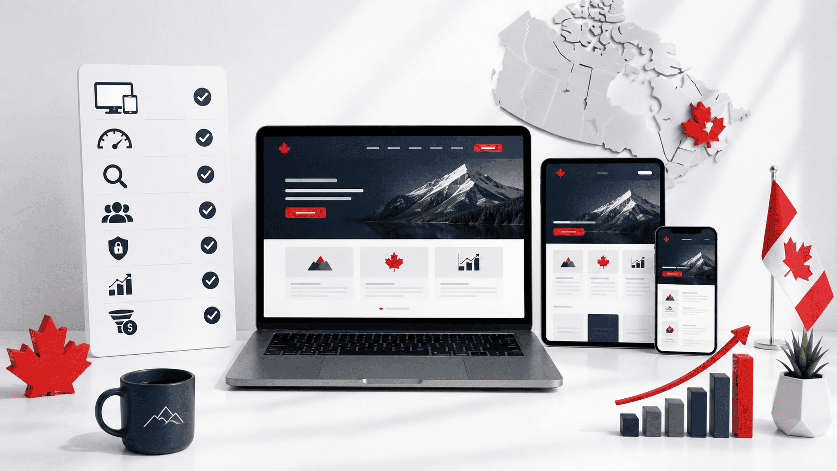


Comments (2)
Pingback: When Should Canadian Businesses Invest in Ecommerce Web Design?
Pingback: Ecommerce Web Design in Edmonton: Strategy, Cost & What to Expect