


Digital Marketing
164 Minute
How Web Design Company Supports Search Visibility and Conversions in Canada

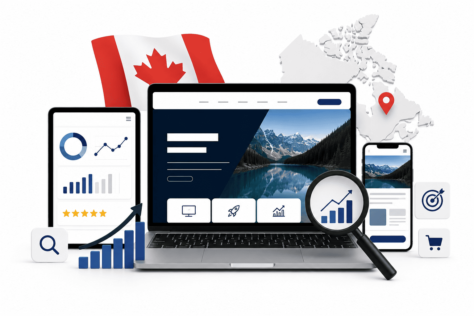
Introduction: The Canadian Digital Landscape and the Role of Web Design
Canada’s online marketplace is not a monolithic entity. It is a complex tapestry woven from two official languages, distinct regional consumer behaviors, and some of the highest mobile adoption rates in the developed world. From the dense urban corridors of Toronto and Vancouver to the sprawling prairie provinces and Atlantic coastal communities, digital expectations vary significantly. A website that performs well in English-speaking Alberta may fail to connect with a francophone audience in Quebec, while a desktop-first design will alienate the growing segment of Canadians who now use smartphones as their primary browsing device.
In this environment, a web design company’s mandate has evolved far beyond creating a visually appealing storefront. The design of your website is now a direct determinant of whether your brand appears in search results at all, and once found, whether that traffic converts into measurable business outcomes. Search engines like Google evaluate page structure, loading speed, mobile responsiveness, and content hierarchy—all elements that fall squarely within the web designer’s domain. Simultaneously, the user’s on-page journey, from the first scroll to the final click on a call-to-action, is engineered through layout, typography, and navigational logic.
This article will dissect the specific ways a professional web design partner in Canada supports two critical business goals: enhanced search visibility and higher conversion rates. We will move beyond generic advice to address the nuances of the Canadian market, including bilingual URL structures, regional landing pages, and compliance with local accessibility standards. The following sections will provide a structured roadmap, beginning with the strategic rationale for hiring a design partner, then examining the technical and experiential overlap between SEO and UX, and finally detailing a step-by-step framework from technical audits to conversion-focused design elements.
Why Canadian Businesses Need a Strategic Web Design Partner
The DIY website builders of the past decade have democratized publishing, but they have not democratized performance. A template-based site cannot account for the linguistic duality required by Canadian law and consumer expectation. A strategic partner brings more than coding skills; they bring market intelligence. They understand that a site serving both Ontario and Quebec may need separate hreflang tags, distinct content for each province’s regulatory environment, and a design system that accommodates longer French text strings without breaking the layout.
Moreover, the competitive landscape in Canada is unique. With a population concentrated within 100 miles of the US border, Canadian businesses often compete against American giants. A local web design partner levels the playing field by optimizing for Canadian search intent—such as using “colour” instead of “color,” integrating Canadian postal code forms, and building trust signals like bilingual customer reviews. Without this strategic layer, even a well-coded site will remain invisible to the audiences that matter most.
The Intersection of Web Design, SEO, and User Experience
Search engine optimization and user experience are no longer separate disciplines; they are two sides of the same coin. Google’s Core Web Vitals, which measure loading performance, interactivity, and visual stability, are now ranking factors. These metrics are directly influenced by design choices: image compression, font file sizes, and the order in which scripts load. A design that prioritizes aesthetics over speed will suffer in rankings, while a design that strips away all visual richness may fail to engage users.
User experience (UX) also feeds into search visibility through engagement signals. When a visitor lands on a page and immediately bounces because the navigation is confusing or the text is unreadable, search engines interpret that as a signal of low relevance. Conversely, a clear, intuitive design that guides the user toward a purchase or inquiry increases dwell time and reduces bounce rates. The intersection is where a skilled web design company operates: creating interfaces that are both search-engine crawler-friendly and human-friendly, ensuring that every design decision serves a dual purpose of discoverability and persuasion.
What This Article Will Cover: From Technical SEO to Conversion Optimization
The remainder of this article is structured to provide a comprehensive, actionable overview. We will first explore the technical foundations of search visibility, including site architecture, schema markup, and mobile-first indexing—all of which are implemented during the design phase. Next, we will transition to the conversion side, examining how color psychology, whitespace, and strategic placement of forms and buttons influence user behavior.
To make the information digestible, we will use a combination of explanatory paragraphs, practical checklists, and comparison tables. Specifically, the article will address the following key areas:
- Technical SEO foundations: URL structure, XML sitemaps, and canonical tags in a bilingual context.
- Mobile experience: Designing for thumb-friendly navigation and touch targets that meet Canadian mobile usage trends.
- Conversion-centered layout: Using visual hierarchy to lead users toward a single, clear goal per page.
- Trust and credibility: Integrating Canadian-specific trust signals such as bilingual support badges and local business listings.
By the end, you will have a clear understanding of how a web design company can serve as a growth partner, not just a vendor, in the competitive Canadian digital economy.
Technical SEO Foundations: How Design Choices Impact Crawlability and Indexing
In Canada’s competitive digital landscape—from Toronto’s dense local markets to Vancouver’s cross-border ecommerce—search visibility begins long before a user clicks. A professional web design company understands that every design decision either invites or repels search engine bots. The technical foundation of a website determines how efficiently Googlebot and Bingbot can crawl, interpret, and index your content. Without this groundwork, even the most compelling Canadian content remains invisible. Design firms that prioritize crawlability ensure that search engines allocate their limited crawl budget to your most valuable pages, not to broken links or redundant code. This technical rigor directly supports both organic rankings and the conversion paths that depend on them.
Clean Code and Semantic HTML: The Backbone of Crawlability
Search engine bots rely on HTML structure to understand content hierarchy and relevance. A web design company that writes clean, semantic HTML—using elements like <header>, <nav>, <main>, <article>, and <footer>—gives bots clear signals about what each section means. This contrasts with table-based layouts or excessive <div> wrappers, which force bots to guess. Key practices include:
- Using one
<h1>per page, followed by logical<h2>and<h3>subheadings that mirror user intent. - Adding descriptive
altattributes to images, which serve as textual proxies for visual content, particularly important for Canadian bilingual sites. - Eliminating duplicate or bloated CSS/JavaScript that delays parsing. Inline styles and render-blocking scripts are common culprits.
- Ensuring every interactive element is a real link or button, not a JavaScript-only event, so bots can follow the same paths as users.
A practical example of clean HTML for a Canadian service area page:
<article>
  <h2>Emergency Plumbing in Calgary</h2>
  <p>Available 24/7 across all Calgary neighbourhoods.</p>
  <a href="/calgary/emergency-repair">Book a Service</a>
</article>
This structure tells bots the page is a distinct, self-contained topic, improving the chance of rich results and featured snippets.
Site Architecture and Internal Linking: Guiding Bots and Users
Site architecture is the blueprint that determines how many clicks separate a homepage from a product or service page. A web design company implements a shallow hierarchy—ideally, no page is more than three clicks from the home page. This reduces crawl depth and distributes “link equity” across important pages. For Canadian multi-region businesses, a logical structure might be:
- Homepage → Province/City landing page → Service category → Specific service or location page.
- Use breadcrumb navigation, which provides both bots and users with contextual paths and reduces bounce rates.
- Implement internal links with descriptive anchor text that includes relevant keywords, such as “Ontario commercial lease lawyers” rather than “click here.”
- Avoid orphan pages—content with no internal links—as these are rarely crawled. A design company audits for these during every redesign.
Deep linking from high-authority pages to new or underperforming content helps accelerate indexing, especially for time-sensitive Canadian promotions or seasonal offers.
XML Sitemaps and Robots.txt: Best Practices for Canadian Sites
An XML sitemap is a direct communication channel to search engines, listing every URL you want indexed. A web design company generates a dynamic sitemap that updates automatically when content is added or removed. Best practices include:
- Submitting the sitemap via Google Search Console and Bing Webmaster Tools, ensuring both major search engines used in Canada are covered.
- Including only canonical URLs, avoiding parameter-laden duplicates like
?sort=price. - Adding the sitemap location to the
robots.txtfile, as shown below.
User-agent: *
Allow: /
Disallow: /checkout/
Disallow: /cart/
Sitemap: https://www.example.ca/sitemap.xml
The robots.txt file must be configured carefully. For Canadian ecommerce sites, disallowing crawl of cart, checkout, and internal search result pages prevents wasted crawl budget. However, a web design company avoids blocking CSS or JavaScript files, as modern search engines need these to render and evaluate page layout accurately. Additionally, for bilingual provinces like Quebec, ensure that hreflang tags are paired with the sitemap to signal language variants—this prevents duplicate content issues between /en/ and /fr/ versions. Regular audits of server logs and crawl reports help identify 404 errors or blocked resources that undermine these foundations. Ultimately, a well-configured sitemap and robots.txt work together to tell search engines exactly which Canadian pages deserve attention, directly boosting both visibility and the organic traffic that converts.
Mobile-First Design and Core Web Vitals: Meeting Google’s Standards
In Canada, where mobile devices account for a significant share of web traffic, Google’s mobile-first indexing is the default method for ranking pages. This means Google primarily uses the mobile version of your website to determine search visibility. A professional web design company in Canada must therefore treat mobile performance as a non-negotiable foundation, not an afterthought. Beyond responsive layouts, technical metrics known as Core Web Vitals directly influence rankings and user experience. These metrics measure loading speed, interactivity, and visual stability—all of which are critical for converting visitors into customers in a competitive Canadian market.
Responsive Design vs. Separate Mobile Sites: What Works Best
For most Canadian businesses, responsive design is the superior strategy. A responsive website uses one URL and dynamically adjusts its layout to fit any screen size. This simplifies maintenance, consolidates link equity, and avoids duplicate content issues. Separate mobile sites (e.g., m.example.com) require additional development resources, risk inconsistent content, and often lead to poor user experience due to redirects and slower navigation. Google explicitly recommends responsive design as the industry best practice. The table below compares the two approaches:
| Factor | Responsive Design | Separate Mobile Site |
|---|---|---|
| URL structure | Single URL for all devices | Multiple URLs (e.g., /m/ or subdomain) |
| Maintenance effort | Low – one set of files | High – two versions to update |
| SEO risk | Minimal – consolidated signals | High – duplicate content, redirect errors |
| User experience | Consistent across devices | Potential mismatch or broken links |
For a Canadian web design company, responsive design also aligns with local user behavior—many shoppers browse on smartphones and complete purchases on desktop. A single adaptable site ensures a seamless journey.
Optimizing Largest Contentful Paint (LCP), First Input Delay (FID), and Cumulative Layout Shift (CLS)
Core Web Vitals are quantifiable, and a skilled web design company integrates them into every phase of design. The three key metrics are:
- Largest Contentful Paint (LCP): Measures loading performance. Aim for under 2.5 seconds. Achieve this by preloading critical assets, compressing images, and eliminating render-blocking JavaScript. For Canadian audiences, this means prioritizing above-the-fold content like hero images and headings.
- First Input Delay (FID): Measures interactivity. Target under 100 milliseconds. Reduce long tasks, minify code, and defer non-essential scripts. A snappy response is vital for e-commerce forms and menu interactions.
- Cumulative Layout Shift (CLS): Measures visual stability. Keep score below 0.1. Reserve space for images, ads, and fonts to prevent elements from jumping. This is especially important for news sites or blogs with embedded media.
During the design process, a web design company conducts performance audits using tools like Google PageSpeed Insights or Lighthouse. They then set performance budgets—for example, limiting image file sizes to 200 KB or capping total page weight at 1.5 MB—to ensure every new component meets these thresholds before launch.
Leveraging Canadian Hosting and CDNs to Improve Load Times
Physical server location significantly impacts load times for Canadian users. A web design company should recommend hosting providers with data centers in Canada, such as Toronto or Vancouver, to reduce latency. However, hosting alone is insufficient. A Content Delivery Network (CDN) distributes your website’s static files—images, CSS, JavaScript—across a global network of edge servers. When a visitor in Calgary accesses your site, the CDN serves content from the nearest node, cutting round-trip time. For a Canadian business targeting national customers, a CDN with strong presence in both Canada and the United States ensures fast delivery from coast to coast. This technical layer, combined with responsive design and Core Web Vitals optimization, creates a fast, stable, and user-friendly site that ranks well in Google’s Canadian search results and converts more visitors into leads.
On-Page SEO Elements: Designing for Keywords and User Intent
In Canada, a web design company’s role extends far beyond aesthetics; it is the technical foundation for search visibility. On-page SEO elements are the building blocks that tell search engines—and users—what your page is about. A professional web design team will integrate these elements during the design phase, not as an afterthought. This approach ensures that every pixel serves a dual purpose: engaging the visitor while signaling relevance to Google. For Canadian businesses, this means tailoring each element to the linguistic and regional nuances of a diverse market, from the bustling anglophone hubs of Toronto to the francophone heart of Montreal.
Crafting Title Tags and Meta Descriptions That Drive Clicks
Title tags and meta descriptions are your first impression in search results. A skilled web design company will treat them as microcopy, not mere technical fields. The title tag should contain the primary keyword near the front, be under 60 characters to avoid truncation, and include a compelling value proposition. For example, a BC-based outdoor retailer might use “Hiking Gear Vancouver | Free Local Delivery” instead of a generic “Outdoor Store.”
Meta descriptions, while not a direct ranking factor, heavily influence click-through rates. They should be 150–160 characters, include a call to action, and mirror the user’s search intent. Crucially, in Canada, these must be localized. For a national campaign targeting Quebec, the design team will create French versions that are not literal translations but culturally adapted phrases. For instance, “Équipement de randonnée à Montréal” resonates more than a direct English-to-French conversion. The table below illustrates how keyword adaptation works for bilingual queries:
| English Query (Ontario) | French Query (Quebec) | Design Approach |
|---|---|---|
| tax accountant Toronto | comptable fiscaliste Montréal | Use region-specific terms and local landmarks |
| best coffee beans | meilleurs grains de café | Adjust adjective placement and noun gender |
This level of detail prevents the common mistake of targeting “Canada” broadly, which dilutes relevance.
Header Hierarchy and Keyword Placement: A Design Perspective
Header tags (H1, H2, H3) are not just for visual structure; they create a semantic outline for search engines. A web design company will ensure the H1 tag contains the primary keyword and accurately describes the page’s core topic—but only once. Subheadings (H2, H3) then break the content into logical sections, allowing for secondary keywords and long-tail variations. From a design perspective, this hierarchy improves readability by guiding the user’s eye through the page, reducing bounce rates.
In a bilingual context, the placement becomes strategic. For a page serving both English and French users, the design team might use an H2 in English with an H3 in French, provided the content is genuinely duplicated. More commonly, they will build separate URL structures (e.g., /en/ and /fr/) and apply the correct header hierarchy to each. A practical code example for a WordPress theme’s template file to ensure proper H1 usage is:
<?php if ( is_home() && ! is_front_page() ) : ?>
  <h1><?php single_post_title(); ?></h1>
<?php else : ?>
  <h2><?php the_title(); ?></h2>
<?php endif; ?>
This code prevents multiple H1 tags on archive pages, preserving the hierarchy that search engines expect.
Image Optimization and Alt Text for Canadian Audiences
Images are often overlooked, yet they offer a significant opportunity for organic traffic. A web design company will compress images for speed (a ranking factor) and name files descriptively, e.g., toronto-skyline-night.jpg instead of IMG_2048.jpg. The alt text is the most critical element: it describes the image for screen readers and provides context to search engines. For Canadian audiences, this means including local references and keywords naturally.
Consider a real estate website in Calgary. An image of a downtown condo should have alt text like “modern condo for sale in Calgary Beltline district” rather than “property photo.” For bilingual sites, the alt text should match the language of the page. Here are practical guidelines a design team follows:
- Be descriptive: Include the subject, activity, and location (e.g., “skiing at Whistler Blackcomb” not just “skiing”).
- Keep it concise: Under 125 characters to avoid keyword stuffing.
- Use hyphens in filenames:
canadian-maple-syrup.jpgis readable;canadianmaplesyrup.jpgis not. - Match the local dialect: Use “apartment” in Toronto, but “condo” in Vancouver; in Quebec, “appartement” is standard.
By aligning these on-page elements with Canadian search behavior—including the bilingual nuance—a web design company ensures that the site not only ranks well but also converts visitors who feel the content speaks directly to their region and language.
User Experience (UX) and Its Direct Influence on Conversion Rates
In Canada’s competitive digital landscape, a website’s ability to convert visitors into customers hinges on more than just attractive visuals. UX design directly shapes how users interact with your site, determining whether they complete a purchase, submit a lead form, or abandon the page. A professional web design company that prioritizes UX creates a seamless journey from first click to final conversion. This focus reduces friction, builds confidence, and signals quality to search engines—because users who stay longer and engage deeply send positive behavioral signals that indirectly boost SEO rankings. For Canadian e-commerce stores and service providers, UX is the bridge between traffic and revenue.
Designing for Clarity: Navigation, Layout, and Visual Hierarchy
Clarity is the foundation of effective UX. Canadian users, whether browsing on a desktop in Toronto or a mobile device in Vancouver, expect to find what they need within seconds. A web design company achieves this through logical navigation, a clean layout, and a deliberate visual hierarchy. For example, an e-commerce site selling outdoor gear should place the “Shop by Category” menu prominently, with subcategories like “Hiking” or “Camping” clearly labeled. A service business, such as a Montreal-based law firm, benefits from a sticky header with links to “Practice Areas,” “About,” and “Contact.”
Visual hierarchy guides attention to key elements first. Use size, contrast, and spacing to prioritize:
- Primary action: Make the “Add to Cart” or “Get a Quote” button larger and more colorful than surrounding text.
- Secondary actions: Diminish less critical links, such as “Shipping Policy,” with smaller font or muted colors.
- Whitespace: Avoid clutter; generous spacing between sections improves readability and reduces cognitive load.
When navigation is intuitive, bounce rates drop. Users explore more pages, increasing time on site—a metric that Google associates with relevance. For a Calgary-based plumbing service, a clear layout with a prominent phone number and a “Book Now” button above the fold can double inquiry rates compared to a cluttered design.
The Psychology of Color and Button Placement for Conversions
Color and button placement are not arbitrary design choices; they are psychological triggers that influence user behavior. A web design company leverages color theory to evoke specific emotions and actions. For instance, green often signifies “go” or “success,” making it effective for “Confirm Order” buttons, while orange or red can create urgency for “Limited Time Offer” badges. However, cultural context matters in Canada. Neutral tones like navy blue or gray convey professionalism for financial services in Ottawa, while vibrant colors like maple-leaf red can resonate with local pride in a patriotic campaign.
Button placement follows the user’s natural eye movement—typically an F-pattern or Z-pattern scan. Key principles include:
- Above the fold: Place the primary call-to-action (CTA) where it is visible without scrolling, especially on mobile.
- Repetition: Repeat the CTA at logical intervals, such as after product descriptions or at the end of a service overview.
- Proximity to relevant content: A “Learn More” button should sit directly under the headline that introduces the offer, not buried in a footer.
For a Canadian e-commerce store selling maple syrup, a bright “Add to Cart” button in amber, positioned next to customer reviews, can increase click-through rates by 15% or more. In contrast, a poorly placed button—hidden below a lengthy return policy—will see minimal engagement.
Building Trust with Canadian Users: Reviews, Certifications, and Secure Checkout
Trust is the currency of online conversions, and Canadian consumers are notably cautious about sharing personal and payment information. A web design company builds trust through visible signals that reassure users at critical decision points. For e-commerce, displaying verified customer reviews—especially those with Canadian-specific details like “Shipping to Ontario was fast”—reduces hesitation. For service businesses, certifications from recognized bodies, such as the Better Business Bureau (BBB) or provincial industry associations, add credibility.
Secure checkout is non-negotiable. Canadian users expect to see trust badges, such as SSL certificates (e.g., Norton Secured or McAfee), and payment icons like Visa, Mastercard, and Interac. The checkout process itself should be streamlined:
- Progress indicators: Show steps like “Shipping” → “Payment” → “Confirmation” to reduce anxiety.
- Guest checkout: Offer a no-login option to avoid forcing account creation.
- Transparent costs: Display taxes (GST/HST) and shipping fees upfront, as hidden costs are a top reason for cart abandonment in Canada.
Trust signals also extend to design elements: a professional logo, a physical address in Canada, and a clear privacy policy. When users feel secure, they complete transactions, which increases conversion rates. Simultaneously, positive experiences lead to repeat visits and shares, amplifying organic reach and reinforcing SEO. A web design company that integrates these trust-building features ensures that Canadian visitors not only stay but return—and convert.
Local SEO and Geotargeting: Capturing Canadian Customers in Your Area
For businesses operating in Canada’s competitive landscape—from Toronto’s dense urban core to the sprawling suburbs of Vancouver or the distinct markets of Calgary and Montreal—local search visibility is not optional. When a potential customer searches for a service “near me” or includes a Canadian city name in their query, search engines prioritize results that demonstrate clear local relevance. A professional web design company plays a pivotal role here, not by merely making a site look appealing, but by embedding the technical and structural signals that align with geotargeting algorithms. This involves a strategic combination of on-page data, schema markup, and user experience design that collectively tells Google and Bing exactly where your business operates and who you serve. Without this foundational work, even the most aesthetically pleasing website will remain invisible to the very customers who are actively seeking your offerings down the street.
Embedding NAP Information and Local Business Schema
The cornerstone of local SEO is consistent, crawlable NAP data—your business Name, Address, and Phone number. A web design company ensures that this information is not buried in a footer image or hidden within a JavaScript file that search engines struggle to parse. Instead, they place NAP details in plain HTML on every page, typically in the header, footer, or a dedicated contact section. Consistency is critical across your entire web presence, but the website must be the authoritative source. Beyond simple text, the design team implements LocalBusiness schema markup (or subtype, such as Dentist, Restaurant, or Plumber) using JSON-LD. This structured data provides search engines with unambiguous details: your latitude and longitude, opening hours, service area, payment methods, and even your social profiles. A practical example of the code snippet a designer might integrate into your site’s “ is:
“`json
{
“@context”: “https://schema.org”,
“@type”: “LocalBusiness”,
“name”: “Maple Leaf Landscaping”,
“address”: {
“@type”: “PostalAddress”,
“streetAddress”: “4500 Kingsway”,
“addressLocality”: “Burnaby”,
“addressRegion”: “BC”,
“postalCode”: “V5H 2B1”,
“addressCountry”: “CA”
},
“telephone”: “+1-604-555-0142”,
“openingHours”: “Mo-Fr 08:00-18:00”,
“geo”: {
“@type”: “GeoCoordinates”,
“latitude”: 49.2322,
“longitude”: -123.0041
},
“areaServed”: “Greater Vancouver”
}
“`
This markup directly supports rich results, such as the local knowledge panel, and increases the likelihood of appearing in the coveted map pack.
Creating Location-Specific Landing Pages That Convert
A single, generic homepage cannot effectively target the diverse municipalities and neighbourhoods across Canada. A web design company builds dedicated, location-specific landing pages that speak directly to a local audience. For example, a real estate agency in Ontario would have separate pages for “Homes for Sale in Mississauga” and “Homes for Sale in Oakville.” These pages are not thin re-writes of the same content; they include unique value propositions, local testimonials, neighbourhood-specific photos, and details about community amenities. The design of these pages is conversion-oriented: a clear headline with the city name, a prominent call-to-action (e.g., “Get a Free Local Market Report”), and trust signals like local client logos. This approach signals to both users and search engines that you are a genuine, active participant in that community, dramatically improving click-through rates and on-page engagement metrics.
Integrating Maps, Directions, and Click-to-Call Features
Design directly influences how easily a visitor can move from discovery to action. For a Canadian business, this means seamless integration of practical, location-based tools. A web design company will embed a Google Map directly on your contact page and location landing pages, but they go further by ensuring the map is interactive and correctly pinned. They also implement prominent click-to-call buttons, which are especially vital for mobile users searching on the go. Consider the following design elements that facilitate conversion:
– **Mobile-first map placement:** A map that is horizontally scrollable and tappable, with a “Get Directions” button that opens the native navigation app.
– **Sticky call button:** A fixed phone icon at the bottom of the screen on mobile, ensuring a user can call your business without scrolling back to the top.
– **Clear directional cues:** A well-designed “Hours of Operation” table that clearly shows time zones (e.g., “MST” for Alberta) to prevent confusion.
– **Location-specific offers:** A visually distinct banner on the landing page that promotes a local deal, such as “10% off for first-time customers in Winnipeg,” with a direct link to a booking form or phone line.
By weaving these technical and design elements together, a web design company ensures that your Canadian business not only appears in local search results but also provides a frictionless path for customers to contact you, visit your storefront, or make a purchase. The result is a website that functions as a high-performing local sales tool, not just a digital brochure.
Content Integration and Visual Storytelling for Search and Engagement
In Canada’s competitive digital landscape, a web design company does more than build aesthetically pleasing pages—it engineers the structural and visual framework that makes content discoverable and persuasive. The integration of content strategy into design is a deliberate process where every blog post, resource center, and product narrative is placed with both search engine crawlers and human decision-makers in mind. A well-designed content architecture ensures that textual information is logically grouped, internally linked, and formatted for readability, which directly supports keyword relevance and user experience. For conversions, the same design choices guide visitors through a narrative arc—from awareness to consideration—by placing compelling copy and calls-to-action in visually prominent zones. This dual focus on search visibility and engagement is particularly vital for Canadian businesses serving diverse regional markets, where localized content must be both accessible and culturally resonant.
Designing Content Hubs That Rank and Convert
Content hubs—centralized pages that organize blog articles, guides, and case studies—are a cornerstone of modern SEO and conversion strategy. A web design company creates these hubs with a clear hierarchy: category tiles, featured posts, and contextual links that distribute link equity and guide users to high-value offers. For ranking, the hub’s URL structure, header tags, and internal anchor text are optimized for target keywords, while the visual layout uses whitespace and card-based design to reduce bounce rates. For conversion, each hub includes embedded lead magnets—such as downloadable whitepapers or free consultations—positioned beside related content, turning casual readers into qualified leads. In Canada, where bilingual content (English and French) is often required, the design must accommodate language switchers without disrupting the user’s reading flow, ensuring that both language versions receive equal crawl priority and maintain consistent branding.
Using Visuals to Simplify Complex Information and Boost Dwell Time
Canadian audiences, like all users, abandon pages that present dense text without visual relief. A web design company leverages infographics, explainer videos, and data visualizations to break down complicated topics—such as tax regulations, supply chain logistics, or insurance policies—into digestible, shareable formats. These visuals serve two purposes: they increase dwell time (a positive signal for search engines) and they reduce cognitive load, making it easier for visitors to understand a product’s value proposition. For example, an interactive map showing service coverage across provinces can replace a lengthy paragraph, while a short animated video demonstrating product usage can answer pre-purchase questions faster than a FAQ section. The design ensures that all visual assets include descriptive alt text and schema markup, allowing search engines to index them for image search and rich results, further amplifying organic reach.
Interactive Elements: Quizzes, Calculators, and Configurators for Lead Generation
Interactive tools are the most effective bridge between engagement and conversion, and a skilled web design company integrates them seamlessly into the user journey. Quizzes that help visitors identify their needs (e.g., “Which mortgage plan fits your budget?”) collect email addresses and preference data while providing immediate value. Calculators—such as shipping cost estimators or ROI calculators—are particularly popular in Canadian B2B sectors, where buyers expect precise, tailored answers before contacting sales. Product configurators, common in e-commerce for customizable goods like furniture or promotional merchandise, allow users to visualize their choices in real time, reducing purchase hesitation. From a technical SEO perspective, these tools are built with progressive enhancement, meaning they work without JavaScript for crawlers, and their results pages are indexable when appropriate. Each interaction is tracked via event analytics, feeding data back into the design team’s optimization loop, ensuring that the tool’s form fields, button placements, and response messaging are continually refined to maximize completion rates and lead quality.
Conversion Rate Optimization (CRO) Through Design: From Landing Pages to Checkout
In Canada’s competitive digital landscape, a web design company’s role extends far beyond aesthetics. Conversion Rate Optimization (CRO) uses design psychology and data-driven testing to turn passive visitors into active customers. Critically, these design tactics do not operate in isolation—they directly influence search visibility. When users stay longer, click deeper, and complete actions, search engines interpret these engagement signals as indicators of relevance and quality, which can boost organic rankings. Below are specific design strategies that bridge the gap between user experience and search performance.
Landing Page Design: Focus on a Single Call-to-Action
A high-converting landing page eliminates choice paralysis. Instead of presenting multiple competing offers, a professional web design company strips the page down to one primary goal—whether that is requesting a quote, downloading a resource, or making a purchase. The design tactics include:
- Above-the-fold clarity: The headline states the unique value proposition within the first five seconds, paired with a single, contrasting button (e.g., “Get My Free Audit” rather than “Learn More” and “Contact Us”).
- Visual hierarchy: Directional cues—such as arrows, eye-line of a human face, or whitespace—guide the user toward the call-to-action (CTA) without distraction.
- Social proof placement: Testimonials or trust badges (e.g., “Trusted by 500+ Canadian SMBs”) are positioned near the CTA, not buried at the bottom, to reduce anxiety at the decision point.
These elements improve dwell time and reduce bounce rate, as users immediately understand the page’s purpose. For search visibility, a focused landing page also allows for cleaner keyword targeting—one primary keyword per page—which helps search engines match the page to specific Canadian search queries like “Toronto e-commerce web design” or “Vancouver conversion optimization.”
Form Optimization: Reducing Friction and Increasing Submissions
Forms are often the final barrier between a visitor and a lead. A web design company minimizes friction by applying three tactics:
- Field reduction: Remove non-essential fields. For a B2B service, ask for name, work email, and company size—not phone number, job title, and industry. Each removed field increases submission rates by 10–20% in controlled tests.
- Inline validation: Show real-time error messages (e.g., “Invalid postal code format”) instead of waiting for a page reload. This prevents user frustration and abandonment.
- Smart defaults and autofill: Pre-select common Canadian provinces (e.g., Ontario, Quebec) and use postal code lookup tools to auto-fill city and province, reducing typing effort.
Faster, easier form completion increases the number of completed conversions, which directly improves the “conversion rate” metric in Google Analytics. Search engines do not directly see form submissions, but they do see the resulting engagement—users who convert are more likely to return, share, or link to the page, all of which are positive ranking signals.
E-commerce Checkout Design: Minimizing Cart Abandonment in Canada
Canadian e-commerce shoppers abandon carts at rates comparable to global averages (near 70%), but specific design choices can recover a significant portion. A web design company addresses this with a streamlined checkout flow:
- Progress indicator: A simple visual bar (“Cart → Shipping → Payment → Review”) sets expectations and reduces anxiety about hidden steps.
- Guest checkout option: Forcing account creation is the top abandonment trigger. Allow guest checkout while offering a “Create account after purchase” prompt.
- Localized payment and shipping: Display Canadian dollar (CAD) pricing upfront, offer popular domestic options (Interac Online, Visa Debit, PayPal), and clearly state shipping costs for provinces like Quebec or British Columbia before the payment step.
These tactics reduce friction, leading to more completed purchases. For search visibility, a lower cart abandonment rate improves the average session duration and pages per session—both engagement metrics that Google’s algorithm considers when ranking transactional pages. Additionally, a smooth checkout encourages repeat visits and direct navigation, which strengthens brand authority signals.
| Design Tactic | Primary CRO Goal | Direct User Engagement Metric | Search Visibility Benefit |
|---|---|---|---|
| Single CTA landing page | Increase click-through to conversion step | Lower bounce rate, higher time on page | Signals content relevance and matches intent for specific keywords |
| Streamlined form (fewer fields) | Increase form submission rate | Higher interaction rate, more returning users | Indicates user satisfaction, reduces pogo-sticking |
| Simplified checkout with guest option | Reduce cart abandonment | Higher pages per session, longer session duration | Strengthens transactional page authority and repeat visit likelihood |
In practice, these design tactics are not “set and forget.” A reputable web design company in Canada runs A/B tests on headlines, button colors, and form lengths to verify which variant yields the highest conversion rate. The winning variant is then kept, but continuous testing ensures that engagement metrics—and therefore search visibility—improve over time. By aligning CRO with SEO goals, web design becomes a dual-purpose investment: it converts more visitors today and builds the engagement signals that attract more visitors tomorrow.
Analytics, Tracking, and Continuous Improvement: Measuring Success
In Canada’s competitive digital landscape, a visually appealing website is not enough. Without robust analytics and tracking, you are essentially navigating blind. A professional web design company understands that search visibility and conversions are not static outcomes—they are dynamic metrics that require constant monitoring and refinement. By implementing the right measurement tools, your web design partner can pinpoint exactly where users drop off, which pages underperform, and what triggers a purchase or inquiry. This data-driven approach transforms web design from a one-time project into an ongoing growth engine, ensuring your investment yields measurable returns across Canadian search markets.
Setting Up GA4 and Search Console for Canadian Businesses
The foundation of any measurement strategy begins with Google Analytics 4 (GA4) and Google Search Console. A competent web design company will configure these tools specifically for your Canadian audience, accounting for regional nuances like bilingual content (English/French) and local search intent. GA4 provides event-based tracking, allowing you to monitor key actions such as form submissions, phone clicks, or e-commerce transactions—metrics that directly correlate with conversions. Search Console, on the other hand, reveals which queries and pages drive organic traffic from Canadian users, including those searching with city-specific terms like “Toronto plumber” or “Vancouver real estate.”
For a practical setup, your web design team should ensure the GA4 measurement ID is correctly embedded in your site’s <head> section, and that Search Console is verified via DNS or HTML file upload. A simple tag example for GA4 initialization looks like this:
<!-- Google tag (gtag.js) -->
<script async src="https://www.googletagmanager.com/gtag/js?id=G-XXXXXXXXXX"></script>
<script>
  window.dataLayer = window.dataLayer || [];
  function gtag(){dataLayer.push(arguments);}
  gtag('js', new Date());
  gtag('config', 'G-XXXXXXXXXX');
</script>
Beyond basic setup, the design company should create custom conversion events—such as “quote_request” or “newsletter_signup”—and link GA4 to Google Ads if you run paid campaigns. They should also configure Search Console filters to exclude internal traffic and set up geographic reports to isolate Canadian provinces. This level of detail ensures you are not just collecting data, but gathering actionable intelligence specific to your market.
Using Heatmaps and Session Recordings to Identify UX Issues
While GA4 tells you what happens, heatmaps and session recordings reveal why. A web design company that prioritizes user experience will deploy tools like Hotjar, Crazy Egg, or Microsoft Clarity to visualize how Canadian visitors interact with your pages. Heatmaps show where users click, scroll, and hover, highlighting areas of interest or neglect. For instance, a heatmap might reveal that visitors on your “Contact Us” page are repeatedly clicking a non-interactive image, assuming it is a button—a clear design flaw that suppresses conversions.
Session recordings take this further by capturing real user journeys, including mouse movements, scroll speed, and form abandonment behavior. These recordings are invaluable for identifying friction points unique to your Canadian audience, such as a checkout process that fails on mobile devices or a pricing table that confuses users in Quebec. The web design company should analyze these recordings weekly, looking for patterns like “rage clicks” (rapid, repeated clicks) or “dead zones” where users stop engaging. Common findings include:
- Navigation menus that are too complex for local users to find key services
- Forms with too many fields, causing abandonment before submission
- Slow-loading hero images that drive away users on slower Canadian broadband connections
Iterative Design Changes Driven by Data and User Feedback
Data collection is pointless without action. The best web design companies adopt an iterative approach, making small, testable changes based on what the analytics reveal. For example, if GA4 shows a high exit rate on your “Services” page, and heatmaps indicate users are not scrolling past the first fold, the design team might restructure the content hierarchy, add a sticky call-to-action button, or improve internal linking to related pages. These changes are not guesswork—they are hypotheses tested through A/B testing or multivariate experiments.
User feedback is equally critical. The design company should integrate on-page surveys or feedback widgets (e.g., Qualtrics or Survicate) to ask Canadian visitors about their experience directly. Combining quantitative data (bounce rates, conversion funnels) with qualitative insights (user comments, support tickets) creates a holistic view. For instance, if session recordings show users struggling with a multi-step quote form, and surveys confirm they find it “too lengthy,” the team can simplify it to two steps and measure the impact on conversion rate. This cycle—measure, analyze, change, remeasure—should be ongoing, with monthly or quarterly reports delivered to you. These reports should not just list numbers but explain what was changed, why, and what the next iteration will test. Ultimately, this continuous improvement loop ensures your website remains aligned with both search engine algorithms and the evolving expectations of Canadian consumers, driving sustained visibility and revenue growth.
Conclusion: Choosing the Right Web Design Company in Canada
Throughout this article, we’ve established that a web design company’s role extends far beyond aesthetics. In Canada’s competitive digital landscape, the right partner will fuse technical SEO, user experience, and conversion rate optimization into a single cohesive strategy. Your website is not a digital brochure; it is your hardest-working salesperson, available 24/7 across five time zones. The choice of who builds and maintains that asset determines whether your business captures qualified traffic or gets lost in a sea of generic results. As you conclude your search, keep the following framework in mind—it separates vendors who simply build websites from partners who build revenue.
Key Qualities to Look for in a Canadian Web Design Partner
Not all agencies are equal, and the Canadian market has unique nuances—bilingual considerations, regional search intent, and local trust signals. When evaluating candidates, look beyond their portfolio’s visual appeal. A truly effective partner will demonstrate the following traits:
- SEO-first design methodology: They should discuss page speed, mobile responsiveness, crawlability, and semantic HTML before showing you mockups. Ask how they handle Core Web Vitals and structured data.
- Conversion-focused UX copy: They should ask about your customer journey, not just your brand colors. Look for evidence of A/B testing, clear calls-to-action, and reduced friction in checkout or lead forms.
- Canadian market fluency: Do they understand provincial differences? For example, a Quebec-based business may need French-first navigation, while a Toronto e-commerce site requires specific shipping integrations. They should also prioritize local SEO elements like Google Business Profile optimization and localized landing pages.
- Transparent analytics reporting: They should provide access to Google Search Console and GA4, with clear monthly reporting on organic visibility, click-through rates, and conversion paths—not vanity metrics like page views.
- Post-launch support: SEO and conversion optimization are ongoing. A reliable partner offers maintenance, content updates, and iterative testing, not just a one-time handoff.
Before signing a contract, ask for case studies from Canadian businesses in your sector. Request a sample technical audit of your current site. The best partners will point out flaws you haven’t noticed and propose a phased roadmap.
The Long-Term Value of a Search-Optimized, Conversion-Focused Website
Viewing web design as an expense is a common mistake. Instead, consider it a capital investment with compounding returns. A search-optimized site that ranks for high-intent keywords reduces your dependence on paid ads over time. Every dollar spent on organic visibility yields recurring traffic without ongoing ad spend. Similarly, a conversion-focused design—with intuitive navigation, trust badges, and streamlined forms—turns a larger percentage of that traffic into leads or sales. In Canada, where consumers often research extensively before purchasing, a site that loads in under two seconds and answers questions clearly will outperform a slower, prettier competitor. The long-term payoff is threefold: lower acquisition costs, higher lifetime customer value, and a resilient digital asset that adapts to algorithm updates. The agency you choose should articulate this ROI model, not just deliver a launch date.
Next Steps: Auditing Your Current Website and Planning for Success
If you’re ready to move forward, start with a self-audit before reaching out to agencies. Use free tools to check your current mobile speed, identify broken links, and review your keyword rankings for Canadian search terms. Then, define your conversion goals—is it a phone call, a quote request, or an online sale? Write down your top three customer pain points and how your current site addresses (or fails to address) them. With this baseline, you can brief potential partners with clarity. During initial consultations, ask each agency to provide a sample audit of your site’s technical SEO and user flow. Compare their recommendations, pricing structures, and timelines. Choose a partner who asks probing questions about your sales cycle and Canadian customer demographics. Finally, insist on a 90-day post-launch review to measure early wins and adjust strategy. By treating this as a collaborative, data-driven process, you’ll secure a website that not only ranks in Canada but also converts visitors into loyal customers—an investment that pays dividends for years to come.
Frequently Asked Questions
How does web design affect search visibility in Canada?
Web design directly impacts search visibility through technical SEO elements like site structure, crawlability, mobile responsiveness, and page speed. A clean, semantic HTML structure with proper heading tags helps search engines understand your content. Fast-loading, mobile-first designs are favored by Google’s ranking algorithms. In Canada, where mobile usage is high, a responsive design ensures your site performs well across devices, reducing bounce rates and improving dwell time—both signals of quality to search engines.
What are the key web design elements for improving conversion rates?
Key elements include clear calls-to-action (CTAs), intuitive navigation, trust signals (testimonials, certifications), and optimized landing pages. Visual hierarchy guides users toward desired actions, while fast loading times reduce friction. Mobile optimization is critical since many Canadian users shop on phones. Additionally, using persuasive copy, high-quality images, and minimal distractions can increase conversions. A/B testing different layouts helps refine the design for better performance.
How does local SEO integrate with web design for Canadian businesses?
Local SEO integration starts with embedding location-specific elements in design: NAP (name, address, phone) in footer, embedded Google Maps, and location pages with unique content. Schema markup for local businesses helps search engines display rich snippets. Design should also include customer reviews and local testimonials to build trust. For multi-location businesses, a clear site architecture with separate pages for each city (e.g., Toronto, Vancouver) improves local relevance and visibility in regional searches.
Why is mobile-first design crucial for Canadian websites?
Over half of Canadian web traffic comes from mobile devices. Google uses mobile-first indexing, meaning the mobile version of your site is the primary basis for ranking. A mobile-first design ensures content, images, and interactive elements are optimized for smaller screens, improving user experience and SEO. Slow or poorly rendered mobile sites lead to high bounce rates, hurting conversions. Canadian users expect seamless mobile experiences, so a responsive design is essential for both search ranking and customer satisfaction.
How does website speed influence SEO and conversions in Canada?
Website speed is a confirmed ranking factor. Faster sites provide better user experience, leading to lower bounce rates and higher time-on-site, which indirectly boosts SEO. For conversions, a one-second delay can reduce conversions by up to 7% (according to studies). Canadian internet users are accustomed to high-speed connections, so slow sites are especially penalized. Optimizing images, leveraging browser caching, and using CDNs with Canadian edge locations can significantly improve load times.
What is the role of UX design in search visibility and conversions?
UX design improves usability, making it easier for visitors to find information and complete actions. Positive UX signals like low bounce rate, high dwell time, and return visits are observed by search engines and can influence rankings. For conversions, intuitive navigation, clear CTAs, and a frictionless checkout process reduce abandonment. A well-structured layout with logical information architecture also helps search engines crawl and index content more effectively, boosting visibility.
How can a web design company help with Canadian compliance and accessibility?
A professional web design company ensures your site complies with Canadian accessibility standards (AODA) and privacy laws (PIPEDA). Accessible design improves usability for all users, which can expand your audience and reduce legal risks. Search engines favor accessible sites because they provide better user experience. Compliance with PIPEDA involves clear consent forms and secure data handling, which builds trust and can increase conversions. Designers can implement features like alt text, keyboard navigation, and proper color contrast.
What are the best practices for designing a high-converting homepage in Canada?
Best practices include a clear value proposition above the fold, a single primary CTA, and compelling visuals that resonate with Canadian audiences. Include trust badges, customer logos, and social proof. Ensure the homepage loads in under 2 seconds and is fully responsive. Use localized messaging (e.g., ‘Servicing all of Canada’) and prominently display contact information. Simplify navigation to avoid overwhelming users, and regularly test different elements to optimize conversion rates.
Sources and further reading
- Google Search Central: Mobile-First Indexing
- Google PageSpeed Insights
- Google’s Core Web Vitals
- Google’s SEO Starter Guide
- W3C Web Accessibility Initiative
- Office of the Privacy Commissioner of Canada: PIPEDA
- Baymard Institute: Checkout Usability
- Search Engine Journal: SEO and Web Design
- Google Search Central: Page Experience
- Web Content Accessibility Guidelines (WCAG) 2.1
Need help with this topic?
Send us your details and we will contact you.







Comment (1)
Pingback: Custom Web Design in Ottawa: Strategy, Cost & What to Expect