
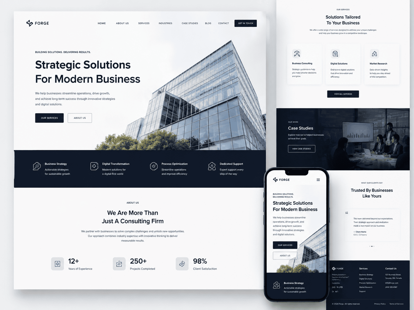


Why Responsive Web Design Matters for Canadian Businesses
For Canadian businesses, a website is no longer a static brochure; it is the primary point of contact for a vast, geographically dispersed, and technologically diverse audience. With a population spread across six time zones and a digital landscape that shifts rapidly between urban and rural connectivity, the ability to deliver a seamless experience on any screen is not a luxury, but a fundamental operational requirement. A responsive website—one that fluidly adapts its layout, content, and functionality to the device being used—directly addresses the reality of how Canadians discover, evaluate, and purchase products and services. Ignoring this reality means not only losing immediate sales but also ceding long-term brand relevance to competitors who understand that user attention is finite and patience is minimal.
The Rise of Mobile and Tablet Usage Across Canadian Provinces
While national averages are instructive, the Canadian market is defined by its regional nuance. From densely populated urban corridors in Ontario and Quebec to sprawling rural communities in the Prairies and Atlantic Canada, device usage patterns reveal a consistent, non-negotiable trend: mobile-first browsing is the standard. In provinces where long commutes and harsh winters encourage on-the-go interaction, smartphones dominate. In contrast, tablet usage often spikes in household settings during evening hours, particularly in provinces with older demographics. This multi-device reality means that a business cannot afford to design for a single screen size. Key considerations include:
- Urban Centres: High-density areas like Toronto and Vancouver show peak mobile usage during transit hours, with users expecting fast load times and thumb-friendly navigation.
- Rural and Remote Regions: Intermittent connectivity demands that responsive sites be lightweight and efficient, ensuring content renders correctly even on slower 3G or 4G connections.
- Tablet Penetration: Provinces with a higher median age, such as British Columbia and Nova Scotia, see sustained tablet use for research and online shopping, requiring layouts that work in both portrait and landscape orientations.
The consequence is clear: a website that only works well on a desktop monitor fails to serve a significant portion of the Canadian population, regardless of where they live.
How User Experience on Mobile Directly Affects Conversion Rates
The correlation between a positive mobile experience and revenue generation is direct and measurable. A responsive design is not merely about shrinking a desktop layout; it is about re-architecting the user journey to minimize friction. When a Canadian consumer lands on a page from a search engine or a social media link, they are often in a state of high intent. If that page requires pinch-to-zoom, has unclickable links, or presents a checkout form that is impossible to complete on a phone, the user will abandon the transaction within seconds. This abandonment has a compounding effect:
| Mobile User Action | Responsive Site Outcome | Non-Responsive Site Outcome |
|---|---|---|
| Initial page load (3-second threshold) | Content renders clearly; user proceeds to browse. | Layout breaks or loads slowly; user hits the back button. |
| Reading product details | Text and images adjust to screen width; readability is high. | User must zoom and pan; frustration leads to exit. |
| Completing a purchase | Simple form fields and large touch targets enable quick checkout. | Misaligned buttons cause accidental clicks; user abandons cart. |
Every step of friction on a non-responsive site is a step toward a competitor. In Canada, where consumers are accustomed to high standards of digital service from major retailers, a poor mobile experience is interpreted as a lack of professionalism and care.
Competitive Disadvantage of Non-Responsive Websites in Canada
Operating a non-responsive website in the current Canadian market is akin to opening a store with a locked front door. The competitive landscape is fierce, with local businesses competing not only against each other but also against international e-commerce giants who have perfected mobile experiences. A non-responsive site signals obsolescence. It suffers in search engine rankings because Google and other search engines prioritize mobile-friendly pages for queries made on mobile devices. Consequently, a business with a legacy, fixed-width website becomes virtually invisible in local search results when a potential customer searches for a product or service on their phone. This invisibility is a severe competitive disadvantage because it means the business is not even considered. Furthermore, when a Canadian user does manage to navigate a non-responsive site, the negative experience is often shared through word-of-mouth or social media, damaging the brand’s reputation far beyond the single visit. In a market that values efficiency and clarity, a responsive design is the baseline for legitimacy, trust, and sustained market share.
Understanding Responsive Web Design: Core Principles and Technologies
Responsive web design (RWD) is a development approach that ensures a single website adapts seamlessly to any screen size, from a smartphone to a widescreen monitor. Rather than creating separate versions of a site for different devices, RWD uses fluid proportions, flexible media, and conditional CSS rules to rearrange and rescale content dynamically. For Canadian businesses—where users switch between mobile, tablet, and desktop throughout the day—this approach eliminates the need for redirects and duplicate maintenance, while improving user experience and search engine visibility. The core philosophy is simple: one URL, one codebase, and a layout that responds to the viewer’s environment.
Fluid Grids and Flexible Layouts: The Backbone of Responsiveness
Traditional fixed-width layouts use pixel-based columns that break on smaller screens. Fluid grids replace these with proportional units like percentages or the fr unit in CSS Grid. Every column width, margin, and padding is calculated relative to its container, so the layout stretches or compresses naturally. For example, a three-column desktop layout might stack into a single column on a 320px viewport—not because the code changes, but because the proportions dictate that each column takes 100% width when the container shrinks.
A practical foundation involves setting the root font size and using relative units:
/* Example: Fluid two-column grid */
.container {
  display: grid;
  grid-template-columns: repeat(auto-fit, minmax(250px, 1fr));
  gap: 1rem;
}
.item { width: 100%; }
This snippet ensures that columns are at least 250px wide and expand to fill available space, automatically reducing the number of columns on narrow screens. Flexible images follow the same principle—using max-width: 100% ensures an image never overflows its parent container, while height: auto preserves aspect ratio.
Media Queries: Tailoring Styles to Screen Sizes and Devices
Media queries are conditional CSS rules that apply styles only when certain viewport characteristics are met—typically width, but also orientation, resolution, or even hover capability. They work alongside fluid grids, allowing you to fine-tune typography, hide non-essential elements, or adjust navigation menus for touch interfaces. A common approach is mobile-first, where base styles target small screens, and @media rules progressively enhance the layout for larger viewports.
/* Base styles for mobile */
.nav { display: block; }

/* For screens wider than 768px */
@media (min-width: 768px) {
  .nav { display: flex; justify-content: space-between; }
}
Media queries do not replace fluid grids; they complement them. While a fluid grid handles the bulk of resizing, queries address specific breakpoints where a simple proportional change is insufficient—such as switching from a hamburger menu to a horizontal navigation bar or increasing font sizes for readability on desktop monitors.
Responsive vs. Adaptive vs. Dynamic Serving: What’s Best for Your Business?
These three methods are often confused, but they differ significantly in implementation and performance:
| Method | How it works | Pros | Cons |
|---|---|---|---|
| Responsive (RWD) | One HTML file, CSS media queries adjust layout | Single URL, easy maintenance, SEO-friendly | May load unnecessary assets on mobile |
| Adaptive | Server or client detects viewport, serves one of several pre-designed layouts | Precise control at breakpoints | More code to maintain, multiple templates |
| Dynamic Serving | Same URL, but server sends different HTML/CSS based on user agent | Can serve stripped-down mobile version | Risk of content mismatch, requires careful Vary header setup |
For most Canadian businesses, responsive design is the recommended default. It aligns with Google’s mobile-first indexing, reduces development overhead, and future-proofs against new devices. Adaptive may suit highly complex web apps with distinct desktop and mobile workflows, while dynamic serving is rarely necessary unless performance on low-end devices is a critical constraint. The key is to evaluate your user base: if most traffic is mobile but sessions are short, responsive with performance optimizations will serve you better than an adaptive solution that requires guessing which layout a user needs.
The Canadian Digital Landscape: User Behavior and Device Statistics
To build a responsive website that performs, you must first understand how Canadians actually browse. The country is not a single digital monolith; behavior shifts sharply by age, geography, and infrastructure. A mobile-first approach is no longer a progressive choice—it is the baseline expectation for most users, and failing to align with these habits directly impacts engagement, conversions, and search visibility.
Smartphone Penetration and Data Consumption Across Canada
Smartphone ownership in Canada is effectively saturated among adults under 55, with penetration rates exceeding 95% in that demographic. Even among Canadians aged 65 and older, ownership has climbed past 70%, a figure that continues to rise each year. However, the more telling metric is data consumption. Canadian mobile users consume an average of over 10 gigabytes of cellular data per month, placing the country among the top tier globally for per-capita usage. This is driven not merely by streaming, but by daily habits: social media browsing, price comparison in physical stores, and video content consumption on the go.
This high data usage has a critical design implication: users expect fast, content-rich pages on cellular connections, not just on Wi-Fi. A responsive site that serves heavy desktop assets to mobile users will frustrate this audience, leading to higher bounce rates. Furthermore, the urban-rural split matters. While urban centres like Toronto and Vancouver enjoy robust 5G coverage and fibre-to-the-home, rural communities often rely on slower LTE or regional carriers. A responsive design must therefore compress images, defer non-critical scripts, and prioritize above-the-fold content to accommodate both high-bandwidth urban users and lower-bandwidth rural users.
E-Commerce Traffic from Mobile Devices: Key Provincial Insights
Mobile commerce in Canada has crossed a decisive threshold. Across the country, roughly 60% of all visits to retail e-commerce sites now originate from a smartphone or tablet. This share is not uniform by province, which matters for businesses targeting specific regions. The following table illustrates the mobile share of e-commerce traffic and the average order value by device, based on recent industry tracking data:
| Province | Mobile Share of E-Commerce Visits | Average Order Value (Mobile) | Average Order Value (Desktop) |
|---|---|---|---|
| Ontario | 62% | $78 | $95 |
| Quebec | 58% | $71 | $89 |
| British Columbia | 64% | $82 | $101 |
| Prairie Provinces (AB, SK, MB) | 55% | $69 | $88 |
| Atlantic Provinces (NB, NS, PE, NL) | 52% | $64 | $80 |
Two patterns emerge. First, mobile traffic share is higher in provinces with dense urban populations, such as Ontario and British Columbia, where commuters and younger professionals shop during transit. Second, desktop users consistently spend more per order across every province. This gap indicates that mobile users are more likely to be in an exploratory or comparison phase, while desktop users are often completing higher-value purchases. A responsive site must therefore not only render correctly on mobile but also streamline the checkout process—reducing form fields, enabling digital wallets, and offering clear progress indicators—to narrow that order value gap.
Mobile-First Indexing: How Google’s Algorithm Affects Canadian Searches
Since Google rolled out mobile-first indexing globally, the search giant has used the mobile version of your website as the primary basis for ranking and indexing. For Canadian businesses, this is not a future concern; it is the current operational reality. If your site serves a stripped-down or different experience to mobile users, Google will index that weaker version, and your desktop rankings will suffer accordingly.
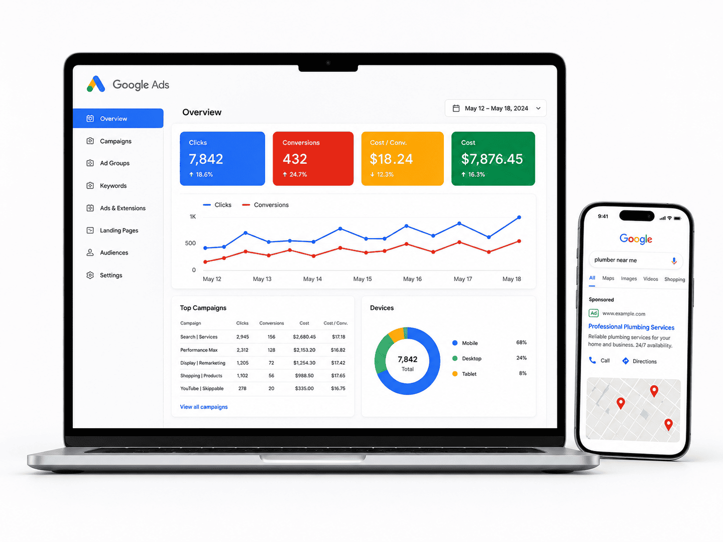
Consider the typical Canadian search pattern: over 70% of local searches for services such as plumbers, restaurants, and legal firms occur on mobile devices. Google evaluates your site based on the mobile viewport, measuring page speed, tap-target sizes, and the legibility of text without zoom. A responsive design that uses a single URL and fluid grids ensures that Googlebot crawls the same content, regardless of device. Avoid common Canadian pitfalls such as blocking JavaScript, CSS, or image files in your robots.txt file, which prevents Google from rendering your mobile pages correctly. Also, verify that your viewport meta tag is present and that font sizes are set to at least 16 pixels to prevent iOS Safari from triggering an automatic zoom on form inputs. Ultimately, a responsive, mobile-first site is not just a user experience improvement—it is a direct ranking factor that determines whether your Canadian audience can find you at all.
Key Benefits of Responsive Design for Canadian SMEs and Enterprises
For Canadian businesses, from local SMEs in Halifax to enterprise-level operations in Toronto or Vancouver, a single responsive website is no longer a luxury—it is a strategic necessity. The shift away from separate mobile and desktop sites toward one fluid, adaptable experience delivers measurable operational and commercial advantages. Below, we break down the three pillars of value that matter most to Canadian organizations navigating a bilingual, geographically vast, and multi-device market.
Cost-Effectiveness Compared to Separate Mobile and Desktop Sites
Maintaining two distinct websites—one for desktop and one for mobile—doubles your development, hosting, and content management costs. A responsive site collapses that overhead into a single codebase. For a Canadian SME with limited IT budgets, this means:
- One development cycle: You pay once for design and build, not twice for parallel projects.
- Single content management system (CMS): Update product listings, promotions, or French/English translations in one place, not two.
- Reduced QA and testing: Test one responsive layout across breakpoints instead of auditing two entirely separate interfaces.
- Lower long-term maintenance: Every plugin, security patch, or feature update applies to one site, cutting developer hours by roughly 40–60% compared to dual-site upkeep.
For enterprises with multiple regional landing pages (e.g., Ontario vs. Quebec), the savings compound because every regional variation also becomes responsive automatically.
SEO Advantages: Unified URLs, Faster Crawlability, and Higher Rankings
Google has used mobile-first indexing since 2019, meaning its crawler primarily evaluates your site’s mobile version for ranking. A responsive design directly aligns with this reality. Here is what that means for your search visibility:
| SEO Factor | Separate Mobile & Desktop Sites | Single Responsive Site |
|---|---|---|
| URL structure | Two URLs (e.g., /page and /m/page) risk duplicate content and split link equity. | One canonical URL consolidates all backlinks and social shares. |
| Crawl efficiency | Googlebot must crawl and index twice as many pages, slowing discovery. | One crawl path covers all devices, improving indexation speed. |
| User signals | Inconsistent experience leads to higher bounce rates on mobile. | Seamless experience lowers bounce and increases dwell time. |
Unified URLs also simplify your XML sitemap and eliminate the need for rel="alternate" tags or Vary headers. For Canadian businesses targeting both English and French queries, a responsive site with hreflang attributes is far easier to manage than duplicating that logic across two domains.
Enhanced User Experience and Lower Bounce Rates Across Devices
Canadian users switch between smartphone, tablet, and desktop throughout the day—often comparing prices on a phone while commuting and finalizing a purchase on a laptop at home. A responsive site preserves the same visual hierarchy, navigation, and checkout flow across every screen size. This consistency directly reduces friction. When a user does not have to pinch, zoom, or scroll horizontally, they are far less likely to abandon the page within the first few seconds.
Key experience improvements include:
- Touch-friendly targets: Buttons and links sized for thumbs on mobile, but equally clickable with a mouse on desktop.
- Readable typography: Font sizes that scale fluidly, avoiding awkward reflows or tiny text on narrow viewports.
- Optimized media: Images and videos use
srcsetand modern formats like WebP to load quickly on 3G or rural Wi-Fi connections.
Lower bounce rates are not just a vanity metric—they feed directly into your SEO performance, creating a virtuous cycle. A responsive site ensures that a customer in a remote Alberta community with a slower connection and a user on a high-end 5G phone in downtown Montreal both receive an equally polished experience, which is the foundation of trust and conversion across Canada’s diverse digital landscape.
Critical Features Every Business Website Should Have on Mobile
In Canada, where mobile devices account for a significant portion of web traffic, a desktop-only mindset will cost you customers. A truly mobile-friendly business website goes beyond shrinking images; it must prioritize usability, speed, and local context. When a potential client in Toronto or Vancouver lands on your site from their phone, they expect a frictionless experience that respects their time and intent. Below are the non-negotiable features that separate high-converting Canadian business sites from frustrating ones.
Mobile-Friendly Navigation and Touch-Friendly Buttons
Navigation on a small screen is a different discipline. Hamburger menus are common, but they must be instantly recognizable and placed within the thumb’s natural reach zone. Avoid hover-based dropdowns, as they do not work on touchscreens. Instead, use a simple, stacked layout that reveals primary pages in one or two taps. Every clickable element—buttons, links, and menu items—should have a minimum touch target of 44 by 44 pixels, as recommended by accessibility guidelines. This prevents mis-taps and the frustration of accidentally closing a form or navigating to the wrong page. Also, ensure that your logo links back to the homepage and that a persistent “Call Now” or “Get Directions” button is visible in the header or footer, not buried in a menu.
Click-to-Call and Integration with Google Maps for Local Searches
For Canadian businesses, especially those serving specific cities or provinces, local search is a primary driver of mobile traffic. Two features are essential here:
- Click-to-Call: Every phone number on your mobile site should trigger a native call prompt. This is not just a convenience; it is a conversion point. A user searching “plumber in Calgary” at 7 PM wants to call immediately, not copy a number. Ensure your phone number is visible without scrolling on key pages.
- Google Maps Integration: Your contact page and footer should include a static map that opens the Google Maps app with a single tap. For businesses with physical locations, embed a map that provides driving directions from the user’s current location. This builds trust and reduces the bounce rate for users comparing your location to competitors.
Consider adding a clear “Store Hours” display adjacent to the map, as many mobile users are checking if you are open right now.
Optimized Forms and Checkout Processes for Conversions
Long, multi-field forms are the fastest way to lose a mobile lead. Whether you are collecting a quote request or processing an e-commerce order, every extra tap costs you conversion rate. Apply these principles:
- Minimize Fields: Request only essential information. For a contact form, that is often name, phone, and a brief message. For checkout, offer a guest option and avoid forcing account creation.
- Use Native Input Types: Set the keyboard type for each field. For example, use
type="tel"for phone numbers andtype="email"for email addresses, so the correct keyboard appears on the phone. - Large, Clear Labels: Place labels above the fields, not inside them as placeholder text, which disappears and confuses users. Ensure the font size is at least 16 pixels to prevent automatic zooming on iOS devices.
- Enable Autofill: Properly name your input attributes (e.g.,
autocomplete="name",autocomplete="postal-code") so users can fill out their Canadian address quickly.
For checkout, display a progress indicator and use a single-column layout. Include trusted payment icons (Visa, Mastercard, Interac, PayPal) early, and verify that your SSL certificate is active and visibly indicated. A final review screen should summarize the order with a prominent “Place Order” button that is impossible to miss.
By implementing these features, you align your site with the expectations of the Canadian mobile user, who values speed, clarity, and direct access to your business. Test every element on a real device, not just a browser simulator, to ensure your taps, forms, and maps work flawlessly from coast to coast.
Responsive Design and SEO: Best Practices for Canadian Markets
For Canadian businesses, a responsive website is no longer optional—it is the foundation of local search visibility. Google’s mobile-first indexing means the search engine primarily uses the mobile version of your site for ranking and indexing. When your responsive design is correctly implemented, you maintain a single URL structure, consolidate link equity, and avoid duplicate content issues that often plague separate mobile sites. This unified approach directly supports local SEO by allowing search engines to crawl, render, and understand your content efficiently across all devices, which is critical for users searching for “plumbers in Toronto” or “boutique hotels in Vancouver” from their smartphones.
Local SEO Strategies for Multi-Region Businesses in Canada
If your business operates across multiple Canadian provinces, responsive design must be paired with a deliberate local SEO strategy. A single responsive site with location-specific pages is the most scalable approach. Avoid using subdomains or separate mobile directories, as these dilute authority. Instead, structure your URLs logically, such as example.ca/pages/montreal-services and example.ca/pages/calgary-services. Within each page, integrate location-based keywords naturally in the title tag, H1, meta description, and body copy—for example, “emergency HVAC repair in Edmonton.”
Beyond on-page text, implement schema markup for LocalBusiness and each physical location. Use the @type: LocalBusiness JSON-LD format to provide search engines with your NAP (name, address, phone number), business hours, and geo-coordinates. For businesses with multiple branches, use the @type: Organization schema with nested @type: LocalBusiness entities. This structured data helps Google display rich results, including map pins and local knowledge panels, which are essential for capturing high-intent local queries.
Additionally, ensure your location pages link to each other using descriptive anchor text, such as “Our Ottawa team” rather than “click here.” This internal linking pattern distributes authority across your regional hubs while signalling geographic relevance to search engines. Finally, embed a Google Map on each location page and include a unique local phone number if possible, as this reinforces local trust signals.
Improving Page Speed on Mobile: Tools and Techniques
Canadian users expect fast load times, especially on mobile networks that vary from dense urban 5G to rural LTE. Page speed is a confirmed ranking factor, and for responsive sites, the performance of the mobile viewport is what matters most. Start by auditing your site with Google’s PageSpeed Insights and Lighthouse, focusing on the “Mobile” tab. These tools will provide a Core Web Vitals report, highlighting LCP (largest contentful paint), CLS (cumulative layout shift), and INP (interaction to next paint). For Canadian audiences, also test with WebPageTest, selecting a server location like Toronto or Vancouver to simulate real-world latency.
Key techniques to improve mobile speed include:
- Compress images using modern formats like WebP and serve them responsively with the
srcsetattribute, ensuring smaller files for low-resolution screens. - Minify CSS, JavaScript, and HTML using tools like UglifyJS or CSSNano, and remove unused code.
- Implement lazy loading for below-the-fold images and iframes using the native
loading="lazy"attribute. - Use a content delivery network (CDN) with Canadian edge nodes to reduce server response time (TTFB) for users in different provinces.
- Prioritize above-the-fold content by inlining critical CSS and deferring non-essential scripts.
A practical technique involves using the fetchpriority attribute on your hero image. For example:
<img src="hero-toronto.jpg" alt="Toronto storefront" fetchpriority="high">This tells the browser to prioritize loading that image, reducing LCP time. Conversely, add fetchpriority="low" to less important images, such as those in the footer.
Avoiding Common SEO Pitfalls in Responsive Implementation
Even well-intentioned responsive designs can harm SEO if misconfigured. One frequent error is using display:none in CSS to hide content on mobile. Search engines may devalue this hidden content if it is seen as an attempt to stuff keywords without providing value. Instead, use responsive breakpoints that rearrange content logically, ensuring that important text and links are visible and accessible on all screen sizes. Another common pitfall is failing to set the viewport meta tag correctly. Without <meta name="viewport" content="width=device-width, initial-scale=1">, your site will render as a desktop page on mobile, causing zoom issues and poor user experience, which increases bounce rates and lowers rankings.
Additionally, be cautious with JavaScript-driven content. If your responsive design relies on JavaScript to load navigation or main content, Google may not render it properly during crawling. Use server-side rendering or dynamic rendering for critical elements, and always test with Google’s Rich Results Test to ensure content is accessible without JS. Finally, avoid blocking CSS or JS files in your robots.txt; this prevents search engines from rendering your responsive layout accurately, leading to incorrect indexing. Regularly audit your site for mixed content errors (HTTP vs. HTTPS) and ensure all internal links work across breakpoints, as broken mobile menus are a fast way to lose both users and search equity.
Choosing the Right Approach: Responsive Design vs. Progressive Web Apps (PWAs)
For Canadian businesses, the decision between a responsive website and a Progressive Web App (PWA) is not about picking the “newer” technology—it is about aligning technical capabilities with user expectations and operational realities. Responsive design remains the foundational standard for broad reach, while PWAs offer a hybrid solution that mimics native app behavior. Understanding the trade-offs, particularly regarding offline access, installation friction, and engagement mechanics, will determine which approach serves your customers across Canada’s diverse connectivity landscape.
What Are PWAs and How Do They Differ from Responsive Sites?
A responsive website uses fluid grids, flexible images, and CSS media queries to adapt its layout to any screen size. It lives entirely in the browser, requires no installation, and depends on a live internet connection for most functionality. In contrast, a PWA is a website built with modern web APIs that adds two critical capabilities: a service worker for offline caching and a web app manifest for installation on a user’s home screen. This means a PWA can load instantly from cache when connectivity is poor—a significant advantage in rural regions or on congested mobile networks—and can send push notifications, just like a native iOS or Android app. However, PWAs do not have full access to device hardware (e.g., advanced Bluetooth or background GPS) and are not distributed through the Apple App Store or Google Play, which alters discovery and update workflows.
When to Choose a PWA Over a Traditional Responsive Website
Choosing a PWA is not a blanket upgrade; it is a strategic decision for specific user journeys. Consider a PWA if your business model relies on repeat engagement or transactions where speed and resilience are paramount. Key indicators include:
- High return visits: Loyalty programs, booking portals, or order tracking benefit from instant loading and push reminders.
- Unstable connectivity: Businesses serving customers in remote areas—construction, tourism, or agriculture—need core content accessible offline.
- App-like interactions without app-store costs: If you want a full-screen immersive experience but lack resources for separate native development.
- E-commerce with cart abandonment issues: A PWA’s faster load times and offline cart recovery can reduce drop-off on slower mobile connections.
Conversely, a traditional responsive site remains the correct choice for content-heavy informational pages, SEO-driven blogs, or businesses with a one-time visit pattern (e.g., finding a local clinic’s hours). Responsive sites also avoid the complexity of service worker caching logic, which can cause stale content if not managed carefully.
Case Examples: Canadian Retailers and Service Providers
Consider a hypothetical Canadian outdoor gear retailer with stores in Vancouver and Toronto. A responsive site serves casual browsers well, but a PWA offers tangible benefits: shoppers on a hiking trail in British Columbia can open the cached product catalog, add gear to their cart, and complete checkout later when signal returns. Push notifications about restock alerts or local pickup windows drive repeat sales. In contrast, a national legal firm offering only informational articles and contact forms would gain little from a PWA—their clients search once, read, and call. A responsive site with a clear mobile menu and click-to-call button is simpler, cheaper to maintain, and ranks equally well in search.
For service providers like a chain of coffee shops across Alberta, a PWA could handle loyalty cards and pre-order payments, reducing queue times. However, a small independent restaurant relying on walk-in traffic and Google Maps discovery should prioritize a fast, responsive site with a prominent reservation link. The deciding factor is whether your users need the site to work like an app or merely look good on a phone. Most Canadian businesses, especially those with limited development budgets, will find that a well-optimized responsive site meets 80% of needs; PWAs are the remaining 20% for engagement-heavy, connectivity-sensitive operations.
Accessibility and Compliance: Meeting Canadian Web Standards (AODA, WCAG)
For businesses operating in Canada, web accessibility is not merely a best practice—it is a legal obligation with tangible consequences. Responsive web design, when executed with accessibility in mind, forms the technical backbone for compliance. A responsive site that adapts fluidly to different viewports must also preserve semantic structure, keyboard operability, and readable text scaling. Failing to meet these standards exposes your organization to human rights tribunal complaints, reputational damage, and lost revenue from the approximately 22% of working-age Canadians living with a disability. This section outlines the regulatory landscape and provides actionable steps to embed accessibility into your responsive framework.
Overview of AODA Requirements and Who Must Comply
The Accessibility for Ontarians with Disabilities Act (AODA), enacted in 2005, sets mandatory standards that apply to all public, private, and non-profit organizations in Ontario with one or more employees. Under the Information and Communication Standards, your website must meet WCAG 2.0 Level AA, with specific deadlines based on organization size and sector. Private businesses with 50+ employees were required to comply by January 1, 2021, while smaller organizations (1–49 employees) had until January 1, 2021, for new content and must ensure all existing content meets the standard by January 1, 2026. Crucially, AODA applies to “internet websites” and “web content” published after January 1, 2012, and includes both public-facing pages and password-protected portals. Organizations must also file an accessibility compliance report every three years. Outside Ontario, federal entities fall under the Accessible Canada Act (ACA), which similarly references WCAG 2.1 Level AA. While other provinces lack specific web regulations, human rights codes in every jurisdiction treat inaccessible digital services as discrimination.
WCAG 2.1 Guidelines: Making Your Responsive Site Inclusive
WCAG 2.1, the international standard referenced by Canadian law, organizes accessibility into four principles: Perceivable, Operable, Understandable, and Robust. For responsive design, these principles translate into concrete technical requirements. The following table compares common accessibility challenges with their WCAG success criteria and responsive solutions:
| Accessibility Barrier | WCAG 2.1 Success Criterion | Responsive Design Solution |
|---|---|---|
| Text too small to read on mobile | 1.4.4 Resize Text (Level AA) | Use relative units (rem/em) so text scales with browser zoom up to 200% without clipping |
| Touch targets too close together | 2.5.8 Target Size (Minimum, Level AA in WCAG 2.2) | Ensure interactive elements are at least 24×24 CSS pixels with adequate spacing on small screens |
| Keyboard focus invisible on narrow layouts | 2.4.7 Focus Visible (Level AA) | Maintain a highly visible focus indicator (e.g., 2px outline) that adapts to each breakpoint |
| Content reflows incorrectly when zoomed | 1.4.10 Reflow (Level AA) | Design layouts that collapse to a single column without horizontal scrolling at 320px width |
| Orientation locked to portrait | 1.3.4 Orientation (Level AA) | Support both landscape and portrait views; never disable rotation on tablets or phones |
Beyond these criteria, WCAG 2.1 emphasizes that responsive design must not rely solely on screen size. For example, a hamburger menu that hides navigation behind an icon may fail Criterion 2.4.6 (Headings and Labels) if the expanded state is not announced to screen readers. Similarly, CSS media queries that change layout order can break the logical reading sequence required by Criterion 1.3.2 (Meaningful Sequence). Always test your responsive breakpoints with a screen reader and keyboard-only navigation to verify that content remains accessible in every viewport.
Practical Steps to Ensure Accessibility in Responsive Layouts
To integrate accessibility into your responsive workflow, follow these concrete practices:
- Adopt a mobile-first CSS strategy: Write base styles for small screens, then use
min-widthmedia queries to enhance layouts for larger viewports. This ensures that essential content and navigation are never hidden or deprioritized. - Use semantic HTML5 landmarks: Apply
<header>,<nav>,<main>, and<footer>consistently. Screen reader users rely on these to jump between sections, regardless of how the visual layout shifts. - Implement accessible touch interactions: Do not rely on hover-only states (e.g., dropdown menus that appear on desktop hover). Provide tap or click equivalents that work on touchscreens and keyboard focus.
- Test with real assistive technology: Use VoiceOver (iOS/macOS), NVDA (Windows), and TalkBack (Android) to navigate your responsive site at multiple viewport widths. Verify that form labels, error messages, and dynamic content are announced correctly.
- Conduct automated and manual audits: Run tools like WAVE or axe at each breakpoint, but remember that automated checks catch only ~30% of issues. Manually review contrast ratios, focus order, and alternative text for images that resize or crop differently across devices.
- Provide a “skip to content” link: This link must remain visible and functional when the page is condensed to a single column, allowing keyboard users to bypass repetitive navigation.
By treating accessibility as a core requirement of your responsive design process—not an afterthought—you not only comply with Canadian law but also improve usability for all users, including those on older devices or slow connections. Regular audits, user testing with people with disabilities, and documented remediation plans will keep your organization aligned with evolving standards like WCAG 2.2 and future AODA updates.
Working with a Canadian Web Design Agency: What to Look For
Selecting the right web design partner in Canada is about more than finding a team that can build a visually appealing site. Your website is a critical business asset, and the agency you choose will influence your digital presence for years. The Canadian market has unique characteristics—from bilingual considerations in Quebec to varying consumer behaviours across provinces—that a professional partner should understand deeply. Focus on finding an agency that combines technical excellence with local business acumen, rather than simply choosing the lowest bidder or the most polished portfolio.
Evaluating a Designer’s Experience with Canadian Business Needs
When reviewing a prospective agency, do not settle for generic examples of past work. Ask them to demonstrate projects specifically completed for Canadian clients, especially those within your industry or geographic region. A designer who has worked with Canadian businesses will understand the importance of compliance with provincial privacy laws such as PIPEDA, the need for bilingual user interfaces where relevant, and the nuances of Canadian e-commerce expectations like shipping and payment preferences. Examine their case studies for evidence of local problem-solving—for instance, how they handled high traffic during a Canadian holiday season or integrated with Canadian logistics providers. Also, verify that they are familiar with the Canadian web hosting landscape and can recommend providers with servers in Canada, which can improve load times and data sovereignty for your customers.
Questions to Ask Before Signing a Contract
Before you commit, conduct a structured interview. A prepared list of questions will reveal the agency’s transparency and operational maturity. Consider asking the following:
- Who will be my direct point of contact, and what is their availability in Canadian time zones?
- Will the content management system (CMS) allow my Canadian team to update content without developer assistance?
- How do you handle accessibility requirements under the Accessibility for Ontarians with Disabilities Act (AODA) or similar provincial legislation?
- What is your process for integrating Canadian payment gateways such as Moneris or Stripe, including currency and tax handling?
- Can you provide a detailed timeline with milestones, and what happens if a milestone is missed?
- Do you offer a fixed-price quote, or are there potential cost overruns for revisions?
These questions help you move beyond aesthetics and into the practical realities of running a Canadian business online. A reputable agency will welcome such scrutiny and provide clear, direct answers.
The Importance of Ongoing Maintenance and Performance Monitoring
Your website is not a one-time project; it requires ongoing care. A professional agency should offer a clear post-launch maintenance plan. This includes regular software updates, security patches, and daily backups. More importantly, they should provide performance monitoring that tracks key metrics like page load speed, uptime, and user behaviour. Ask if they set up analytics that respects Canadian privacy guidelines, such as anonymized IP tracking. For example, they should configure your server to send proper caching headers. A practical command they might use during optimization is:
curl -I https://yourwebsite.caThis command checks the response headers to verify that caching and compression are active, directly impacting your site’s speed for Canadian visitors. Ongoing monitoring should also include regular reviews of conversion paths, mobile usability, and search engine rankings. Insist on a monthly or quarterly report that explains what was monitored, what issues were found, and what actions were taken. The right agency treats your website as a living system that evolves with your business, not a static deliverable they abandon after launch. Choose a partner who demonstrates a genuine commitment to your long-term digital health in the Canadian market.
Cost Considerations and ROI of Responsive Web Design in Canada
Investing in a responsive website is a significant business decision, and Canadian companies face a wide range of pricing based on scope, location, and agency expertise. Understanding where your project fits on that spectrum—and how to track its financial return—is critical before signing a contract. Below, we break down realistic costs, potential hidden fees, and the metrics that prove your investment is working.
Average Costs for Small Business vs. Enterprise-Level Projects
Pricing in Canada varies dramatically by project complexity, team size, and whether you hire a freelance designer, a boutique agency, or a large digital firm. Geographic location also matters: agencies in Toronto or Vancouver typically charge 20–30% more than those in Winnipeg or Halifax.
| Project Type | Typical Cost Range (CAD) | Common Inclusions |
|---|---|---|
| Small business (5–10 pages, template-based) | $3,000 – $8,000 | Responsive theme, basic CMS, contact forms, mobile testing |
| Mid-sized business (custom design, 15–30 pages) | $10,000 – $25,000 | Custom wireframes, content migration, SEO structure, advanced interactions |
| Enterprise-level (50+ pages, integrations, custom apps) | $40,000 – $120,000+ | Full UX research, API integrations, multi-language support, rigorous QA, project management |
For enterprise projects, expect additional costs for accessibility compliance (WCAG 2.1 AA) and load testing under high traffic. Small businesses can reduce costs by using a pre-designed theme, but custom design is strongly recommended if brand differentiation is a priority.
Hidden Costs: Hosting, SSL, and Ongoing Updates
Many Canadian businesses overlook recurring expenses that surface after launch. Budget for these items from day one:
- Hosting: Canadian-based hosting with SSD storage and daily backups costs $30–$150/month, depending on traffic. Cheap shared hosting ($10/month) often undermines responsive performance.
- SSL certificate: Most reputable hosts include a free Let’s Encrypt SSL, but extended validation (EV) certificates for e-commerce can cost $100–$300/year.
- Ongoing updates: Core CMS updates, plugin patches, and security monitoring typically run $500–$2,000/year. Without these, your site becomes vulnerable to attacks.
- Content changes: Most agencies charge $75–$150/hour for post-launch edits. A monthly maintenance retainer of $300–$800 often provides better value.
- Compliance: Canadian privacy laws (PIPEDA) may require cookie consent tools and data storage audits, costing $500–$1,500 initially.
Always ask for a written list of excluded costs before signing. A quote that seems low may omit critical items like favicon design, 404 page creation, or basic image optimization.
Measuring ROI: Analytics, User Engagement, and Sales Attribution
To determine if your responsive design investment pays off, track these three areas over a 6–12 month period. Start with a baseline before the redesign.
Analytics: Use Google Analytics 4 to monitor mobile bounce rate, pages per session, and average session duration. A successful redesign should show mobile bounce rate dropping by 15–25% and pages per session increasing by at least 10%.
User engagement: Track form submissions, click-to-call buttons, and map interactions. For Canadian businesses, also measure time-on-location pages for physical stores—a key indicator of mobile intent.
Sales attribution: Set up e-commerce tracking or goal conversions for quote requests. Compare conversion rate before and after launch. For example, if your old site converted at 1.5% and your new responsive site converts at 2.5%, a monthly traffic of 10,000 visitors yields an extra 100 leads. If each lead is worth $50 in profit, your monthly ROI is $5,000—meaning a $20,000 redesign pays for itself in four months.
Use UTM parameters on Canadian-specific campaigns (e.g., Google Ads targeting “Toronto web design”) to isolate responsive site performance. Finally, run A/B tests on key mobile landing pages to validate design decisions, not just overall traffic trends.
Frequently Asked Questions
What is responsive web design and why is it important for Canadian businesses?
Responsive web design (RWD) ensures that a website adapts its layout and content to fit any screen size, from desktop monitors to smartphones. For Canadian businesses, this is crucial because over 60% of web traffic now comes from mobile devices. A responsive site improves user experience, reduces bounce rates, and boosts search engine rankings, especially since Google uses mobile-first indexing. It also helps meet the accessibility expectations of diverse Canadian users, making your business more inclusive and competitive.
How does responsive design affect SEO in Canada?
Responsive design is Google’s recommended mobile configuration. It uses a single URL and HTML, making it easier for Google to crawl and index your pages. This can lead to better rankings in Canadian search results. Additionally, responsive sites load faster and provide a better user experience, which are key ranking factors. By avoiding duplicate content issues common with separate mobile sites, responsive design consolidates your SEO efforts, helping Canadian businesses reach more local customers.
What are the key elements of a successful responsive web design?
Key elements include a flexible grid system that uses relative units like percentages, fluid images that scale within their containers, and CSS media queries to apply different styles based on screen width. Additionally, consider touch-friendly navigation, readable font sizes, and optimized performance for mobile networks. Testing across various devices and browsers is essential. For Canadian businesses, integrating local content and ensuring fast load times across the country, including remote areas with slower connections, is also vital.
How does responsive design relate to accessibility requirements in Canada?
In Canada, the Accessibility for Ontarians with Disabilities Act (AODA) and the Accessible Canada Act require businesses to make their digital content accessible. Responsive design supports accessibility by ensuring content is usable on any device, including assistive technologies. It works well with guidelines like WCAG 2.1, such as providing text alternatives for images and ensuring sufficient color contrast. A responsive layout also adapts to zoom levels and orientation changes, helping users with visual or motor impairments navigate more easily.
What is the difference between responsive and adaptive web design?
Responsive web design uses fluid grids and CSS media queries to create a single flexible layout that responds to the screen size. It adjusts continuously as you resize the browser. Adaptive design, on the other hand, uses multiple fixed layouts and detects the device to serve the most appropriate one. While adaptive can offer more control, responsive is generally easier to maintain and is recommended by Google because it uses a single URL. For most Canadian businesses, responsive design offers a cost-effective, future-proof solution.
How can a Canadian business implement responsive web design?
Businesses can start by choosing a responsive website builder or content management system (CMS) like WordPress with a responsive theme. For existing sites, a redesign may be necessary. It’s best to hire a professional web developer experienced in RWD and Canadian market needs. Ensure the design is tested on popular devices and browsers used in Canada. Also, consider integrating analytics to monitor mobile performance. If you’re in Ontario or other provinces with accessibility laws, include accessibility checks from the start.
What are the benefits of responsive web design for e-commerce in Canada?
For Canadian e-commerce, responsive design enhances the shopping experience on mobile devices, leading to higher conversion rates and customer satisfaction. It reduces the need for multiple site versions, cutting maintenance costs. A single responsive site also centralizes your SEO, helping you rank better in Canadian searches. Additionally, with a growing number of consumers shopping on mobile, a responsive design ensures your store is accessible anywhere, from urban centers to rural areas, boosting your reach and sales.
Sources and further reading
- Mobile-first Indexing – Google Search Central
- Responsive Web Design – W3C
- Accessibility for Ontarians with Disabilities Act (AODA)
- Accessible Canada Act
- WCAG 2.1 – Web Content Accessibility Guidelines
- Why Mobile Matters – Think with Google
- Mobile Internet Usage Statistics in Canada – Statista
- Responsive Design vs. Adaptive Design – Smashing Magazine
- Google’s Mobile-Friendly Test
- PageSpeed Insights – Google Developers
Need help with this topic?
Send us your details and we will contact you.