

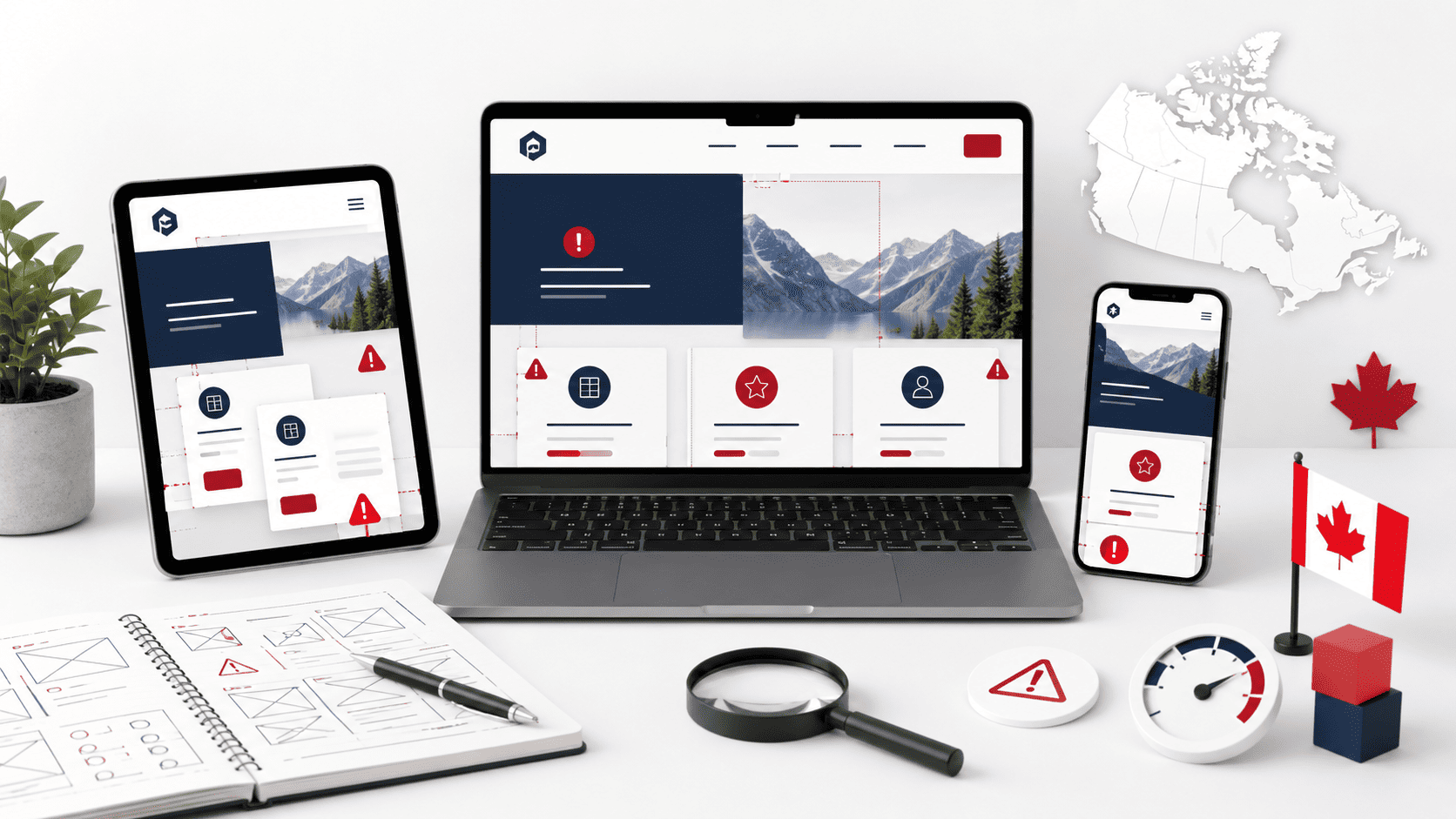
Introduction: Why Responsive Design Matters for Canadian Businesses
In Canada, the digital landscape is not a single, uniform terrain. It is a sprawling, multi-device ecosystem shaped by vast geography, two official languages, and distinct regional consumer behaviours. For businesses operating from Vancouver to Halifax, a website that fails to adapt seamlessly to every screen size is not merely an inconvenience—it is a direct barrier to revenue. Responsive web design is no longer a progressive enhancement; it is the foundational standard for digital credibility. When a Canadian consumer lands on your site from a smartphone during a commute in Toronto or a tablet in a rural kitchen in Quebec, they expect an experience that feels native to their device. Anything less signals neglect, and in a market where trust is hard-won, that perception is costly.
The State of Mobile Usage in Canada
Canadian internet behaviour has decisively shifted toward smaller screens. While precise figures fluctuate, the trend is unambiguous: a majority of web traffic in Canada now originates from mobile devices, with smartphones being the primary gateway for local searches, product research, and social media engagement. This is not limited to urban centres. In rural and remote communities, where broadband infrastructure may lag, mobile networks often serve as the primary—or only—connection to the digital world. Consequently, a business’s mobile experience is frequently its first and only impression. Furthermore, bilingual users often toggle between English and French content on the same device. A responsive framework must handle not only layout shifts but also the text expansion and contraction inherent to translation, ensuring legibility and navigation integrity in both official languages. Ignoring these mobile realities means excluding a substantial portion of the Canadian public from your digital storefront.
How Responsive Design Affects User Experience and SEO
The connection between responsive design, user experience, and search engine visibility is symbiotic. From a user perspective, a non-responsive site forces pinch-zooming, horizontal scrolling, and mis-tapped links—all friction points that drive visitors away within seconds. This poor experience is directly measured by Google, which uses mobile-first indexing as its primary ranking system. This means search engines evaluate your site’s mobile version first to determine its position in results. A desktop-only layout, or a poorly executed separate mobile site, fails these evaluations, leading to lower rankings for critical Canadian keywords. Moreover, user experience signals such as high bounce rates and low dwell time further penalize your visibility. For a Canadian business competing against both local rivals and international giants, a drop of even a few positions in search results can mean the difference between a thriving inquiry pipeline and digital obscurity. Responsive design consolidates your SEO authority into a single URL, preventing the dilution of link equity across separate mobile and desktop domains.
The Cost of Ignoring Responsive Design for Canadian Brands
The financial and reputational consequences of neglecting responsive design are severe and measurable. Consider the following direct impacts:
- Lost Conversions: Mobile users who encounter a broken layout are unlikely to complete a purchase, fill out a contact form, or book a service. Each abandoned session represents direct revenue loss.
- Increased Ad Spend Waste: Paid search campaigns that direct mobile users to a non-responsive landing page will see inflated bounce rates and wasted clicks, driving up acquisition costs without corresponding returns.
- Damaged Brand Perception: In a country where word-of-mouth and community reputation are powerful, a frustrating mobile experience is quickly shared. Negative reviews on platforms like Google or Yelp often cite poor website usability, tarnishing the brand’s image across provinces.
- Regional Alienation: A rigid design may fail to display region-specific content correctly, such as local store hours, French-language toggles, or province-specific shipping information, confusing users in different markets.
- Accessibility Compliance Risks: Canadian provinces, notably Ontario and Quebec, are increasingly aligning with web accessibility standards. Non-responsive layouts often fail basic accessibility requirements, exposing businesses to legal and compliance risks.
Ultimately, ignoring responsive design is not a cost-saving measure. It is a strategic decision to surrender market share to competitors who offer a fluid, respectful, and efficient digital experience for every Canadian user, regardless of their chosen device or language preference.
Mistake 1: Ignoring Mobile-First Indexing and Page Speed
For Canadian businesses, the path to higher search rankings and stronger customer retention runs directly through mobile performance. Google now predominantly uses the mobile version of your website for indexing and ranking. If your mobile site is slow, bloated, or poorly structured, your desktop experience will not save you. Canadian users, especially those in regions with variable network coverage, abandon pages that take more than a few seconds to load. This mistake is costly because it compounds: slow mobile pages hurt your visibility in search results, and the resulting high bounce rates further signal poor quality to search engines.
What Mobile-First Indexing Means for Your Website
Mobile-first indexing means Googlebot crawls and renders your website using a smartphone user agent. It no longer uses the desktop version as the primary reference for content, structured data, or canonical signals. If your mobile site hides content behind accordions, serves different text, or fails to load key resources, Google will index that incomplete experience. For Canadian e-commerce, local service pages, and content-heavy blogs, this can lead to a dramatic drop in organic visibility.
- Ensure all critical content (headings, body text, images, internal links) is present in the mobile HTML.
- Do not block CSS, JavaScript, or image files in your robots.txt; Google needs these to render the page correctly.
- Use the same meta robots tags and canonical URLs on mobile and desktop versions.
- Test with Google’s Mobile-Friendly Test and the URL Inspection tool to see the rendered mobile version.
Key Page Speed Metrics to Monitor on Mobile
Page speed on mobile is not just about one number. You need to track metrics that reflect real user experience under network constraints. Google’s Core Web Vitals are the baseline, but for Canadian businesses targeting diverse regions, consider additional timing metrics.
| Metric | What It Measures | Mobile Target |
|---|---|---|
| Largest Contentful Paint (LCP) | Time until the main content (hero image, text block) is visible. | Under 2.5 seconds |
| First Input Delay (FID) / Interaction to Next Paint (INP) | Responsiveness when a user taps a button or link. | Under 200 ms |
| Cumulative Layout Shift (CLS) | Visual stability as the page loads (prevents accidental taps). | Under 0.1 |
| Time to First Byte (TTFB) | Server response time for the initial request. | Under 800 ms |
Common speed pitfalls that push these metrics into the red include unoptimized hero images served at full desktop resolution, heavy JavaScript frameworks that block rendering, and third-party scripts (chat widgets, analytics, ad trackers) that delay interactive time.
Practical Tips to Improve Mobile Load Times
Start by auditing your current mobile performance. Use Lighthouse in Chrome DevTools with a mobile preset, or PageSpeed Insights for a field-based view. Then, apply these fixes in order of impact.
- Compress and resize images: Serve WebP or AVIF formats with appropriate dimensions. For a typical product image, aim for under 100 KB. Use
srcsetto deliver different sizes based on viewport. - Defer or eliminate non-critical JavaScript: Load chat widgets and social feed scripts only after the main content is interactive. Use the
deferattribute or load them on user interaction. - Enable text compression: Ensure your server sends Brotli or Gzip for HTML, CSS, and JavaScript. Most Canadian hosting providers allow this via .htaccess or nginx config.
- Minify CSS and JS: Remove unused code and whitespace. Combine files where possible, but prioritize critical CSS inlined in the
<head>.
For a quick server-side win, add cache-control headers for static assets. An example for Apache servers in your .htaccess file:
<IfModule mod_headers.c>
  <FilesMatch ".(jpg|jpeg|png|gif|webp|svg|css|js)$">
    Header set Cache-Control "max-age=31536000, public, immutable"
  </FilesMatch>
</IfModule>
Finally, test on a real 4G connection, not just Wi-Fi. Use throttling in DevTools to simulate a slower network. Canadian businesses that prioritize these fixes will see improved rankings, lower bounce rates, and higher conversion from mobile users who expect speed as a baseline, not a bonus.
Common Responsive Web Design Mistakes Canadian Businesses Should Avoid
When Canadian businesses overlook mobile navigation, they directly undermine their responsive design efforts. Desktop-oriented menus—those sprawling horizontal bars with multiple dropdowns—rarely translate well to a 375-pixel-wide smartphone screen. The result is a frustrating tap-and-pinch experience that drives users away. Research consistently shows that mobile users abandon sites that require excessive zooming or precise hovering; in fact, nearly 57% of users say they won’t recommend a business with a poorly designed mobile site. For Canadian retailers, service providers, and local enterprises, this means lost conversions and a damaged brand reputation. Below, we dissect why navigation fails on small screens and how to fix it with user-first patterns.
Common Navigation Pitfalls on Mobile Devices
Several recurring issues plague mobile menus, each contributing to high bounce rates:
- Hover-dependent dropdowns: Desktop menus often reveal subcategories on hover. On touchscreens, there is no hover state—only a tap. Users either accidentally trigger menus or cannot access subpages without long-pressing, which feels unnatural.
- Overcrowded link lists: Displaying 10–15 top-level links in a single row forces tiny, un-tappable text. This violates the recommended minimum touch target size of 44×44 pixels (Apple HIG) and 48×48 pixels (Material Design), leading to mis-taps.
- Fixed desktop header: Many sites keep the full desktop navigation bar intact, shrinking it proportionally. The result is microscopic fonts, clipped labels, and a layout that requires constant horizontal scrolling—a cardinal sin in mobile UX.
- Hidden search functionality: When search is buried inside a menu, users who want to quickly find a product or service must perform extra taps. On mobile, visible search reduces cognitive load and speeds up task completion.
These pitfalls create a “dead-end” feeling. Users cannot locate key pages, so they leave—often to a competitor with a simpler interface.
Designing Hamburger Menus and Bottom Navigation for Usability
Two dominant patterns solve mobile navigation clutter: the hamburger menu and bottom navigation. Each has distinct advantages, and the choice depends on your content hierarchy.
Hamburger menus (three stacked lines) are ideal for sites with many secondary pages—blogs, support centers, or large e-commerce catalogs. However, they are not a magic bullet. A hamburger hides navigation, reducing discoverability. To make it usable:
- Place it in the top-left or top-right corner, within the thumb’s natural reach zone.
- Ensure the menu slides in quickly, covers no more than 80% of the screen, and includes a clear close (X) button.
- Use a single-level expansion for subcategories, avoiding nested accordions that require multiple taps.
Bottom navigation works best for primary actions—Home, Products, Cart, Account—when you have 3–5 main destinations. It is thumb-friendly and persistent, reducing the need to scroll back to the top. For Canadian businesses like restaurants, clinics, or local shops, bottom tabs can highlight “Call Now” or “Directions,” directly driving conversions.
Below is a comparison to guide your decision:
| Feature | Hamburger Menu | Bottom Navigation |
|---|---|---|
| Best for | Deep sites with 6+ top-level categories | Shallow sites with 3–5 core actions |
| Discoverability | Low (hidden behind icon) | High (always visible) |
| Thumb reach | Depends on placement (top vs. middle) | Excellent (bottom of screen) |
| Screen space | Minimal when closed | Uses ~50–60px permanently |
| Scalability | Handles many links via scroll | Limited to 5 items max |
| User familiarity | Widely understood but can feel generic | Native to iOS and Android apps |
For Canadian businesses, consider a hybrid approach: bottom navigation for key actions, plus a hamburger for secondary links. Test which pattern reduces task completion time for your specific audience.
Testing Navigation Across Devices and Screen Sizes
No design is complete without rigorous testing. Canadian businesses must account for a fragmented device landscape—from older iPhones (SE, 375px wide) to large Android phablets (430px+). Testing should go beyond resizing a browser window. Use real devices or cloud-based emulators to check:
- Tap accuracy: Ensure menu items have adequate spacing. Adjacent links with less than 8px gap cause accidental taps.
- Scroll behavior: Verify that sticky headers or bottom navs do not cover content, and that the page scrolls smoothly without jank.
- Orientation changes: Rotate the device from portrait to landscape. Menus must not overlap content or require horizontal scrolling.
- Accessibility: Test with screen readers (VoiceOver, TalkBack). Hamburger buttons need clear ARIA labels like “Open main menu,” and focus states must be visible.
Additionally, run heatmap or session-recording tools to observe where users tap and where they hesitate. If analytics show high exit rates on pages that require menu interaction, revisit your information architecture. A practical test is the “one-thumb rule”: can a user reach every primary nav item without stretching? If not, reposition elements.
Finally, remember that responsive design is not a one-time task. As your Canadian business adds new products, services, or content, revisit your navigation structure quarterly. Mobile user behavior evolves, and so should your menu. By prioritizing touch-friendly, collapsible patterns and testing them relentlessly, you will reduce bounce rates and keep users engaged—wherever they are in Canada.
Common Responsive Web Design Mistakes Canadian Businesses Should Avoid: Mistake 3: Overlooking Touch Targets and Interactive Elements
When Canadian businesses adapt their websites for mobile, they often focus on text size, image scaling, and navigation menus. Yet one of the most frequent and damaging oversights involves the physical usability of interactive elements. On a desktop, a user wields a precise mouse cursor; on a smartphone or tablet, they use a fingertip. This difference is not cosmetic—it fundamentally changes how users interact with your site. If buttons, links, or form fields are too small or packed too tightly, users will tap the wrong thing, become frustrated, and leave. For businesses relying on mobile traffic for bookings, purchases, or inquiries, this friction directly translates into lost revenue.
Ideal Touch Target Sizes and Spacing Guidelines
The core principle is simple: design for thumbs and fingers, not cursors. Industry standards provide clear minimums, and while they are not legally binding, they represent user comfort thresholds. The widely accepted minimum target size is 44 by 44 CSS pixels, as recommended by Apple’s Human Interface Guidelines. However, for Canadian businesses with diverse audiences, including older users or those with motor impairments, aiming for 48 by 48 pixels is safer.
Spacing is equally critical. Even a correctly sized button will cause errors if it sits directly against another interactive element. Maintain at least 8 pixels of dead space between touch targets. This gap prevents the “fat finger” problem where a user’s tap registers on an unintended adjacent element, such as tapping “Delete” instead of “Edit.”
| Element Type | Recommended Minimum Size | Minimum Spacing from Other Targets |
|---|---|---|
| Primary buttons (e.g., “Add to Cart”) | 48 x 48 px | 8 px |
| Icon buttons (e.g., hamburger menu, close) | 44 x 44 px | 8 px |
| Inline links within paragraphs | 44 px hit area (extend with padding) | 4 px from surrounding text |
| Form checkboxes and radio buttons | 44 x 44 px (including label tap area) | 10 px |
Common Interactive Elements That Fail on Mobile
Several elements routinely frustrate mobile users when improperly sized. Dropdown menus are a prime offender—many sites present a tiny arrow icon that is nearly impossible to tap accurately. Similarly, “close” or “X” buttons on pop-ups are often placed in a corner at 20 pixels wide, forcing users to zoom in just to dismiss an advertisement.
Other frequent failures include:
- Accordion headers: When the entire header row is not tappable, users must aim for a small chevron icon.
- Carousel dots: Small navigation indicators at the bottom of image sliders are difficult to hit, especially while scrolling.
- Form validation messages: If an error message appears as a small “tooltip” that disappears on tap, users cannot correct the issue without repeated frustration.
- Social media share icons: Often grouped tightly at 30 pixels, leading to accidental shares or opens.
For Canadian e-commerce sites, product quantity selectors or “+” and “−” buttons are notorious for being too narrow. A user trying to increase quantity from 1 to 3 might accidentally tap “Add to Wishlist” instead, breaking their flow.
How to Audit and Fix Touch Target Issues
Conducting a touch target audit does not require expensive equipment. Start by opening your site on a real mobile device, not a browser’s responsive mode. Use your thumb to navigate through key flows: adding an item to cart, submitting a contact form, and opening the main menu. Note any instance where you miss or double-tap.
For a systematic check, use browser developer tools. In Chrome’s DevTools, you can inspect an element and view its computed size. A quick CSS fix involves adding invisible padding to small inline links, expanding their hit area without altering visual layout. Here is a practical example for a common problem—small text links in a footer:
/* Expand the tap area of inline links without changing visual text */
.footer-links a {
  display: inline-block;
  padding: 12px 6px;  /* Adds invisible space above, below, and beside */
  margin: -12px -6px; /* Prevents layout shift by pulling back the visual space */
  position: relative;
  z-index: 1;
}
After applying fixes, test again on multiple devices, including older Android models where touch accuracy is lower. Also, check that interactive elements are not disabled by overlapping invisible layers, such as a full-screen overlay with a tiny close button. By prioritizing touch target size and spacing, Canadian businesses can ensure that mobile visitors complete their intended actions without error, improving conversion rates and user satisfaction.
Common Responsive Web Design Mistakes Canadian Businesses Should Avoid
When your website relies on a fixed-width layout, it locks your content to a specific pixel measurement, such as 1200px. On a desktop monitor, that looks fine. But switch to a 768px tablet or a 390px smartphone, and the page forces horizontal scrolling, crops text, or hides navigation entirely. Canadian users browse on a wide range of devices—from older iPhones to large 4K monitors—and they expect your site to adapt instantly. A fixed design treats every screen as identical, which is no longer a viable approach. Instead, you need fluid grids that use percentages or fractional units, allowing columns to resize proportionally. This shift is not about aesthetics; it is about usability, accessibility, and keeping visitors on your page rather than losing them to a competitor with a flexible layout.
Why Fixed-Width Layouts Are Outdated
Fixed-width layouts were a product of the early 2000s when most users accessed the web from a single desktop resolution. Today, that assumption is obsolete. Consider the consequences of a fixed design:
- Broken mobile experience: Users must pinch, zoom, and scroll sideways to read content, which directly increases bounce rates.
- Unusable on foldable or split-screen devices: Canadian professionals often use split-screen multitasking on tablets or large monitors, and a fixed design will not reflow to fit half the viewport.
- Accessibility failures: Text may become unreadable when the viewport is narrower than the fixed width, violating Web Content Accessibility Guidelines (WCAG) that many Canadian public-sector contracts require.
- Maintenance nightmare: Every time a new device size appears, you must create a separate fixed version or risk breaking the existing one.
Modern CSS frameworks and browsers support fluid layouts out of the box. Using max-width: 100% combined with percentage-based columns ensures that your design stretches or shrinks gracefully. For example, a two-column layout can use flex: 1 1 50% instead of width: 600px. This approach respects the viewport’s actual dimensions, not a guess from a decade ago.
Implementing Fluid Grids and Flexible Images
A fluid grid is built on relative units like percentages, vw (viewport width), or fr (fractional units in CSS Grid). The core principle is that every column, gutter, and margin should scale in relation to the screen, not a fixed pixel count. For instance, instead of setting a sidebar to 300px, you define it as 25% of the container. When the viewport shrinks, the sidebar narrows proportionally, and your main content area expands or contracts accordingly.
Flexible images are equally critical. An image with a hard-coded width="800" attribute will overflow its container on a small screen. To fix this, apply the following CSS rule to all media elements:
img, video, iframe {
    max-width: 100%;
    height: auto;
}
This ensures that images scale down to fit their parent container without distorting aspect ratios. Additionally, use the srcset attribute in HTML to serve different image resolutions based on device pixel density. A high-end smartphone with a retina display needs a larger file than a budget Android phone, but both should render within a fluid layout. By combining percentage-based containers with responsive media, you eliminate overflow, clipping, and excessive data usage—three common complaints from Canadian mobile users on limited data plans.
Choosing the Right Breakpoints for Canadian Devices
Breakpoints are the points where your fluid layout “breaks” and rearranges content based on CSS media queries. The mistake is choosing arbitrary values like 320px or 1440px without researching actual user behavior. Instead, start from your content: identify where your text becomes too cramped or where your navigation becomes unusable. Then set breakpoints at those natural thresholds, not at device names.
For Canadian audiences, consider these realities:
| Device Category | Common Viewport Width | Breakpoint Strategy |
|---|---|---|
| Small phones (older iPhone SE, small Androids) | 320–375px | Single column, stacked navigation |
| Large phones (iPhone 14/15 Pro Max, Pixel) | 390–430px | Single column, touch-friendly buttons |
| Tablets (iPad, Surface) | 768–1024px | Two columns, visible sidebar |
| Desktop and laptops | 1280px and above | Full multi-column layout |
Use CSS media queries like @media (max-width: 768px) to adjust your layout at these points. However, do not over-rely on breakpoints alone. Instead, build a mobile-first design using min-width queries, where you start with the smallest screen and progressively enhance for larger ones. This reduces the need for complex overrides and ensures that your fluid grid handles intermediate widths—such as a 700px tablet landscape or a 500px foldable phone—without breaking. Test your site on actual Canadian network conditions and common devices, not just desktop browser resizing, to catch layout shifts before your customers do.
Common Responsive Web Design Mistakes Canadian Businesses Should Avoid
When Canadian businesses overlook font sizing and readability on smaller screens, they risk alienating a significant portion of their mobile audience. Text that shrinks to unreadable proportions or line spacing that collapses into a dense block forces users to pinch, zoom, and squint—actions that quickly lead to frustration and abandonment. This mistake is especially damaging for businesses serving older demographics or users with visual impairments, where readability directly correlates with trust and conversion. The solution lies not in guessing pixel sizes but in adopting a systematic approach to responsive typography that prioritizes legibility across every device.
The Impact of Font Size on Mobile Readability
On a desktop monitor, a 14-pixel font may appear crisp and professional, but on a 375-pixel-wide smartphone screen, the same text becomes a strain to read. Mobile users typically hold devices 30 to 40 centimeters from their eyes, closer than a desktop screen, yet the physical size of each character shrinks dramatically. When body text falls below 16 CSS pixels (the default browser size), reading speed drops and comprehension suffers. Moreover, tight line-height values—below 1.4 for body copy—cause lines to blur together, especially on high-density screens where subpixel rendering differs. Canadian businesses often copy desktop designs directly into mobile layouts without testing real-world conditions like sunlight glare or one-handed scrolling, compounding the problem. A user who cannot comfortably read product descriptions, shipping policies, or contact details will not hesitate to bounce to a competitor with clearer content.
Using Relative Units (em, rem, %) for Responsive Text
Fixed pixel values for font sizes are the root cause of unresponsive text. Instead, use relative units that scale with the user’s browser settings or viewport. The rem unit is ideal for most typography because it references the root element’s font size, allowing users who have increased their default browser font size to see your text scale proportionally. The em unit, by contrast, is relative to the parent element, which can cause compounding effects but is useful for components like buttons or headings that should scale with their container. Percentages work similarly to em but are less predictable for nested elements. A practical baseline is to set the root font size to 100% (which defaults to 16px) and then define all text using rem. For example:
html { font-size: 100%; } /* 16px default */
body { font-size: 1rem; line-height: 1.6; }
h1 { font-size: 2.25rem; } /* 36px on default */
h2 { font-size: 1.75rem; } /* 28px */
p  { font-size: 1.0625rem; } /* 17px for comfortable reading */
This approach also enables fluid scaling with media queries or container queries, where you adjust the root font size at specific breakpoints without rewriting every selector. For instance, on very small phones you might reduce the root to 90%, instantly shrinking all rem-based text proportionally while preserving hierarchy.
Accessibility Considerations for Canadian Users
Canada’s accessibility legislation, including the Accessible Canada Act and provincial standards like the Accessibility for Ontarians with Disabilities Act (AODA), sets clear expectations for digital content. Under these frameworks, text must be resizable up to 200% without loss of content or function—a requirement that fixed pixel fonts fail outright. Relative units satisfy this because they respond to browser zoom and user preferences. Additionally, consider that many Canadian users rely on screen readers or magnification software; these tools interpret font size and spacing to announce content clearly. Insufficient line height or letter-spacing below 0.01em can cause screen readers to merge words or mispronounce text. To meet accessibility best practices:
- Maintain a minimum body font size of 1rem (16px) for standard content.
- Set line-height between 1.5 and 1.7 for paragraph text to improve readability across ages and abilities.
- Use
remunits exclusively for font sizes to respect user browser preferences. - Test with real Canadian users, including those using assistive technologies, rather than relying on simulator tools alone.
By adopting relative units and generous spacing, Canadian businesses not only comply with legal requirements but also demonstrate a commitment to inclusive design—a factor that increasingly influences purchasing decisions among the country’s diverse, socially conscious consumers. Readable text is not a luxury; it is the foundation of every successful mobile interaction.
Common Responsive Web Design Mistakes Canadian Businesses Should Avoid
For Canadian businesses, the mobile shopping experience is often the first and only impression a customer gets. While many companies invest heavily in making their homepage or product pages responsive, they frequently overlook the most critical part of the journey: the form and checkout process. A beautifully designed site that fails at the point of conversion is not just a minor oversight; it is a direct drain on revenue. When a mobile user has to pinch, zoom, and squint to complete a purchase, the likelihood of them abandoning their cart skyrockets.
Why Mobile Forms Are a Common Conversion Killer
On a desktop, a multi-field form is an inconvenience. On a mobile device, it becomes a barrier. The fundamental issue is that mobile users are often on the go, using one thumb, and dealing with intermittent connectivity. A form designed for a 24-inch monitor becomes a maze of tiny text boxes and dropdowns on a 6-inch screen. This friction is a primary driver of cart abandonment, which is notoriously high in the Canadian e-commerce sector, particularly when cross-border shipping and duties are involved.
The most damaging mistakes include:
- Excessive Field Count: Asking for a separate “State/Province” and “Country” field when the postal code already implies both is redundant.
- Unnecessary Data Entry: Requiring a separate billing address when the shipping address is identical, forcing the user to type everything twice.
- Poorly Sized Touch Targets: Dropdown menus that are impossible to operate with a thumb, or radio buttons that are smaller than the recommended 44×44 pixels.
- Invisible Error Messages: Displaying validation errors at the top of the page, forcing the user to scroll away from the field they just filled in, or using colors that are indistinguishable for colour-blind users.
Each of these issues forces the user to perform unnecessary cognitive and physical work. In a mobile context, every second of delay increases the chance that the user will close the tab and seek a competitor with a smoother process.
Best Practices for Mobile-Friendly Checkout
To reduce abandonment, Canadian businesses must treat the checkout as a dedicated, minimal experience. The goal is to remove every obstacle between the “Add to Cart” button and the final confirmation. A robust approach involves simplifying the data required and leveraging the device’s native capabilities.
Consider the following structural improvements:
| Traditional (Poor) Practice | Mobile-Optimized Practice |
|---|---|
| Separate fields for first name, last name, and middle initial. | Single “Full Name” field with smart parsing. |
| Manual entry of credit card number, expiry, and CVV. | Camera-based card scanning or digital wallet integration (Apple Pay, Google Pay). |
| Creating an account before checkout. | Guest checkout as the default option, with account creation offered post-purchase. |
| Multiple pages for shipping, then billing, then review. | A single, continuous scrolling page with clear progress indicators. |
Furthermore, security is a paramount concern for Canadian consumers. Displaying trust badges, such as “SSL Secured” or “Verified by Visa,” directly on the mobile checkout screen reassures users. More importantly, offering a “Pay with Interac” option is a uniquely Canadian trust signal that can significantly boost conversion rates, as it aligns with local banking habits and avoids foreign transaction fees.
Reducing Friction with Smart Input and Validation
The most effective way to reduce friction is to make the form do the work for the user. This is where smart input and validation come into play. Instead of relying on the user to know the exact format required, the form should anticipate their needs and adapt in real-time.
Key techniques include:
- Auto-Formatting Input: Automatically inserting slashes in a date field (MM/YY) or spaces in a credit card number. This prevents user error and reduces the number of keystrokes.
- Contextual Keyboards: Bringing up the numeric keypad for phone numbers or credit card fields, and the email-specific keyboard (with the “@” symbol) for email addresses. This simple change can reduce typing time by over 30%.
- Inline Validation: Checking the field as soon as the user moves to the next one. If the postal code is invalid, display an error message immediately below the field in red text, and also provide a hint (e.g., “Format: A1A 1A1”). Never rely on a single “Submit” button to reveal all errors.
- Leveraging Autofill: Properly labeling fields with
autocompleteattributes (e.g.,autocomplete="postal-code") allows the browser to suggest saved data from the user’s device. This eliminates typing entirely for returning visitors.
By implementing these practices, Canadian businesses can transform a frustrating mobile checkout into a seamless experience. The result is not just a reduction in cart abandonment but an increase in customer trust and repeat purchases. Remember, on mobile, a form is not a data collection tool; it is a promise of convenience. If that promise is broken, the customer will leave—often permanently.
Mistake 7: Hiding Content or Using Unnecessary Pop-Ups
When Canadian businesses optimize for mobile, a common yet damaging error is assuming that smaller screens require less content or that aggressive pop-ups are an acceptable trade-off for attention. This approach directly contradicts user expectations and search engine guidelines. Mobile users are typically task-oriented, often searching for hours of operation, product details, or contact information while on the go. When essential information is hidden behind accordions, tabs, or “view full site” links, you force an extra step that increases bounce rates. Simultaneously, intrusive interstitials that cover the main content can trigger Google’s specific penalties for mobile usability, leading to lower rankings and reduced organic visibility. The principle of content parity—ensuring the same core information is available on all devices—is not just a best practice; it is a baseline requirement for modern SEO and customer satisfaction.
The Danger of Content Hiding on Mobile
Content hiding occurs when designers decide to truncate paragraphs, collapse critical details, or remove sections entirely based on viewport size. While progressive disclosure is a legitimate design pattern, hiding essential data (like pricing, shipping policies, or service descriptions) without a clear user trigger is a failure. From an SEO perspective, if the content is not in the HTML or is obscured via JavaScript that search engines cannot reliably render, the page loses its semantic relevance. More importantly, user experience suffers: a visitor who cannot quickly find your return policy or product specifications will likely abandon the purchase. For Canadian businesses serving bilingual markets (English and French), hiding content can also mean failing to provide legally required disclosures. Always audit your mobile site to ensure that every critical piece of information available on the desktop version is either visible or accessible with one intuitive tap, not buried behind vague icons or “learn more” links that lead nowhere.
Intrusive Pop-Ups and Their Impact on User Experience
Pop-ups on mobile are particularly problematic because screen real estate is limited, and accidental taps are common. A full-screen interstitial that appears immediately upon page load forces the user to actively dismiss it just to see the content they requested. This creates a negative feedback loop, increasing frustration and causing users to associate your brand with annoyance. Google’s Interstitial Penalty (officially part of the page experience update) targets pages that show intrusive interstitials that obscure the main content immediately or after scrolling. Specifically, Google’s guidelines flag pop-ups that cover the primary content, require dismissal before user interaction, or use a layout that shifts the content unexpectedly. The penalty is not a manual action but a ranking signal that reduces your visibility in mobile search results. For Canadian e-commerce sites, this can be catastrophic during peak shopping seasons, as competitors with cleaner interfaces will outrank you simply because they respect the user’s intent.
Better Alternatives for Mobile Promotions and Alerts
Instead of hiding content or using disruptive overlays, adopt strategies that inform without obstructing. The goal is to deliver value while preserving content accessibility. Below is a comparison of common mobile alert methods based on user friction and SEO safety:
| Method | User Friction | SEO Risk | Best Use Case |
|---|---|---|---|
| Full-screen interstitial (on load) | Very High (blocks content) | High (Google penalty risk) | Not recommended |
| Slide-in banner (bottom, dismissible) | Low (does not cover main content) | Low (if not persistent) | Newsletter sign-up or free shipping notice |
| Inline callout (within page flow) | Minimal (part of content) | None | Promotional code or store hours update |
| Sticky header with announcement bar | Medium (takes vertical space) | Low (if thin and non-obscuring) | Urgent sale or emergency alert |
For promotions, consider a thin, dismissible banner at the top of the viewport that does not push content down permanently. For alerts (e.g., weather closures or shipping delays), use an inline notification within the relevant page section. To capture emails, trigger a slide-in only after the user has scrolled past 50% of the page or has shown exit intent, and ensure it can be closed with a generous touch target. Crucially, never use a pop-up to hide legal or regulatory information. By prioritizing content parity and non-intrusive alerts, your Canadian business will build trust, reduce bounce rates, and maintain strong search rankings without sacrificing promotional goals.
Common Responsive Web Design Mistakes Canadian Businesses Should Avoid: Mistake 8 – Not Testing on Real Devices and Browsers
Many Canadian businesses rely on browser resizing or built-in developer tools to verify their responsive layouts. While these methods are useful for a quick check, they cannot replicate the true behaviour of a website on physical hardware. Touch gestures, screen glare, mobile network latency, and hardware-specific rendering engines all influence how a site feels. When you skip real-device testing, you risk delivering a broken experience to customers in Toronto, Vancouver, or Montreal who use different phones, tablets, and browsers than your development team.
Why Emulators Aren’t Enough for Responsive Testing
Emulators and simulators approximate the screen size and user agent of a device, but they run on your desktop’s processor and browser engine. This creates three critical gaps:
- Rendering differences: Safari on iOS uses WebKit, while Chrome on Android uses Blink. Even when both display the same viewport width, CSS grid, flexbox, and font rendering can differ significantly.
- Touch and interaction: Mouse-based hover states, click delays, and scroll behaviour do not mirror finger taps, swipes, or pinch-to-zoom actions.
- Performance and network: Emulators ignore real-world variables like 4G latency, low memory, or thermal throttling, which can make a page slow or unresponsive on an actual phone.
For example, a CSS media query that works in Chrome’s device toolbar may fail on an older iPhone because of a missing -webkit- prefix. To catch this, you must open the page on the physical device, not a simulation.
Top Devices and Browsers to Test for the Canadian Market
Statistics from Canadian web traffic consistently show a mix of iOS and Android devices. While exact numbers shift annually, you should prioritize testing on these categories:
| Category | Recommended Devices/OS | Why It Matters |
|---|---|---|
| Smartphones | iPhone 13/14/15 (Safari), Google Pixel 7/8 (Chrome), Samsung Galaxy S22/S23 (Samsung Internet) | Covers the most common iOS and Android screen sizes and rendering engines. |
| Tablets | iPad (Safari), Samsung Galaxy Tab (Chrome) | Tablet users often browse in both portrait and landscape; test both orientations. |
| Budget Android | Motorola G-series or older Samsung A-series | Many Canadians use mid-range phones with smaller screens and less RAM. |
| Desktop browsers | Chrome, Safari, Firefox, Edge | Even on desktop, responsive breakpoints can behave differently across browsers. |
Additionally, test your site with JavaScript disabled and with a slow network throttle (e.g., 3G) to ensure content remains accessible and readable for all users.
Creating a Responsive Testing Plan for Your Team
A practical plan does not require owning every device. Instead, combine physical hardware with remote testing services and a clear checklist. Start by defining a test matrix that maps your most important user flows (e.g., checkout, contact form, product browsing) to each device and browser.
For your team, implement the following steps:
- Set a weekly manual test day: Spend 30 minutes on a physical device, rotating which devices are used each week.
- Use a cloud device lab: If you lack hardware, use services like BrowserStack or Sauce Labs to access real iPhones and Android phones.
- Document bugs with screenshots and device info: Record the exact model, OS version, and browser to help developers reproduce issues.
Here is a simple command to help your team quickly test responsive breakpoints from a local server using Chrome’s headless mode and capture a screenshot at a specific viewport:
chrome-headless-shell --headless --screenshot=mobile.png --window-size=375,812 http://your-site.localFinally, include user testing. Ask a colleague or a real customer to navigate your site on their own phone and complete a purchase or sign-up. Their feedback will reveal usability problems that automated tools miss. By integrating real-device testing into your workflow, you avoid the most costly responsive design mistake: delivering a site that looks great in theory but fails in practice for Canadian users.
Conclusion: Building a Responsive Strategy for Long-Term Success
Avoiding the common responsive web design mistakes outlined above is not a one-time fix but a continuous commitment. Canadian businesses that treat mobile optimization as an afterthought—whether by hiding content, ignoring touch targets, or neglecting performance on slower rural connections—will inevitably lose ground to competitors who prioritize user experience. The real cost is not just a high bounce rate; it is damaged brand credibility and lost revenue from the growing majority of users who browse on smartphones and tablets. To thrive in Canada’s diverse digital landscape, from urban 5G corridors to remote communities relying on satellite internet, your responsive strategy must be proactive, data-driven, and user-centric.
Key Takeaways for Canadian Businesses
Success in responsive design hinges on recognizing that your website is not a static brochure but a dynamic tool that must adapt to context. The most critical lessons from the mistakes discussed include:
- Prioritize mobile-first indexing: Google now primarily uses the mobile version of your content for ranking. If your mobile site is stripped down or slow, your desktop rankings will suffer too.
- Never sacrifice content for layout: Hiding important text, forms, or product details behind accordions or “view desktop version” links frustrates users and reduces conversions.
- Test with real Canadian users: A design that works in Toronto may fail in a rural Alberta town with limited bandwidth. Test across devices, browsers, and connection speeds, not just on the latest iPhone.
- Respect thumb zones: Buttons and navigation links must be large enough (at least 44×44 pixels) and spaced to prevent accidental taps, which is a frequent complaint among mobile shoppers.
- Optimize images and media: Use responsive images (
srcset) and lazy loading to cut page weight, ensuring quick load times even on 3G or shared Wi-Fi networks.
Developing a Responsive Design Checklist
To institutionalize quality, create a living checklist that your team or agency follows before every launch and after every major update. This checklist should go beyond basic visual checks and include functional and technical criteria. A practical starting point includes:
| Category | Checklist Item | Why It Matters |
|---|---|---|
| Layout | No horizontal scrolling at 320px, 375px, and 768px widths | Prevents awkward zooming and cut-off content |
| Interaction | All links and buttons have sufficient tap target size and spacing | Reduces mis-taps and user frustration |
| Performance | Page weight under 1.5MB; LCP under 2.5 seconds on a mid-range Android device | Meets Core Web Vitals for better SEO and user retention |
| Content | Forms have proper input types (e.g., tel, email) and labels |
Activates the correct keyboard and improves accessibility |
| Navigation | Menus are collapsible but not hidden; breadcrumbs are visible on mobile | Helps users orient themselves without extra taps |
| Cross-device | Test on iOS Safari, Android Chrome, and Firefox with responsive design mode | Catches browser-specific rendering bugs |
Review this checklist quarterly, as new devices and browser updates regularly change how your site renders. Pair it with analytics to track mobile-specific bounce rates and conversion paths.
Investing in Professional Responsive Design Services
While DIY website builders offer convenience, they often produce bloated code and generic templates that fail to meet the nuanced needs of Canadian markets. Professional responsive design services bring measurable value through custom breakpoints, performance audits, and accessibility compliance (such as WCAG 2.1 AA, which is legally relevant for public sector organizations in Canada). An experienced team will also conduct real-device testing labs and user sessions to uncover issues that automated tools miss—like how a sticky header might cover a checkout button on a specific fold. This investment is not an expense but a strategic asset. A professionally built responsive site reduces long-term maintenance costs, improves customer satisfaction, and directly supports your bottom line by turning mobile traffic into loyal clients. In a country where bilingual content and regional preferences (e.g., French-language interfaces in Quebec) add complexity, expert guidance ensures your design respects local nuances while maintaining global best practices. Do not wait for a competitor to outrank you; make responsive excellence a permanent pillar of your digital strategy, backed by continuous testing and a willingness to adapt to the next wave of devices and user expectations.
Frequently Asked Questions
What is the most common responsive web design mistake?
The most common mistake is not adopting a mobile-first approach. Many businesses design for desktop first and then scale down, leading to compromised layouts, hidden content, or poor navigation on mobile. This results in higher bounce rates and lost conversions. Instead, start with the smallest screen and progressively enhance the experience for larger screens, ensuring core content and actions are prioritized for mobile users.
Why is page speed important for responsive design in Canada?
Page speed is critical because mobile users expect fast loading times, and Google uses Core Web Vitals as a ranking factor. In Canada, with varying internet speeds across regions, a slow site can frustrate users and lead to abandonment. Compress images, leverage browser caching, and minify CSS/JavaScript to improve performance. Aim for under 3 seconds on 3G and under 2 seconds on 4G for optimal user experience.
How does responsive design affect SEO for Canadian businesses?
Responsive design is Google’s recommended mobile configuration because it uses a single URL and HTML, making it easier for Google to crawl and index your site. It consolidates signals like backlinks and page authority, avoiding duplicate content issues. With a responsive site, you provide a consistent user experience across devices, which improves dwell time and reduces bounce rate—both positive SEO signals. For local searches, this helps you rank better when Canadians search on mobile.
What are common navigation mistakes in responsive design?
Common navigation mistakes include using the same desktop menu on mobile, which can be too complex, and hiding important links behind hamburger menus without clear labels. Another mistake is not making touch targets large enough—buttons and links should be at least 44×44 pixels. Also, avoid hover-dependent dropdowns that don’t work on touch screens. Use a simple, prioritized navigation with clear CTAs to improve user flow.
How can I test my website’s responsiveness?
Use Google’s Mobile-Friendly Test and Chrome DevTools device mode to simulate different screen sizes. Test on real devices—both iOS and Android—to check touch interactions and performance. Also, use tools like BrowserStack or Responsinator for cross-device testing. Regularly check your site’s Core Web Vitals via Google Search Console to identify issues. Make sure to test across popular Canadian devices and browsers, including mobile Safari and Chrome.
What is the impact of ignoring touch targets on mobile UX?
Ignoring touch targets leads to accidental taps and frustration, causing users to leave your site. The recommended minimum size is 44×44 CSS pixels, per Apple’s guidelines. Small links or buttons that are too close together can be impossible to tap accurately. This increases error rates and bounce rates. By providing adequate spacing and sizing, you improve usability and accessibility, which also benefits SEO as Google considers user engagement and usability signals.
Why is flexible content important in responsive design?
Flexible content ensures that text, images, and media scale and rearrange to fit any screen width without horizontal scrolling or cropping. Fixed-width designs break on smaller screens, forcing users to zoom or pan. Using relative units like percentages, em, or rem, and CSS Grid/Flexbox allows content to flow naturally. This maintains readability and visual hierarchy, reducing user frustration and improving dwell time.
How does a responsive design impact local SEO for Canadian businesses?
Responsive design improves local SEO by providing a seamless experience across all devices, which is crucial since 76% of local searches result in a visit within 24 hours. A mobile-friendly site encourages users to engage with your business, click-to-call, or get directions. Google’s local pack also favors sites that are fast and mobile-friendly. Ensure your responsive site includes clear NAP (name, address, phone) information and is integrated with Google Business Profile.
Sources and further reading
- Google Developers: Responsive Web Design
- Google Web Fundamentals: Responsive Design
- MDN Web Docs: Responsive Design
- MDN Web Docs: Using media queries
- W3C: Mobile Web Best Practices
- Statistics Canada: Internet Use by Canadians
- Google Developers: Core Web Vitals
- Google Developers: Mobile-Friendly Test
- Google Developers: Speed and Core Web Vitals
- Think with Google: Mobile Page Speed Statistics
Need help with this topic?
Send us your details and we will contact you.







Comments (2)
Pingback: How to Choose a Web Design Agency for Small Business in Canada
Pingback: Choosing an Ecommerce Web Design Agency in Canada: Guide