


Why Responsive Web Design Matters for Canadian Businesses
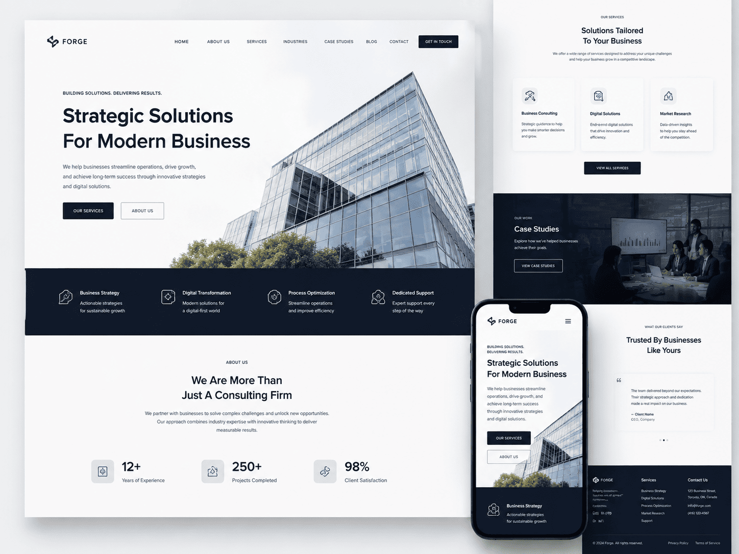
For Canadian businesses, a website is no longer a static brochure; it is a dynamic storefront, customer service desk, and sales representative that operates 24/7. However, with the country’s immense geography—spanning six time zones—and a population that increasingly relies on smartphones for everything from local searches to e-commerce, a desktop-only approach is a critical failure. Responsive web design is not merely a technical nicety; it is the foundational strategy that ensures your business remains accessible, credible, and competitive. When your site adapts fluidly to any screen size, you eliminate friction for users from St. John’s to Vancouver, building trust and driving conversions regardless of how or where they connect.
The Canadian Mobile Landscape: Usage Statistics and Trends
Canada consistently ranks among the top nations for smartphone penetration and mobile data consumption. While precise numbers fluctuate, the trend is unmistakable: the majority of Canadian web traffic now originates from mobile devices. This is not limited to urban centres; in rural and remote communities, where broadband infrastructure may lag, mobile networks are often the primary—or only—gateway to the internet. Consider these key behavioural patterns:
- Mobile-first behaviour: Canadians use their phones for quick lookups, price comparisons, and social media browsing, often during commutes or while multitasking.
- Time-of-day shifts: Traffic patterns show a surge in mobile usage during evening hours and weekends, when users are at home but prefer the convenience of a handheld device.
- E-commerce growth: Mobile shopping has seen sustained year-over-year growth, with consumers expecting seamless checkout processes on smaller screens.
- Bilingual complexity: With English and French as official languages, responsive design must also accommodate text expansion and different character sets without breaking layout integrity.
Ignoring these trends means your business risks alienating a substantial portion of its audience. A site that requires pinch-zooming or horizontal scrolling sends a clear signal of neglect, prompting users to abandon your page for a competitor’s more accessible offering.
User Expectations for Seamless Browsing Across Devices
Modern Canadian consumers do not think in terms of “mobile site” versus “desktop site.” They expect a single, cohesive experience that follows them from a smartphone during a lunch break to a laptop later that evening. Seamless browsing means more than just resized images; it involves:
- Consistent content: Users should not be penalized with reduced information or hidden sections on mobile. The full value proposition must be available everywhere.
- Touch-friendly navigation: Buttons and links must be adequately sized for thumbs, with no accidental clicks. Menus should collapse logically, not just shrink.
- Fast loading times: Mobile users are often on cellular networks. A responsive site must be optimized for speed, compressing images and leveraging caching to prevent frustrating delays.
- Readable text: No need for zooming. Font sizes and line spacing should be legible on a 5-inch screen as they are on a 27-inch monitor.
- Integrated features: Click-to-call buttons, maps, and forms must function flawlessly on touchscreens, directly supporting local business enquiries.
When these elements align, users feel a sense of professional reliability. When they fail, bounce rates skyrocket, and negative word-of-mouth spreads quickly, particularly in close-knit local communities.
Impact on Local SEO and Google’s Mobile-First Indexing
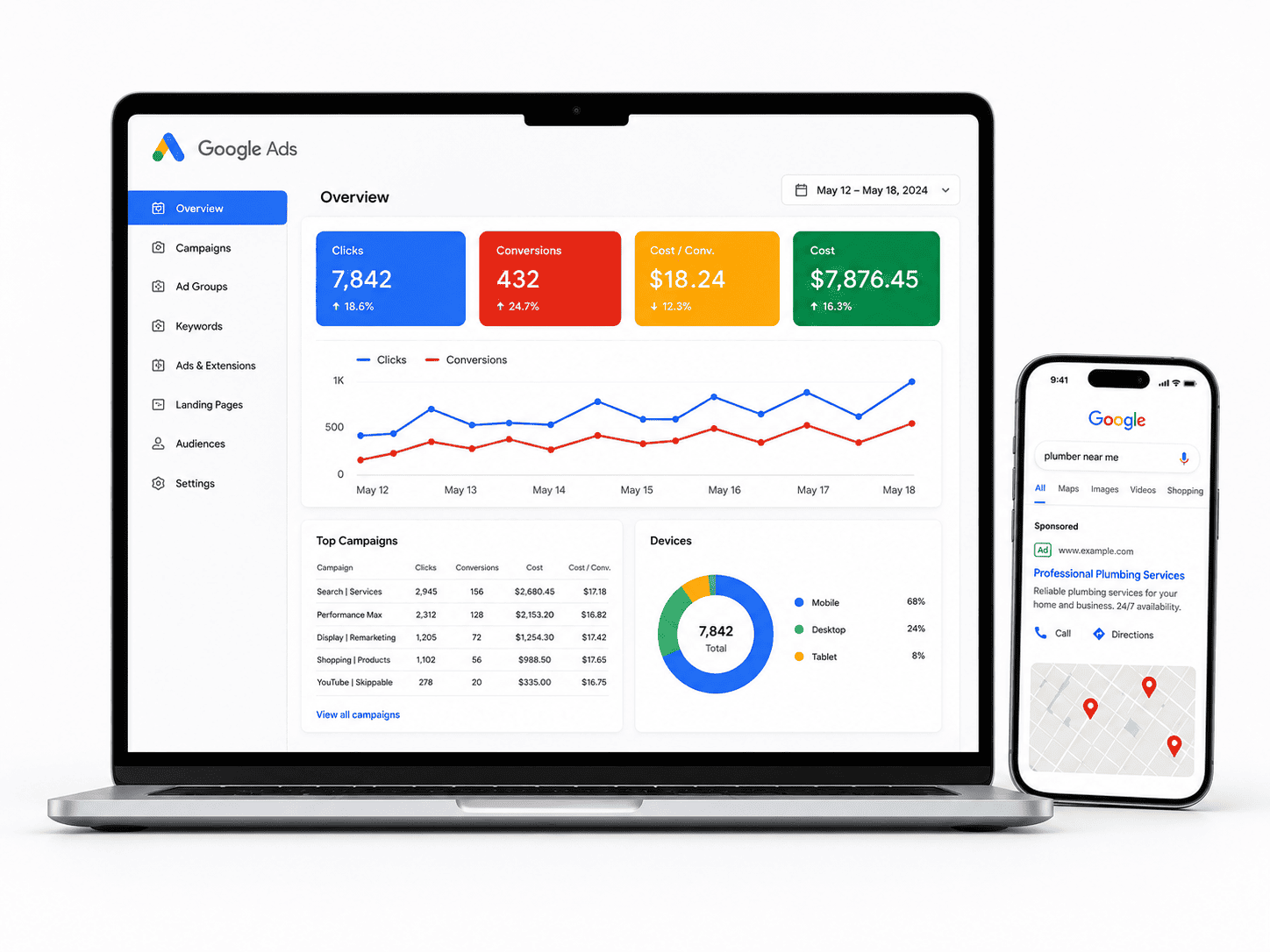
Google’s shift to mobile-first indexing is a decisive factor for Canadian businesses. This means Google predominantly uses the mobile version of your page for indexing and ranking. If your site is not responsive, Googlebot will still crawl it, but it will assess the experience through a mobile lens. A poorly configured desktop-only site or a separate, thin ‘m’ subdomain can lead to lower rankings, even for users on desktop. For local SEO—critical for businesses serving specific Canadian cities or regions—this impact is amplified. Consider the following:
| Factor | How Responsive Design Helps |
|---|---|
| Unified URL structure | One URL for all devices consolidates authority and avoids duplicate content issues common with separate mobile sites. |
| Local search signals | Responsive pages load faster and are easier to navigate, increasing dwell time and engagement—positive signals for local pack rankings. |
| Click-to-call and maps | Properly coded responsive elements make it effortless for on-the-go users to contact your business or find your physical location. |
| Core Web Vitals | Responsive design frameworks often encourage better performance practices, directly contributing to the user experience metrics Google prioritizes. |
Furthermore, in a bilingual market, responsive design ensures that French-language content is as accessible and well-structured as English, preventing negative SEO implications from hidden or poorly rendered text. For any Canadian business aiming to capture local search demand, from a Toronto law firm to a rural Alberta equipment dealer, responsive design is the non-negotiable baseline. It aligns your technical infrastructure with both user behaviour and search engine requirements, forming the bedrock of a robust digital presence. Without it, you are not just losing clicks; you are losing relevance in a competitive, geographically vast market.
Core Principles of Mobile-First Design for the Canadian Market
Canadian consumers are among the most mobile-dependent in the world, often juggling long commutes, harsh weather delays, and a preference for quick, on-the-go transactions. A mobile-first approach is no longer optional—it is the structural backbone of any successful responsive website. Instead of designing a desktop layout and shrinking it down, mobile-first forces you to build from the smallest screen upward, ensuring that every element serves a purpose. This methodology naturally enforces speed, clarity, and usability, which are non-negotiable for Canadian users who expect seamless bilingual experiences and fast-loading pages even on rural 4G connections.
Designing for Smaller Screens First: Key Considerations
When you start with a 360px-wide viewport, you immediately confront constraints that improve decision-making. The core consideration is progressive enhancement: begin with a single-column layout, minimal images, and core functionality, then layer on complexity for larger screens. For Canadian businesses, this means prioritizing elements like store locators, click-to-call buttons, and bilingual toggle (EN/FR) above decorative imagery. A practical rule is to test every component at 320px width—if it fails there, it will likely fail on a mid-range Android device. Use CSS min-width media queries to add breakpoints only when the content requires them, not based on specific device names.
Optimizing Touch Targets and Navigation for Thumbs
Canadians hold their phones with one hand, often while standing on a crowded transit platform or holding a coffee. Your navigation must respect thumb reach zones—the bottom third of the screen is the easiest to tap. Avoid top-anchored hamburger menus that force a stretch; instead, use a persistent bottom tab bar for primary actions (Home, Products, Contact, Cart). Every touch target should be at least 44×44 pixels, with 8 pixels of spacing to prevent accidental taps. For dropdown menus, replace hover states with tap-based accordions, and ensure that form fields trigger the correct mobile keyboard (e.g., input type="tel" for phone numbers). A simple test: if a user can navigate to your checkout in under three thumb movements, your navigation is optimized.
Prioritizing Content for the On-the-Go Canadian User
Your mobile user is likely searching for immediate answers: business hours, product availability, or directions. Content hierarchy must reflect this urgency. Place critical information—address, phone number, and a clear call-to-action—above the fold, and use progressive disclosure for secondary details like company history or team bios. For bilingual content, never auto-redirect based on IP alone; instead, provide a prominent language switch that remembers the user’s choice in a session cookie. Performance is part of content prioritization: lazy-load images below the viewport, defer non-critical JavaScript, and serve compressed WebP images. Consider this practical CSS example for reducing layout shift on mobile:
img, video {
  max-width: 100%;
  height: auto;
  aspect-ratio: 16/9; /* Reserve space to prevent CLS */
  object-fit: cover;
}
Finally, audit your content for “micro-moments”—queries like “open near me” or “return policy.” If these answers require scrolling through three paragraphs, your mobile experience fails. Use collapsible sections (<details> elements) for long policies and bullet lists for key specs. By designing for the impatient, gloved, or multitasking Canadian user, you build trust that translates directly to higher conversion rates on both mobile and desktop.
Fluid Grids and Flexible Layouts: Building a Solid Foundation
For Canadian businesses, a website must perform equally well on a desktop in Toronto, a tablet in Vancouver, and a smartphone in Halifax. Rigid, pixel-based layouts fail this test, forcing users to pinch, zoom, and scroll horizontally—a quick path to high bounce rates. Fluid grids and flexible layouts solve this by using proportional sizing, allowing content blocks to expand and contract relative to the viewport. This ensures your brand’s typography, imagery, and calls-to-action remain visually consistent and usable, regardless of device. The core principle is simple: design with proportions, not absolutes, so every screen becomes a canvas for a seamless experience.
Using Relative Units (%, em, rem) Instead of Fixed Pixels
Fixed pixel widths are the enemy of adaptability. A container set to 1200px will overflow a 375px-wide mobile screen, creating a broken layout. Relative units solve this by calculating sizes against a reference point. Here is how to choose correctly:
- Percentages (%): Best for defining the width of containers, columns, and images relative to their parent element. For example, a sidebar at 30% width will always occupy a third of its wrapper.
- rem (root em): Ideal for font sizes and spacing. One rem equals the font size of the root
<html>element (typically 16px). Using rem for padding, margins, and text ensures that if a user changes their browser’s default font size, your entire layout scales proportionally—a critical accessibility feature. - em (relative to parent): Useful for components that should scale in relation to their own font size, such as a button’s padding growing when its label is enlarged. Use sparingly to avoid compounding inheritance issues in nested elements.
Avoid using pixels for anything structural. Reserve them only for precise details like a 1px border or a box-shadow blur radius, where scaling is not required.
CSS Grid and Flexbox: Modern Techniques for Layout Flexibility
Two modern CSS layout modules have replaced the fragile floats and positioning hacks of the past. They work best together:
- Flexbox (one-dimensional): Perfect for distributing space along a single axis—either a row or a column. Use it for navigation bars, aligning buttons in a hero section, or stacking cards in a horizontal row that wraps on smaller screens.
- CSS Grid (two-dimensional): Designed for full-page layouts where you need control over both rows and columns simultaneously. Define a grid with tracks like
grid-template-columns: repeat(auto-fit, minmax(250px, 1fr))to create a responsive card grid that automatically adds columns on wide screens and stacks them on narrow ones, without writing a single media query.
The strategic approach is to use Grid for the macro layout (header, main, footer, aside) and Flexbox for micro-components inside those grid areas (e.g., aligning social icons within a footer column). This combination yields robust, maintainable code that adapts to any viewport, from the smallest phone to a 4K monitor.
Handling Breakpoints: When and How to Adjust Layouts
Breakpoints are the specific viewport widths where you change your layout to preserve usability. The modern best practice is not to target specific devices (e.g., iPhone 15) but to let your content dictate the breakpoint. Add a media query only when the layout starts to feel cramped or elements collide. Common practical breakpoints include 480px (small phones), 768px (tablets portrait), and 1024px (desktop). However, a content-first approach means you might adjust at 700px or 1100px depending on your typography and grid.
Follow this rule of thumb: start with a mobile-first design (base styles for small screens), then use @media (min-width: ...) to progressively enhance the layout as viewport width increases. This reduces CSS complexity and improves performance on mobile data connections. The table below contrasts common breakpoint strategies.
| Strategy | Base Approach | Example Query | Best Use Case |
|---|---|---|---|
| Device-based | Targets specific devices | @media (max-width: 768px) |
Quick fixes for known legacy devices |
| Content-based | Adjusts when layout breaks | @media (min-width: 900px) |
Highly flexible, future-proof designs |
| Mobile-first | Base styles for mobile, then enhance | @media (min-width: 600px) |
Performance-focused, recommended default |
When a breakpoint triggers, make decisive changes: switch a two-column grid to a single column, increase font sizes, or convert a horizontal menu into a hamburger icon. Avoid minor pixel tweaks; instead, reflow the entire component for clarity and touch-friendly targets. By combining fluid grids, relative units, modern layout tools, and thoughtful breakpoints, your Canadian business site will deliver a consistent, high-quality experience across the country’s diverse digital landscape.
Responsive Web Design Best Practices for Canadian Businesses: Flexible Images and Media for a Faster, Visual Web
For Canadian businesses, a visually rich website is non-negotiable, but slow-loading pages are a conversion killer. Images and videos often account for over 70% of a page’s total weight. Flexible media is not just about resizing; it is about delivering the right file, at the right size, for the right device and connection. This ensures a fast, crisp experience whether your customer is on a fibre connection in Toronto or 4G in rural Alberta.
Implementing srcset and Sizes for Art Direction
The srcset attribute allows the browser to choose the optimal image file based on viewport width and device pixel ratio (DPR). The sizes attribute tells the browser how much space the image will occupy in the layout. Without sizes, the browser defaults to 100vw, which often downloads a desktop-sized image on a mobile phone.
Use this pattern for a hero banner that spans half the viewport on desktop and the full width on mobile:
<img src="hero-800.jpg"
     srcset="hero-400.jpg 400w,
             hero-800.jpg 800w,
             hero-1200.jpg 1200w"
     sizes="(max-width: 600px) 100vw,
            50vw"
     alt="Downtown Vancouver skyline at dusk">
For true art direction—where you crop or change the subject entirely on mobile—pair srcset with the <picture> element:
<picture>
  <source media="(max-width: 600px)" srcset="product-mobile-crop.jpg">
  <source media="(min-width: 601px)" srcset="product-full.jpg">
  <img src="product-full.jpg" alt="Maple syrup bottle with label">
</picture>| Attribute | Purpose | When to Use |
|---|---|---|
srcset |
Provides multiple resolutions of the same image. | Always, for responsive images. |
sizes |
Defines rendered width in CSS pixels. | Mandatory when using srcset with width descriptors. |
<picture> |
Allows different file types or crops. | For art direction or WebP fallback. |
Choosing the Right Image Format (WebP, AVIF) for Performance
JPEG and PNG are legacy formats. Modern formats like WebP and AVIF offer 25–50% smaller file sizes at the same visual quality. AVIF provides superior compression but has slightly less browser support than WebP. For Canadian e-commerce sites, where every kilobyte counts on mobile data plans, switching to WebP is the first step. Use AVIF for photographic content where you can afford a fallback.
- WebP: Ideal for photographs and graphics. Supported in all modern browsers. Use as your primary format.
- AVIF: Best for high-detail photos (e.g., real estate, food). Offers the smallest file size but always provide a WebP or JPEG fallback via
<picture>. - SVG: Use for logos, icons, and simple illustrations. Never use for photographs.
A practical fallback pattern for AVIF:
<picture>
  <source type="image/avif" srcset="cabin.avif">
  <source type="image/webp" srcset="cabin.webp">
  <img src="cabin.jpg" alt="Lakefront cabin in Muskoka">
</picture>
Responsive Video and Embedded Media: Scaling Without Breaking
Videos embedded from YouTube or Vimeo often come with fixed dimensions. To make them fluid, wrap them in a container with a specific aspect ratio. The classic technique uses padding-top to preserve the 16:9 ratio. Modern CSS offers a cleaner approach with aspect-ratio.
.video-wrapper {
  aspect-ratio: 16 / 9;
  position: relative;
  height: 0; /* Fallback for older browsers */
  padding-bottom: 56.25%; /* 9/16 * 100 */
}
.video-wrapper iframe {
  position: absolute;
  top: 0; left: 0;
  width: 100%; height: 100%;
}
For native HTML5 video, always include width="100%" and height="auto" via CSS, and set preload="metadata" to avoid downloading the entire video file on page load. Lazy-load videos that are below the fold using the loading="lazy" attribute on iframes. Also, consider serving videos as compressed MP4 files with WebM fallback for certain browsers, and always provide a poster image to give visual context before playback. This combination ensures your media scales perfectly across devices while keeping page weight lean for users across Canada’s diverse network infrastructure.
Responsive Web Design Best Practices for Canadian Businesses
Typography is the backbone of user experience. When a Canadian visitor lands on your site from a smartphone, tablet, or desktop, the text must be instantly readable without pinch-zooming or horizontal scrolling. Poor typography leads to high bounce rates, especially for bilingual audiences who switch between English and French. The goal is not merely to shrink text on mobile, but to create a fluid, accessible reading experience that respects both languages’ unique character sets and spacing needs.
Fluid Type Scales: Using vw and clamp() for Responsive Text
Fixed pixel sizes are a liability in responsive design. Instead, adopt a fluid type scale using CSS clamp() to combine viewport units (vw) with relative units (rem). This allows font sizes to scale smoothly between a minimum and maximum value, eliminating abrupt breakpoints. A typical rule for body text might be font-size: clamp(1rem, 0.9rem + 0.5vw, 1.25rem). For headings, use a larger multiplier, such as clamp(2rem, 1.5rem + 2vw, 3rem).
Why this matters for Canadian businesses:
- Viewport variety: From small iPhone SEs to large desktop monitors, text remains proportional.
- Accessibility compliance: Users can still override sizes via browser settings if you use
remas the base. - Reduced maintenance: No need for dozens of media queries solely for font resizing.
Avoid using vw alone, as it ignores user preferences and can make text unreadably tiny on narrow screens. Always test your clamp() values at 320px, 768px, and 1440px widths.
Line Length and Spacing: Improving Readability on Mobile
Readability collapses when lines stretch too long or crowd together. On desktop, aim for a line length of 45–75 characters per line; on mobile, reduce this to 35–50 characters. Achieve this by controlling the max-width of your text container (e.g., max-width: 65ch) rather than relying on percentage widths. For mobile, ensure generous line-height — typically 1.5 to 1.7 for body text — and paragraph spacing of at least 1.5 times the font size.
Spacing adjustments for touch devices:
- Increase
margin-bottombetween paragraphs to 1.5em to prevent accidental taps on links. - Set
letter-spacingslightly tighter for French text (0.01em) to prevent awkward gaps, but test for accents. - Use
paddingon text blocks (at least 16px side padding) so text never touches screen edges. - Avoid justified text alignment; use left alignment for both languages to prevent “rivers” of white space.
Remember that French uses more characters than English for the same meaning (e.g., “file” vs. “fichier”), so your layout must accommodate longer words without truncation or hyphenation errors.
Supporting French and English: Fonts and Language Switching
Bilingual content demands careful font selection. Not all typefaces render French accents (é, è, ç, à, ù) or guillemets (« ») correctly. Choose system fonts or web fonts with extensive Latin Extended support, such as system-ui, Roboto, Source Sans Pro, or Noto Sans. Avoid decorative fonts that lack accented glyphs or italic variants for French.
When switching languages, apply the lang attribute (lang="fr" or lang="en") on the <html> or specific elements. This enables correct hyphenation, quotation marks, and screen reader pronunciation. Additionally, adjust line-height and font-weight for French, which often requires slightly larger font sizes (0.5–1px) to maintain legibility due to its higher frequency of ascending letters (like d, h, l) and accents.
Practical implementation checklist:
- Test your chosen font at 16px in both languages for accent clarity.
- Provide a visible language toggle that preserves the user’s scroll position and text size.
- Set
font-display: swapin your@font-faceto avoid invisible text during loading. - Use CSS variables for font sizes and spacing, allowing easy per-language overrides if needed.
By prioritizing fluid sizing, disciplined spacing, and bilingual font compatibility, your Canadian business will deliver a seamless reading experience that respects both official languages, on any device.
Navigation and User Experience (UX) Patterns in Responsive Design
For Canadian businesses, mobile traffic often exceeds desktop, especially in urban centres like Toronto and Vancouver. The way users navigate your responsive site directly impacts bounce rates, conversion, and even local SEO rankings. A navigation pattern that works on a 27-inch monitor can become a frustrating maze on a 5.8-inch phone. Below, we break down the most effective UX patterns, weighing their trade-offs for Canadian audiences who expect speed, clarity, and bilingual accessibility where applicable.
Hamburger Menus vs. Visible Navigation: Pros and Cons
The classic three-line hamburger icon saves valuable screen real estate, but it hides critical links behind a tap. For content-heavy Canadian retailers or service providers, this can reduce discoverability of key pages like “Shop Now” or “French (FR)” toggle.
- Hamburger pros: Declutters the header, allows more space for hero imagery or search bars, and works well for sites with 8+ primary menu items.
- Hamburger cons: Lower engagement rates on secondary links; users may miss the “Contact” or “Locations” page entirely. This is problematic for businesses with physical storefronts in multiple provinces.
- Visible navigation pros: Immediate access to core actions (e.g., “Order Online,” “Book a Service”). Better for conversion-focused pages where hesitation leads to abandonment.
- Visible navigation cons: On narrow screens (under 360px), even 4–5 text links can wrap awkwardly or force tiny tap targets, violating WCAG 2.1 touch guidelines.
Recommendation: Use a hybrid approach. Keep 3–4 critical links visible (e.g., “Menu,” “Locations,” “Contact”) and place the rest under a hamburger. For bilingual sites, ensure the language toggle is always visible, not hidden, to respect Canada’s official language expectations.
Sticky Headers and Bottom Navigation: Enhancing Usability
Sticky headers—where the logo and primary nav remain fixed at the top while scrolling—reduce the effort needed to jump back to a menu. However, on mobile, a persistent header consumes 50–60px of vertical space, shrinking the viewport for content. Bottom navigation, a pattern popularized by native apps, places primary tabs (Home, Search, Cart, Account) within thumb’s reach. This is especially effective for e-commerce sites serving Canadian customers who often shop on the go during commutes.
| Pattern | Best For | Watch Out For |
|---|---|---|
| Sticky header | News sites, blogs, multi-section corporate sites | Banner height increases on scroll; hide it when scrolling down, show on scroll up. |
| Bottom nav | E-commerce, booking apps, delivery services | iOS safe-area insets; ensure no clash with the home indicator bar. |
For a sticky header, a practical CSS snippet to avoid overlap with content:
header {
  position: sticky;
  top: 0;
  z-index: 100;
  background: #fff;
  box-shadow: 0 2px 4px rgba(0,0,0,0.1);
}
main { padding-top: 0; } /* Use margin-top on main if header height is fixed */
Breadcrumbs and Search: Helping Users Find Content Quickly
Breadcrumbs—the “Home > Services > Web Design” trail—are often overlooked in mobile responsive design because they take up a full line of text. But for Canadian businesses with deep catalogs (e.g., hardware supplies, legal service hubs), breadcrumbs reduce cognitive load and support back-navigation without relying on the browser’s back button. Keep them truncated on mobile: show only the current page and its immediate parent, with a “Home” icon at the start.
Search functionality is equally critical. A visible, tappable search icon that expands to a full-width input field beats a hidden search behind a menu. For Canadian users, search should handle French accents (e.g., “café” vs. “cafe”) and common Canadian spellings (“colour,” “centre”). Implement a debounced search that suggests popular queries after 2–3 characters. Place search in the sticky header or as a dedicated icon in the bottom nav—never bury it more than one tap deep. Testing with real users in both English and French markets will reveal whether your current pattern creates friction, especially on slower 4G connections in rural areas.
Performance Optimization for Responsive Sites in Canada
For Canadian businesses, a responsive website that looks beautiful but loads slowly is a liability. Canada’s digital landscape is not uniform: urban centres like Toronto and Vancouver enjoy high-speed fibre, while rural and northern communities often rely on slower DSL, satellite, or congested mobile networks. Additionally, Canadian mobile data plans are among the most expensive in the G7, meaning every kilobyte counts for your users. Performance is therefore not just a technical metric—it is a core component of user experience, SEO, and conversion rates. When your responsive site adapts its layout, it must also adapt its weight and delivery speed, or you risk alienating a significant portion of your audience.
Minimizing HTTP Requests and Using Asynchronous Loading
Every file your responsive site requests—CSS, JavaScript, images, fonts—creates an HTTP request. On a slow connection, each request adds latency. The first step is to audit your site and reduce the total number of requests. Combine multiple CSS files into one and similarly bundle JavaScript files. Remove unused CSS rules and scripts, especially those loaded on mobile-only breakpoints. For images, which are often the heaviest elements, use modern formats like WebP and implement srcset with appropriate sizes attributes so that a mobile user never downloads a desktop-sized hero image.
Beyond reduction, you must control when resources load. JavaScript that is not essential for above-the-fold content should be loaded asynchronously using the async or defer attributes. This prevents render-blocking, allowing your responsive layout to appear quickly while secondary scripts load in the background. Lazy loading for images and iframes is non-negotiable; use the native loading="lazy" attribute to defer off-screen elements until the user scrolls near them. These techniques ensure that the critical path for initial paint is as short as possible, even on a 3G connection in rural Alberta.
Leveraging Browser Caching and Content Delivery Networks (CDNs)
Canada’s geography is vast, and the distance between a user in St. John’s and your server in Vancouver creates unavoidable physical latency. A Content Delivery Network (CDN) mitigates this by caching your static assets—CSS, JavaScript, images, fonts—on edge servers located in major Canadian cities such as Toronto, Montreal, Calgary, and Vancouver. When a user in Halifax visits your site, they receive files from the nearest edge node, drastically reducing round-trip time. For a responsive site, a CDN is especially valuable because it can serve different image resolutions from the same URL based on the user’s device, without extra server load.
Browser caching works hand-in-hand with a CDN. By setting proper Cache-Control headers, you instruct the user’s browser to store previously downloaded resources locally. For example, your site’s logo and global stylesheet rarely change; you can cache them for weeks or months. However, be careful with versioning—if you update a CSS file, the filename must change (e.g., styles.v2.css) to force a fresh download. Effective caching means repeat visitors on expensive mobile data plans will load your responsive site almost instantly, as their browsers will only fetch new content, not re-download the entire page.
Testing Performance on 3G/4G/5G Networks Across Canadian Regions
You cannot optimize what you do not measure. Testing your responsive site only on a fast office Wi-Fi connection gives you a false sense of security. Use browser developer tools to simulate throttled network conditions, but that is only the first step. To truly understand Canadian user experience, you must test on real networks and from different geographic regions. Here is a practical testing matrix for your team:
- 3G (Fallback): Simulate 400ms latency and 1.6 Mbps throughput. This represents users in remote areas or on older plans. Your site must be usable, not just loadable.
- 4G/LTE (Mainstream): Simulate 150ms latency and 4 Mbps. This is the baseline for most urban and suburban users. Aim for a fully interactive time under 3 seconds.
- 5G (Urban Premium): Simulate 50ms latency and 20 Mbps. This is for users in downtown cores. Your site should feel instant, with no janky layout shifts.
For geographic testing, use a remote device lab or a cloud-based testing service that has servers in Canadian regions. Test from the East Coast (Halifax), Central Canada (Toronto), the Prairies (Calgary), and the West Coast (Vancouver). Pay close attention to Time to First Byte (TTFB) and Largest Contentful Paint (LCP). A high TTFB from a specific region indicates a CDN routing issue. Also, test on actual mobile devices, not just emulators, as mobile CPUs and memory are significantly less powerful than desktops. Finally, document your results and set a performance budget—for example, LCP under 2.5 seconds on 4G in all five regions. Regularly test after every major design or content update, as a single unoptimized image can undo all your hard work.
Accessibility and Inclusive Design in a Multilingual Context
For Canadian businesses, a responsive website is only truly effective when it is accessible to every user, regardless of ability, device, or language. With official bilingualism and a legally protected commitment to disability inclusion under the Accessible Canada Act, responsive design must go beyond fluid grids and flexible images. It must integrate accessibility into the very structure of the layout, ensuring that content is perceivable, operable, and understandable in both English and French, and for users relying on assistive technologies. An accessible responsive site reduces legal risk, expands market reach, and improves overall usability for all visitors, including those on mobile devices in low-light or high-glare environments.
WCAG 2.1 Compliance: Key Requirements for Responsive Layouts
The Web Content Accessibility Guidelines (WCAG) 2.1 provide the technical benchmark for Canadian public and private sector sites. In a responsive context, three requirements demand particular attention:
- Reflow (1.4.10): Content must be presented without loss of information or functionality, and without requiring two-dimensional scrolling, at a viewport width of 320 CSS pixels. This forces designers to prioritize linear content flow and hide non-essential decorative elements on narrow screens.
- Target Size (2.5.5): Pointer targets (buttons, links, form fields) must be at least 44 by 44 CSS pixels. On responsive layouts, this prevents accidental taps on touch devices, especially for users with motor impairments.
- Text Spacing (1.4.12): Users must be able to override line height (1.5x), paragraph spacing (2x), and letter spacing (0.12x) without breaking the layout. Responsive grids must therefore use flexible containers that accommodate increased text size and spacing without clipping or overlapping content.
These requirements are not optional enhancements; they are the baseline for ensuring that a responsive design does not inadvertently exclude users when they zoom, reorient their device, or use larger font settings.
Ensuring Keyboard Navigation and Screen Reader Compatibility
Responsive layouts often rearrange content visually, but the underlying Document Object Model (DOM) order must remain logical for keyboard users and screen readers. A common failure occurs when mobile menus hide navigation behind a hamburger icon; if the toggle button is not focusable or the expanded menu does not receive focus, keyboard users cannot access key pages. Implement the following practices:
- Ensure all interactive elements are reachable via the Tab key in a predictable sequence that matches the visual order of the primary content, not the visual order of the desktop layout.
- Use visible focus indicators (e.g., outlines or contrast changes) that are not removed by CSS resets, and ensure they remain visible on touch devices when using an external keyboard.
- For carousels and accordions common in responsive design, use ARIA attributes such as
aria-expandedandaria-controlsto communicate state changes to screen readers, and ensure that swipe gestures have keyboard equivalents (e.g., arrow keys). - Test with a real screen reader (NVDA or VoiceOver) at multiple viewport widths, because responsive breakpoints can change how screen reader virtual cursors traverse content.
Designing for Language Direction and Bilingual (EN/FR) Accessibility
Canadian businesses must serve both English and French, but bilingual accessibility adds complexity to responsive design. Each language has different average word lengths—French text is often 20-30% longer than English—which can break fixed-width buttons or cause horizontal overflow on small screens. Additionally, while both official languages use left-to-right (LTR) direction, any future inclusion of Indigenous languages or content in Arabic, Hebrew, or other RTL scripts requires careful planning. The table below compares key considerations:
| Design Aspect | English (EN) | French (FR) |
|---|---|---|
| Average word length | Shorter (e.g., “Settings”) | Longer (e.g., “Paramètres”) |
| Button label space | Requires ~150px minimum at base font | Requires ~30% additional horizontal padding |
| Text expansion on mobile | May fit in 320px viewport | Often wraps into 3 lines; use flexible line-height |
| Language toggle placement | Top-right corner on desktop; must be above fold on mobile | Same position, but label “FR” or “EN” must be clear without icon alone |
| Date and number formats | MM/DD/YYYY | DD/MM/YYYY with spaces or hyphens |
To manage these differences, use a responsive grid that allows text containers to expand vertically rather than horizontally, and set a minimum touch target of 44px even for language switchers. Always declare the lang attribute on the <html> element and switch it dynamically when the user changes language, so screen readers use the correct pronunciation and punctuation rules. Finally, provide a visible, persistent language toggle that does not require opening a hidden menu, because bilingual users often switch language frequently and need immediate access without losing their scroll position.
By embedding these bilingual and accessibility practices into the responsive framework from the start, Canadian businesses build sites that are not only legally compliant but genuinely welcoming to all citizens.
Testing and Maintenance: Ensuring Consistency Across Devices
For Canadian businesses, a responsive website is not a one-time deliverable but a living system. With a market spanning dense urban centres and remote communities, your visitors will access your site on a wide range of devices, network speeds, and screen sizes—from the latest iPhone in Toronto to an older Android tablet in Whitehorse. Thorough testing and ongoing maintenance are essential to prevent broken layouts, slow interactions, and frustrated users who may turn to a competitor. The goal is not merely to make the site “work” but to ensure that every interaction, from product browsing to checkout, feels seamless regardless of the entry point.
Using Browser DevTools and Real Device Testing Labs
Start every testing session with browser developer tools, which are free and immediately available. In Chrome or Firefox, open the responsive design mode (Ctrl+Shift+M on Windows, Cmd+Shift+M on Mac) to simulate common viewport widths. This is efficient for catching obvious overflow issues, misaligned grids, or unreadable text at specific breakpoints. However, do not rely solely on these simulations—they do not accurately replicate touch gestures, hardware rendering differences, or the behaviour of mobile browsers like Safari’s dynamic toolbar.
Complement DevTools with a real device testing lab. You do not need every device on the market; instead, build a representative sample based on your analytics. For Canadian audiences, prioritise:
- One recent iPhone (e.g., iPhone 14 or newer) and one older iPhone (e.g., iPhone SE) to test iOS Safari.
- One mid-range Android phone (e.g., Google Pixel 7) and one budget Android device to test Chrome and Samsung Internet.
- One tablet, such as an iPad, to verify landscape and portrait modes.
- One Windows laptop with a standard 1366×768 screen, a common resolution for business users.
Physically hold these devices, rotate them, and test with both thumbs and a stylus. Pay attention to tap targets (minimum 44×44 pixels), hover states (which do not exist on touch), and the visibility of forms under the on-screen keyboard. If a physical lab is impractical, consider a cloud-based service that provides access to real devices hosted remotely, but always verify critical checkout flows on a physical device you can touch.
Automated Visual Regression Testing for Responsive Breakpoints
Manual testing is essential but time-consuming, especially when you update content or styles. Automated visual regression testing solves this by taking screenshots of your pages at defined breakpoints before and after a code change, then comparing them pixel by pixel. Tools like Playwright, Puppeteer, or BackstopJS can be integrated into your CI/CD pipeline. Here is a minimal example using Playwright to capture a screenshot at a mobile breakpoint:
const { test, expect } = require('@playwright/test');

test('capture mobile viewport', async ({ page }) => {
  await page.setViewportSize({ width: 375, height: 812 });
  await page.goto('https://example.ca/products');
  await page.screenshot({ path: 'mobile-products.png', fullPage: true });
});
Set up a baseline set of screenshots for your core pages (home, product listing, product detail, cart, and checkout) at each breakpoint—typically 320px, 768px, 1024px, and 1440px. Run the test after every deployment. When a mismatch appears, the tool will generate a diff image highlighting the changed area. Review every diff; not all changes are bugs, but any unintended shift in layout, font size, or spacing should be investigated immediately.
Monitoring Analytics to Identify Device-Specific Issues
Your testing strategy must be informed by real user behaviour. Use analytics tools (such as Google Analytics or Matomo) to segment your traffic by device category, screen resolution, and browser. Set up alerts for unusual patterns, such as a sudden increase in bounce rate on a specific device model or a drop in conversion on Android tablets. Pay special attention to these metrics:
| Metric | What to Look For | Action If Abnormal |
|---|---|---|
| Bounce rate by device | Rate 20%+ higher than desktop on mobile | Check page load speed and above-the-fold content |
| Exit pages by viewport | High exits on a form or cart page | Test that page on the exact device and browser |
| Event tracking (e.g., menu clicks) | Low interaction on mobile hamburger menu | Verify menu opens correctly and is not hidden behind overlays |
Additionally, review the “device” report weekly to spot new devices or browser versions that appear in your traffic. When you see a new entry, reproduce it in your lab and run a quick manual pass. Maintain a changelog of known issues per device and revisit it after each major browser update. By combining automated checks with analytics-driven manual testing, you ensure that your responsive design remains robust and user-friendly as the Canadian device landscape evolves.
Future-Proofing Your Responsive Design Strategy
For Canadian businesses, a responsive website is no longer a competitive advantage—it is a baseline expectation. However, the digital landscape shifts quickly, and a layout that feels modern today may feel dated within two years. To stay ahead, your responsive strategy must anticipate changes in user behaviour, device capabilities, and search engine requirements. The following emerging trends and technologies deserve your attention as you plan your next iteration of web design.
Embracing Progressive Web Apps (PWAs) for Enhanced Mobile Experience
Progressive Web Apps bridge the gap between a traditional website and a native mobile application. For Canadian businesses with customers in regions of variable connectivity—from dense urban centres to remote communities—PWAs offer reliable performance even on slower networks. Unlike native apps, PWAs are delivered through the browser, meaning no app store approval or separate maintenance cycle is required. They install instantly on a user’s home screen, send push notifications, and load content almost immediately due to service worker caching.
When integrating PWA features into your responsive design, focus on these practical elements:
- Offline-first architecture: Ensure key pages, such as product catalogues or store locations, remain accessible without an internet connection.
- Add-to-home-screen prompts: Encourage repeat visits without the friction of downloading an app.
- Secure HTTPS delivery: All PWA features require a secure connection, which also boosts trust with Canadian users concerned about data privacy under PIPEDA.
A responsive PWA does not replace your existing site; it enhances it. Start by auditing which user journeys benefit most from offline access or push notifications—often booking, order tracking, or loyalty programs—and implement those first.
Preparing for Foldable Devices and New Screen Form Factors
Foldable smartphones and dual-screen laptops are no longer prototypes. Canadian consumers are gradually adopting these devices, which introduce fluid breakpoints that change mid-session. A user may open your site on a compact 6-inch cover screen, unfold to a 7.6-inch tablet-like display, or switch to a desktop browser within minutes. Your responsive framework must handle these transitions without jarring layout shifts or hidden content.
To future-proof for this variability, adopt the following practices:
- Use CSS container queries instead of relying solely on viewport width, allowing components to adapt to their parent container’s size.
- Design for a fluid grid with flexible images and media queries that respond to both width and height changes.
- Test on emulators or actual foldable devices to verify that navigation menus, modals, and interactive elements do not become trapped in the “crease” area.
- Prioritize content hierarchy so that when a user unfolds the device, the most critical information appears above the fold without excessive scrolling.
By treating each screen transition as a progressive enhancement rather than a separate site version, you ensure a seamless experience regardless of how the hardware evolves.
Integrating Voice Search and AI Assistants into Responsive UX
Voice search is growing rapidly among Canadian users, particularly for local queries like “where is the nearest pharmacy” or “book a table for two tonight.” AI assistants such as Siri, Google Assistant, and Alexa pull answers from websites that are structured for easy parsing. Your responsive design must therefore accommodate not just visual browsing, but also conversational interaction.
To align your responsive UX with voice and AI requirements:
- Structure content with clear, concise headings (H2, H3) and short paragraphs that answer direct questions.
- Implement schema markup (e.g., LocalBusiness, FAQ, Product) to help AI assistants extract accurate information about your hours, location, and offerings.
- Optimize for natural language keywords that mirror how Canadians speak, including regional terms and bilingual phrasing where relevant.
- Ensure tap targets and buttons are large enough for voice-initiated actions, such as calling your business directly or completing a form.
Additionally, consider how your responsive layout behaves when a voice assistant reads your page aloud. Avoid hidden text or content that only appears on hover, as these elements may be skipped entirely. A logical reading order—starting with a summary, then details—benefits both screen readers and AI parsers. By treating voice as another viewport, you make your site more accessible to all users, including those with visual impairments or situational limitations like driving.
Ultimately, future-proofing is not about predicting every device or assistant. It is about building a flexible, semantic foundation that can adapt to unknown variables. Canadian businesses that invest in PWAs, fluid container queries, and voice-friendly content now will find it easier to pivot as new technologies emerge, ensuring their responsive design remains a growth engine rather than a maintenance burden.
Frequently Asked Questions
Why is responsive web design important for Canadian businesses?
Responsive web design is critical because over 60% of Canadian web traffic comes from mobile devices. A responsive site ensures a seamless experience across phones, tablets, and desktops, which improves user engagement, reduces bounce rates, and boosts search rankings. For Canadian businesses, it also supports local SEO by making it easier for customers to find and interact with your business on the go. Google prioritizes mobile-friendly sites, so a responsive design is essential for staying competitive in the Canadian digital marketplace.
What is the difference between responsive and adaptive design?
Responsive design uses fluid grids and CSS media queries to make a single layout adapt to any screen size, while adaptive design serves different fixed layouts for specific device categories. Responsive design is generally easier to maintain and provides a more consistent experience across the wide range of devices Canadians use. Adaptive design can offer more tailored experiences but requires more development effort. For most Canadian businesses, responsive design is the recommended approach because it future-proofs your site for new devices and is favored by Google for SEO.
How does responsive design impact SEO for Canadian businesses?
Responsive design improves SEO by consolidating your website into a single URL, avoiding duplicate content issues that can occur with separate mobile sites. Google recommends responsive design because it simplifies crawling and indexing. A mobile-friendly site also satisfies Google’s mobile-first indexing, which uses the mobile version of your site for ranking. Faster load times and lower bounce rates, which are benefits of good responsive design, further enhance your search visibility. For Canadian businesses targeting local customers, this means better chances of appearing in local search results.
What are the key elements of a mobile-first responsive design?
Key elements include starting with the smallest screen size, using a fluid grid, flexible images, and CSS media queries. Prioritize essential content, ensure touch-friendly navigation, and use large, readable fonts. Optimize images for speed with appropriate formats and compression. Also, design for thumb-friendly interactions and avoid requiring pinch-to-zoom. For Canadian businesses, consider local context like bilingual content (English/French) and ensure that the layout handles text expansion gracefully. Testing on real devices is crucial to refine the experience.
How can I test the responsiveness of my website?
You can use browser developer tools to simulate various screen sizes, but real-device testing is essential. Tools like Google’s Mobile-Friendly Test and PageSpeed Insights provide automated checks for mobile usability and performance. For a comprehensive audit, test on popular devices used in Canada, including iPhones, Android phones, and tablets. Test across different browsers and operating systems. Also, use Google Search Console’s Mobile Usability report to identify specific issues. Consider manual testing by navigating your site on actual devices to catch nuances that automated tools miss.
What are common responsive design mistakes to avoid?
Common mistakes include using fixed-width layouts, ignoring touch targets (buttons too small), hiding content on mobile, using non-responsive media (like videos with fixed dimensions), and neglecting performance optimization. Also, avoid designing only for one orientation and failing to test on real devices. For Canadian businesses, overlooking bilingual content layout can cause text overflow. Another mistake is not prioritizing content, leading to a cluttered mobile experience. Ensure your site loads quickly on 3G/4G networks and that pop-ups or interstitials don’t disrupt the user experience.
How does responsive design affect conversion rates for Canadian e-commerce sites?
Responsive design directly impacts conversion rates by providing a smooth user experience across all devices. If a mobile user encounters a site that is hard to navigate or has slow load times, they are likely to abandon the purchase. A responsive site that is fast, easy to use, and visually appealing builds trust and encourages users to complete transactions. For Canadian e-commerce, features like clear calls-to-action, simple checkout forms, and secure payment options should be optimized for mobile. Studies show that mobile-friendly sites have higher conversion rates, especially in retail.
What are the best practices for responsive images and videos?
Use CSS max-width: 100% for images and videos to ensure they scale within their container. Use the srcset attribute to serve different image resolutions based on screen size and device pixel ratio. For videos, use responsive HTML5 video players or embed with aspect-ratio preservation. Compress images using modern formats like WebP to reduce load times. Lazy loading can postpone off-screen images. For Canadian businesses, consider hosting media on a CDN with Canadian edge locations to speed up delivery. Also, provide descriptive alt text for images to support accessibility and SEO.
Sources and further reading
- Mobile-first indexing best practices – Google Developers
- Responsive Web Design – W3C
- Web Content Accessibility Guidelines (WCAG) 2.1 – W3C
- What is Responsive Web Design? – Smashing Magazine
- PageSpeed Insights – Google Developers
- Mobile-Friendly Test – Google
- Statistics on mobile usage in Canada – Statistics Canada
- Digital Economy Statistics in Canada – Statistics Canada
- Core Web Vitals – Google Developers
- Mobile share of web traffic in Canada – Statista
Need help with this topic?
Send us your details and we will contact you.