


Why Canadian Businesses Need a Dedicated Responsive Design Strategy
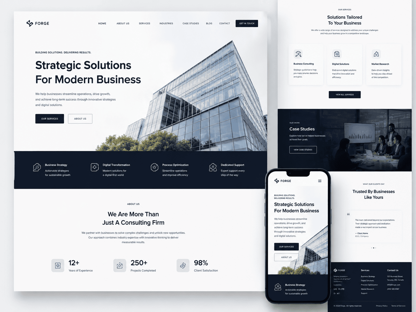
For Canadian enterprises, a generic responsive website is no longer sufficient. The country’s unique digital landscape—characterized by high mobile penetration, official bilingualism, and geographically dispersed e-commerce—demands a tailored approach. A dedicated responsive design strategy ensures that your site not only functions across devices but also aligns with the specific behaviours, languages, and search patterns of Canadian consumers. Without this focus, you risk losing visibility, engagement, and revenue to competitors who understand these local nuances.
Mobile-First Indexing and Canadian Search Behaviour
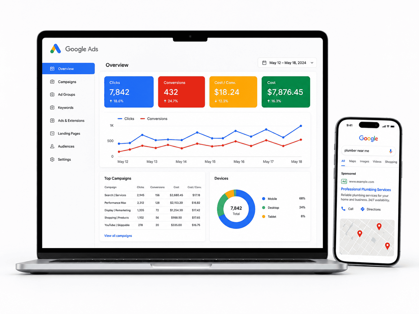
Google has fully transitioned to mobile-first indexing, meaning the search engine predominantly uses the mobile version of your content for ranking and indexing. In Canada, this shift is critical. Statistics consistently show that over 60% of all web traffic in Canada originates from smartphones and tablets, with urban centres like Toronto, Vancouver, and Montreal showing even higher rates. Canadian users often search on the go—comparing prices while in store, looking up transit directions, or checking business hours.
Therefore, your responsive design must prioritize mobile performance, not just as an afterthought but as the baseline. A dedicated strategy involves:
- Speed optimization: Compressing images and leveraging lazy loading to meet Core Web Vitals thresholds, as Canadian mobile networks can vary significantly between urban and rural areas.
- Touch-friendly navigation: Ensuring buttons and menus are sized for thumbs, not just mouse cursors, reducing accidental clicks.
- Local intent capture: Optimizing for “near me” searches, which are disproportionately high on mobile in Canada due to commuting patterns and weather-related indoor searches.
By designing mobile-first, you signal relevance to Google’s crawlers and cater to the immediate, intent-heavy behaviour of Canadian searchers.
Bilingual and Cultural Considerations for English and French Audiences
Canada’s official bilingualism creates a unique responsive design challenge. English and French text have different average character lengths; French is typically 20-30% longer. A rigid layout that works for English can break or create awkward truncation in French. A dedicated strategy must implement fluid typography and flexible grids that accommodate both languages without compromising visual hierarchy.
Beyond literal translation, cultural considerations matter. French-speaking Canadians, particularly in Quebec, prefer localized content that reflects their regional idioms and shopping habits. Your responsive framework should support:
- Language toggling: A clear, persistent toggle that does not reset the user’s scroll position or cart contents.
- Directional adaptability: While both languages are LTR (left-to-right), your CSS should allow for variable word lengths and hyphenation rules specific to French.
- Visual asset swapping: Images and icons that work in an English context may carry unintended meanings in French-Canadian culture. Responsive design must allow for asset replacement based on locale, not just device.
Ignoring these factors leads to a fractured user experience and potential abandonment from a significant portion of your audience.
Cross-Province E-Commerce and Local SEO Implications
Canada is vast, with distinct provincial regulations, shipping costs, and consumer preferences. From British Columbia to Nova Scotia, your responsive site must handle multi-region e-commerce seamlessly. A dedicated strategy addresses this by creating location-aware components that adapt not only to screen size but also to geographic context. For instance, a user in Alberta should see GST (5%) while a user in Quebec sees QST (9.975%)—without the layout breaking on a smaller viewport.
Local SEO is inextricably linked to responsive design. Consider these implications:
| Region | Responsive Design Need | Local SEO Impact |
|---|---|---|
| Ontario | Fast-loading product pages for high-density urban traffic | Improves dwell time for Toronto-based queries |
| Quebec | French-first navigation and checkout flow | Aligns with Google’s hreflang signals for fr-ca |
| Prairies | Robust filtering for rural delivery options | Supports long-tail keywords like “shipping to Saskatchewan” |
Furthermore, responsive design must integrate with your local SEO schema (e.g., Store, LocalBusiness) so that province-specific pages render correctly on any device. This ensures that a user searching for “vancouver outdoor gear” on a phone sees your optimized, clickable listing without horizontal scrolling or missing information. Ultimately, a dedicated responsive strategy is not a luxury—it is the foundation for competing effectively across Canada’s diverse digital ecosystem.
Defining Your Mobile User Journey and Conversion Goals
For Canadian businesses, a responsive website is not merely about shrinking content to fit a screen. It is about reconstructing the path a mobile user takes from first tap to final action. Unlike desktop browsing, mobile sessions are often shorter, context-driven, and influenced by location or urgency. Before writing a single line of CSS, map out the distinct journeys your customers follow on a phone. A contractor in Calgary might see users searching for “emergency roof repair” at 11 PM, while a boutique in Toronto attracts shoppers checking store hours during a lunch break. These intents demand different layouts, different calls-to-action, and different friction points to eliminate.
Identifying Primary Conversion Actions for Mobile Users
Start by listing every possible action a visitor could take on your site, then rank them by business value and mobile feasibility. For most Canadian SMEs, the top three are:
- Click-to-call: Especially critical for service businesses (plumbers, dentists, legal firms) where immediacy drives revenue.
- Get directions: Vital for retail, restaurants, and any physical location where “near me” searches dominate.
- Complete a purchase or booking: Relevant for e-commerce and appointment-based services (salons, clinics, auto repair).
Once ranked, design your mobile header and above-the-fold area around the single most important action. For a restaurant, that might be a persistent “Reserve” button. For a hardware store, it could be “Call Store” to check inventory. Avoid forcing users to scroll through a long narrative before seeing these options. Also, consider Canadian-specific needs: bilingual toggles (French/English) should never obscure the primary action, and shipping or service area indicators (e.g., “Serving all of BC”) must be visible but secondary.
Adapting Content Hierarchy for Smaller Screens
Desktop layouts often rely on sidebars, multi-column grids, and hover menus—none of which translate directly to mobile. On a 375px viewport, every element competes for attention. Reorder your content based on the “mobile moment” rather than your corporate structure. For example:
| Desktop Priority | Mobile Priority (Revised) |
|---|---|
| Company history and mission | Clear value proposition + primary conversion button |
| Product categories in a sidebar | Hamburger menu with 4–5 key categories |
| Testimonials and awards | Stripped-down trust signals (star rating, “Licensed in Ontario”) |
| Contact form with 8 fields | Click-to-call or 3-field quick form |
This does not mean deleting content—it means collapsing it behind taps. Use accordions for FAQs, carousels for team bios, and “Read more” for lengthy service descriptions. Crucially, test your layout with one thumb: all critical buttons should fall within the bottom 40% of the screen, as that is where most users naturally tap.
Setting Measurable KPIs for Responsive Performance
Without metrics, a responsive design is just an opinion. Define KPIs that directly tie to your conversion goals. Start with these:
- Mobile conversion rate: Percentage of mobile sessions that complete your primary action.
- Tap-to-call rate: Tracked via call tracking numbers or click events.
- Bounce rate by device: Compare mobile vs. desktop—a high mobile bounce often indicates layout or speed issues.
- Time to first interaction: How quickly users tap a button after page load.
For technical tracking, ensure your analytics tool captures mobile-specific events. A simple JavaScript snippet for tracking a call button click might look like:
document.querySelector('.call-btn').addEventListener('click', function() {
  gtag('event', 'click_to_call', {
    'event_category': 'engagement',
    'event_label': window.location.pathname
  });
});
Finally, review these KPIs monthly. If mobile purchases lag but calls are high, shift your layout to emphasize the phone number. If users abandon a multi-step booking form, test a single-page version. Responsive design is never static—it evolves with the behaviours you measure and the feedback your Canadian customers provide through their taps and scrolls.
Core Technical Foundations for Responsive Sites
For Canadian businesses, a responsive website is no longer optional—it is the baseline for reaching customers from Vancouver to St. John’s. However, true responsiveness depends on a set of technical foundations that many DIY builders and even some agencies overlook. Without these core elements, your site may look fine on a desktop but fail on the varied devices your customers actually use. This section covers the non-negotiable technical building blocks: viewport configuration, content-driven breakpoints, and modern CSS layout methods. Master these, and your site will render consistently across every screen size, from a 4K monitor to a budget Android phone on a rural 3G connection.
Implementing the Viewport Meta Tag Correctly
The viewport meta tag is the single most important line of code for mobile usability. It tells the browser how to adjust the page’s dimensions and scaling. Without it, mobile browsers render the page at a typical desktop width (often 980px) and then shrink it down, forcing users to pinch and zoom.
For Canadian businesses, the correct implementation is:
<meta name="viewport" content="width=device-width, initial-scale=1.0">
Key rules to follow:
- Always use
width=device-width—this matches the CSS pixel width to the device’s screen width. - Set
initial-scale=1.0—this ensures a 1:1 ratio between CSS pixels and device-independent pixels. - Never use
maximum-scale=1oruser-scalable=no—this blocks zooming, which is an accessibility failure under WCAG 2.1 and can frustrate users with low vision. Canadian accessibility laws (AODA) increasingly penalize such practices.
Place this tag in the <head> of every page. If you use a content management system like WordPress or Shopify, verify that your theme includes it—many older themes omit it, breaking responsiveness entirely.
Choosing Breakpoints Based on Content, Not Devices
Many businesses still design for specific devices—iPhone 14, iPad Pro, or a 13-inch laptop. This is a trap. New devices appear yearly, and your breakpoints will become obsolete within months. Instead, choose breakpoints where your content naturally breaks.
Start with a mobile-first approach: write your base CSS for a 320px screen, then add @media rules to enhance the layout as the viewport widens. Common content-driven breakpoints include:
- 480px – where single-column text becomes cramped and navigation needs to expand.
- 768px – where two-column layouts fit comfortably (e.g., sidebar + main content).
- 1024px – where three-column product grids or full-width hero sections work.
To find your own breakpoints, resize your browser window slowly. When the text starts to wrap awkwardly, images overflow, or whitespace becomes uneven, that is your breakpoint. Do not force a layout change just because a popular device has a certain width.
Using CSS Flexbox and Grid for Fluid Layouts
Older float-based layouts rely on fixed pixel widths and break easily. Modern CSS offers two powerful tools: Flexbox for one-dimensional layouts (rows or columns) and Grid for two-dimensional layouts (rows and columns simultaneously).
For most content blocks—navigation bars, card rows, button groups—Flexbox is simpler. For entire page structures, Grid is superior. Here is a practical comparison table to help you choose:
| Property | Flexbox | CSS Grid |
|---|---|---|
| Best for | Navigation, toolbars, aligning items in a row or column | Full-page layouts, complex dashboards, overlapping elements |
| Axis control | Single axis (row OR column) at a time | Both axes (row AND column) simultaneously |
| Content vs. layout | Content-driven—items size based on their content first | Layout-driven—tracks and areas defined first, content placed inside |
| Common use in Canada | Header menus, filter bars on e-commerce, product thumbnails | Checkout pages, comparison tables, service landing pages |
| Fallback support | Works everywhere since 2017; use display: flex |
Works in all modern browsers; add @supports for older ones |
Practical tip: Use grid-template-columns: repeat(auto-fit, minmax(250px, 1fr)) for product listings. This automatically reflows items from one column on a phone to four columns on a wide monitor—without a single media query. For flexible images, always set max-width: 100% and height: auto on all img elements to prevent overflow.
Finally, test your responsive site on real Canadian network conditions—use Chrome DevTools’ throttling to simulate 3G speeds common in rural areas. A fluid layout that loads slowly is still a failure. Combine these technical foundations with performance optimization, and your business will serve every customer reliably, regardless of device or location.
Optimizing Typography and Readability Across Devices
For Canadian businesses, typography is not merely a design choice—it is a functional bridge between your content and your audience. On a phone held at arm’s length, a paragraph that looked elegant on a desktop monitor can quickly become a wall of unreadable text. The challenge intensifies when your content must serve both English and French users, each with distinct linguistic rhythms and character lengths. A disciplined approach to font sizing, line spacing, and contrast ensures that your message remains clear whether it is read on a 13-inch laptop or a 6.1-inch smartphone. Below is a practical, device-agnostic checklist to keep your text legible, accessible, and professionally scaled across every viewport.
Setting a Responsive Type Scale with rem Units
Pixels (px) are fixed, but screens are not. To create a fluid type system, base your font sizes on the root element’s font size using rem units. This allows you to adjust the entire typographic scale with a single media query or a user’s browser settings. Start by setting a comfortable base size—typically 16px on the root (html), which equals 1rem. Then define your scale in rem values: body copy at 1rem, headings at 2rem (h1), 1.5rem (h2), and 1.25rem (h3). To scale up on larger screens, simply adjust the root font size:
html { font-size: 16px; }
@media (min-width: 768px) { html { font-size: 18px; } }
h1 { font-size: 2rem; } /* 32px on mobile, 36px on desktop */
p  { font-size: 1rem; }
This approach preserves proportion while respecting user preferences—a critical accessibility win. For Canadian businesses, also ensure that any custom font loading includes font-display: swap to avoid invisible text during slow connections, particularly for visitors in rural or remote regions.
Ensuring Sufficient Contrast and Touch-Friendly Line Spacing
Readability fails when contrast is weak or line height is cramped. Follow WCAG 2.1 AA standards: a contrast ratio of at least 4.5:1 for normal text and 3:1 for large text (18px+ or 14px bold). Avoid light grey on white—common but often illegible under sunlight. For line spacing, use a line-height of 1.5 for body copy and 1.4 for headings. Paragraph margins should be at least 1rem to separate blocks visually. On touch devices, also consider the vertical rhythm: if a user taps a link, the hit area should be at least 44×44 CSS pixels. When text wraps across lines, ensure that subheads and links have sufficient padding to prevent accidental taps. A quick checklist for your QA team:
- Body text contrast ratio ≥ 4.5:1
- Line-height between 1.4 and 1.6 for paragraphs
- Maximum line length of 45–75 characters per line (including spaces)
- Minimum tap target of 44px for interactive text elements
- Avoid pure black (#000) on white—use dark grey (#1a1a1a) to reduce halation
Handling French and English Text Expansion Gracefully
French text is typically 15–20% longer than its English equivalent. A button that says “Submit” becomes “Envoyer” (shorter) but “Sign up” becomes “S’inscrire” (longer). More critically, phrases like “Privacy Policy” expand to “Politique de confidentialité.” If your layout uses fixed-width containers or tight padding, expansion will cause awkward wrapping or overflow. To manage this gracefully, adopt a flexible grid with generous horizontal padding (at least 16px on mobile) and allow text to reflow naturally. Use CSS overflow-wrap: break-word only as a last resort—prefer hyphens: auto for French, which relies on correct language attributes (lang="fr"). Test with a sample list of high-expansion terms:
| English (short) | French (long) | Potential Issue |
|---|---|---|
| Buy now | Achetez maintenant | Button width overflow |
| Contact us | Communiquez avec nous | Header nav wrap |
| Learn more | En savoir davantage | Card title clipping |
For bilingual sites, set a minimum width for critical UI elements (e.g., call-to-action buttons) and use white-space: nowrap only on short labels. Better yet, design with a “French-first” mindset: if the layout works with French text at 125% length, it will work for English. Finally, ensure that font stacks include fallbacks for accented characters (é, à, ç) and that your chosen typeface has proper diacritic support—many free fonts do not. A quick visual test with “Été à Montréal” across all breakpoints will save you from embarrassing clipping on your product pages.
Navigation and Menus That Work on Every Screen
For Canadian businesses, navigation is the silent salesperson. A menu that frustrates a visitor on a smartphone in Toronto is a lost conversion; a menu that feels intuitive in Vancouver builds trust. The challenge is balancing the limited real estate of a mobile viewport with the need to guide users toward key actions—booking a consultation, finding a store location, or checking shipping rates to the Territories. Your navigation must adapt to context, not just shrink. A desktop menu with seven top-level items becomes a cluttered wall of text on a 360-pixel-wide screen. The goal is to preserve discoverability—ensuring users can always find where they are, where they can go, and how to return—without forcing them to hunt through layers of hidden content.
Evaluating Hamburger Menus vs. Visible Navigation
The hamburger icon (three stacked lines) is a common pattern, but it is not a universal solution. For Canadian businesses with a small number of primary pages—say, five or fewer—a fully visible horizontal menu often outperforms a hidden one. Users can see all options at a glance, reducing cognitive load and taps. However, if your site has a deep information architecture (e.g., separate sections for residential, commercial, and wholesale clients), a hamburger menu prevents a cramped interface. The key is to pair the hamburger with a clearly labelled “Menu” text, not just the icon, to improve recognition among older demographics. Avoid using a hamburger as a dumping ground for secondary links; instead, reserve it for less critical items like “Careers” or “Blog.” A hybrid approach works well: keep a persistent “Call Now” or “Get a Quote” button visible outside the hamburger, ensuring your primary conversion path is never hidden.
Designing Thumb-Friendly Tap Targets and Spacing
Mobile users navigate with thumbs, and the average thumb pad is about 10 millimetres wide. If your tap targets are smaller than 44 by 44 pixels—the minimum recommended by accessibility guidelines—you risk mis-taps and frustration. This is especially critical for drop-down menus, where a user might accidentally trigger a parent link instead of a child item. Space out your menu items with at least 8 pixels of vertical padding between targets. Avoid placing two critical links (e.g., “Cart” and “Account”) adjacent without sufficient margin. For Canadian users on winter mornings with gloves, or those with motor impairments, generous spacing is not a luxury—it is a requirement. Also, ensure that any drop-down menu opens on tap, not hover, and that the tap area includes the entire row, not just the text label.
Prioritizing Key Links for Mobile Users
Not all navigation items are equal on a small screen. For a Canadian e-commerce site, “Shop by Category” might be the primary entry point, but “Track Order” and “Store Locator” are high-intent actions that should be directly accessible from the top-level menu, not buried three levels deep. Conduct a simple card-sorting exercise with your team: list every page, then rank each by frequency of mobile visits and business value. The top three to five items become your persistent navigation—visible either in a bottom tab bar or a sticky header. A bottom tab bar (with icons like Home, Categories, Cart, Account) is excellent for one-handed use, as it sits within the thumb’s natural arc. A sticky header, in contrast, keeps your logo and search bar visible while scrolling but can consume precious vertical space—so keep its height under 50 pixels. Remember that Canadian users often switch between English and French; if your site offers both languages, place the language toggle prominently, but not at the expense of your primary call-to-action. Prioritize clarity over completeness: on mobile, a menu that shows five clear paths beats one that shows fifteen confusing ones.
Images, Media, and Performance Optimization
For Canadian businesses, a visually rich website can be a double-edged sword. From urban centres with fibre-optic connections to rural and remote communities relying on slower DSL or satellite internet, your audience experiences your site across a vast spectrum of network speeds. A heavy, unoptimized page will frustrate users in Northern Ontario just as much as it will penalize your search rankings in Vancouver. The following checklist focuses on making every image and video count without sacrificing load time or user experience.
Implementing srcset and Sizes for Art Direction
The core of responsive images is ensuring the browser downloads the correct file for the viewport, not a one-size-fits-all desktop image scaled down on mobile. The srcset attribute provides a list of image candidates with their intrinsic widths, while sizes tells the browser how much space the image will occupy on the screen. This combination prevents wasted bandwidth on mobile devices.
For art direction—where you want to crop or zoom differently on a phone versus a desktop—pair srcset with the picture element and separate source tags. This is crucial for hero banners where a wide, panoramic shot becomes unreadable on a narrow portrait screen. A practical example for a product page thumbnail:
<img src="product-small.jpg"
     srcset="product-small.jpg 480w,
             product-medium.jpg 800w,
             product-large.jpg 1200w"
     sizes="(max-width: 600px) 100vw,
            (max-width: 900px) 50vw,
            33vw"
     alt="Handcrafted maple syrup bottle">
In this example, a phone with a 375px viewport will fetch product-small.jpg, while a desktop with a 1440px viewport will fetch product-large.jpg only if the layout column is wide enough. Always include a fallback src for legacy browsers that ignore srcset.
Using Modern Formats (WebP, AVIF) with Fallbacks
Modern compression formats like WebP and AVIF offer significantly smaller file sizes at equivalent visual quality compared to JPEG or PNG. AVIF, in particular, can reduce image weight by up to 50% over JPEG, which is a massive win for users on metered or slow connections. However, support is not universal across all older browsers, especially those on older Windows or Android devices.
The recommended approach is to serve the modern format first, then fall back to a universally supported format. Implement this using the picture element with multiple source tags. The browser will choose the first source type it supports:
<picture>
  <source type="image/avif" srcset="hero.avif">
  <source type="image/webp" srcset="hero.webp">
  <img src="hero.jpg" alt="Toronto skyline at dusk" loading="lazy">
</picture>
Use this pattern for your largest images—heroes, category banners, and product shots. For smaller UI icons or logos, consider inline SVG, which is text-based and scales perfectly without any raster compression overhead.
Lazy Loading and Preloading Critical Assets
Lazy loading defers the download of off-screen images and videos until the user scrolls near them. This dramatically reduces initial page weight and speeds up the time to interactive. Native lazy loading via the loading="lazy" attribute is the simplest method, but it has one caveat: it does not work for images above the fold. For those critical, first-viewport assets—your logo, primary hero image, and main product visual—you must use fetchpriority="high" to tell the browser to prioritize them immediately.
A balanced strategy for a typical Canadian e-commerce or service page:
- Above the fold: Use
loading="eager"(default) andfetchpriority="high"on the single most important image. Do not lazy load these. - Below the fold: Add
loading="lazy"to all other images, iframes, and videos. - Background images: For CSS background images, lazy loading is not automatic. Use a JavaScript Intersection Observer to swap in the URL only when the element is near the viewport.
- Video: Do not use a
<video>tag with aposterattribute alone. Instead, use a lightweight poster image and lazy load the actual video file withpreload="none".
Finally, compress every file before upload. Tools like Squoosh or ImageOptim can reduce JPEG and PNG weight by 30–70% without visible quality loss. Combine this with a Content Delivery Network (CDN) that has Canadian edge nodes (e.g., Toronto, Montreal, Vancouver) to ensure that a user in Halifax receives your optimized files from a nearby server, not a distant one across the country. Following this checklist will keep your site responsive, fast, and respectful of every Canadian user’s bandwidth.
Forms and Checkout That Convert on Mobile
For Canadian businesses, the moment a mobile visitor reaches your form or checkout is where revenue is won or lost. On small screens, every extra tap, confusing field, or hidden cost multiplies friction. A streamlined, mobile-first approach to forms and payment flows directly boosts conversion rates and reduces cart abandonment. The following checklist focuses on reducing cognitive load, leveraging device capabilities, and respecting Canadian e-commerce expectations.
Simplifying Form Fields and Using Input Types
Long, generic forms are the fastest way to lose a mobile shopper. Your goal is to ask only for essential information and to make data entry as painless as possible. Apply these practices:
- Cut non-essential fields: Remove optional fields like “Company,” “Fax,” or “How did you hear about us?” unless strictly necessary for fulfillment or marketing compliance.
- Use the correct input types: For phone numbers, use
type="tel"; for email,type="email"; for postal codes,type="text"with an input mask. This triggers the right mobile keyboard (numeric, email, or standard) and improves accuracy. - Enable autofill and autocomplete: Add the
autocompleteattribute (e.g.,autocomplete="given-name",autocomplete="address-line1",autocomplete="postal-code") so browsers and password managers can prefill data with one tap. - Use a single column layout: Never place two fields side-by-side on a narrow viewport. Stack fields vertically with large, tappable targets (at least 44px high).
- Provide clear labels and error messages: Keep labels visible above fields, not as placeholder text that disappears. Show inline validation after the user finishes a field, and display error messages in plain language with a clear fix.
A simple table below summarizes the optimal input types for common Canadian fields:
| Field | Recommended Input Type | Mobile Keyboard Shown |
|---|---|---|
| Phone Number | tel |
Numeric keypad |
| Email Address | email |
Email layout (with @ and .com) |
| Postal Code (e.g., K1A 0B1) | text with auto-uppercase and mask |
Standard text keyboard |
| Card Number | text with inputmode="numeric" |
Numeric keypad with spacing |
Enabling Express Checkout and Digital Wallets
Canadian shoppers increasingly expect to pay without typing out card details. Offering express options reduces friction dramatically, especially on mobile. Prioritize the following:
- Integrate major digital wallets: Support Apple Pay, Google Pay, and Shopify Pay (if applicable). These are widely used across Canada and allow one-touch biometric authentication.
- Offer Interac Online or Interac e-Transfer for specific cases: While less common for e-commerce checkout, some Canadian banks support Interac Online. For B2B or high-value purchases, consider adding it as an alternative.
- Enable guest checkout: Never force account creation. Provide a clear “Checkout as Guest” button with the option to create an account afterward.
- Place express payment buttons prominently: Show Apple Pay or Google Pay buttons at the top of the checkout, above the standard form fields.
- Minimize steps: If possible, offer a single-page checkout or a progress indicator with no more than three clear steps (Shipping → Payment → Review).
Displaying Shipping and Tax Estimates Early
One of the biggest mobile checkout frustrations is discovering unexpected shipping or tax costs at the final step. Canadian shoppers deal with varying GST/HST rates by province, plus remote shipping fees. Be transparent from the start:
- Show shipping estimates on the cart page: Add a postal code lookup field directly in the cart so users can see delivery options and costs before entering checkout.
- Calculate taxes upfront based on destination: Use the shopper’s province or postal code to display accurate GST/HST/PST estimates as soon as shipping address is entered, not just on the payment screen.
- Break down all costs clearly: On the review step, list subtotal, shipping, taxes (by type if applicable), and total in a bold, easy-to-scan summary.
- Offer multiple shipping speeds with clear dates: Show estimated delivery dates (e.g., “Arrives by Friday, Nov 10”) rather than vague “5-7 business days.”
- Never hide fees: Avoid adding handling fees, environmental charges, or duty at the last moment. If you must charge them, disclose them in the cart with a link to a policy.
By implementing these form and checkout optimizations, you align with Canadian mobile shoppers’ expectations for speed, transparency, and convenience. Test every flow on a real device, not just a desktop emulator, and measure where drop-offs occur. A frictionless mobile checkout is not a luxury—it is a baseline requirement for competitive e-commerce in Canada.
Accessibility and Inclusive Design for All Users
For Canadian businesses, accessibility is not just an ethical imperative—it is a legal requirement under the Accessibility for Ontarians with Disabilities Act (AODA) and increasingly aligned with provincial standards across the country. A responsive layout that fails to accommodate assistive technologies excludes a significant portion of the population, including the over 6.2 million Canadians aged 15 and older with disabilities. Moreover, accessible sites tend to rank better in search engines and convert higher among all users, as they reduce friction and improve clarity. This section of your responsive design checklist focuses on WCAG 2.1 compliance, touch usability, keyboard navigation, and screen reader compatibility.
Meeting WCAG 2.1 AA Standards on Responsive Layouts
WCAG 2.1 AA is the benchmark for most Canadian public sector contracts and many private sector mandates. On a responsive site, the challenge is maintaining contrast, reflow, and text spacing across breakpoints. Key requirements include:
- Contrast ratio: Text and images of text must have a contrast ratio of at least 4.5:1 against their background. This must hold true at all viewport widths, including when text scales up on mobile.
- Reflow at 320px: Content must be fully readable and functional without horizontal scrolling at a viewport width of 320 CSS pixels (common for older smartphones). No loss of content or functionality is permitted when zoomed to 200%.
- Text spacing: Users must be able to override line height (to 1.5), letter spacing (0.12em), and word spacing (0.16em) without clipping or overlapping content—especially critical in fluid grids.
- Orientation: Do not lock the viewport to portrait or landscape unless essential (e.g., for a bank statement viewer). Canadian users often switch orientation on tablets.
When designing responsive layouts, use relative units (rem, em, %) rather than fixed pixels for font sizes and container widths. This allows the page to adapt seamlessly when users apply browser zoom or custom style sheets.
Providing Text Alternatives and Descriptive Links
Screen reader users rely heavily on text alternatives, but responsive design introduces complexity when images are hidden or resized at different breakpoints. Your checklist must include:
- Alt text for meaningful images: Every informative image must have concise, context-aware alt text. Decorative images should have empty alt attributes (
alt="") so they are skipped by assistive tech. - SVG and icon fonts: If you use inline SVGs for icons, add
role="img"and an accessible name viaaria-label. For icon fonts, use a hidden text span oraria-hidden="true"with adjacent visible text. - Descriptive link text: Avoid “click here” or “read more.” Instead, use links like “View our winter pricing guide (PDF, 2MB)” or “Learn about Canadian accessibility regulations.” On mobile, where surrounding context is less visible, descriptive links become even more critical.
- Form labels: Every input field must have a programmatically associated label, and placeholder text cannot be the sole label. This is a frequent failure point in responsive forms where labels are visually hidden on narrow screens.
To illustrate the difference, consider the table below comparing common link text patterns and their impact on screen reader users:
| Link Text Example | Screen Reader Experience | WCAG 2.1 Criterion |
|---|---|---|
| “Click here” | User hears “Click here” with no destination context; requires reading surrounding text. | Fails 2.4.4 Link Purpose (In Context) |
| “Read more about our shipping policy” | User hears full destination and can decide relevance immediately. | Passes 2.4.4 and 2.4.9 (if on its own) |
| “Download annual report (PDF, 1.4MB)” | User knows file type and size, reducing unexpected downloads. | Passes 2.4.4 and 3.2.3 (Consistent Navigation) |
Testing with Assistive Technologies on Multiple Devices
A responsive design is only accessible if you verify it with real assistive technology across device classes. Automated tools like WAVE or Axe catch roughly 30% of issues; manual testing is essential. Your testing protocol should include:
- Screen reader pairing: Test with NVDA (Windows + Chrome) and VoiceOver (macOS + Safari). On mobile, test VoiceOver on iOS and TalkBack on Android. Each browser/OS combination renders ARIA and semantic HTML differently.
- Keyboard-only navigation: Tab through the entire page at mobile, tablet, and desktop widths. Ensure focus indicators are visible (not removed) and that focus order follows the visual order of the responsive layout. Watch for hidden off-canvas menus that trap focus.
- Touch target size: Interactive elements must be at least 24×24 CSS pixels (WCAG 2.1 AA), but aim for 44×44 pixels per Apple and Google guidelines. Test with a finger, not just a mouse, to ensure no accidental taps on adjacent links.
- Dynamic content: If your responsive layout collapses accordions or tabs on mobile, test that screen readers announce expanded/collapsed states using
aria-expandedand that keyboard users can activate them without issues.
Conduct these tests on real devices (at least one older Android and one current iPhone) rather than only emulators. Emulators do not reproduce touch sensitivity, screen reader gestures, or hardware keyboard behavior accurately. Document any failures and fix them within your sprint cycle, not at the end of the project.
Testing and Quality Assurance Across Devices and Browsers
For Canadian businesses, a responsive website is only as good as its performance on the devices your customers actually use. A rigorous QA process prevents lost revenue from broken layouts or sluggish interactions. Begin by testing on physical hardware, then supplement with emulators and cloud-based tools to cover the long tail of device-browser combinations. Always prioritize real-world conditions: Canadian internet speeds vary widely, from fibre in downtown Toronto to satellite in rural Yukon, so throttle your testing to mimic 3G and 4G networks.
Building a Device and Browser Test Matrix
Create a spreadsheet or document that maps your priority devices against the browsers your audience uses. In Canada, the dominant browsers are Chrome, Safari, and Firefox, with Edge growing for business users. Your matrix should include at minimum:
- Apple iPhone (latest two models) – Safari and Chrome
- Android phones (mid-range and budget) – Chrome and Samsung Internet
- Tablets (iPad and common Android tablets) – Safari and Chrome
- Desktop (Windows and macOS) – Chrome, Firefox, Edge, Safari
- Older devices with smaller viewports – iPhone SE or similar, to test 320px width
Prioritize the matrix by your analytics data. If most visitors use a specific Android model or a particular screen size, move it to the top. For each combination, test critical user flows: navigation, product search, checkout, and contact forms. Log issues with screenshots and the exact viewport size. A practical command for automated screenshot capture using Puppeteer (Node.js) is:
npx puppeteer browsers install chrome
node -e "const puppeteer=require('puppeteer');(async()=>{const b=await puppeteer.launch();const p=await b.newPage();await p.setViewport({width:375,height:667});await p.goto('https://yoursite.ca',{waitUntil:'networkidle0'});await p.screenshot({path:'mobile-home.png'});await b.close();})();"
This captures a mobile-sized screenshot, but you can loop through multiple viewports for a quick smoke test.
Using Chrome DevTools and Responsive Design Mode
Chrome DevTools is your first line of defense for catching layout issues without leaving the browser. Open it with Ctrl+Shift+I (Windows) or Cmd+Option+I (Mac), then click the device toolbar icon (or press Ctrl+Shift+M). This gives you access to:
- Device presets – emulate iPhone, Pixel, iPad, and other common models.
- Custom viewports – drag the edges to test fluid breakpoints at any width from 280px upward.
- Network throttling – simulate “Slow 3G” or “Fast 4G” to see how assets load.
- Touch simulation – toggle to test hover states and tap targets.
While DevTools is invaluable, it uses Chrome’s rendering engine only. It will not catch Safari-specific quirks, such as issues with 100vh or flexbox gaps in older iOS versions. For those, pair DevTools with Safari’s own Responsive Design Mode (Cmd+Option+R), which offers similar presets but uses WebKit. Always validate critical CSS and JavaScript in at least two engines before deployment.
Conducting Real‑World User Testing in Different Provinces
Emulators cannot replicate the variability of real networks, GPS-based content, or regional hosting. For a truly Canadian QA process, recruit testers from different provinces, especially if your site serves local content or uses location-based pricing. For example, a tester in Newfoundland using a low-end Android phone on a 3G connection will experience your site differently than one in Alberta on fibre. Set up a structured test:
- Ask testers to complete a core task (e.g., find a store location or buy a product) on their primary device.
- Record their session using screen-recording software or ask for verbal feedback.
- Instruct them to note any horizontal scrolling, overlapping text, or buttons smaller than 44×44 pixels.
- Have them test both Wi-Fi and cellular data, and repeat at peak evening hours when networks are congested.
If you lack a physical testing pool, use cloud services like BrowserStack or Sauce Labs, which let you run manual or automated tests on real devices hosted in various Canadian regions. These services allow you to select a device located in Toronto or Vancouver, giving you a closer approximation of local network latency. Combine this with your emulator tests, then fix issues in order of severity—layout breaks first, then performance bottlenecks. Document every fix and retest the original failing scenario to confirm the solution holds across your entire matrix.
Continuous Monitoring and Iteration for Long‑Term Success
Launching a responsive website is not the finish line—it is the starting point of an ongoing optimization cycle. Canadian businesses face unique challenges, from fluctuating mobile traffic patterns in metropolitan hubs like Toronto and Vancouver to the varying connection speeds in rural regions. A truly effective responsive design requires relentless observation and adjustment. Without a structured post-launch strategy, even the most meticulously built site will gradually drift out of alignment with user expectations and search engine requirements. The following practices form the backbone of a sustainable responsive web design checklist for Canadian businesses, ensuring your digital presence remains fast, intuitive, and competitive long after the initial deployment.
Monitoring Core Web Vitals and Real‑User Metrics
Google’s Core Web Vitals remain a cornerstone of both user experience and search rankings. For a responsive site, these metrics must be tracked across every device type, not just desktop. Canadian businesses should prioritize the following real-user monitoring (RUM) data:
- Largest Contentful Paint (LCP): Aim for under 2.5 seconds on 4G and Wi‑Fi connections, but also test on slower 3G fallbacks common in remote areas.
- Interaction to Next Paint (INP): Ensure responsiveness under 200 milliseconds, especially for mobile taps and scroll-triggered interactions.
- Cumulative Layout Shift (CLS): Keep visual stability below 0.1, paying attention to dynamically loaded ads or embedded maps used by local businesses.
Use tools like Google Search Console’s Core Web Vitals report and CrUX (Chrome User Experience Report) to segment data by device. If your LCP spikes on mobile for a specific region (e.g., due to large hero images served to smaller screens), address it immediately. Real-user metrics also include bounce rate and session duration—but compare these only against device-specific baselines. A high bounce rate on tablets might indicate a layout issue that does not affect phones.
Reviewing Heatmaps and Session Recordings for Mobile Users
Analytics tell you what happens; heatmaps and session recordings reveal why. For responsive design, these tools are essential to detect hidden friction points. Focus on the following when reviewing mobile behavior:
- Tap target accuracy: Check if thumb-friendly navigation menus or buttons are frequently mis-tapped, leading to accidental page exits.
- Content fold behavior: Identify where mobile users stop scrolling—if they rarely reach your key call-to-action, the responsive hierarchy may be flawed.
- Form interaction patterns: Watch recordings of users filling out contact forms on a 375px-wide screen. Look for fields that trigger unwanted zoom or keyboards that obscure submit buttons.
Pay special attention to horizontal scroll bars. Session recordings often show users attempting to swipe horizontally when a page element is slightly too wide. Even a 10-pixel overflow on a mobile viewport can cause frustration. Schedule weekly reviews of at least 20 mobile sessions per key landing page, and tag recordings by device type and Canadian province to spot regional differences in network speed or device age.
Scheduling Regular Responsive Design Audits
Evolving mobile behavior—new device sizes, foldable screens, or changes in how users hold their phones—demands periodic audits. A quarterly audit is a minimum for most Canadian businesses, but a semi-annual deep dive is recommended. Your responsive design audit should include:
| Audit Component | Frequency | Key Action for Canadian Businesses |
|---|---|---|
| Viewport and breakpoint testing | Quarterly | Test on real devices (not just emulators) popular in Canada, such as iPhone 13/14 and Samsung Galaxy S series. |
| Font and image delivery | Quarterly | Verify that `srcset` and `sizes` attributes serve appropriately compressed images for lower-bandwidth rural connections. |
| Navigation and menu usability | Every 6 months | Re-test hamburger menus vs. bottom tabs, especially after major browser updates that alter default touch behavior. |
| Accessibility and readability | Annually | Check contrast ratios and tap target sizes against WCAG 2.2 guidelines, which are increasingly enforced in Canadian provincial accessibility laws. |
During each audit, also re-evaluate your search algorithm assumptions. Google’s mobile-first indexing is now standard, but algorithm updates may prioritize new signals like page experience for specific query types. Integrate audit findings into a prioritized backlog: fix critical layout shifts first, then optimize download speeds, and finally refine interactive elements. By consistently iterating based on these monitoring and audit practices, your responsive website will remain a high-performing asset for years, regardless of how mobile technology or search algorithms evolve.
Frequently Asked Questions
Why is responsive design critical for Canadian businesses?
Responsive design ensures your website adapts to any screen size, providing a seamless experience on smartphones, tablets, and desktops. In Canada, over 70% of web traffic comes from mobile devices, and Google uses mobile-first indexing. A responsive site improves user engagement, reduces bounce rates, and boosts search rankings. For local businesses, it also enhances local SEO by making it easy for customers to find directions, call, or make purchases on the go. Ultimately, a poor mobile experience can drive potential customers to competitors.
What are Core Web Vitals and why do they matter for responsive design?
Core Web Vitals are a set of Google metrics that measure user experience: Largest Contentful Paint (LCP), First Input Delay (FID), and Cumulative Layout Shift (CLS). They matter because they directly affect search rankings. For responsive sites, these metrics are influenced by how images scale, how scripts load on mobile, and how layout shifts when elements resize. Optimizing for Core Web Vitals ensures your Canadian site loads quickly, responds to user interactions promptly, and avoids unexpected layout jumps—critical for keeping visitors on your site.
How does responsive design affect local SEO for Canadian businesses?
Responsive design improves local SEO by providing a consistent URL structure and HTML across devices, which is easier for search engines to crawl and index. It also enhances user experience, leading to longer dwell times and lower bounce rates—positive signals for local rankings. Mobile users are often searching for nearby services; a responsive site ensures your location, phone number, and reviews are easily accessible. Google also considers mobile-friendliness as a ranking factor, and with mobile-first indexing, a responsive site is essential for appearing in local search results across Canada.
What are the key technical elements of a responsive website?
Key technical elements include the viewport meta tag, fluid grid layouts, flexible images and media, and CSS media queries. The viewport tag ensures the page width matches the device screen. Fluid grids use relative units like percentages rather than fixed pixels, allowing content to resize smoothly. Flexible images and videos scale within their containers. Media queries apply different styles based on screen size, orientation, or resolution. Other important elements include touch-friendly navigation, readable font sizes without zoom, and avoiding intrusive interstitials that hamper mobile browsing.
How can Canadian businesses test their website’s responsiveness?
Businesses can use multiple tools: Google’s Mobile-Friendly Test quickly checks if a page is mobile-friendly. Google Search Console provides Core Web Vitals reports for real-user data. Browser developer tools (e.g., Chrome DevTools) allow you to simulate various devices. Also, use responsive design testing websites that show your site in different viewports. For real-world testing, ask employees or customers to access the site on various smartphones and tablets. Additionally, check your site on popular Canadian mobile networks to ensure load times are acceptable.
What are common responsive design mistakes to avoid?
Common mistakes include hiding content unnecessarily on mobile, using small tap targets (buttons less than 48×48 pixels), ignoring touch gestures, not optimizing images, and failing to test on real devices. Also, avoid using fixed-width elements or large, unbreakable text that forces horizontal scrolling. Pop-ups and interstitials that block content are penalized by Google. Another mistake is not considering page speed—large images and heavy scripts slow down mobile load times. Finally, neglecting to design for different orientations (portrait/landscape) can break layouts.
How does responsive design impact e-commerce in Canada?
For Canadian e-commerce, responsive design is vital because it directly influences conversion rates. A responsive site provides a consistent shopping experience across devices, allowing customers to browse and purchase on mobile, tablet, or desktop seamlessly. It simplifies maintenance because you have one site instead of separate mobile and desktop versions. Responsive design also supports local delivery and pickup features by integrating with GPS and maps. With the rise of mobile commerce in Canada, a responsive e-commerce site can reduce cart abandonment and increase sales.
What is mobile-first indexing and how does it relate to responsive design?
Mobile-first indexing means Google primarily uses the mobile version of a page for indexing and ranking. This applies to all websites, including those in Canada. Responsive design is the recommended setup because it serves the same HTML and CSS to all devices, making it easier for Google to crawl and index content. With a responsive site, you don’t have to worry about separate mobile URLs or inconsistent content. Therefore, responsive design naturally aligns with mobile-first indexing, ensuring your site is correctly indexed and ranked.
Sources and further reading
- Mobile-First Indexing – Google Search Central
- Web Performance Metrics (Core Web Vitals) – Google Developers
- Mobile-Friendly Test – Google
- Responsive Design – MDN Web Docs
- Media Queries – MDN Web Docs
- Viewport Meta Tag – MDN Web Docs
- Web Content Accessibility Guidelines (WCAG) 2.1 – W3C
- Mobile and Tablets Usage in Canada – Statistics Canada
- Small Business Mobile Adoption – Innovation, Science and Economic Development Canada
- Google’s Mobile-First Indexing – Search Engine Journal
Need help with this topic?
Send us your details and we will contact you.







Comments (2)
Pingback: Ecommerce Web Design Best Practices for Canadian Businesses
Pingback: 10 Questions Before Ecommerce Web Design in Canada