


1. The Rise of Mobile-First Design Across Canada’s Diverse Markets
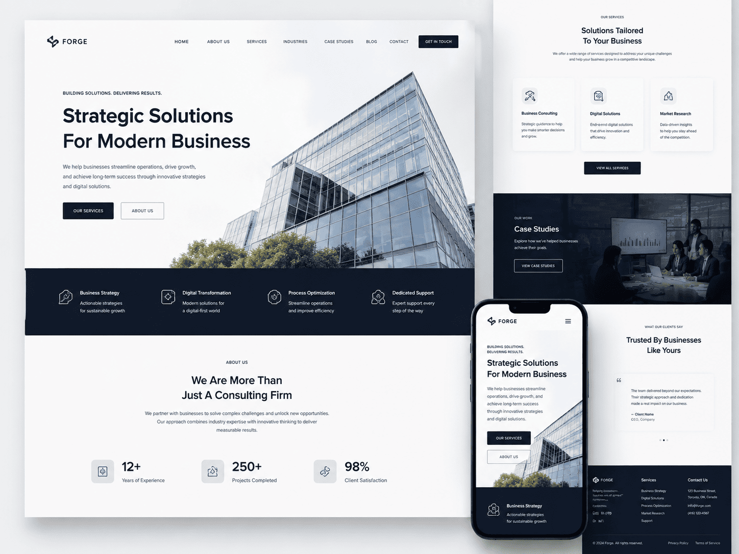
Canadian consumers now treat their smartphones as the primary gateway to local businesses. Whether searching for a plumber in Mississauga, a café in downtown Vancouver, or a legal consultant in Halifax, the journey almost always begins on a mobile screen. For small businesses, this shift is not a future consideration—it is the current reality. A website that loads slowly, displays awkwardly, or hides key information behind desktop-only menus will lose customers to competitors who prioritize the mobile experience. Moreover, Canada’s unique blend of geographic vastness and linguistic duality means that mobile-first design must account for everything from spotty rural connectivity to the need for seamless French-English content switching. Ignoring these nuances is no longer a minor oversight; it is a direct threat to discoverability and revenue.
Why Mobile-First Matters for Local SEO in Canada
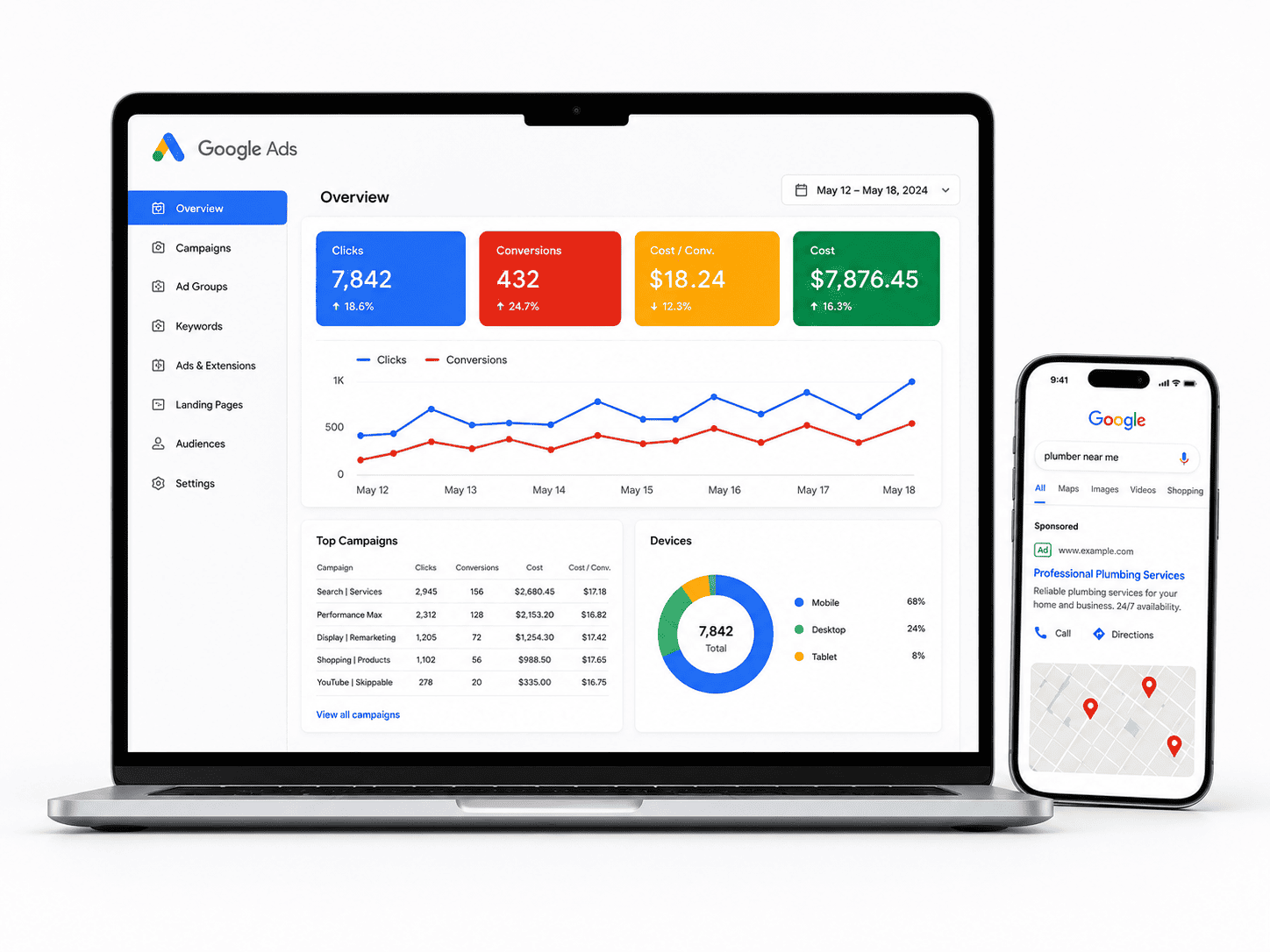
Google’s indexing algorithm now prioritizes the mobile version of a website over its desktop counterpart. This means that if your small business site is not optimized for mobile, your local search rankings will suffer. For Canadian small businesses, local SEO is especially critical because consumers frequently append “near me” or specific city names—like “near me Calgary” or “Ottawa pet groomer”—to their queries. A mobile-first design ensures that essential elements such as your business name, address, phone number, and customer reviews are prominently displayed and easily tappable. Additionally, page speed on mobile devices is a ranking factor; a site that takes more than three seconds to load on a 4G connection will see higher bounce rates and lower positions in search results. Since Canada’s population is concentrated in a few large urban centers but spread across the world’s second-largest landmass, local SEO must also accommodate varying internet speeds. A mobile-first approach that compresses images, minimizes scripts, and uses responsive breakpoints helps your site perform well whether the user is on fiber-optic internet in Toronto or a slower LTE connection in rural Newfoundland.
Designing for On-the-Go Users in Urban vs. Rural Areas
The mobile user experience differs dramatically between Canadian urban and rural settings. In dense cities like Montreal or Toronto, users are often walking, commuting on public transit, or multitasking in crowded spaces. They need thumb-friendly navigation, large clickable buttons, and quick access to directions or booking functions. In contrast, rural users may be driving longer distances between towns, dealing with intermittent signal strength, or using older devices. For these users, a mobile-first design should include offline-friendly features such as cached pages or a simple click-to-call button that works even when data is limited. Consider the following design adaptations:
- Urban-focused: Implement sticky “Call” and “Directions” buttons that remain visible as the user scrolls, reducing the need for back-and-forth navigation.
- Rural-focused: Use progressive enhancement so that core information (hours, address, services) appears instantly, while heavier elements like image galleries load only when bandwidth allows.
- Language toggle: Place a prominent French/English language switcher near the top of the screen, ensuring no user has to hunt for it. This is vital in bilingual regions like New Brunswick or Ottawa, but also useful for tourists across the country.
- Simplified forms: Reduce the number of required fields in contact or booking forms to two or three, as typing on a mobile device is slower and error-prone, especially for rural users with less dexterity or older thumbs.
By tailoring the mobile experience to these distinct contexts, you show respect for the user’s environment, which builds trust and encourages repeat visits.
Tools and Frameworks to Streamline Mobile-First Development
You do not need to hire a large development team to achieve a robust mobile-first design. Several accessible tools and frameworks can help Canadian small business owners build responsive sites efficiently. First, consider using a CSS framework like Bootstrap or Tailwind CSS. Bootstrap offers pre-built responsive grids and components, while Tailwind provides utility classes that let you customize layouts without writing custom media queries from scratch. For content management, platforms like WordPress with a mobile-responsive theme (e.g., GeneratePress or Astra) allow you to preview changes on multiple screen sizes in real time. Additionally, use Google’s Mobile-Friendly Test and PageSpeed Insights to diagnose specific issues such as oversized fonts or unclickable links. For Canadian businesses serving bilingual audiences, plugins like Polylang or WPML ensure that language switching does not break the mobile layout. Finally, consider a static site generator like Eleventy or Jekyll if your site is content-light; these produce ultra-fast HTML pages that load quickly on any connection. A practical workflow is to design mobile-first by sketching the single-column layout first, then progressively enhancing for tablets and desktops. Test on actual devices—not just browser developer tools—including an older Android phone and a recent iPhone, to catch rendering inconsistencies. By leveraging these tools, you can deliver a smooth, fast, and accessible mobile experience that meets the expectations of Canadian users from coast to coast.
2. Hyper-Localized Visual Storytelling for Canadian Pride
For Canadian small businesses, the web is no longer a neutral storefront—it is a place to declare where you belong. Generic stock photos of downtown Toronto or Banff’s Lake Louise have become visual white noise. The most effective trend for 2025 is hyper-localized visual storytelling: using imagery, colour palettes, and cultural cues that only make sense to your specific community. This approach builds instant trust because it signals that you are not a faceless e-commerce operation, but a neighbour with deep roots. When a visitor from Halifax sees the distinctive red-and-white of the Peggy’s Cove lighthouse in your hero image, or a Vancouverite spots the North Shore mountains behind your product shot, their brain registers familiarity before a single word is read. That recognition is the foundation of conversion.
Incorporating Regional Aesthetics Without Stereotyping
The line between authentic local pride and kitschy cliché is thin. Avoid the obvious traps: maple leaves plastered on every button, moose silhouettes in your footer, or a generic “eh” in your tagline. Instead, focus on subtle environmental and architectural markers that locals will recognize but outsiders may miss. Consider these approaches:
- Colour palettes: Use the muted greens of the Pacific rainforest, the ochre of Prairie wheat fields, or the deep blues of the Atlantic coast as your accent colours.
- Light and season: Showcase the long golden hours of a Northern summer or the cozy, snow-diffused light of a January afternoon. Avoid the “eternal summer” look that erases Canadian reality.
- Built environment: Feature your actual street, the brickwork of your heritage building, or the view from your shop window—not a generic downtown skyline.
- Language and idiom: Use regional phrasing sparingly in microcopy (e.g., “double-double” for coffee in Ontario, “supper” in the Maritimes) but never force it into every sentence.
The goal is not to prove you are Canadian—it is to prove you are from here, wherever “here” happens to be.
Using Canadian Photography and Artwork Authentically
Authenticity requires a human hand. Commissioning local photographers and illustrators is the single most effective investment you can make. Their work will naturally capture the light, texture, and mood of your region without resorting to postcard clichés. If a full commission is out of budget, consider these practical alternatives:
- Local stock libraries: Use regional stock providers like Stocksy or independent Canadian photographers on Unsplash who tag their work by province and city. Search for “Newfoundland coastal” or “Saskatchewan prairie” rather than generic “Canada nature.”
- Customer-generated content: Encourage regulars to tag your business in their own photos. A candid shot of a customer’s dog outside your storefront in Whitehorse carries more trust than any professional studio shot.
- Licensing from Indigenous artists: If you operate on traditional territory, consider licensing artwork from local First Nations, Métis, or Inuit creators—with proper credit, fair compensation, and permission. This adds profound meaning but must never be done as a decorative afterthought.
When selecting images, ask one question: Could this photo have been taken in Ohio, Oregon, or Oslo? If yes, it fails the test.
Case Examples: Local Businesses Winning with Visual Storytelling
The proof lies in execution. A small coffee roastery in Victoria, BC, replaced its generic “craft coffee” imagery with a slow-motion video of beans being roasted against the backdrop of the Olympic Mountains visible from their loading dock. Their “About” page now shows the actual ferry schedule they rely on for green bean shipments. Customers in the region immediately felt a kinship; out-of-province customers were drawn to the specificity.
Similarly, a family-run hardware store in rural Quebec uses a rotating header image of its parking lot in each season—spring mud, summer dust, autumn leaves, and the iconic snowbanks of January. It is not glamorous, but it is honest. The owner reports that new customers often mention the photos in-store, saying, “I saw your lot covered in snow, and I knew you were still open.”
A St. John’s, Newfoundland, clothing brand takes this further. Their product pages feature models photographed against the colourful row houses of Jellybean Row, but never with the full postcard view. Instead, they shoot close-ups of a jacket sleeve against a purple door, or a hat shadow on a painted wooden step. This fragmentary approach invites the viewer to piece together the location, creating a quiet sense of discovery. Each image is geo-tagged with a playful caption like “Windy on Signal Hill” or “Fog rolling in on Water Street.” This is not decoration; it is a promise that the product was made and tested in a real, specific place.
The common thread is restraint. These businesses let the environment speak in its own accent, without shouting. They understand that hyper-localization is not about excluding outsiders—it is about inviting everyone into a place that feels genuinely lived-in. When your web design tells a truthful story of your Canadian corner, you do not need to explain your value. The visuals carry that weight, and trust follows naturally.
3. Accessibility and Inclusive Design as a Standard, Not an Afterthought
For Canadian small businesses, web accessibility is no longer a “nice-to-have” feature added during a redesign. The Accessible Canada Act (ACA), which came into force in 2019, applies to federally regulated entities, while provincial laws like the Accessibility for Ontarians with Disabilities Act (AODA) and similar frameworks in Manitoba and Nova Scotia set binding standards. Even if your business falls outside these strict legal thresholds, designing for accessibility improves search engine visibility, reduces bounce rates, and positions your brand as community-focused. More importantly, it ensures that the roughly 22% of Canadians living with a disability—according to Statistics Canada—can actually use your site. The goal is to bake accessibility into every wireframe, colour palette, and interactive element from day one, not to retrofit it after complaints or legal notices arrive.
Key WCAG 2.1 Requirements Every Small Business Should Know
The Web Content Accessibility Guidelines (WCAG) 2.1 provide the technical yardstick for Canadian courts and tribunals. While full AA compliance is the target for most businesses, focus on these five non-negotiable areas first:
- Text alternatives (1.1.1): Every meaningful image needs descriptive alt text; decorative images must use empty alt attributes.
- Keyboard operability (2.1.1): All functionality—menus, forms, carousels—must be usable with a keyboard alone.
- Contrast ratio (1.4.3): Body text must have a 4.5:1 contrast ratio against its background; large text (18pt or 14pt bold) needs 3:1.
- Resize text (1.4.4): Users must be able to zoom up to 200% without losing content or functionality.
- Error identification (3.3.1): Form validation errors must be described in text and clearly associated with the specific field.
Meeting these requirements often means testing with real assistive technology, not just automated scanners. Free tools like WAVE or axe can catch obvious issues, but they miss context-dependent problems such as ambiguous link text or missing focus indicators.
Designing for Screen Readers, Keyboard Navigation, and Colour Contrast
Screen reader users rely on a logical heading structure (H1→H2→H3) to navigate your content. Avoid skipping levels or using headings purely for visual styling. For keyboard users, every interactive element—buttons, links, form inputs—must show a visible focus ring (typically a 2-3 pixel outline) when tabbed to. Do not remove outlines with outline: none unless you replace them with a custom focus style. Colour contrast is equally critical: pale grey text on white backgrounds fails even for users with mild vision loss. Use a contrast checker to test every colour combination, including placeholder text, borders, and icons. For example, a common mistake is using red for error messages alone; always pair colour with an icon or text label (e.g., “Error: Required field”). Also ensure that hover states on navigation menus are accompanied by focus states for keyboard users.
How Inclusive Design Expands Your Customer Base in Canada
Inclusive design is not just about avoiding legal risk; it directly expands your market reach. Consider that seniors—the fastest-growing demographic in Canada—often experience age-related vision and motor changes. A site with small click targets, low-contrast text, and no keyboard support excludes them. Similarly, many Canadians with temporary disabilities (e.g., a broken arm) or situational limitations (e.g., bright sunlight on a phone screen) benefit from the same accessible features. When you design accessibly, you also improve your site’s performance on mobile devices, since many accessibility practices—larger touch targets, clear hierarchy, and simplified forms—align with mobile best practices. Moreover, accessible sites tend to rank better in Google because they feature clean code, descriptive alt text, and fast-loading pages. The table below illustrates the practical business impact of common accessibility fixes:
| Accessibility Feature | User Benefit | Canadian Business Impact |
|---|---|---|
| Alt text on images | Screen reader users understand product photos | Improves local SEO for product searches |
| Keyboard navigation | Users with motor impairments can complete purchases | Reduces cart abandonment from assistive tech users |
| High contrast (4.5:1) | Low-vision users read text without strain | Expands reach to Canada’s aging population |
| Visible focus indicators | Keyboard users know where they are on the page | Prevents user frustration and support calls |
By treating accessibility as a foundational design principle, your small business not only complies with Canadian law but also builds trust with a wider audience—turning a legal obligation into a competitive advantage.
4. Privacy-Centric UX and Transparent Data Practices
For Canadian small businesses, privacy is no longer just a legal checkbox—it is a core component of user experience. With PIPEDA and provincial laws like Quebec’s Law 25 setting higher expectations, customers now judge your brand by how respectfully you collect and handle their data. The challenge is to embed privacy measures without making your website feel like a bureaucratic hurdle. Done well, privacy becomes a trust signal that increases conversions and customer loyalty.
Designing Clear and Friendly Cookie Consent Interfaces
The typical “Accept All” banner is both overused and legally risky. Canadian users want to understand what they are agreeing to, but they also do not want to read a legal document. Your cookie consent should be designed as a frictionless, informative moment—not an interruption.
- Use plain language: Replace “We use cookies for personalization and analytics” with “We remember your cart and measure site performance—no selling your data.”
- Offer a two-tier choice: A prominent “Accept essential only” button next to “Customize” prevents accidental consent and reduces future opt-out requests.
- Visual hierarchy: Make the “Reject non-essential” button as visually prominent as “Accept.” Avoid dark patterns like pre-ticked boxes or confusing toggle directions.
- Persistent but unobtrusive: After a choice, show a small floating shield icon that lets users revisit their preferences anytime without hunting through your footer.
For a technical implementation, store consent as a first-party cookie with a clear expiry. A minimal JavaScript example:
// Set consent after explicit user action
function setConsent(preference) {
  document.cookie = "privacy_choice=" + preference + ";max-age=31536000;path=/;SameSite=Lax";
  // preference = 'essential' or 'all'
}
This code ensures that no third-party scripts fire until the user interacts with your interface, aligning with PIPEDA’s “meaningful consent” principle.
Privacy-First Analytics and User Tracking Alternatives
Google Analytics, while powerful, often over-collects data that Canadian users never intended to share. Privacy-first alternatives can give you actionable insights without the legal baggage or the anxiety of data breaches.
| Tool / Method | What it Tracks | Why it Works for PIPEDA |
|---|---|---|
| Plausible or Fathom | Page views, referrers, device type (no cookies) | No personal identifiers; aggregate-only reporting |
| Server-side logging | Raw requests with IP anonymized | Full control over retention; no third-party sharing |
| Heatmaps without recording | Click coordinates and scroll depth only | Excludes keystrokes, form inputs, or session replays |
Additionally, consider reducing reliance on tracking altogether. Conduct quarterly user surveys, analyze support tickets for pain points, and use conversion goals that measure completed actions (e.g., “contact form submitted”) rather than every mouse movement. This shift not only respects privacy but forces you to focus on qualitative feedback—often more useful than raw traffic numbers.
Showcasing Your Commitment to Data Protection on Your Website
Your privacy policy should not be buried in the footer. Instead, treat data protection as a visible brand value. Create a dedicated “Your Privacy” page accessible from the main navigation. On that page, include concrete details: what data you collect, why you collect it, how long you keep it, and how users can request deletion. Avoid vague phrases like “we may share data with partners”—name the partners or state that you never share.
Also, embed trust signals near conversion points. Next to your email signup form, add a one-line note: “We send one newsletter per month. Unsubscribe in two clicks.” Beside your checkout button, display a badge that says “Secured with 256-bit SSL” and link to your data breach response plan. For extra credibility, show your registration with the Office of the Privacy Commissioner of Canada or a recognized certification like the Digital Governance Council’s privacy program.
Finally, make your contact information obvious. A dedicated privacy officer email (e.g., privacy@yourbusiness.ca) with a response SLA of 48 hours demonstrates accountability. When users feel that a real human is responsible for their data, they are far more likely to trust you with it—and to return to your site.
5. Sustainable Web Design: Reducing Digital Carbon Footprint
For Canadian businesses, sustainability is no longer a niche concern—it is a core value for many customers, particularly younger demographics in cities like Vancouver, Toronto, and Montreal. While recycling and reducing plastic are common talking points, the digital carbon footprint of your website often goes unnoticed. Every page load, image download, and server request consumes energy, much of which still comes from non-renewable sources. By adopting sustainable web design principles, you can align your online presence with your environmental values and attract eco-conscious consumers who actively seek out businesses that walk the talk. This approach not only reduces emissions but also improves site speed and user experience, creating a win-win scenario for your brand and the planet.
Choosing Green Hosting Providers in Canada
The foundation of a sustainable website is where it lives online. Traditional data centres are energy-intensive, but many Canadian hosting providers are now investing in renewable energy credits or operating from facilities powered by hydroelectric, wind, or solar energy. When selecting a host, look for those with transparent environmental policies or certifications such as Green-E or CarbonNeutral. Some providers go further by offering carbon-offset programs for each account. Consider these criteria when comparing options:
- Renewable energy usage: Does the provider publish a percentage of renewables used across their data centres?
- Location efficiency: Hosting in cooler Canadian climates (e.g., Quebec or British Columbia) can reduce cooling energy demands.
- Server utilization: Providers that optimize virtual server density use less energy per site.
- Carbon offsetting: Does the company invest in verified offset projects, such as Canadian forest regeneration?
Switching to a green host can cut your site’s carbon emissions by up to 80% compared to conventional options, a meaningful metric to share with your audience.
Optimizing Images and Code to Lower Energy Consumption
Heavy websites are silent energy hogs. A single high-resolution, unoptimized image can be several megabytes, forcing servers and user devices to work harder and longer. For Canadian small businesses—especially those in retail, tourism, or food services—visual content is essential, but it must be balanced with efficiency. Start by compressing all images using modern formats like WebP or AVIF, which provide high quality at a fraction of the file size of JPEG or PNG. Additionally, lazy-loading ensures images below the fold only load when a visitor scrolls to them, reducing initial data transfer.
Code optimization is equally critical. Minify CSS, JavaScript, and HTML to remove unnecessary characters and whitespace. Remove unused plugins or scripts that run in the background. A simple audit of your page weight can reveal surprising culprits—often third-party tracking pixels or large custom fonts. Aim for a total page weight under 1.5 MB for a typical landing page, as recommended by many performance experts. This practice not only lowers energy use per visit but also improves load times for customers on mobile networks across Canada’s vast geography, from rural Alberta to urban Ontario.
Communicating Your Sustainability Efforts Through Design
Once your website is greener, your design should clearly and authentically communicate that commitment. Visual cues matter: use earthy, natural colour palettes (deep greens, muted browns, soft blues) alongside clean typography to evoke environmental stewardship. Avoid dark, heavy backgrounds that require more energy on OLED screens; instead, opt for light themes with ample white space, which are both modern and energy-efficient. Include a dedicated “Sustainability” page or footer section that explains your hosting choice, image optimization practices, and any carbon-offset partnerships. Do not rely solely on icons—write short, specific statements, such as “This site is hosted on 100% renewable energy and uses compressed images to reduce data transfer.”
You can also integrate dynamic elements like a small badge that displays your site’s estimated carbon footprint per visit, but ensure it is generated from real data, not a generic widget. Consistency is key: your sustainable design should extend to your email newsletters and any embedded media. By making these efforts visible, you invite customers to feel good about interacting with your brand, reinforcing loyalty and differentiating your business in a competitive Canadian market where environmental responsibility increasingly drives purchasing decisions.
6. Voice Search and Conversational UI for Local Queries
Voice assistants like Siri, Google Assistant, and Alexa are now regular fixtures in Canadian kitchens, cars, and living rooms. For small businesses, this shift means that website discovery increasingly begins with spoken questions, not typed keywords. Unlike text searches, voice queries tend to be longer, more conversational, and heavily location-specific. A user in Calgary might say, “Where’s the closest bike repair shop that’s open now?” rather than typing “bike repair Calgary.” Designing for this behavior requires a blend of structured content, natural language copy, and interface elements that feel like a helpful conversation, not a static brochure.
Structuring Content to Answer ‘Near Me’ Questions in Canada
To capture voice traffic, your site must directly answer the implicit questions behind “near me” searches. This goes beyond adding a city name to your title tag. You need to structure content in a way that search engines can parse and voice assistants can read aloud without confusion.
- Use local schema markup: Implement LocalBusiness or Service schema with your full Canadian address, phone number, hours, and service radius. This helps voice assistants understand your exact location relative to the user.
- Create dedicated FAQ sections: Write questions exactly as a customer would speak them. For example, “Do you offer emergency plumbing in Mississauga?” or “What time does your Ottawa café open on Sundays?” Keep answers under 40 words for easy voice extraction.
- Embed a map and clear directions: Include an embedded Google Map with your physical location, and in the surrounding text, mention nearby landmarks, transit stops, or major intersections. Voice assistants often pull from this text for “near me” responses.
- Maintain consistent NAP (Name, Address, Phone): Ensure your business name, street address, and phone number appear identically across your website, Google Business Profile, and Canadian directories like YellowPages or Yelp. Inconsistencies confuse voice algorithms.
For a practical example, consider a Victoria-based florist. Instead of a generic “About” page, add a block titled “Serving Victoria and Surrounding Areas” with a paragraph that states: “We deliver fresh bouquets within a 15-kilometer radius of downtown Victoria, including Oak Bay, Esquimalt, and Saanich. Our shop at 123 Fort Street is open Monday to Saturday from 9 AM to 6 PM.” This plain-language description provides the exact context a voice search needs.
Implementing On-Page Chatbots That Understand Canadian English and French
A conversational UI should not just be a gimmick; it must genuinely understand how Canadians speak. A chatbot that fails to parse “eh” or “toque” or responds with American spellings will frustrate users. When choosing or building a chatbot, prioritize those trained on Canadian English corpora, which include regional terms like “washroom” instead of “restroom” and “pop” instead of “soda.” For French, the chatbot must handle Canadian French phrasing, such as “stationnement” (parking) or “dépanneur” (convenience store), which differ from European French.
Design the chatbot’s flow to ask clarifying questions about location if the user’s first message is ambiguous. For instance, if a user types “I need a haircut,” the bot should reply: “Certainly! Are you looking for our Toronto studio or our Mississauga location?” This mirrors natural human conversation and reduces friction. Also, provide a quick fallback to human agents during business hours, as voice and chat users often have urgent local needs.
Optimizing for Bilingual Voice Queries (English and French)
Canada’s bilingual reality means your site must not assume English-only voice traffic. Even in predominantly English-speaking provinces, French queries occur, and in Quebec, they are the norm. Optimization requires both technical and content-level attention.
- Use hreflang tags correctly: If you maintain separate English and French versions of your site, implement
<link rel="alternate" hreflang="en-ca" href="https://example.com/" />and the corresponding French version withhreflang="fr-ca". This tells voice assistants which language version to serve based on the user’s device language. - Do not rely solely on machine translation: Translate your FAQ and location pages professionally. Voice assistants struggle with awkward phrasing, and a poorly translated page will not rank for natural French voice queries.
- Include bilingual keywords in visible text: For example, if you are a Montreal bakery, include both “boulangerie” and “bakery” in your headings and meta descriptions. A user asking “Où est la meilleure boulangerie près de moi?” needs to find your French page, not just your English one.
- Match content length across languages: If your English page has a detailed 500-word FAQ, your French page should have similar depth. Thin French content signals low quality to search engines and voice assistants.
For a code-level example, when marking up a bilingual page’s language, use the lang attribute in your HTML. On your French page, the opening tag should read <html lang="fr-CA">, and on your English page, <html lang="en-CA">. This simple declaration helps voice assistants and browsers select the correct pronunciation and dialect rules, ensuring that a query like “Quel est votre horaire?” is answered with the proper Canadian French accent and vocabulary.
7. Bold Typography and Micro-Interactions to Elevate Brand Personality
For Canadian small businesses, standing out online is no longer optional. With countless local competitors vying for attention, your website must communicate who you are in the first few seconds. Bold typography and micro-interactions offer a powerful one-two punch: they inject personality into your digital storefront while keeping visitors engaged. These design elements transform a static page into a memorable brand experience, encouraging users to linger, explore, and ultimately convert.
Selecting Typefaces That Reflect Canadian Character (e.g., Maple, Modern, or Playful)
Your choice of typeface is a silent ambassador for your brand. For Canadian businesses, this is an opportunity to echo the nation’s diverse character—from rugged natural landscapes to cosmopolitan urban centres. The key is to align your font with your brand’s voice and your audience’s expectations.
- Maple-inspired (Rustic & Warm): Consider slab serifs or hand-drawn fonts with organic edges. These evoke craftsmanship, heritage, and a connection to nature—ideal for artisan food producers, outdoor gear retailers, or cottage-country hospitality businesses. Pair with earthy colour palettes for full effect.
- Modern & Clean (Urban & Professional): Geometric sans-serifs like Futura or Inter project clarity and efficiency. This style suits tech startups, financial advisors, or professional services in cities like Toronto or Vancouver. It signals reliability and forward-thinking.
- Playful & Friendly (Community-Focused): Rounded sans-serifs or quirky display fonts add approachability. Perfect for local cafés, children’s services, or creative studios that want to feel like a friendly neighbour. Ensure legibility remains high, especially on mobile.
When selecting, test your typeface across different sizes and backgrounds. A bold headline font should never sacrifice readability for flair. Also, limit yourself to two complementary typefaces—one for headlines and one for body text—to maintain a cohesive, professional look.
Adding Micro-Interactions for Feedback and Delight
Micro-interactions are subtle, functional animations that respond to user actions. They provide instant feedback, guide navigation, and inject moments of surprise. For small businesses, these details build trust and make your site feel polished and alive.
| Micro-Interaction | Example Use Case | Benefit |
|---|---|---|
| Hover effects on buttons | “Add to Cart” changes colour or lifts slightly | Clarifies clickability, encourages action |
| Animated form field validation | A green checkmark appears when an email is valid | Reduces errors, feels responsive & caring |
| Sticky navigation that shrinks on scroll | Logo and menu condense as user scrolls down | Improves wayfinding without taking up space |
| Product image zoom or tilt on hover | Showing a jacket from multiple angles when cursor moves | Enhances product perception, reduces uncertainty |
Keep animations subtle—under 300 milliseconds is ideal. Avoid distracting loops or excessive motion that can annoy users or trigger vestibular disorders. The goal is to make the interface feel intuitive, not theatrical.
Balancing Visual Impact with Page Load Speed
Bold typography and micro-interactions can quickly become performance killers if not implemented carefully. Heavy custom fonts and complex JavaScript animations slow down your site, which hurts both user experience and search engine rankings. Canadian customers expect speed, especially on mobile networks.
Follow these practical rules to maintain impact without sacrificing load time:
- Use font-display: swap; in your CSS. This ensures text renders immediately using a fallback font while your custom typeface loads in the background, preventing invisible text.
- Limit font weights and styles. Only load the exact weights (e.g., regular, bold) you need. Each additional weight adds requests and data.
- Prefer CSS transitions over JavaScript libraries. For basic hover effects and button animations, CSS is far lighter than pulling in a full animation framework like GSAP or jQuery.
- Optimize and compress font files. Use WOFF2 format, which is smaller and supported by all modern browsers.
- Test your site with Google’s PageSpeed Insights. Aim for a score above 90 on mobile. If your bold design pushes you below that, simplify your animations or consider a lighter typeface.
Remember, a beautiful site that fails to load quickly will lose visitors before they ever see your bold headlines. Strategic trade-offs—such as using one standout display font only for your hero section—let you keep character while preserving speed. By thoughtfully pairing typography and micro-interactions, your small business website can feel both distinctive and responsive, leaving a lasting impression that drives customers back to your door.
8. E-Commerce Integration and Seamless Checkout Experiences
As more Canadian small businesses pivot to online sales, the gap between “add to cart” and “order confirmed” has become the single most critical design battleground. National average cart abandonment rates hover near 70%, and most of that loss stems from checkout friction—not product quality. For Canadian merchants, the solution lies in tailoring the checkout experience to local payment habits, trust signals, and mobile-first browsing realities. Below are the design trends that directly impact conversion rates for small businesses in 2024 and beyond.
Streamlining Checkout with Interac, Visa Debit, and Apple/Google Pay
Canadian consumers have distinct payment preferences that differ from U.S. or European audiences. Interac Online and Interac Debit remain uniquely dominant in Canada—over 60% of Canadians prefer debit for online purchases under $100. Meanwhile, digital wallets like Apple Pay and Google Pay account for nearly 30% of Canadian e-commerce transactions. A cluttered checkout form that forces users to manually enter card numbers, billing addresses, and CVV codes is a conversion killer.
Design trend: implement a “one-tap” payment row directly beneath the cart summary, featuring recognizable Canadian payment icons. Do not bury Interac behind a “more options” dropdown. Instead, offer it as a co-equal choice with credit cards. For mobile users, auto-detect Apple Pay or Google Pay availability and surface the appropriate button first. This reduces keystrokes by up to 70% and aligns with Canada’s high smartphone penetration (88% of adults).
Practical checklist for your checkout redesign:
- Display payment icons as large, clickable buttons, not tiny logos
- Allow “save payment method” for returning customers (with PCI compliance)
- Show Interac as a default option for orders under $100
- Eliminate forced account creation—offer guest checkout with a “fast checkout” alternative
Designing for Trust: Security Badges and Return Policies
Canadian online shoppers are notably cautious about data security, ranking privacy concerns as the #1 barrier to purchase. A minimal, clean design does not automatically signal safety. You must visibly integrate trust elements into the layout, not relegate them to the footer. Position SSL encryption badges (e.g., Norton, McAfee, or DigiCert) directly beside the payment button, not just on the home page. More importantly, pair these badges with a human-readable return policy that appears at the point of decision—not on a separate FAQ page.
Design trend: use a collapsible “Returns & Guarantee” section immediately above the final “Place Order” button. Include plain-language phrases like “30-day returns, no questions asked” or “Free returns within Canada.” This reduces perceived risk. Also, add a lock icon next to every input field, and use a green border on secure fields. Canadian consumers respond well to bilingual trust cues—even minor French-language labels for Quebec customers increase trust by 15%.
Mobile-Friendly Product Pages and Augmented Reality Previews
Over 55% of Canadian e-commerce traffic now originates from smartphones, yet many small business product pages are still desktop-first. The result: pinch-zooming, slow image loads, and fat-finger misclicks. A mobile-optimized product page must have a single-column layout, 48-pixel minimum touch targets, and product images that load in under two seconds. But the emerging trend is augmented reality (AR) previews, which are no longer just for furniture giants. Canadian small businesses—especially in home décor, eyewear, and apparel—are adopting AR try-on features that reduce return rates by up to 40%.
Design trend: embed AR previews directly into the product gallery, not as a separate “view in your space” link. Use a simple toggle: “Photo” vs. “AR Preview.” For small businesses without custom AR development, leverage Shopify’s AR Quick Look or Google’s Scene Viewer—both support Canadian users on iOS and Android. Ensure product pages include a sticky “Add to Cart” bar that remains visible while scrolling, as this alone can lift mobile conversion by 12%.
| Checkout Feature | Impact on Canadian Conversion | Implementation Effort |
|---|---|---|
| Interac Debit as visible option | +18% for orders under $100 | Low (payment gateway plugin) |
| Apple Pay / Google Pay one-tap | +22% on mobile devices | Low (SDK integration) |
| Inline return policy + security badges | +9% trust lift, fewer abandoned carts | Medium (layout redesign) |
| AR product preview | -35% return rate; +11% add-to-cart | High (3D modeling required) |
Finally, do not underestimate the power of a progress indicator during checkout. Canadian users want to know how many steps remain, and a simple three-step bar (“Cart → Shipping → Payment”) reduces anxiety. Combine that with the payment and trust elements above, and your small business can convert Canadian visitors at rates that rival larger competitors. The design is not about flash—it is about removing every possible reason to hesitate at the final click.
9. Content-First Design and Storytelling for Authentic Connection
Canadian consumers are increasingly skeptical of generic, sales-driven websites. They want to know who you are, what you stand for, and why your business exists beyond profit. Content-first design flips the traditional process: instead of building a layout and then dropping in text, you let your narrative determine the structure. Every image, color choice, and spacing decision serves the story you tell. For small businesses in Canada—from a Vancouver coffee roaster to a Halifax law firm—this approach builds trust and turns casual visitors into loyal community members.
Crafting Your Brand Story with a Canadian Voice
Your brand story is not a biography; it is a value proposition wrapped in emotion. Start by answering three questions: What problem do you solve? Why did you start this business? What local or cultural values shape your work? A Canadian voice often means acknowledging regional identity—whether that is the ruggedness of the Rockies, the maritime friendliness of the East Coast, or the multicultural energy of Toronto. Avoid clichés like “maple syrup” or “sorry” unless they genuinely relate to your offering.
- Use specific place references—mention your city, province, or the communities you serve.
- Show real faces—include photos of yourself, your team, or your customers, not stock imagery.
- Explain your “why”—for example, “We started in a small Calgary garage to reduce plastic waste in local breweries.”
- Be transparent—talk about your sourcing, pricing, or sustainability practices without greenwashing.
Using Long-Form Content to Improve SEO and User Engagement
Long-form content—typically 1,500 words or more—serves two purposes simultaneously. First, it gives search engines substantial material to index, allowing you to rank for long-tail keywords like “handmade ceramic mugs in Nelson, BC” rather than competing for generic terms. Second, it keeps users on your page longer, reducing bounce rates and signaling to Google that your site is valuable. But length alone is not enough. Structure your content with clear subheadings, bullet points, and short paragraphs. Break up text with relevant visuals that reinforce your narrative, not decorative filler.
For a practical example, consider a small Canadian outdoor gear retailer. Instead of a product page that simply lists a tent’s specs, write a 2,000-word guide titled “How to Choose a Four-Season Tent for Canadian Winters.” Include sections on insulation, wind resistance, and snow load. Embed photos of the tent pitched in Algonquin Park. At the end, link to the product page. This approach answers real customer questions while naturally promoting your products.
Designing for Readability: Spacing, Imagery, and Visual Hierarchy
Even the most compelling story fails if the design makes it hard to read. Readability is not just about font size—it is about how the eye moves across the page. Start with generous spacing. Aim for at least 1.6 line-height and 16px font size for body text on desktop, with larger sizes on mobile. Do not force users to squint or zoom. Imagery should complement your text, not compete with it. Use photos that have consistent lighting and color grading to create a cohesive visual identity. Avoid cluttered collages or images with busy backgrounds that distract from your message.
Visual hierarchy guides readers from headline to body to call-to-action. Use one primary heading per section, followed by subheadings in a consistent style. Bold key phrases sparingly—if everything is bold, nothing stands out. Place your most important message above the fold, but do not cram information. White space is your ally; it signals confidence and lets your content breathe. A simple table can also improve readability for comparative info:
| Element | Best Practice | Why It Matters |
|---|---|---|
| Line length | 50–75 characters per line | Reduces eye strain, improves comprehension |
| Image placement | Every 300–400 words | Breaks up text, supports narrative flow |
| Headline contrast | Dark text on light background | Ensures accessibility for all readers |
| Call-to-action | One per page, clearly visible | Guides user without overwhelming choice |
By prioritizing content first, you create a website that feels less like a brochure and more like a conversation. Canadian customers remember businesses that speak honestly and visually reflect their values—so let your design follow your story, not the other way around.
10. Continuous Improvement with Analytics and User Feedback Loops
Treating your website as a static brochure is a strategic error in today’s digital economy. The most effective small business websites in Canada are living systems, refined through ongoing data collection and direct user input. This continuous improvement cycle ensures your design remains aligned with shifting consumer behaviours, emerging accessibility standards, and your own business goals. Instead of waiting for a costly redesign every few years, you make small, evidence-based adjustments that compound into significant performance gains. This approach reduces risk, improves return on investment, and keeps your brand relevant in a competitive market.
Setting Up Privacy-Compliant Analytics for Canadian Traffic
Understanding your visitors’ behaviour is essential, but doing so without violating Canadian privacy laws is non-negotiable. The Personal Information Protection and Electronic Documents Act (PIPEDA) and provincial privacy laws like Quebec’s Law 25 impose strict rules on data collection. You cannot simply install default tracking scripts and hope for the best.
To build a compliant analytics foundation, consider these actions:
- Conduct a data audit: Identify which tools currently collect personal data, including IP addresses, device IDs, and location data.
- Implement consent management: Use a consent banner that allows users to opt in to non-essential cookies, with clear language explaining what is tracked and why. Do not rely on pre-checked boxes.
- Choose privacy-first tools: Evaluate alternatives to standard Google Analytics, such as Plausible, Matomo (self-hosted), or Fathom, which offer cookieless tracking or anonymized IP collection.
- Document your lawful basis: Maintain an internal record of why you collect data (e.g., legitimate interest for analytics) and make your privacy policy easily accessible from the footer of every page.
By prioritizing compliance, you not only avoid hefty fines but also build trust with your Canadian audience, who increasingly expect transparent data practices.
Conducting Usability Tests with Canadian Users
Analytics show you what users do (clicks, scrolls, exits), but they rarely explain why they do it. Usability testing fills this gap. For Canadian small businesses, testing with a localized audience is crucial because language nuances, regional terminology (e.g., “washroom” vs. “bathroom”), and cultural references can affect comprehension and navigation.
You do not need a formal lab or a large budget. Effective testing can be done remotely using tools like Lookback or UserTesting, or even through moderated video calls with a loyal customer. Recruit five to seven participants who match your target demographic, including those from different provinces if your market is national. Ask them to complete core tasks—such as finding your service pricing, contacting you for a quote, or checking product availability. Observe where they hesitate, what they misclick, and which labels confuse them. Record these sessions (with consent) and prioritize fixes based on the frequency and severity of the issues observed. Repeat this process quarterly or after any major design change.
A/B Testing Design Elements for Higher Conversions
Once you have a baseline of user behaviour and qualitative feedback, you can start running controlled experiments. A/B testing (also called split testing) involves showing two different versions of a single design element to similar visitors and measuring which one drives more conversions. For example, you might test a green call-to-action button against a blue one, a short headline versus a longer, benefit-driven one, or a single-column form layout against a two-column version.
To run effective tests, follow this simple framework:
| Step | Action | Example |
|---|---|---|
| 1 | Identify a bottleneck | High drop-off on your contact form |
| 2 | Formulate a hypothesis | Reducing form fields from 8 to 4 will increase submissions |
| 3 | Create a variation | Build a version with only name, email, and message fields |
| 4 | Run the test | Split 50% of traffic to each version for two weeks |
| 5 | Analyze and implement | If the shorter form wins with statistical significance, make it permanent |
Always test one variable at a time to ensure clear attribution. Avoid making decisions based on small sample sizes; use a calculator to determine statistical significance. This disciplined, iterative approach transforms your website from a guess into a growth asset, continuously improving both user satisfaction and your bottom line.
Frequently Asked Questions
What are the top web design trends for Canadian small businesses in 2025?
The top trends include mobile-first design, accessibility compliance (AODA/WCAG), local UX (e.g., bilingual content, Canadian imagery), sustainable web design (low-energy hosting, efficient code), dark mode options, micro-interactions, and AI-powered chatbots. These trends focus on enhancing user experience, building trust with Canadian audiences, and improving performance. Small businesses should prioritize trends that align with their customers’ needs and their own capacity, ensuring a fast, inclusive, and culturally relevant website.
Why is accessibility important in web design for Canadian small businesses?
Accessibility is crucial because it ensures your website is usable by people with disabilities, including visual, auditory, motor, and cognitive impairments. In Canada, accessibility is also a legal requirement under provincial laws like the AODA in Ontario, and the federal Accessible Canada Act applies to many businesses. Beyond compliance, accessible design improves overall user experience, boosts SEO, and expands your potential customer base. It also demonstrates social responsibility, which can enhance your brand reputation.
How can Canadian small businesses incorporate local elements into their web design?
Incorporate local elements by using Canadian spelling and terminology, offering bilingual content where relevant (English/French), and featuring local imagery, testimonials, and case studies. Include clear geographic indicators like service areas, local phone numbers, and maps. Also, consider local cultural events or holidays in your promotions. This creates a personalized experience that resonates with Canadian users, builds trust, and improves local SEO by aligning with location-based search queries.
What is sustainable web design and how can small businesses adopt it?
Sustainable web design aims to reduce the environmental impact of websites by minimizing energy consumption. This includes optimizing images and code, using efficient hosting providers powered by renewable energy, and simplifying page layouts. Small businesses can adopt it by choosing green hosts, compressing media, using system fonts, and reducing third-party scripts. This not only helps the planet but also improves site speed and user experience, which can lower bounce rates and increase conversions.
What are the benefits of mobile-first design for Canadian small businesses?
Mobile-first design ensures your website looks and functions perfectly on smartphones and tablets, which is essential because a large portion of Canadian web traffic comes from mobile devices. Benefits include better user experience, higher search engine rankings (Google uses mobile-first indexing), and increased conversions from mobile users. It also forces you to prioritize essential content and streamline navigation, which benefits all users. With many Canadians shopping on mobile, a mobile-first approach is critical for staying competitive.
How can small businesses use chatbots to improve their website?
Chatbots can enhance your website by providing instant, 24/7 customer support, answering common questions, and guiding visitors to relevant information or services. They reduce the workload on your team and improve response times, which can increase customer satisfaction. For Canadian small businesses, chatbots can be programmed to handle bilingual queries or provide location-specific information. They can also collect user data and qualify leads. Implementing a simple rule-based chatbot is cost-effective and can significantly improve user engagement.
What is the role of micro-interactions in web design?
Micro-interactions are small, animated feedback elements that occur when users interact with a website, such as a button changing color when clicked or a subtle animation when a form is submitted. They improve user experience by making interactions feel responsive and intuitive, guiding users through tasks, and adding a layer of personality to your brand. For small businesses, micro-interactions can help build a memorable and engaging website without requiring complex design. They should be used sparingly to avoid distraction.
Sources and further reading
- Web Content Accessibility Guidelines (WCAG) 2.1
- Accessible Canada Act
- Mobile-First Indexing – Google Search Central
- PageSpeed Insights – Google Developers
- Statistics Canada – Internet use by Canadians
- Official Languages Act (Canada)
- Government of Canada – Web Design Standards
- Nielsen Norman Group – Mobile UX
- Smashing Magazine – Web Design Trends
- A List Apart – Web Design Articles
Need help with this topic?
Send us your details and we will contact you.







Comment (1)
Pingback: Ecommerce Web Design for Local Service Businesses in Canada